はじめに
NavigationBarをカスタマイズする方法がAppleのDeveloperサイトに載っています。
https://developer.apple.com/documentation/uikit/uinavigationcontroller/customizing_your_app_s_navigation_bar
そこにはサンプルアプリもダウンロードできるようになっており、記事とサンプルアプリの両方を見ながらNavigationBarのカスタマイズ方法を学びます。
NavigationBarをカスタマイズする方法として以下の2種類があると記載されています。
- ViewControllerのUINavigationItemを変更することで間接的にNavigationBarを変更
- Appearanceプロキシを使用して直接NavigationControllerを変更
概要の意味の深掘りはここではしません。
実際にサイトの説明やサンプルアプリを順に追って見ていきましょう。
BarStyleの変更
NavigationBarの外観を変更する方法です。
サンプルコードはご覧のようになっています。
// NavigationBarのスタイルを変更するbarStyleを.blackとすることで背景を黒くする
self.navigationController!.navigationBar.barStyle = .black

// isTranslucentでNavigationBarを半透明にする
self.navigationController!.navigationBar.isTranslucent = true

// NavigationBarのタイトルの色を変更
self.navigationController!.navigationBar.titleTextAttributes = [.foregroundColor: UIColor.white]

// NavigationBarのItemの色を変更
self.navigationController!.navigationBar.tintColor = #colorLiteral(red: 1, green: 0.99997437, blue: 0.9999912977, alpha: 1)
サンプルコードにコメントを入れてみました。
NavigationBarのスタイルを変更するbarStyleには実は.blackTranslucentというstyleが存在していたのですが、iOS13.0でdeprecatedになったので、stlyeを.blackに、isTranslucentをtrueにという方法を取っています。
こちらのサンプルコードが実行されると以下のような見た目になります。
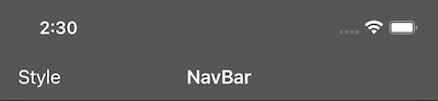
RightViewをカスタマイズする
RightViewというのはNavigationBar右側の領域でカスタムUIViewの適用やUIBarButtonItemを使用することができます。
サンプルでは、3種類のUIBarButtonItemをNavigationBarの右側に配置しています。
サンプルコードです。
// 上下の画像を設定したUISegmentedControlを生成
let segmentedControl = UISegmentedControl(items: [
    UIImage(systemName: "arrow.up")!,
    UIImage(systemName: "arrow.down")!
])
// セグメントが選択された状態を表示しない(デフォルトはfalse)
segmentedControl.isMomentary = true

// BarButtonItemのカスタムUIViewとして、segmentedControlを使用
let segmentBarItem = UIBarButtonItem(customView: segmentedControl)
// 右側にItemを設定
navigationItem.rightBarButtonItem = segmentBarItem
サイト上だと末尾2行しか掲載されてなかったので、サンプルアプリからソースコードを一部追加しました。
こちらの例ではUISegmentedControlをNavigationBar右側のバーボタン項目として設定しています。
見た目はこうなります。
NavigationBar右側に上下の画像が設定されたUISegmentedControlが表示されていると思います。
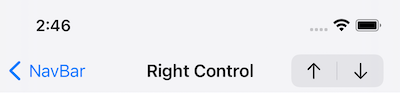
TitleViewをカスタマイズする
navigationItem.titleViewにUIViewを設定して、NavigationBarのTitleViewをカスタマイズすることができます。
サンプルコードではUISegmentedControlを中央のカスタムTitleViewとして設定しています。
let segmentTextContent = [
    NSLocalizedString("Image", comment: ""),
    NSLocalizedString("Text", comment: ""),
    NSLocalizedString("Video", comment: "")
]
let segmentedControl = UISegmentedControl(items: segmentTextContent)
self.navigationItem.titleView = segmentedControl
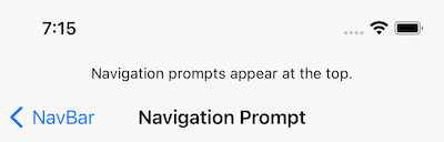
NavigationPromptの変更
PromptとはNavigationBar上部に表示される1行のテキストのことです。
UINavigationItemのpromptプロパティを使用します。
navigationItem.prompt = NSLocalizedString("Navigation prompts appear at the top.", comment: "")
promptはきちんと1行までに限定されていて、改行コードを設定しても無効でした。
改行コード以降の文字は無視されて表示されません。
また、大量の文字を設定しましたが、端末幅に収まりきらない文字は表示できるフォントサイズまで小さくされます。
adjustsFontSizeToFitWidthをtrueにしたのと同じような動きですね。
場合によっては認識できないくらいのフォントサイズに縮小されてしまうので、文字数は意識しましょう。(あまり長い文字を設定するのはオススメしません)
NavigationBarの外観をカスタマイズする
barTintColorや背景画像を追加してNavigationBarの背景をカスタマイズします。
サンプルコードでは画像を設定する方法を紹介しています。
guard let bounds = navigationController?.navigationBar.bounds else { return }

// 色を指定して、グラデーション画像を生成
var backImageForDefaultBarMetrics =
    UIImage.gradientImage(bounds: bounds,
                          colors: [UIColor.systemBlue.cgColor, UIColor.systemFill.cgColor])
var backImageForLandscapePhoneBarMetrics =
    UIImage.gradientImage(bounds: bounds,
                          colors: [UIColor.systemTeal.cgColor, UIColor.systemFill.cgColor])

let navigationBarAppearance = self.navigationController!.navigationBar
// デフォルト(より適切な背景画像が見つからない時に使用される)
navigationBarAppearance.setBackgroundImage(backImageForDefaultBarMetrics, for: .default)
// iPhoneで横向きのときに使用される
navigationBarAppearance.setBackgroundImage(backImageForLandscapePhoneBarMetrics, for: .compact)
戻るボタンのタイトルをカスタマイズ
ユーザーは戻るボタンをタップ・ホールドすることで異なるスタックレベルを素早く切り替えることができると説明されています。
サンプルコードはありませんが、サンプルアプリではスタック内の各ViewControlerのレベルに合わせてバックボタンのタイトルをカスタマイズしています。
文章だと少し伝わりづらいかもしれないので、サンプルアプリで実装されているコードを抜粋します。
func makeViewController(_ level: Int) -> UIViewController {
    let viewController = UIViewController()
    viewController.navigationItem.backButtonTitle = "\(level)"
    return viewController
}

for level in 1..<10 {
    self.navigationController?.pushViewController(
        makeViewController(level), animated: false
    )
}

self.navigationController?.pushViewController(makeViewController(10), animated: true)
各スタックのレベルに応じて戻るボタンがカスタマイズされていることがわかると思います。
10個のViewControllerを作成し、それをPUSHすることでスタック上に戻るボタンがカスタマイズされたViewControllerが積み上がります。
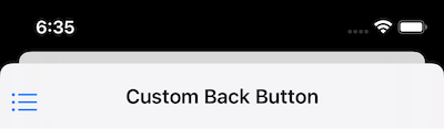
戻るボタンを画像でカスタマイズ
NavigationBarの戻るボタンはデフォルトのままだと、テキストと戻る矢印がセットで表示されます。
カスタマイズすることでそれを表示せず、ユーザー側で用意した画像を表示する方法です。
UINavigationBarAppearanceを使用しています。
ここでようやくAppearanceプロキシが登場してきましたね。
let backButtonBackgroundImage = UIImage(systemName: "list.bullet")

// CustomBackButtonNavControllerにあるすべてのUINavigationBarの設定を変更するためにUINavigationBarAppearanceを生成
let barAppearance =
    UINavigationBar.appearance(whenContainedInInstancesOf: [CustomBackButtonNavController.self])

// 戻るボタンを変更する(backIndicatorTransitionMaskImageも一緒に設定する必要がある)
barAppearance.backIndicatorImage = backButtonBackgroundImage
// PushやPopのトランジション時にコンテンツのマスクとして使用される画像
barAppearance.backIndicatorTransitionMaskImage = backButtonBackgroundImage

// CustomBackButtonNavControllerにあるすべてのUIBarButtonItemの設定を変更するためにUIBarButtonAppearanceを生成
let barButtonAppearance =
    UIBarButtonItem.appearance(whenContainedInInstancesOf: [CustomBackButtonNavController.self])
// 戻るボタンのテキストの位置を調整
barButtonAppearance.setBackButtonTitlePositionAdjustment(UIOffset(horizontal: 0, vertical: -5), for: .default)
戻るボタンのタイトルを取り除くためのコードも必要です。
空文字を設定してデフォルトの設定を変更していることが分かります。
let backBarButtton = UIBarButtonItem(title: "", style: .plain, target: nil, action: nil)
navigationItem.backBarButtonItem = backBarButtton
これを実装すると戻るボタンは以下のような見た目になります。
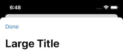
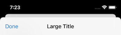
NavigationBarのタイトル文字を大きくする
こちらは非常にシンプルに実装することができます。
ただしLargeタイトルはScrollTopの時に限定され、スクロールすると通常の表示に自動的に切り替わります。
self.navigationController?.navigationBar.prefersLargeTitles = true
ScrollTopのとき
Scrollしたとき
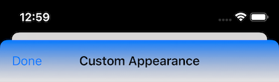
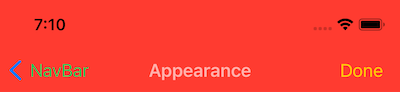
NavigationBarの外観を変更
少し前にも利用されていましたが、
UINavigationBarAppearanceとUIBarButtonItemAppearanceを使用する方法です。
let appearance = UINavigationBarAppearance()
appearance.configureWithOpaqueBackground()
// 背景色を変更
appearance.backgroundColor = UIColor.systemRed
// NavigationBarのタイトル色を変更
appearance.titleTextAttributes = [.foregroundColor: UIColor.lightText]
// 通常のNavigationBarの表示
navigationItem.standardAppearance = appearance
// LargeタイトルのScrollTopの時の表示
navigationItem.scrollEdgeAppearance = appearance
// 表示モードが横向きの時の表示
navigationItem.compactAppearance = appearance

let buttonAppearance = UIBarButtonItemAppearance()
// UIBarButtonのタイトルの色を変更
buttonAppearance.normal.titleTextAttributes = [.foregroundColor: UIColor.systemGreen]
navigationItem.standardAppearance?.buttonAppearance = buttonAppearance
navigationItem.compactAppearance?.buttonAppearance = buttonAppearance

let doneButtonAppearance = UIBarButtonItemAppearance()
// Doneボタンのタイトルの色を変更
doneButtonAppearance.normal.titleTextAttributes = [.foregroundColor: UIColor.systemYellow]
navigationItem.standardAppearance?.doneButtonAppearance = doneButtonAppearance
navigationItem.compactAppearance?.doneButtonAppearance = doneButtonAppearance
ここでのポイントとしてはAppearanceがstandardAppearance、scrollEdgeAppearance、compactAppearance、の3種類あることです。
大まかな意味合いはソースコードのコメントに記載しています。
NavigationBarは表示モードが若干違いますので、それぞれで設定が適用されるようにしています。
standardAppearance
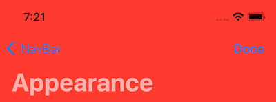
scrollEdgeAppearance
サンプルアプリではNavigationBarの表示はstandardなので、
scrollEdgeAppearanceの表示をご紹介するためにソースコードを追加しています。
// 追加
appearance.largeTitleTextAttributes = [.foregroundColor: UIColor.lightText]
navigationController?.navigationBar.prefersLargeTitles = true
compactAppearance

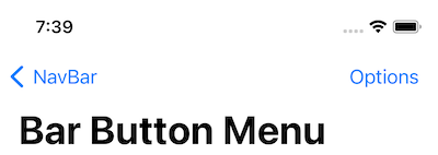
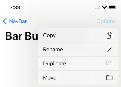
BarButtonItemにメニューを追加
メニューを追加すると、1箇所でアプリケーションの機能に簡単にアクセスすることができます。
UIBarButtonItemの右側にUIMenuを追加します。
@IBOutlet var optionsBarItem: UIBarButtonItem!

func menuHandler(action: UIAction) {
    Swift.debugPrint("Menu handler: \(action.title)")
}

override func viewDidLoad() {
    let barButtonMenu = UIMenu(title: "", children: [
        UIAction(title: NSLocalizedString("Copy", comment: ""), image: UIImage(systemName: "doc.on.doc"), handler: menuHandler),
        UIAction(title: NSLocalizedString("Rename", comment: ""), image: UIImage(systemName: "pencil"), handler: menuHandler),
        UIAction(title: NSLocalizedString("Duplicate", comment: ""), image: UIImage(systemName: "plus.square.on.square"), handler: menuHandler),
        UIAction(title: NSLocalizedString("Move", comment: ""), image: UIImage(systemName: "folder"), handler: menuHandler)
    ])
    optionsBarItem.menu = barButtonMenu
}
UIBarButtonItemにはmenuプロパティがあるので、そこにUIMenuを設定しています。
ただし、iOS14から追加されたプロパティのようなのでOSバージョンには注意してください。
サンプルではボタンを押してもログを出力しているだけなので、アプリの要件に合わせて変更すると良いと思います。
メニュー閉
メニュー開
最後に
UINavigationBarのカスタマイズ方法をご紹介しました。
私もやったことがないものもあったり、よくわかってなかったところが整理されたので勉強になりました。
参考になれば幸いです。