タイトル
React,Typescript,styledを使ってオリジナルのチェックボックスを作成する
開発環境
"react": "^18.2.0",
"typescript": "^5.2.2",
"vite": "^5.0.8"
"styled-components": "^6.1.3"
"@types/styled-components": "^5.1.34"
何故この記事を書こうと思ったのか。
muiのチェックボックスを使おうとしていたが、微妙なデザインのズレにより0→1で制作する羽目に...
単純なhtml cssの資料は割と見かけるが、styled-componentsを使用してチェックボックスを作っている解説がなかなか見つからなかった。今回は閲覧者の方がすぐに使えるようにテンプレートを置いたあと、補足的なお話で完結させたいと思う。
npm i などの説明は今回は省略させてくださいまし。
また、やはりhtml cssとフォームの取り扱いが変わってくるので、別記事にてこのラジオボタンを使ってform作りたいと思います。
今回のディレクトリの構成について
こちらをご参照願います。
https://qiita.com/nuhaha_2023/items/74ccf938bb8de4922c6d
index.tsxのソースコード
import React from "react";
import { SCheckBoxWrapper, SCheckBoxLabel, SCheckBoxInput } from "./style";

type Props = {
  id: string;
  label: string;
  checked: boolean;
  onChange: (event: React.ChangeEvent<HTMLInputElement>) => void;
};

const MyCheckBox: React.FC<Props> = ({
  id,
  label,
  checked,
  onChange,
  ...other
}) => {
  return (
    <SCheckBoxWrapper {...other}>
      <SCheckBoxInput id={id} checked={checked} onChange={onChange} />
      <SCheckBoxLabel htmlFor={id}>{label}</SCheckBoxLabel>
    </SCheckBoxWrapper>
  );
};

export default MyCheckBox;
style.tsのソースコード
import styled from "styled-components";

export const SCheckBoxWrapper = styled.div`
  display: flex;
  align-items: center;
  padding: 4px 8px;
  font-size: 14px;
`;

export const SCheckBoxLabel = styled.label`
  display: block;
  position: relative;
  cursor: pointer;
  padding-left: 24px;
  height: 16px;
  &:before,
  &:after {
    content: '';
    position: absolute;
    transition: 0.2s;
  }
  &:before {
    left: 0;
    top: 0;
    width: 16px;
    height: 16px;
    background: #fff;
    border: 1px solid grey;
    border-radius: 4px;
    box-sizing: border-box;
  }
  &:after {
    left: 2px;
    top: 3px;
    width: 12px;
    height: 8px;
    border-left: 2px solid #fff;
    border-bottom: 2px solid #fff;
    transform: rotate(-45deg);
    opacity: 0;
  }
`;

export const SCheckBoxInput = styled.input.attrs({ type: 'checkbox' })`
  display: none;
  position: absolute;
  cursor: pointer;
  margin: 0;
  top: 0;
  left: 0;
  &:checked + ${SCheckBoxLabel}:before {
    background-color: #1D7DDD;
    border: none;
  }
  &:checked + ${SCheckBoxLabel}:after {
    opacity: 1;
  }
`;
`;
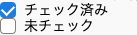
実装の結果
一応上記での実行結果はこのような形です。
背景色や色、幅など、各自で変更して使っていただいたらいいかなと思います。

感想
CSSも奥が深いなぁと思うところですね。
次回更新記事では、このチェックボックスを複数使用する方法をお話しします。