仕事でデータ分析することになった。統計のこと何もわからんのに...。
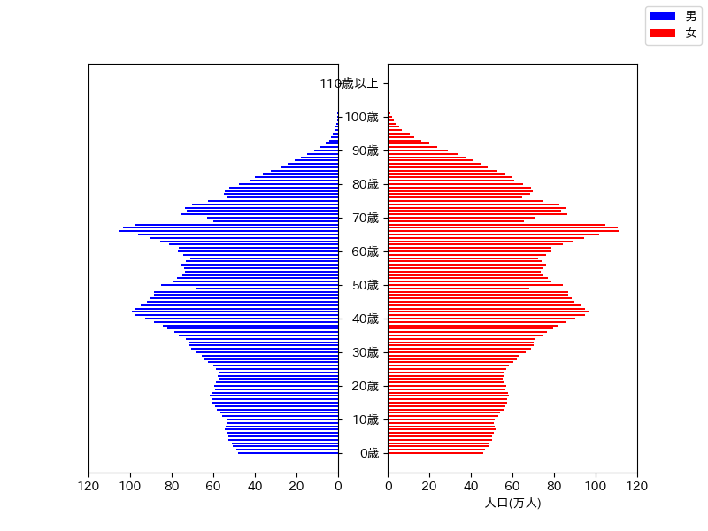
Pythonでのデータの取り扱いに慣れる練習がてら,e-Statのデータで人口ピラミッドを描いてみた。
データはこんな感じ(タブ区切り)。
| 年齢 | 男 | 女 |
|---|---|---|
| 0歳 | 480925 | 460898 |
| 1歳 | 488854 | 465670 |
| 2歳 | 506509 | 484764 |
| 3歳 | 510136 | 487542 |
| ... | ||
| 106歳 | 105 | 908 |
| 107歳 | 47 | 476 |
| 108歳 | 26 | 263 |
| 109歳 | 9 | 98 |
| 110歳以上 | 9 | 136 |
左に男性,右に女性のグラフを配置した人口ピラミッドを描画。
Python
import numpy as np
import pandas as pd
import matplotlib.pyplot as plt

plt.rcParams['font.family'] = 'IPAPGothic'

df = pd.read_table('population.tsv', index_col=0)
man = df['男'] / 10000 # 1万人単位にする
wom = df['女'] / 10000

fig, ax = plt.subplots(ncols=2, figsize=(8,6))

# 男性人口
ax[0].barh(df.index, man, color='b', height=0.5, label='男')
ax[0].yaxis.tick_right() # 軸を右に
ax[0].set_yticks(np.array(range(0,111,10))) # 10歳刻み
ax[0].set_yticklabels([]) # こちらの軸ラベルは非表示
ax[0].set_xlim([120,0]) # x軸反転
#  女性人口
ax[1].barh(df.index, wom, color='r', height=0.5, label='女')
ax[1].set_yticks(np.array(range(0,111,10)))
ax[1].set_xlim([0,120])
ax[1].set_xlabel('人口(万人)')

fig.legend(loc='upper right')
plt.show()
できた画像がこちら。
グラフ反転についてはこちら,軸の目盛りを右に表示する方法はこちら,subplotについてはこちらの記事を参考にさせていただきました。