やりたいこと
- 「完了」ボタンを設置する
- 完了ボタンの対に、カスタマイズした何かを設置する
今回は、文字入力のカウントをツールバーに実装しようと思います。
サンプル
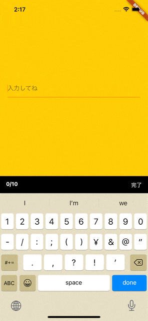
実装方法
完了ボタンを楽に実装できる、keyboard_actionsパッケージを使用します。
以下が、サンプルのコードです。
import 'package:flutter/material.dart';
import 'package:flutter/services.dart';
import 'package:keyboard_actions/keyboard_actions.dart';

class Sample extends StatefulWidget {
  @override
  _SampleState createState() => _SampleState();
}

class _SampleState extends State<Sample> {
  final FocusNode _nodeText1 = FocusNode();

  int charLength = 0;

  _onChanged(String value) {
    setState(() {
      charLength = value.length;
    });
  }

  KeyboardActionsConfig _buildConfig(BuildContext context) {
    return KeyboardActionsConfig(
      keyboardActionsPlatform: KeyboardActionsPlatform.IOS,
      keyboardBarColor: Colors.black,
      nextFocus: false,
      actions: [
        KeyboardActionsItem(
          focusNode: _nodeText1,
          toolbarAlignment: MainAxisAlignment.start,
          displayArrows: false,
          toolbarButtons: [
            (node) {
              return Padding(
                padding: const EdgeInsets.symmetric(horizontal: 16),
                child: Stack(
                  children: [
                    Container(
                      child: Text(
                        "$charLength/10",
                        style: TextStyle(
                          color: Colors.white,
                          fontWeight: FontWeight.bold,
                        ),
                      ),
                    ),
                    Container(
                      margin: EdgeInsets.only(left: 330),
                      child: GestureDetector(
                        onTap: () => node.unfocus(),
                        child: Text(
                          "完了",
                          style: TextStyle(color: Colors.white),
                        ),
                      ),
                    ),
                  ],
                ),
              );
            }
          ],
        ),
      ],
    );
  }

  @override
  Widget build(BuildContext context) {
    return Scaffold(
      backgroundColor: Colors.amber,
      body: Container(
        child: KeyboardActions(
          config: _buildConfig(context),
          child: Center(
            child: Padding(
              padding: const EdgeInsets.all(20.0),
              child: Column(
                crossAxisAlignment: CrossAxisAlignment.stretch,
                children: <Widget>[
                  TextField(
                    onChanged: _onChanged,
                    maxLength: 10,
                    maxLengthEnforcement: MaxLengthEnforcement.none,
                    keyboardType: TextInputType.text,
                    focusNode: _nodeText1,
                    decoration: InputDecoration(
                      hintText: "入力してね",
                      counterText: '',
                    ),
                  ),
                ],
              ),
            ),
          ),
        ),
      ),
    );
  }
}
デフォルトだと、サンプルで表示されているカウンターのの部分は↑、↓アイコンが設置されおり、boolで表示、非表示することが可能です。
ただ、これを非表示にするだけでは要素は残り続けてしまうので完全になきものにしてしまいましょう。
KeyboardActionsItem(
          focusNode: _nodeText1,
          toolbarAlignment: MainAxisAlignment.start,
          displayArrows: false,
displayArrows: falseとすることで、消え去りました。
はい、あとは簡単です。
無理やり、完了ボタンとカウントに幅を広げてやればいいのです。(脳筋)
おまけ❤️
完了ボタンは他のページでも使えると思うので、使い回せようにしておくと便利かも!
import 'package:flutter/material.dart';

Widget customDoneButton(FocusNode _focusNode) {
  return GestureDetector(
    onTap: () {
      _focusNode.unfocus();
    },
      child: Text(
        '完了',
      ),
  );
}