はじめに
普段デザイナーとコミュニケーション取る中でデザイナーの方にreactについてに知って欲してほしいこと、認識を合わせておきたいことを記事にしました。
reactでコンポーネントをどのように作成しているのか、
propsとは何なのかをざっくり理解していただけたら嬉しいです!
reactとは
超簡単に説明すると、javascriptでのUI作成を手助けしてくれるもの。
reactはコンポーネント指向という特徴を持っており、アプリケーションの構成要素を小さな部品(コンポーネント)の集合と考えて設計されており、再利用を意識したUIの作成に適しています。
propsとは
親コンポーネントから子コンポーネントへ値を渡すための仕組みまたは渡される値をpropsと呼びます。
ちょっとちがうけどfigmaでいうvariantsみたいなもの
reactのコンポーネント作成において避けては通れないのがprops、こいつによってコンポーネントの再利用が現しています。
実際に簡単なコードを見てみよう!
簡単なコンポーネントなので普段コードを見ない人でもだいたい何をしているのかわかると思います!
Buttonコンポーネントの例
propsとしてonClick,text, size, 受け取ることができます。
sizeによってwidth, height, fontSize, borderRadiusが決まります。
onClickにはButtonを押したときに走らせたい処理が入りますが、今回は説明を割愛します。
import React from "react";
import { defaultTheme } from "../../Elements/Color";

export enum ButtonSize {
  LARGE,
  MIDDLE,
  SMALL,
}

type Props = {
  onClick: () => void;
  size: ButtonSize;
  text: string;
};

const Button: React.FC<Props> = ({
  onClick,
  text,
  size,
}) => {
  let width = 64;
  let height = 24;
  let fontSize = 12;
  let borderRadius = 16;

  if (size === ButtonSize.MIDDLE) {
    width = 128;
    height = 32;
    fontSize = 16;
    borderRadius = 24;
  }

  if (size === ButtonSize.LARGE) {
    width = 164;
    height = 48;
    fontSize = 24;
    borderRadius = 32;
  }

  return (
    <button
      style={{
        background: "#007450",
        cursor: "pointer",
        width: width,
        height: height,
        borderRadius: borderRadius,
      }}
      onClick={onClick}
    >
      <text style={{ fontSize: fontSize, color: "white" }}>{text}</text>
    </button>
  );
};

export default Button;
呼び出し元
テキストは「Button」
ボタンサイズはLarge
const IndexPage = () => (
  <div>
    <Button
      onClick={() => {}}
      text={"Button"}
      size={ButtonSize.LARGE}
    />
  </div>
);

export default IndexPage;
Largeサイズのボタンが表示されました。
このように値をコンポーネントに渡すだけで、そのコンポーネントの中身を見ることなく、必要なUIを作成することができます。

コンポーネント作成時に認識をあわせておきたいこと
一つのコンポーネントが対応する範囲の認識を合わせる
どういうことかButtonComponentを例に説明します
先程のButtonコンポーネントは3つのサイズで完結していました。
様々なサイズに対応したい場合は実装が変わってきます。
先程はpropsとしてsizeを受けとっていましたが今回は変わりにwidth, height, fontSize, borderRadiusを受け取っています。
つまり、それらの4つの項目を自由に変換できるButtonコンポーネントとなります。
import React from "react";

type Props = {
  onClick: () => void;
  text: string;
  width: number;
  height: number;
  fontSize: number;
  borderRadius: number;
};

const Button2: React.FC<Props> = ({
  onClick,
  text,
  width,
  height,
  fontSize,
  borderRadius,
}) => {
  return (
    <button
      style={{
        background: "Black",
        cursor: "pointer",
        width: width,
        height: height,
        borderRadius: borderRadius,
      }}
      onClick={onClick}
    >
      <text style={{ fontSize: fontSize, color: "white" }}>{text}</text>
    </button>
  );
};

export default Button2;
一見、自由度の高いButton2コンポーネントのほうが便利そうではありますが、再利用する際に渡すpropsが多くなり記述量が増えてしまいます。
以下のButtonList.tsx、ButtonList2.tsxは全く同じ見た目になるのですが、記述量に差が出ています。
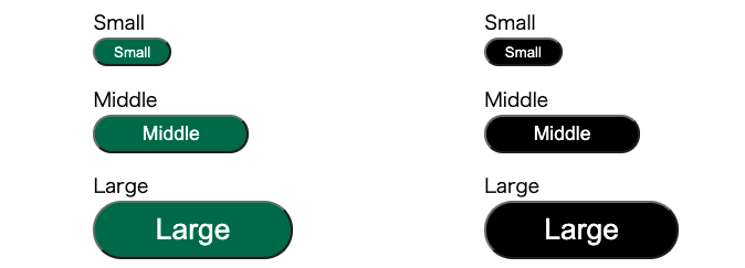
Buttonコンポーネントを使用したButtonList
import React from "react";
import Button, { ButtonSize } from "../UIkit/Button";

const ButtonList = () => {
  return (
    <div style={{ display: "flex", flexDirection: "column" }}>
      <div style={{ marginTop: 16 }} />
      <text>Small</text>
      <Button onClick={() => {}} text={"Small"} size={ButtonSize.SMALL} />
      <div style={{ marginTop: 16 }} />
      <text>Middle</text>
      <Button onClick={() => {}} text={"Middle"} size={ButtonSize.MIDDLE} />
      <div style={{ marginTop: 16 }} />
      <text>Large</text>
      <Button onClick={() => {}} text={"Large"} size={ButtonSize.LARGE} />
    </div>
  );
};

export default ButtonList;
Button2コンポーネントを使用したButtonList
import React from "react";
import Button2 from "../UIkit/Button2";

const Button2LIst = () => {
  return (
    <div style={{ display: "flex", flexDirection: "column" }}>
      <div style={{ marginTop: 16 }} />
      <text>Small</text>
      <Button2
        onClick={() => {}}
        text={"Small"}
        width={64}
        height={24}
        fontSize={12}
        borderRadius={16}
      />
      <div style={{ marginTop: 16 }} />
      <text>Midde</text>
      <Button2
        onClick={() => {}}
        text={"Middle"}
        width={128}
        height={32}
        fontSize={16}
        borderRadius={24}
      />
      <div style={{ marginTop: 16 }} />
      <text>Large</text>
      <Button2
        onClick={() => {}}
        text={"Large"}
        width={160}
        height={48}
        fontSize={24}
        borderRadius={32}
      />
    </div>
  );
};

export default Button2LIst;
Buttonに限らず、限定的な種類なのか、様々な種類に対応する必要があるのかで実装が変わってくるので、デザイナーとエンジニア間で認識を合わせていきましょう!
Reactの公式ドキュメントにデザイナー向けの資料(tutriarl)がのっていたので興味をもっていただけたらぜひ試してみてください!!!
https://reactfordesigners.com/
▼複業でスキルを活かしてみませんか?複業クラウドの登録はこちら!
https://talent.aw-anotherworks.com/?login_type=none