pandasとmatplotlibを使ってPythonでグラフを描く
初めてPythonを使ってグラフを描くため勉強しながら記載しました。
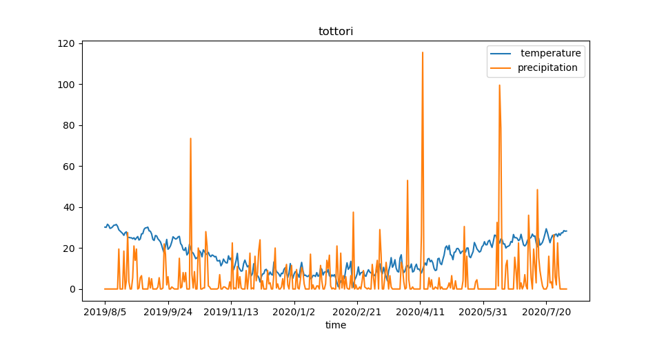
今回は、鳥取市の日平均気温と降水量の日合計のデータをグラフで表示します。
気象庁|過去の気象データ・ダウンロードからデータを取得して
以下のようなcsvファイルを解析します。
time, temperature,precipitation
2019/8/5,30.2,0
2019/8/6,30.1,0
2019/8/7,31.6,0
2019/8/8,31,0
2019/8/9,29.6,0
2019/8/10,29.8,0
2019/8/11,30.3,0
…
下記のファイルは、Python3.7で動かしました。
from matplotlib import pyplot as plt
import pandas as pd

# CSVファイルをpandas.DataFrameとして読み込む
# index(見出し列)としてtimeの列を指定
# デフォルトでheader=0が指定されており1行目はヘッダーとして無視
data = pd.read_csv(r'data.csv', index_col='time')

# 行と列の抽出
# :は全部の行、'[0,1]'はindexとして指定した列を除き2列を抽出
df = data.iloc[:, [0,1]]
# データをプロット
df.plot()

# グラフのタイトル
plt.title("tottori")

# グラフを表示
plt.show()
参考
Python/pandas/matplotlibを使ってcsvファイルを読み込んで素敵なグラフを描く方法(Mac/Raspberry Pi) - karaage. [からあげ]
pandasでcsv/tsvファイル読み込み(read_csv, read_table) | note.nkmk.me