ComboBoxの外観を変更したい
シンプルなComboBox&MouseOverした時に色を変えることをやりたかったが思ったより時間がかかったのでまとめておきます。
ComboBox MSDNを見ると
Customizing the ComboBox Control
To apply the same property settings to multiple ComboBox controls, use the Style property. You can modify the default ControlTemplate to give the control a unique appearance. For more information about creating a ControlTemplate, see Customizing the Appearance of an Existing Control by Creating a ControlTemplate. To see the parts and states that are specific to the ComboBox, see ComboBox Styles and Templates.
とあります。
複数のComboBoxの外観を変更したい場合はControlTemplateを使うようです。
ComboBox Styles and Templates MSDNを見てみると、ComboBoxのControlTemplate例があります。
とりあえず、ComboBoxのControlTemplate例を使ってみた結果、
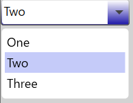
ToggleButtonがグラデーションがかかっていたり丸角になっていたり、シンプルとは言いづらいですね。
シンプルなComboBox
ComboBoxのControlTemplate例を編集して、以下の項目を削除変更してシンプルにしてみました。
- グラデーションをかけているLinearGradientBrush MSDNを削除
- 要素の丸みを削除
- ToggleButtonとPopupの間のMarginを削除
- ToggleButtonの▼をよりシンプルなものに変更
また、WPF Flat Combo Box Style GitHubを参考にさせていただきました。
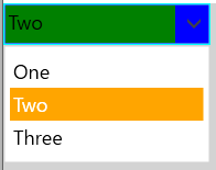
どこを編集したか分かりやすいように色は以下に設定しました。
- ToggleButton: Blue
- ToggleButton横のTextBox: Green
- ToggleButtonのBoorder: Aqua
- ToggleButton横のTextBoxのBoorder: GreenYellow
- Popupの選択した項目: Orange
ToggleButton横のTextBoxのBoorderは設定しましたが、見た目としては表れないようですね。
(2019/12/28更新)
- 別環境ではArrowの色Path.Fillは
<SolidColorBrush Color="{DynamicResource GlyphColor}"/>が取ってこれなかったので、固定した方が良さそうです。
        <ControlTemplate x:Key="ComboBoxToggleButtonStyle"
                 TargetType="{x:Type ToggleButton}">
            <Grid>
                <Grid.ColumnDefinitions>
                    <ColumnDefinition />
                    <ColumnDefinition Width="20" />
                </Grid.ColumnDefinitions>
                <Border x:Name="Border"
                        Grid.ColumnSpan="2"
                        BorderThickness="1">
                    <Border.BorderBrush>
                        <SolidColorBrush Color="Aqua"/>
                    </Border.BorderBrush>
                    <Border.Background>
                        <SolidColorBrush Color="Blue"/>
                    </Border.Background>
                </Border>
                <Border Grid.Column="0"
                        Margin="1" >
                    <Border.BorderBrush>
                        <SolidColorBrush Color="GreenYellow"/>
                    </Border.BorderBrush>
                    <Border.Background>
                        <SolidColorBrush Color="Green"/>
                    </Border.Background>
                </Border>
                <Path x:Name="Arrow"
                      Grid.Column="1"
                      HorizontalAlignment="Center"
                      VerticalAlignment="Center"
                      Data="M0,0 L0,2 L4,6 L8,2 L8,0 L4,4 z"
                      Fill="#444444">
                </Path>
            </Grid>
        </ControlTemplate>

        <Style x:Key="SimpleComboBoxStyle"
       TargetType="{x:Type ComboBox}">
            <Setter Property="SnapsToDevicePixels"
                    Value="true" />
            <Setter Property="OverridesDefaultStyle"
                    Value="true" />
            <Setter Property="ScrollViewer.HorizontalScrollBarVisibility"
                    Value="Auto" />
            <Setter Property="ScrollViewer.VerticalScrollBarVisibility"
                    Value="Auto" />
            <Setter Property="ScrollViewer.CanContentScroll"
                    Value="true" />
            <Setter Property="MinWidth"
                    Value="120" />
            <Setter Property="MinHeight"
                    Value="20" />
            <Setter Property="Template">
                <Setter.Value>
                    <ControlTemplate TargetType="{x:Type ComboBox}">
                        <Grid>
                            <ToggleButton x:Name="ToggleButton"
                                            Template="{StaticResource ComboBoxToggleButtonStyle}"
                                            Grid.Column="2"
                                            Focusable="false"
                                            ClickMode="Press"
                                            IsChecked="{Binding IsDropDownOpen, Mode=TwoWay, RelativeSource={RelativeSource TemplatedParent}}"/>
                            <ContentPresenter x:Name="ContentSite"
                                                IsHitTestVisible="False"
                                                Content="{TemplateBinding SelectionBoxItem}"
                                                ContentTemplate="{TemplateBinding SelectionBoxItemTemplate}"
                                                ContentTemplateSelector="{TemplateBinding ItemTemplateSelector}"
                                                Margin="3,3,23,3"
                                                VerticalAlignment="Stretch"
                                                HorizontalAlignment="Left">
                            </ContentPresenter>
                            <TextBox x:Name="PART_EditableTextBox"
                                       Style="{x:Null}"
                                       HorizontalAlignment="Left"
                                       VerticalAlignment="Bottom"
                                       Margin="3,3,23,3"
                                       Focusable="True"
                                       Background="Transparent"
                                       Visibility="Hidden"
                                       IsReadOnly="{TemplateBinding IsReadOnly}" >
                                <TextBox.Template>
                                    <ControlTemplate TargetType="TextBox" >
                                        <Border Name="PART_ContentHost" Focusable="False" />
                                    </ControlTemplate>
                                </TextBox.Template>
                            </TextBox>
                            <Popup x:Name="Popup"
                                     Placement="Bottom"
                                     IsOpen="{TemplateBinding IsDropDownOpen}"
                                     AllowsTransparency="True"
                                     Focusable="False"
                                     PopupAnimation="Slide">
                                <Grid x:Name="DropDown"
                                      SnapsToDevicePixels="True"
                                      MinWidth="{TemplateBinding ActualWidth}"
                                      MaxHeight="{TemplateBinding MaxDropDownHeight}">
                                    <Border x:Name="DropDownBorder"
                                            BorderThickness="1">
                                        <Border.BorderBrush>
                                            <SolidColorBrush Color="{DynamicResource BorderMediumColor}" />
                                        </Border.BorderBrush>
                                        <Border.Background>
                                            <SolidColorBrush Color="{DynamicResource ControlLightColor}" />
                                        </Border.Background>
                                    </Border>
                                    <ScrollViewer Margin="4,6,4,6"
                                                  SnapsToDevicePixels="True">
                                        <StackPanel IsItemsHost="True"
                                                    KeyboardNavigation.DirectionalNavigation="Contained" />
                                    </ScrollViewer>
                                </Grid>
                            </Popup>
                        </Grid>
                        <ControlTemplate.Triggers>
                            <Trigger Property="HasItems"
                                     Value="false">
                                <Setter TargetName="DropDownBorder"
                                        Property="MinHeight"
                                        Value="95" />
                            </Trigger>
                            <Trigger Property="IsGrouping"
                                     Value="true">
                                <Setter Property="ScrollViewer.CanContentScroll"
                                        Value="false" />
                            </Trigger>
                        </ControlTemplate.Triggers>
                    </ControlTemplate>
                </Setter.Value>
            </Setter>
        </Style>
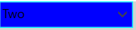
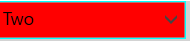
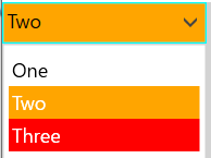
MouseOrverで色が変わるComboBox
MouseOrverで色が変わったことが分かりやすいように以下のように色を設定しました。
TextBox + ToggleButtonの色
- 要素を選んでいる時: Orange
- MouseOrver時: Red
- 上記以外: Blue
Popupの色
- 選択した項目: Orange
- MouseOrver時: Red
- 上記以外: White
(2019/12/28更新)
- ComboBoxのHeightとポップアップの要素のHeightを合わせるようにしました。
- 左揃え指定にも対応しました (中央揃えにするとプルダウンの要素はトグルボタン分ずれてしまいますが)。
<Style x:Key="ChangingColorComboBoxBorderStyle" TargetType="{x:Type Border}">
<Setter Property="Background" Value="Blue"/>
<Setter Property="BorderBrush" Value="Aqua"/>
<Style.Triggers>
<DataTrigger Binding="{Binding IsMouseOver, ElementName=Border}" Value="True">
<Setter Property="Background" Value="Red"/>
</DataTrigger>
<DataTrigger Binding="{Binding IsMouseOver, ElementName=TextBoxBorder}" Value="True">
<Setter Property="Background" Value="Red"/>
</DataTrigger>
<DataTrigger Binding="{Binding IsChecked, ElementName=ToggleButton}" Value="True">
<Setter Property="Background" Value="Orange"/>
</DataTrigger>
<DataTrigger Binding="{Binding IsChecked, ElementName=ToggleButton}" Value="True">
<Setter Property="Background" Value="Orange"/>
</DataTrigger>
</Style.Triggers>
</Style>
<ControlTemplate x:Key="ComboBoxToggleButtonStyle"
TargetType="{x:Type ToggleButton}">
<Grid>
<Grid.ColumnDefinitions>
<ColumnDefinition />
<ColumnDefinition Width="20" />
</Grid.ColumnDefinitions>
<Border x:Name="Border"
Grid.ColumnSpan="2"
BorderThickness="1"
Style="{StaticResource ChangingColorComboBoxBorderStyle}"/>
<Border x:Name="TextBoxBorder"
Grid.Column="0"
Margin="1"
Style="{StaticResource ChangingColorComboBoxBorderStyle}"/>
<Path x:Name="Arrow"
Grid.Column="1"
HorizontalAlignment="Center"
VerticalAlignment="Center"
Data="M0,0 L0,2 L4,6 L8,2 L8,0 L4,4 z"
Fill="#444444">
</Path>
</Grid>
</ControlTemplate>
<Style x:Key="ChangingColorComboBoxItemStyle"
TargetType="{x:Type ComboBoxItem}">
<Setter Property="SnapsToDevicePixels"
Value="true" />
<Setter Property="OverridesDefaultStyle"
Value="true" />
<Setter Property="HorizontalContentAlignment"
Value="{Binding HorizontalContentAlignment, RelativeSource={RelativeSource AncestorType={x:Type ComboBox}}}" />
<Setter Property="VerticalContentAlignment"
Value="{Binding VerticalContentAlignment, RelativeSource={RelativeSource AncestorType={x:Type ComboBox}}}"/>
<Setter Property="Template">
<Setter.Value>
<ControlTemplate TargetType="{x:Type ComboBoxItem}">
<Border x:Name="Border"
Padding="2"
SnapsToDevicePixels="true"
Background="Transparent"
Height="{Binding Height, RelativeSource={RelativeSource AncestorType={x:Type ComboBox}}}">
<!--↑高さのみComboBoxと合わせる-->
<ContentPresenter
VerticalAlignment="{Binding VerticalContentAlignment, RelativeSource={RelativeSource AncestorType={x:Type ComboBoxItem}}}"
HorizontalAlignment="{Binding HorizontalContentAlignment, RelativeSource={RelativeSource AncestorType={x:Type ComboBoxItem}}}"/>
</Border>
<ControlTemplate.Triggers>
<Trigger Property="IsSelected"
Value="true">
<Setter Property="Background" TargetName="Border"
Value="Orange" />
<Setter Property="Foreground"
Value="{DynamicResource {x:Static SystemColors.HighlightTextBrushKey}}" />
</Trigger>
<Trigger Property="IsMouseOver"
Value="true">
<Setter Property="Background" TargetName="Border"
Value="Red" />
<Setter Property="Foreground"
Value="{DynamicResource {x:Static SystemColors.HighlightTextBrushKey}}" />
</Trigger>
<Trigger Property="IsEnabled"
Value="false">
<Setter Property="Foreground"
Value="{DynamicResource {x:Static SystemColors.GrayTextBrushKey}}" />
</Trigger>
</ControlTemplate.Triggers>
</ControlTemplate>
</Setter.Value>
</Setter>
</Style>
<Style x:Key="ChangingColorComboxStyle"
TargetType="{x:Type ComboBox}">
<Setter Property="SnapsToDevicePixels"
Value="true" />
<Setter Property="OverridesDefaultStyle"
Value="true" />
<Setter Property="ScrollViewer.HorizontalScrollBarVisibility"
Value="Auto" />
<Setter Property="ScrollViewer.VerticalScrollBarVisibility"
Value="Auto" />
<Setter Property="ScrollViewer.CanContentScroll"
Value="true" />
<Setter Property="MinWidth"
Value="120" />
<Setter Property="MinHeight"
Value="20" />
<Setter Property="HorizontalContentAlignment"
Value="Left" />
<Setter Property="VerticalContentAlignment"
Value="Center"/>
<Setter Property="ItemContainerStyle"
Value="{StaticResource ChangingColorComboBoxItemStyle}"/>
<Setter Property="Template">
<Setter.Value>
<ControlTemplate TargetType="{x:Type ComboBox}">
<Grid>
<ToggleButton x:Name="ToggleButton"
Template="{StaticResource ComboBoxToggleButtonStyle}"
Grid.Column="2"
Focusable="false"
ClickMode="Press"
IsChecked="{Binding IsDropDownOpen, Mode=TwoWay, RelativeSource={RelativeSource TemplatedParent}}"/>
<ContentPresenter x:Name="ContentSite"
IsHitTestVisible="False"
Content="{TemplateBinding SelectionBoxItem}"
ContentTemplate="{TemplateBinding SelectionBoxItemTemplate}"
ContentTemplateSelector="{TemplateBinding ItemTemplateSelector}"
Margin="3,3,23,3"
VerticalAlignment="{Binding HorizontalContentAlignment, RelativeSource={RelativeSource AncestorType={x:Type ComboBox}}}"
HorizontalAlignment="{Binding HorizontalContentAlignment, RelativeSource={RelativeSource AncestorType={x:Type ComboBox}}}">
</ContentPresenter>
<TextBox x:Name="PART_EditableTextBox"
Style="{x:Null}"
HorizontalAlignment="Left"
VerticalAlignment="Bottom"
Margin="3,3,23,3"
Focusable="True"
Background="Transparent"
Visibility="Hidden"
IsReadOnly="{TemplateBinding IsReadOnly}" >
<TextBox.Template>
<ControlTemplate TargetType="TextBox" >
<Border Name="PART_ContentHost" Focusable="False" />
</ControlTemplate>
</TextBox.Template>
</TextBox>
<Popup x:Name="Popup"
Placement="Bottom"
IsOpen="{TemplateBinding IsDropDownOpen}"
AllowsTransparency="True"
Focusable="False"
PopupAnimation="Slide">
<Grid x:Name="DropDown"
SnapsToDevicePixels="True"
MinWidth="{TemplateBinding ActualWidth}"
MaxHeight="{TemplateBinding MaxDropDownHeight}">
<Border x:Name="DropDownBorder"
BorderThickness="1">
<Border.BorderBrush>
<SolidColorBrush Color="{DynamicResource BorderMediumColor}" />
</Border.BorderBrush>
<Border.Background>
<SolidColorBrush Color="{DynamicResource ControlLightColor}" />
</Border.Background>
</Border>
<ScrollViewer Margin="4,6,4,6"
SnapsToDevicePixels="True">
<StackPanel IsItemsHost="True"
KeyboardNavigation.DirectionalNavigation="Contained" />
</ScrollViewer>
</Grid>
</Popup>
</Grid>
<ControlTemplate.Triggers>
<Trigger Property="HasItems"
Value="false">
<Setter TargetName="DropDownBorder"
Property="MinHeight"
Value="95" />
</Trigger>
<Trigger Property="IsGrouping"
Value="true">
<Setter Property="ScrollViewer.CanContentScroll"
Value="false" />
</Trigger>
</ControlTemplate.Triggers>
</ControlTemplate>
</Setter.Value>
</Setter>
</Style>