レスポンシブルウェブデザインで苦労するコンテンツの一つがテーブル(表)です。
スマートフォンで幅広いテーブルを表示する場合、横にスクロールさせるプラグインを使ったり、縮小して表示させたりと様々な対応方法がありますが、横スクロールはいれたくない(使い勝手が悪い)し縮小すると文字が小さすぎて読めません。
今回は下記のような比較表を例に、苦肉の策で対応をした例を公開します。
仕様と表示例
このような比較表があったとします。
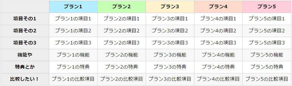
こちらの場合、例えば左の項目を固定して中身を横スクロールさせるという手もありますが、それだと「プラン5」まで辿り着かず見てもらえない可能性が高いです。
かと言ってフォントを小さくしたり余白をなくしたりでは、320px程度のスマートフォンサイズに収めるのは不可能です。
そこで、スマートフォンで見た場合には下記のようにしてみました。
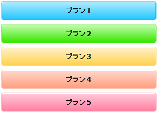
はい、プラン名だけ残して他を非表示にしました。
さらにプラン名はセルであるにも関わらずボタンぽいスタイルにしました。
要するにボタン化させるということです。
そしてボタン化した「プラン1」を押すと、以下のようにプラン1の内容だけが開きます。
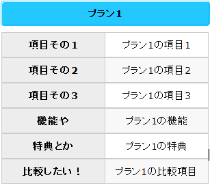
ボタンである「プラン1」を再度押すと表が閉じられます。
各プランをクリックしないといけないので手間が増えてはしまいますが、内容を確認するという意味ではそれなりに見やすくないでしょうか。
力技ですね…。全然スマートじゃありません。
それでも背に腹変えられないという方は、以下のコードをご参照くださいませ。
コード
HTML
※上記サンプルです。
<table>
	<thead>
		<tr>
			<th class="none"></th>
			<th class="thead-cell-01">プラン1</th>
			<th class="thead-cell-02">プラン2</th>
			<th class="thead-cell-03">プラン3</th>
			<th class="thead-cell-04">プラン4</th>
			<th class="thead-cell-05">プラン5</th>
		</tr>
	</thead>
	<tbody>
		<tr>
			<th>項目その1</th>
			<td>プラン1の項目1</td>
			<td>プラン2の項目1</td>
			<td>プラン3の項目1</td>
			<td>プラン4の項目1</td>
			<td>プラン5の項目1</td>
		</tr>
		<tr>
			<th>項目その2</th>
			<td>プラン1の項目2</td>
			<td>プラン2の項目2</td>
			<td>プラン3の項目2</td>
			<td>プラン4の項目2</td>
			<td>プラン5の項目2</td>
		</tr>
		<tr>
			<th>項目その3</th>
			<td>プラン1の項目3</td>
			<td>プラン2の項目3</td>
			<td>プラン3の項目3</td>
			<td>プラン4の項目3</td>
			<td>プラン5の項目3</td>
		</tr>
		<tr>
			<th>機能や</th>
			<td>プラン1の機能</td>
			<td>プラン2の機能</td>
			<td>プラン3の機能</td>
			<td>プラン4の機能</td>
			<td>プラン5の機能</td>

		<tr>
			<th>特典とか</th>
			<td>プラン1の特典</td>
			<td>プラン2の特典</td>
			<td>プラン3の特典</td>
			<td>プラン4の特典</td>
			<td>プラン5の特典</td>
		</tr>

		<tr>
			<th>比較したい!</th>
			<td>プラン1の比較項目</td>
			<td>プラン2の比較項目</td>
			<td>プラン3の比較項目</td>
			<td>プラン4の比較項目</td>
			<td>プラン5の比較項目</td>
		</tr>
	</tbody>
</table>
CSS
table {
	width: 100%;
	table-layout: fixed;
	border-collapse: collapse;
}
table th,
table td {
	box-sizing: border-box;
	padding: .5em;
	border: solid 1px #ccc;
	text-align: center;
	line-height: 150%;
	letter-spacing: .05em;
}
table th {
	background-color: #ededed;
	vertical-align: top;
}
table tbody tr:nth-child(even) td {
	background-color: #f8f8f8;
}

/* 以下はセルのスタイルです。class名、スタイルはお好みで編集してください。 */
.thead-cell-01 {
	background-color: #B3ECFF;
}

.thead-cell-02 {
	background-color: #C6FFB3;
}

.thead-cell-03 {
	background-color: #FFF2CC;
}

.thead-cell-04 {
	background-color: #FFD9CC;
}

.thead-cell-05 {
	background-color: #FFCCDA;
}

/* ここからスマートフォン用のスタイル。今回は最大480pxに指定しています。 */
@media screen and (max-width: 480px) {
	table thead th,
	table thead td {
		display: block;
	}
	table thead th {
		margin-bottom: 10px;
		border: none;
		border-radius: 4px;
		cursor: pointer;
	}
	table thead th.none {
		display: none;
	}
	table tbody th,
	table tbody td {
		display: none;
		float: left;
		width: 50%;
	}
	table tbody td {
		margin-left: -1px;
	}

	/* 以下はセルのスタイルです。class名、スタイルはお好みで編集してください。 */
	.thead-cell-01 {
		background: linear-gradient(#b3ecff 0%, #23c8ff 100%);
		box-shadow: inset 1px 1px 0 #fff, inset -1px -1px 0 #00B4F0, 0 0 0 1px #23c8ff;
	}
	.thead-cell-01:hover, .thead-cell-01.active {
		background: #23c8ff;
	}

	.thead-cell-02 {
		background: linear-gradient(#C6FFB3 0%, #39E600 100%);
		box-shadow: inset 1px 1px 0 #fff, 0 0 0 1px #39E600;
	}
	.thead-cell-02:hover, .thead-cell-02.active {
		background: #39E600;
	}

	.thead-cell-03 {
		background: linear-gradient(#FFF2CC 0%, #FFD24D 100%);
		box-shadow: inset 1px 1px 0 #fff, 0 0 0 1px #FFD24D;
	}
	.thead-cell-03:hover, .thead-cell-03.active {
		background: #FFD24D;
	}

	.thead-cell-04 {
		background: linear-gradient(#FFD9CC 0%, #FF9F80 100%);
		box-shadow: inset 1px 1px 0 #fff, 0 0 0 1px #FF9F80;
	}
	.thead-cell-04:hover, .thead-cell-04.active {
		background: #FF9F80;
	}

	.thead-cell-05 {
		background: linear-gradient(#FFCCDA 0%, #FF80A2 100%);
		box-shadow: inset 1px 1px 0 #fff, 0 0 0 1px #FF80A2;
	}
	.thead-cell-05:hover, .thead-cell-05.active {
		background: #FF80A2;
	}
}
JavaScript
$(window).load(respTable);

var breakPt = 480;	//ブレイクポイント
var timer = false;
var winWidth = $(window).width();
var winWidth_resized;

$(window).on('resize', function(){
	if (timer !== false) {
		clearTimeout(timer);
	}
	timer = setTimeout(function() {
		winWidth_resized = $(window).width();

		if ( winWidth != winWidth_resized ) {
			location.href = location.href;
			winWidth = $(window).width();
		}
	}, 200);
});

function respTable(){
	if(winWidth <= breakPt){
		spTable();
	} else {
		defaltTable();
		$('thead th').unbind();
	}
} // end resTable

function spTable(){
	$('table thead th').click( function() {
		var index = $('thead th').index(this);
		var cell_num = index + 1;
		var thiscell = $('table td:nth-child(' + cell_num + ')');

		// 表が開いていたら行う処理
		if ($(this).hasClass('active')){
			$(this).removeClass('active');
			$('table thead th').not('.none').show();
			$(thiscell).hide();
			$('table tbody th').hide();

		// 表が閉じていたら行う処理
		} else {
			$(this).addClass('active');
			$('table thead th').not('.active').hide();
			$(thiscell).show();
			$('table tbody th').show();
		}
	});
	return false;
} // end spTable

function defaltTable(){
	$('table thead th').show().css('display','').removeClass('active');
	$('table tbody th').show().css('display','');
	$('table tbody td').show().css('display','');
} // end defaltTable
あまり汎用性がある例ではないと思って詳細な説明は割愛いたしました。
こんな力技を使わずとも、もっとスマートな方法があるよという方は是非アドバイスいただけますと嬉しいです。
※ウィンドウサイズの変更に応じてリロードさせる処理をいれています。
下記のページを参考にさせていただきました。ありがとうございます。
▼レスポンシブWebでリサイズ時のみリロードを行いレイアウトを再描写する処理
http://www.webengineeer.com/resizereload/
▼jQueryでウインドウの横幅/縦幅どちらかだけのリサイズを検知する
http://memo.brdr.jp/post/74923719890/jquery%E3%81%A7%E3%82%A6%E3%82%A4%E3%83%B3%E3%83%89%E3%82%A6%E3%81%AE%E6%A8%AA%E5%B9%85%E7%B8%A6%E5%B9%85%E3%81%A9%E3%81%A1%E3%82%89%E3%81%8B%E3%81%A0%E3%81%91%E3%81%AE%E3%83%AA%E3%82%B5%E3%82%A4%E3%82%BA%E3%82%92%E6%A4%9C%E7%9F%A5%E3%81%99%E3%82%8B