変更点
マウス下のタブをハイライトするよう修正しました。
本当はhover時にもフレア上に色を変えたいと思ったのですが、
z-indexを使いこなせず断念…
修正前はフレア上の広がりを表現するために、前後の要素の:before, :afterを使って表現していたため、
要素の重なりの兼ね合いでうまく行きませんでしたが、
background-image:radial-gradient()を使い、その要素で完結するようにした結果表現できました。
また、新しいタブの表示も必須でなくなりました。
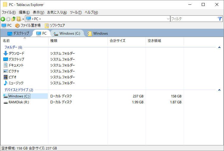
長らくお世話になっていたMDIEと決別し、Tablacus Explorerに乗り換えました。
色々カスタマイズ可能なので痒い所に手が届いていい感じです。
見た目も(一部ですが)CSSで変更できるので、フレア状に広がったデザインをCSSで表現してみました。
必要なアドオン
- タブプラス
新しいタブの表示必須
- ユーザーシート
user.css
.tab, .tab2, .tab3,
.tab:hover, .tab2:hover, .tab3:hover {
  box-shadow: none;
}

.tab0 {
  padding: 3px 0 0 12px;
  background-color: ActiveCaption;
}

.tab, .tab2, .tab3 {
  position: relative;
  background: transparent;
  border-width: 0 0.1px;
  border-style: solid;
  border-color: transparent;
  padding: 0 12px;
  opacity: 1 !important;
}

.activetab {
  position: relative;
  background-color: #fff;
  border-width: 0 0.1px;
  border-color: #fff;
  border-top-left-radius: 12px calc(2em - 12px);
  border-top-right-radius: 12px calc(2em - 12px);
  margin: 0;
  padding: 0 12px;
  height: 2em;
}

.activetab:before,
.activetab:after {
  content: "";
  position: absolute;
  bottom: 0;
  width: 12px;
  height: 12px;
  z-index: -1;
}
.activetab:before {
  left: 0;
  background-image: radial-gradient(
    farthest-side at top right,
    transparent 100%,
    #fff 100%
  );
  transform: scale(-1, 1);
  transform-origin: left;
}
.activetab:after {
  right: 0;
  background-image: radial-gradient(
    farthest-side at top left,
    transparent 100%,
    #fff 100%
  );
  transform: scale(-1, 1);
  transform-origin: right;
}

.tab:hover,
.tab2:hover {
  position: relative;
  border-width: 0 0.1px;
  border-style: solid;
  border-color: #d0e0e9;
  border-top-left-radius: 12px calc(2em - 12px);
  border-top-right-radius: 12px calc(2em - 12px);
  background-color: #d0e0e9;
  z-index:0 !important;
}

.tab:hover:before,
.tab:hover:after,
.tab2:hover:before,
.tab2:hover:after {
  content: "";
  position: absolute;
  bottom: 0;
  width: 12px;
  height: 12px;
  z-index: -1;
}
.tab:hover:before,
.tab2:hover:before {
  left: 0;
  background-image: radial-gradient(
    farthest-side at top right,
    transparent 100%,
    #d0e0e9 100%
  );
  transform: scale(-1, 1);
  transform-origin: left;
}
.tab:hover:after,
.tab2:hover:after {
  right: 0;
  background-image: radial-gradient(
    farthest-side at top left,
    transparent 100%,
    #d0e0e9 100%
  );
  transform: scale(-1, 1);
  transform-origin: right;
}
結局
曲線のつなぎ目がキレイに重ならないのが気になり、結局フリンジ部分はSVGで書き、CSSに埋め込みました
色の変更ができるようあえてBASE64ではなくURLで埋め込みました。
このあたりが自由に弄れるのはいいですね。
user.css
.tab, .tab2, .tab3,
.tab:hover, .tab2:hover, .tab3:hover {
  box-shadow: none;
}

.tab0 {
  padding: 3px 0 0 12px;
  background-color: ActiveCaption;
}

.tab, .tab2, .tab3 {
  position: relative;
  background: transparent;
  border: 0;
  padding: 0 12px;
  opacity: 1;
}

.activetab {
  position: relative;
  background-color: #fff;
  border: 0;
  padding: 0 2px;
  margin: 0 10px;
  height: 2em;
}

.activetab:before,
.activetab:after {
  content: "";
  position: absolute;
  background-image: url("data:image/svg+xml;charset=utf8,%3Csvg%20xmlns%3D%22http%3A%2F%2Fwww.w3.org%2F2000%2Fsvg%22%3E%3Cpath%20fill%3D%22%23fff%22%20d%3D%22M24%200C9%200%2015%2024%200%2024h25V0h-1z%22%2F%3E%3C%2Fsvg%3E");
  bottom: 0;
  width: 25px;
  height: 24px;
}
.activetab:before {
  left: -24px;
}
.activetab:after {
  right: 1px;
  transform: scaleX(-1);
  transform-origin: right;
}

.tab:hover,
.tab2:hover,
.tab3:hover {
  position: relative;
  background-color: #d0e0e9;
  border: 0;
  padding: 0 2px;
  margin: 0 10px;
}

.tab:hover:before,
.tab:hover:after,
.tab2:hover:before,
.tab2:hover:after,
.tab3:hover:before,
.tab3:hover:after {
  content: "";
  position: absolute;
  background-image: url("data:image/svg+xml;charset=utf8,%3Csvg%20xmlns%3D%22http%3A%2F%2Fwww.w3.org%2F2000%2Fsvg%22%3E%3Cpath%20fill%3D%22%23d0e0e9%22%20d%3D%22M24%200C9%200%2015%2024%200%2024h25V0h-1z%22%2F%3E%3C%2Fsvg%3E");
  bottom: 0;
  width: 25px;
  height: 24px;
}
.tab:hover:before,
.tab2:hover:before,
.tab3:hover:before {
  left: -24px;
}
.tab:hover:after,
.tab2:hover:after,
.tab3:hover:after {
  right: 1px;
  transform: scaleX(-1);
  transform-origin: right;
}