仕事で、Material DesignではないUIを実装したので、そのパーツについて紹介します。
実装したもの
ユーザがタップすると少し小さくなることで、タップフィードバックを行うボタンです。
↓イメージ
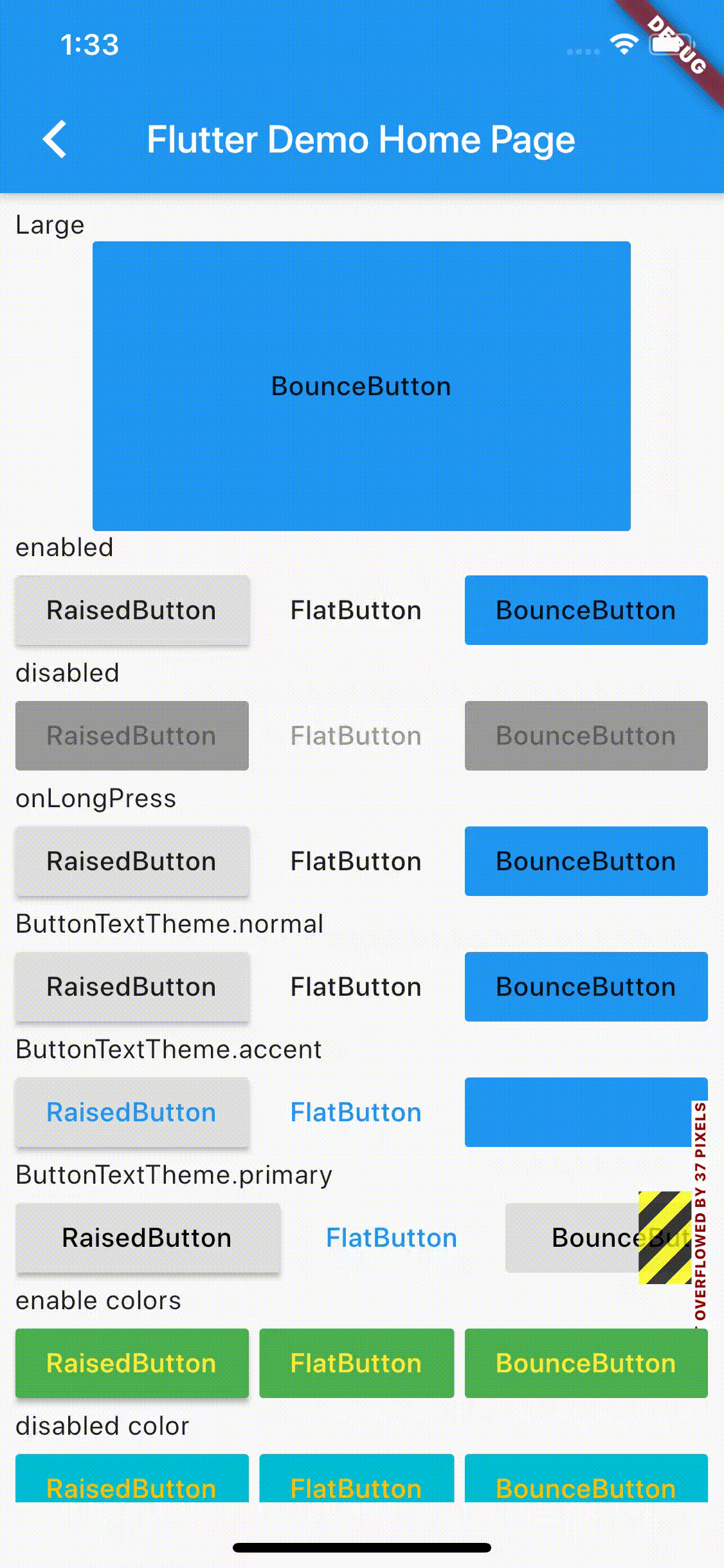
(GIFアニメなので、少しカクついてますが、実際の端末では滑らかに動きます。)
コード
全文は こちら。
https://medium.com/flutter-community/flutter-bouncing-button-animation-ece660e19c91 の記事をベースにしつつ改変、ある程度自由度が高い形で作れたと思います。
コード説明
上から順番に抜粋していき、それぞれの説明をしていきます。
import 'package:flutter/material.dart';

class BounceButton extends MaterialButton {
  BounceButton({
    Key key,
    @required VoidCallback onPressed,
    VoidCallback onLongPress,
    ButtonTextTheme textTheme,
    Color textColor,
    Color disabledTextColor,
    Color color,
    Color disabledColor,
    Brightness colorBrightness,
    double elevation = 0,
    EdgeInsetsGeometry padding,
    ShapeBorder shape,
    Clip clipBehavior = Clip.none,
    FocusNode focusNode,
    bool autofocus = false,
    MaterialTapTargetSize materialTapTargetSize,
    Duration animationDuration = kThemeChangeDuration,
    Widget child,
    this.ratio = 0.95,
  })  : assert(autofocus != null),
        assert(clipBehavior != null),
        super(
          key: key,
          onPressed: onPressed,
          onLongPress: onLongPress,
          textTheme: textTheme,
          textColor: textColor,
          disabledTextColor: disabledTextColor,
          color: color,
          disabledColor: disabledColor,
          colorBrightness: colorBrightness,
          elevation: elevation,
          padding: padding,
          shape: shape,
          clipBehavior: clipBehavior,
          focusNode: focusNode,
          autofocus: autofocus,
          materialTapTargetSize: materialTapTargetSize,
          animationDuration: animationDuration,
          child: child,
        );
Flutter標準のRaisedButtonやFlatButtonを参考に、 MaterialButton を継承しています。
これにより、「ボタンとしての標準的なUI・動作」は実装不要となっています。
コンストラクタについては、 RaisedButtonのコンストラクタ定義 と FlatButtonのコンストラクタ定義 を参考にしました。
ratio は、このUI用に追加したパラメータで、小さくなったときの倍率を設定できます。
プロジェクトのコード内に入れるときには、更に複数のパラメータに初期値を設定しています。
  final double ratio;

  @override
  Widget build(BuildContext context) {
    return BounceAnimation(
      onPressed: onPressed,
      onLongPress: onLongPress,
      ratio: ratio,
      animationDuration: animationDuration,
      child: AbsorbPointer(
        child: super.build(context),
      ),
    );
  }
}
BounceButton の定義自体はここまでです。
後述する BounceAnimation で super.build を囲んでいます。
タップ動作に関することは BounceAnimation に渡していますが、それ以外の「ボタン的なUI・動作」については、親クラスの動作に丸投げしています。
そのままだと、MaterialButtonの標準動作も実行されてしまったので、 AbsorbPointer を間にはさみ、JSの stopPropagation 的なことを実現しています。
class BounceAnimation extends StatefulWidget {
  BounceAnimation({
    @required this.onPressed,
    this.onLongPress,
    this.child,
    this.ratio = 0.95,
    this.animationDuration = kThemeChangeDuration,
    this.scaleAlignment = Alignment.center,
  });
BounceAnimation の定義です。こちらは、StatefulWidgetを継承しています。
他のUIパーツで作ったときに、「小さくなる起点」を変えたいパターンがあったため、scaleAlignmentをパラメータに追加しています。(別記事で記載する予定です。)
  final VoidCallback onPressed;
  final VoidCallback onLongPress;
  final Widget child;
  final double ratio;
  final Duration animationDuration;
  final Alignment scaleAlignment;

  bool get enabled => onPressed != null || onLongPress != null;

  @override
  _BounceAnimationState createState() => _BounceAnimationState();
}
enabled の定義は、標準ボタンの丸パクリです。
_BounceAnimationState で利用しています。(利用者側のコードでも使えるかと思って、privateにはしていません。)
class _BounceAnimationState extends State<BounceAnimation>
    with SingleTickerProviderStateMixin {
  AnimationController _controller;
  Animation<double> _scale;
  TickerFuture _tickerFuture;

  @override
  void initState() {
    super.initState();

    _controller = AnimationController(
      vsync: this,
      duration: widget.animationDuration,
    );
    _scale = _controller
        .drive(
          CurveTween(curve: Curves.linear),
        )
        .drive(
          Tween(begin: 1, end: widget.ratio),
        );
  }

  @override
  void dispose() {
    _controller.dispose();
    super.dispose();
  }
Stateの定義です。
SingleTickerProviderStateMixin を適用することで、縮小・もとに戻るアニメーションを制御しています。
アニメーションカーブは linear に固定していますが、他のカーブを使うことで、面白いフィードバックにできると思います。
  void _forwardAnimation() {
    if (!widget.enabled) {
      return;
    }

    _tickerFuture = _controller.forward();
  }

  void _reverseAnimation() {
    if (!widget.enabled) {
      return;
    }

    // start the reverse animation after the forward animation ends.
    _tickerFuture.whenCompleteOrCancel(() {
      _controller.reverse();
    });
  }
タップ動作に合わせて、アニメーションの開始・終了を行っています。
先程の enabled を利用して、無効な場合はアニメーションしないようにしています。
TickerFuture.whenCompleteOrCancel を利用することで、「小さくなりきってから、もとに戻る」を実現しています。
(これが無いと、tapDown -> tapUpが高速に行われた場合に、フィードバックがほとんど見えませんでした。)
  @override
  Widget build(BuildContext context) {
    return GestureDetector(
      onTapDown: (_) => _forwardAnimation(),
      onTapUp: (_) => _reverseAnimation(),
      onTapCancel: _reverseAnimation,
      onTap: widget.onPressed,
      onLongPress: widget.onLongPress,
      child: ScaleTransition(
        scale: _scale,
        alignment: widget.scaleAlignment,
        child: widget.child,
      ),
    );
  }
}
GestureDetector -> ScaleTransition -> child という階層構造にすることで、
「タップに反応する」 -> 「子要素の大きさを変える」 -> 「実際に表示したいもの」を表現できました。
onTapDown と onTapUp でアニメーションの開始・反転を行っていますが、
onTapCancel でも、アニメーションの反転をすることで、押したままボタン領域外に出た場合にも大きさが戻るようにしています。
終わり
標準のUI部品を参考にしつつ、ある程度は移譲することで、比較的少ないコードでやりたいことが実現できました。
Flutterでは、多くのUI部品が child として Widget を受け取るので、それに従ってUI部品を作ることで、可用性の高い部品を作ることができました。(今回のボタンも、ボタン内にアイコンを表示したり、装飾したテキストを表示したりできます。)
参考
Flutter — Bouncing button animation - Flutter Community - Medium
FlutterのTransition系アニメーションWidgetをすべて紹介 - Flutter 🇯🇵 - Medium