主成分分析とは
次元削減手法の一つ。
データセットに対して、最大分散を取る方向に軸を生成、
それに直行する方向に最大分散軸を取る...ということを繰り返すことで、
データを少ない特徴量で表現する。
必要ライブラリのimport
import numpy as np
import matplotlib.pyplot as plt
np.random.seed(1)
データセット
# 乱数でデータを生成
data = np.random.multivariate_normal(mean=[0,0],
                                     cov=[[1.0,0.7],[0.7,1.0]],
                                     size=200)
pop = data.shape[0]
dv = data.shape[1]
二次元正規分布に従って2変数のサンプルを生成する。
主成分分析
# 共分散行列(covariance matrix)
covmatrix = np.cov(data.T)

# 固有値, 固有ベクトルを求める
eig = np.linalg.eig(covmatrix)[0]
eigvec = np.linalg.eig(covmatrix)[1]

# 昇順に並べ替え
idx = np.argsort(eig)[::-1]
eig = eig[idx]
eigvec = eigvec[idx]

# 主成分得点
pcacor = np.dot(data, eigvec)

# 寄与率
cr = eig/sum(eig)
累積寄与率のプロット
## 累積寄与率をプロット
ccr = np.cumsum(cr)
lb = ["PC{}".format(i+1) for i in range(dv)]

fig = plt.figure(figsize=(6,3),dpi=320)
ax = fig.add_subplot(111)
ax.bar(lb, ccr, label="累積寄与率")
plt.ylabel("cumulative contribution rate")
今回は2変数のサンプルなので、第2主成分で累積寄与率1になる。

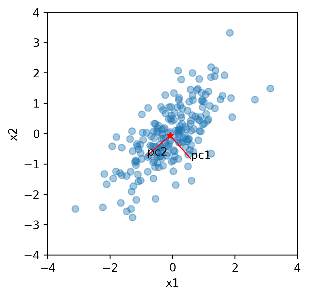
データ空間の可視化
# データ中心と主成分軸を計算
ave = np.mean(data, axis=0)
dpt = ave + eigvec

# プロット
fig = plt.figure(figsize=(4,4),dpi=320)
ax = fig.add_subplot(111)
plt.xlim(-4,4)
plt.ylim(-4,4)
plt.xlabel("x1")
plt.ylabel("x2")

ax.scatter(data[:,0], data[:,1], alpha=0.4)
ax.scatter(ave[0], ave[1], marker="*", color="red")
for i in range(2):
    ax.plot([ave[0], dpt[0,i]], [ave[1], dpt[1,i]],
            color="red", linewidth=1)
    ax.text(dpt[0,i], dpt[1,i], "pc{}".format(i+1))
データの分散が大きくなる方向に、主成分軸PC1、PC2が現れる。
データの再構築
resamplept = np.array([np.dot(eigvec, pcacor[i]) for i in [0,1,2,3,4]])
ax.scatter(resamplept[:,0], resamplept[:,1],
           s=10, marker="*", color="blue")
index 0~4までのデータを再構成する。
下図の青*マーカーの点。

主成分空間に投影
# 主成分空間にプロット
fig = plt.figure(figsize=(4,4),dpi=320)
ax = fig.add_subplot(111)
plt.xlim(-4,4)
plt.ylim(-4,4)
plt.xlabel("pc1")
plt.ylabel("pc2")

# 全データ
ax.scatter(pcacor[:,0], pcacor[:,1], alpha=0.4)
# 0~4までのデータ
ax.scatter(pcacor[0:5,0], pcacor[0:5,1],
           s=10, marker="*", color="blue")

まとめ
例えば、pc1だけでこのデータセットを表現する場合、
1変数のみでデータ全体の8割程度の説明が可能、ということになる。
実際は主成分と累積寄与率の関係を見ながら、採用する主成分数を決める。