1. 目標を立てる
1.1. 存在するデータ
約1万5千人がプレイしているゲームの全ユーザーのデータがある。
このゲームでは各ユーザーは東西南北軍のいずれかの軍団に属している。
また各ユーザーはその行動タイプがA~Dの4種のいずれかに分類される。
| ID | group | typeB | typeC | typeD | pt |
|---|---|---|---|---|---|
| 00001 | 1 | 0 | 0 | 0 | 6.86 |
| 00002 | 1 | 0 | 0 | 1 | 7.65 |
| 00003 | 1 | 0 | 0 | 0 | 6.37 |
| 00004 | 1 | 1 | 0 | 0 | 8.19 |
| 00005 | 1 | 0 | 1 | 0 | 4.74 |
| 以下略 |
「group」列は所属軍団を表し、1から4までの数字が入っている。
「type」列は行動タイプを表し、AからDまでのいずれかが入っているが、ダミー変数化されている。
「pt」列は今回は使わない。
1.2. やりたいこと
各軍団毎の行動タイプ構成比および総数を視覚的に比較したい。
おそらく積み上げ棒グラフを作ると良いんじゃかろうか。
2. データ準備
2.1. データ読み込み
from pathlib import Path

import pandas as pd

p = Path("D:/data/")
df = pd.read_csv(p.joinpath("file.csv"),
                 header=0, index_col=0,
                 engine="python", encoding="utf_8_sig")
2.2. データ整形
ダミー変数化された「type」列を一つにする。こうするしかないのか。
df["type"] = df["typeB"] + df["typeC"]*2 + df["typeD"]*3
type0~3が行動タイプABCDを表す列ができた。
諸事情によりついでに日本語化する。
df["タイプ"] = df["type"].map(
    {0: "タイプA", 1: "タイプB", 2: "タイプC", 3: "タイプD"})
df["軍団"] = df["group"].map(
    {1: "北軍", 2: "東軍", 3: "南軍", 4: "西軍"})
2.3. グラフ用テーブル作成
軍団ごとの各行動タイプ別ユーザー数が知りたい。
pd.crosstab()を使うと一気に数えてくれる。
table = pd.crosstab(df["軍団"], df["タイプ"])
table = table.iloc[[0, 2, 1, 3]]
print(table)
| タイプ | タイプA | タイプB | タイプC | タイプD |
|---|---|---|---|---|
| 軍団 | ||||
| 北軍 | 1843 | 724 | 922 | 249 |
| 東軍 | 1996 | 1035 | 862 | 796 |
| 南軍 | 759 | 440 | 570 | 1272 |
| 西軍 | 1107 | 390 | 417 | 270 |
ここで気づいたが元データでtypeD=2と誤っている行が存在していた(map()で日本語化したときにタイプ=NaNになった)。
1人だけなので無視しとこう。
グラフ描画
matplotlib以外にもいろいろツールがあるのでそれも使ってみた。画像の大きさは適当。
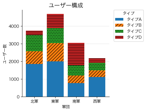
3.1. matplotlib
matplotlibには積み上げ棒グラフ専用関数はない。よって、各タイプ毎にAxes.bar()で棒グラフを作り、その下端をbottom=で持ち上げる必要がある。あとは値を累積和にして上下に重ねるとか、まあやり口はいろいろある。
白黒用紙に印刷しても耐えうるようにhatch=で網掛けを指定する。
Axes.grid()でグラフの方眼線を指定。
import matplotlib.pyplot as plt

fig = plt.figure(figsize=(3, 3), dpi=100)
ax = fig.add_axes((0, 0, 1, 1),
                  xlabel=table.index.name,
                  ylabel="ユーザー数")
fig.suptitle("ユーザー構成", y=1.08, size="x-large")
hatchlist = ["", "///", "...", "---"]
bottom = 0
for i in range(0, 4):
    ax.bar(table.index, table.iloc[:, i], label=table.columns[i],
           color="C"+str(i), hatch=hatchlist[i], zorder=10-0.1*i,
           bottom=bottom)
    bottom += table.iloc[:, i]
ax.legend(title=table.columns.name,
          bbox_to_anchor=(1.05, 1), loc='upper left', borderaxespad=0)
ax.grid(True, axis="y", color="gainsboro", alpha=0.8, zorder=7)
[ax.spines[side].set_visible(False) for side in ["right", "top"]]
fig.savefig(p.joinpath("bar.png"), bbox_inches="tight")
凡例の順番が気になる場合は各タイプの描画の順番を逆にする。
bottom = table.sum()
for i in range(3, -1, -1):
    bottom -= table.iloc[:, i]
    ax.bar(table.index, table.iloc[:, i], label=table.columns[i],
           color="C"+str(i), hatch=hatchlist[i], zorder=10-0.1*i,
           bottom=bottom)
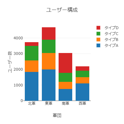
3.2. plotly
初めて使った。棒グラフに網掛けはできない。
レイアウトでbarmode="stack"として、データに棒グラフのリストを渡すと積み上げてくれるようだ。
import plotly.graph_objs as go
import plotly.io as pio

data = [go.Bar(x=table.index, y=table.iloc[:, i], name=table.columns[i])
        for i in range(0, 4)]
layout = go.Layout(
    title=go.layout.Title(text="ユーザー構成"),
    xaxis=go.layout.XAxis(title=table.index.name),
    yaxis=go.layout.YAxis(title="ユーザー数"),
    barmode="stack",
    width=400, height=400,
    margin=go.layout.Margin(l=75, r=75, b=75, t=75))
fig = go.Figure(data=data, layout=layout)
pio.write_image(fig, str(p.joinpath("bar.png")))
3.3. bokeh
初めて使ったが、なんか使い勝手が悪い。棒グラフに網掛けはできない。
積み上げ棒グラフ専用関数があるもののmatplotlibと同じように棒グラフを重ねたほうが楽かもしれない。
凡例をグラフ枠外に配置できないため棒に重ならないように細かい調整を行った。
from bokeh import palettes
from bokeh.core.properties import value
from bokeh.io import export_png
from bokeh.plotting import figure

plot = figure(title="ユーザー構成",
              plot_width=350, plot_height=350,
              x_range=table.index.values,
              toolbar_location=None, tools="hover",
              tooltips="$name @index: @$name")
plot.vbar_stack(table.columns.values,
                x=table.index.name,
                legend=[value(x) for x in table.columns],
                source=table, width=0.7,
                color=palettes.Category10[4])
plot.xaxis.axis_label = table.index.name
plot.xgrid.grid_line_color = None
plot.yaxis.axis_label = "ユーザー数"
plot.y_range.start = 0
plot.legend.orientation = "vertical"
plot.legend.location = "top_right"
plot.legend.label_height = 12
plot.legend.glyph_height = 12
plot.legend.glyph_width = 12
plot.legend.label_text_font_size = "10pt"
export_png(plot, filename=p.joinpath("bar.png"))

4. おわり
どの軍団にもタイプAが多いが、南軍はタイプDの割合が多いということがわかった。
画像を出力するなら王道を往くmatplotlibですかね。