- 「ページのこの部分を流れる文字にしたいです」と言われてしまった
- <marquee>は使いたくない…
ときのための、CSSアニメーションを使ったスタイル指定のサンプルです。
※「【CSS3】全ブラウザ対応! CSS3 で作る marquee の実装。 - ONZE」さんのコードをもとに可変幅にして依存する前提を極力少なくしたものになります。例示用としてベンダープレフィックス(-webkit-等)も外しています。
/** マーキーさせたい部分 */
.marquee {
  overflow: hidden; /* スクロールバーが出ないように */
  position: relative; /* マーキーの内容部分の位置の基準になるように */
}
 /* マーキーの内容部分の高さ確保 */
.marquee::after {
  content: "";
  white-space: nowrap;
  display: inline-block;
}
/* マーキーさせたい部分(内側) */
.marquee > .marquee-inner {
  position: absolute;
  top: 0;
  white-space: nowrap;
  animation-name: marquee;
  animation-timing-function: linear;
  animation-duration: 20s;
  animation-iteration-count: infinite;
}
/* マウスオーバーでマーキーストップ */
.marquee > .marquee-inner:hover {
  animation-play-state: paused;
  cursor: default;
}
/** マーキーアニメーション */
@keyframes marquee {
    0% { left: 100%; transform: translate(0); }
  100% { left: 0; transform: translate(-100%); }
}
マーキーさせたい部分は下記のようにタグ付けします。
<div class="marquee">
  <div class="marquee-inner">商品1を入荷しました。ぜひお試しください。</div>
</div>
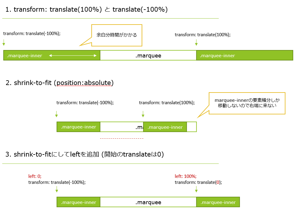
アニメーションの位置指定について
「スムーズなアニメーションを実装するコツと仕組みを説明するよ。CPUとGPUを理解しハードウェアアクセラレーションを駆使するのだ!(Frontrend Advent Calendar 2013 – 06日目) | Ginpen.com」 を考えるとアニメーションの位置指定は translate() のみでできるとよいと思いますが、「左端にたどり着いて退場したらすぐ右端から出てくる」+「可変幅」を実現しようとすると
- 流したい要素幅が内容幅ぴったり(shrink-to-fit)になっている必要がある (=
position:absoluteやfloatなどの指定が必要。そうでないと、例えば要素幅が500pxで内容幅が100pxくらいだった場合に400px分の空白が流れ終わるのをまたないと右端から出てこない) - 要素幅を内容幅ぴったりにすると
transform: translate(100%)が右端に来ない (transform: translate(100%)の代わりにleft: 100%; transform: translate(0);にするとtransform: translate(-100%)が左端にたどり着かない )
ということで translate() と left が両方指定されています…
(図にしてみました)
他によい方法があればお知らせください。