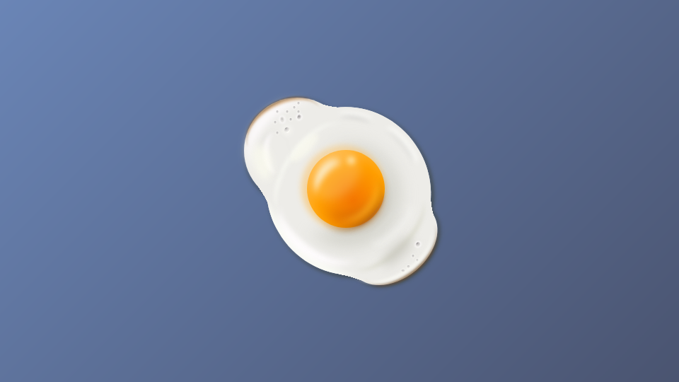
前回、リアルなタピオカを作りましたが、今回は目玉焼きを作りました。コードはあまり整理されていませんが、そこはご了承ください。
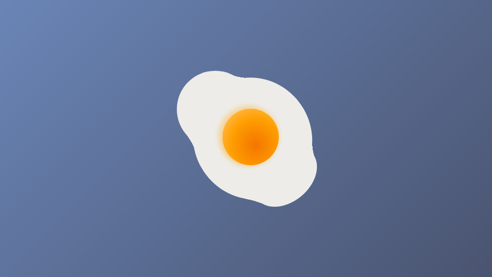
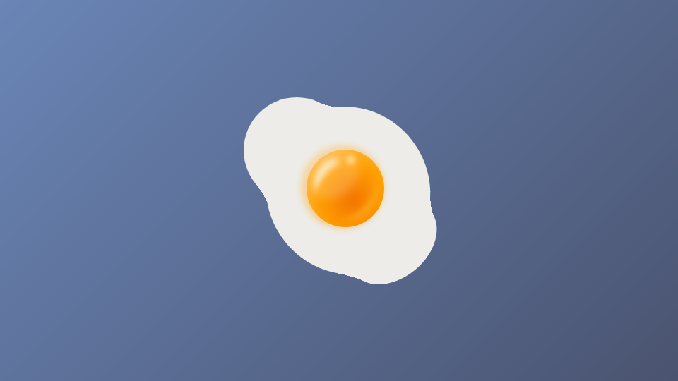
完成品はこちら
See the Pen sunny-side up by Nishihara (@Nishihara) on CodePen.
概要
基本的な作り方は前回と同様、円形グラデーション(background-image: radial-gradient())とフィルターのぼかし(filter: blur())を駆使して作っています。前回になかった要素としては、凹の字型でなめらかにつなぐ要素を追加しています。
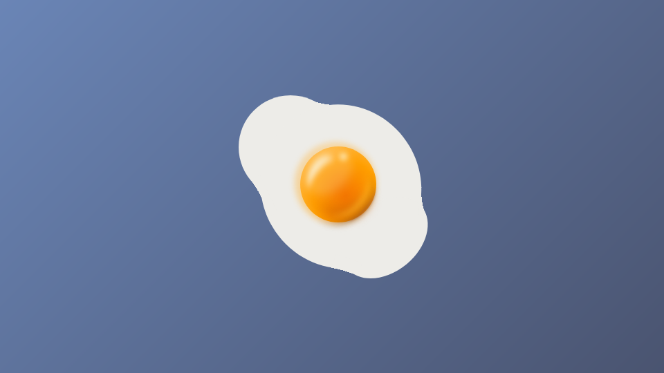
本体を作る
<div class="shiromi shiromi-body1"></div>
<div class="shiromi shiromi-body2"></div>
<div class="shiromi shiromi-body3"></div>
.shiromi {
  background-color: $shiromi;
  z-index: 1;
  &-body1 {
    width: 150px;
    height: 150px;
    border-radius: 50%;
    position: absolute;
    top: 6%;
    left: 5%;
  }
  &-body2 {
    width: 230px;
    height: 240px;
    border-radius: 50%;
    transform: rotate(-30deg);
    position: absolute;
    top: 10%;
    left: 16%;
  }
  &-body3 {
    width: 140px;
    height: 100px;
    border-radius: 50%;
    transform: rotate(-40deg);
    position: absolute;
    top: 58%;
    left: 52%;
  }
}

3つの白い円を並べているだけです。ただ、このままだと重なっている交差点が鋭角になってしまうので、そこを滑らかにつなぐパーツを用意します。
<div class="shiromi shiromi-bridge shiromi-bridge1"></div>
<div class="shiromi shiromi-bridge shiromi-bridge2"></div>
<div class="shiromi shiromi-bridge shiromi-bridge3"></div>
<div class="shiromi shiromi-bridge shiromi-bridge4"></div>
.shiromi-bridge {
  position: absolute;
  z-index: 2;
  &1 {
    width: 60px;
    height: 80px;
    -webkit-mask-image: radial-gradient(
      circle at 38% -100%,
      rgba(0, 0, 0, 0) 90%,
      rgba(0, 0, 0, 1) 90%
    );
    transform: scaleX(0.8) rotate(12deg) skewX(0deg);
    top: -12.5%;
    left: 37%;
  }
  &2 {
    width: 60px;
    height: 50px;
    -webkit-mask-image: radial-gradient(
      circle at 48% -200%,
      rgba(0, 0, 0, 0) 90%,
      rgba(0, 0, 0, 1) 0%
    );
    transform: rotate(-115deg);
    top: 48.5%;
    left: 2%;
  }
  &3 {
    width: 40px;
    height: 80px;
    -webkit-mask-image: radial-gradient(
      circle at 20% -160%,
      rgba(0, 0, 0, 0) 90%,
      rgba(0, 0, 0, 1) 90%
    );
    transform: rotate(-160deg);
    top: 84%;
    left: 47%;
  }
  &4 {
    width: 40px;
    height: 30px;
    -webkit-mask-image: radial-gradient(
      circle at 25% -200%,
      rgba(0, 0, 0, 0) 90%,
      rgba(0, 0, 0, 1) 90%
    );
    transform: rotate(88deg);
    top: 52%;
    left: 90%;
  }
}
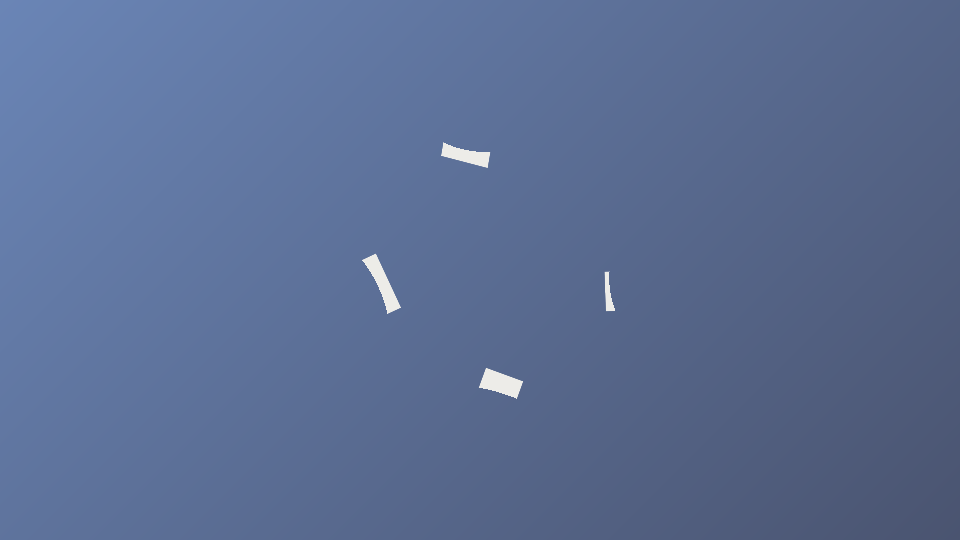
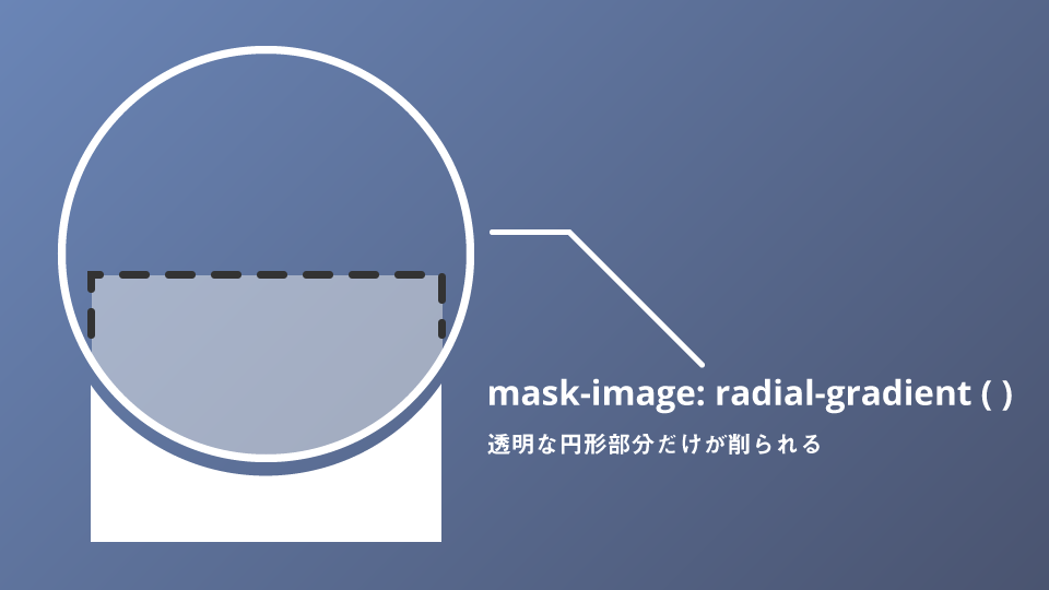
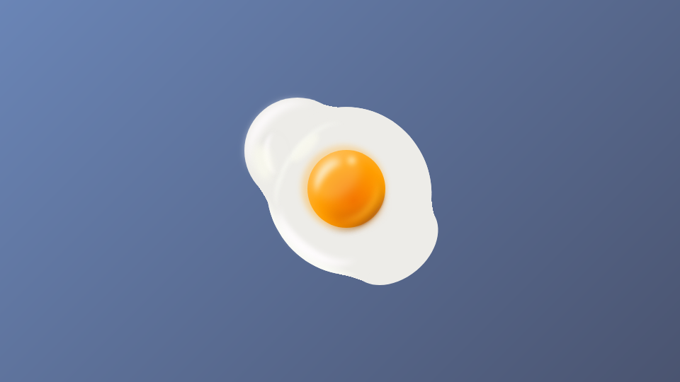
なにをやっているかというと、mask-imageとradial-gradientを使い四角い要素を凹の字型にくり抜いています。mask-imageは色のついている部分をマスクしますので、透明な円形を作り円の中心位置や半径を変えることで、滑らかにつなぐ曲線部分を作っています。
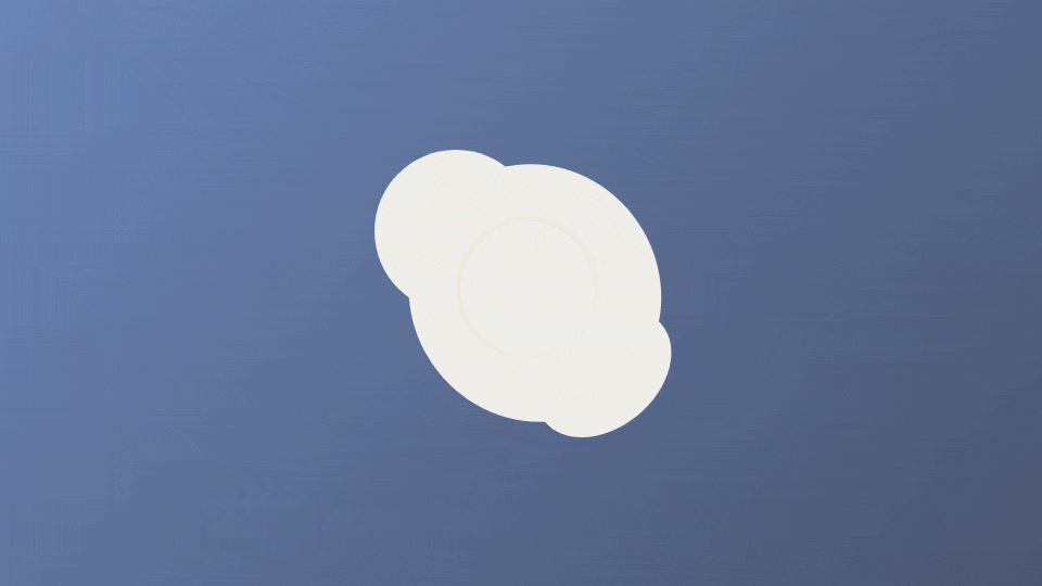
これをさきほどの本体と組み合わせれば
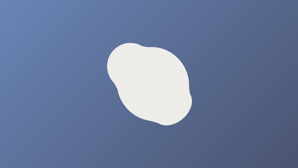
なめらかに3つの円がつながった図形が出来上がります。
黄身を作る
<div class="kimi"></div>
.kimi {
  width: 110px;
  height: 110px;
  border-radius: 50%;
  position: absolute;
  top: 49%;
  left: 53%;
  z-index: 10;
  background-image: radial-gradient(
    farthest-corner at 60% 65%,
    #f47501 0%,
    #ff9f00 50%,
    #ffbc4f 82%
  );
  transform: translate(-50%, -50%);
  &:after {
    content: "";
    display: block;
    width: 118px;
    height: 118px;
    border-radius: 50%;
    position: absolute;
    top: 48%;
    left: 46%;
    z-index: 9;
    background-image: radial-gradient(
      farthest-corner at 60% 65%,
      #f47501 0%,
      #ff9f00 50%,
      #ffbc4f 82%
    );
    transform: translate(-50%, -50%);
    filter: blur(4px);
    opacity: 0.4;
  }
}
黄身は前回のタピオカと同様円形グラデーションで明るい部分、暗い部分を作っています。さらに疑似要素で黄身上部に明るい影を白身に落としています。これは白身映る黄身です。
黄身にハイライトを入れていく
<div class="kimi-highlight kimi-highlight1"></div>
<div class="kimi-highlight kimi-highlight2"></div>
<div class="kimi-highlight kimi-highlight3"></div>
<div class="kimi-highlight kimi-highlight4"></div>
.kimi-highlight {
  position: absolute;
  z-index: 12;
  &1 {
    width: 55px;
    height: 40px;
    top: 37.5%;
    left: 36%;
    border-top: 12px solid #fbe5b6;
    border-radius: 50%;
    filter: blur(4px);
    transform: rotate(-48deg) skewX(-20deg);
  }
  &2 {
    width: 75px;
    height: 55px;
    top: 44%;
    left: 45%;
    border-top: 8px solid rgba(253, 194, 45, 0.56);
    border-radius: 50%;
    filter: blur(4px);
    transform: rotate(132deg);
  }
  &3 {
    width: 15px;
    height: 15px;
    top: 33%;
    left: 53%;
    border-radius: 50%;
    background-image: radial-gradient(
      farthest-corner at 50% 50%,
      #fbe5b6 0%,
      rgba(255, 184, 58, 1) 60%,
      rgba(255, 184, 58, 0) 100%
    );
    filter: blur(3px);
  }
  &4 {
    width: 60px;
    height: 80px;
    border-radius: 50%;
    background-color: rgba(255, 255, 255, 0.18);
    top: 29%;
    left: 38%;
    filter: blur(6px);
    transform: rotate(45deg);
  }
}
これもタピオカで使った技法でハイライトを入れています。詳しくは前回の記事をご覧ください。
黄身にシャドウを入れる
<div class="kimi-shadow kimi-shadow1"></div>
<div class="kimi-shadow kimi-shadow2"></div>
<div class="kimi-shadow kimi-shadow3"></div>
.kimi-shadow {
  position: absolute;
  z-index: 11;
  &1 {
    width: 65px;
    height: 30px;
    border-top: 2px solid #b66b3f;
    border-radius: 50%;
    top: 53%;
    left: 51.5%;
    transform: rotate(133deg);
    filter: blur(1px);
  }
  &2 {
    width: 75px;
    height: 60px;
    border-top: 16px solid #d56500;
    border-radius: 50%;
    top: 45%;
    left: 43%;
    transform: rotate(165deg);
    filter: blur(8px);
  }
  &3 {
    width: 100px;
    height: 80px;
    border-top: 2px solid #371f05;
    border-radius: 50%;
    top: 40%;
    left: 38%;
    transform: rotate(138deg);
    filter: blur(4px);
  }
}
こちらもborder-topとfilter: blur()を使っていい感じに影を演出します。
白身を立体的にしていく
黄身はだいぶいい感じになりました。まだ白身がペタっとフラットなので立体感を付けていきます。
白身にハイライトをいれる
<div class="shiromi-highlight shiromi-highlight1"></div>
<div class="shiromi-highlight shiromi-highlight2"></div>
<div class="shiromi-highlight shiromi-highlight3"></div>
<div class="shiromi-highlight shiromi-highlight4"></div>
<div class="shiromi-highlight shiromi-highlight5"></div>
<div class="shiromi-highlight shiromi-highlight6"></div>
<div class="shiromi-highlight shiromi-highlight7"></div>
.shiromi-highlight {
  z-index: 3;
  position: absolute;
  &1 {
    width: 125px;
    height: 100px;
    border-radius: 50%;
    top: 10%;
    left: 4%;
    border-top: 12px solid #fffcfe;
    transform: rotate(-48deg);
    filter: blur(5px);
  }
  &2 {
    width: 230px;
    height: 240px;
    border-radius: 50%;
    transform: rotate(-30deg);
    top: 10%;
    left: 16%;
    background-image: radial-gradient(
      circle at 130% 25%,
      $shiromi 82%,
      #f9faf4 86%
    );
  }
  &3 {
    width: 155px;
    height: 80px;
    border-top: 5px solid #f9faf4;
    border-radius: 50%;
    top: 27%;
    left: 12%;
    transform: rotate(-55deg);
    filter: blur(2.5px);
  }
  &4 {
    width: 130px;
    height: 80px;
    border-top: 12px solid #fffcfe;
    border-radius: 50%;
    transform: rotate(-145deg);
    top: 55%;
    left: 19%;
    filter: blur(4px);
  }
  &5 {
    width: 60px;
    height: 38px;
    border-top: 9px solid #fffcfe;
    box-shadow: 0 -2px 7px -6px rgba(0, 0, 0, 1);
    border-radius: 50%;
    top: 26%;
    left: 10%;
    transform: rotate(-94deg);
    filter: blur(2px);
    opacity: 0.7;
  }
  &6 {
    width: 52px;
    height: 16px;
    background-color: rgba(253, 253, 240, 0.6);
    border-radius: 50%;
    top: 27%;
    left: 25%;
    transform: rotate(-46deg);
    filter: blur(3px);
  }
  &7 {
    width: 52px;
    height: 26px;
    background-color: rgba(253, 253, 240, 0.7);
    border-radius: 50%;
    top: 32%;
    left: 5%;
    transform: rotate(-105deg);
    filter: blur(5px);
  }
}
border-topによる線状のハイライトだけでなく、楕円を使ったハイライトも所々にいれています。
白身にシャドウを入れる
ハイライトを入れたら、シャドウも入れましょう。
<div class="shiromi-shadow shiromi-shadow1"></div>
<div class="shiromi-shadow shiromi-shadow2"></div>
<div class="shiromi-shadow shiromi-shadow3"></div>
<div class="shiromi-shadow shiromi-shadow4"></div>
<div class="shiromi-shadow shiromi-shadow5"></div>
<div class="shiromi-shadow shiromi-shadow6"></div>
<div class="shiromi-shadow shiromi-shadow7"></div>
.shiromi-shadow {
  position: absolute;
  z-index: 3;
  &1 {
    width: 135px;
    height: 60px;
    border-top: 5px solid #d8d8c9;
    border-radius: 50%;
    top: 60%;
    left: 50%;
    transform: rotate(135deg);
    filter: blur(2.5px);
  }
  &2 {
    width: 185px;
    height: 185px;
    border-radius: 50%;
    transform: rotate(38deg);
    top: 30%;
    left: 26%;
    background-image: radial-gradient(
      closest-side at 40% 40%,
      rgba(199, 198, 189, 1) 50%,
      rgba(240, 240, 230, 0) 80%
    );
  }
  &3 {
    width: 150px;
    height: 150px;
    border-top: 48px solid rgba(199, 198, 189, 0.6);
    border-left: 18px solid rgba(199, 198, 189, 0.6);
    border-radius: 50%;
    top: 27%;
    left: 29%;
    transform: rotate(140deg);
    filter: blur(10px);
  }
  &4 {
    width: 56px;
    height: 3px;
    background-color: rgba(199, 198, 189, 0.7);
    border-top: 8px solid rgba(199, 198, 189, 0.7);
    border-bottom: 8px solid rgba(199, 198, 189, 0.7);
    top: 76%;
    left: 68%;
    border-radius: 50%;
    transform: rotate(-43deg);
    filter: blur(7px);
  }
  &5 {
    width: 45px;
    height: 8px;
    border-top: 2px solid rgba(150, 150, 148, 0.7);
    box-shadow: 0px -4px 3px 1px #fdfdfa;
    border-radius: 50%;
    transform: rotate(10deg);
    top: 15%;
    left: 50%;
    filter: blur(3px);
  }
  &6 {
    width: 62px;
    height: 14px;
    border-top: 2px solid rgba(150, 150, 148, 0.5);
    box-shadow: 0px -5px 3px 1px #fdfdfa;
    border-radius: 50%;
    transform: rotate(50deg);
    top: 27%;
    left: 68%;
    filter: blur(3px);
  }
  &7 {
    width: 72px;
    height: 16px;
    //background-color: rgba(205,204,200,0.5);
    border-top: 1px solid rgba(150, 150, 148, 0.6);
    box-shadow: 0px -3px 4px 1px #fdfdfa;
    border-radius: 50%;
    transform: rotate(135deg);
    top: 63%;
    left: 62%;
    filter: blur(4px);
  }
}

数は多いですが、こちらもハイライトと同じ要領で入れていきます。
目玉焼きは気泡ができる
立体感も出て、だいぶ本物っぽくなりました。ただ、なにか少し作り物っぽさが残ります。
実際に目玉焼きを作ると細かい気泡ができます。なのでそれも追加していきます。
<div class="hole hole1"></div>
<div class="hole hole2"></div>
<div class="hole hole3"></div>
<div class="hole hole4"></div>
<div class="hole hole5"></div>
<div class="hole hole6"></div>
<div class="hole hole7"></div>
<div class="hole hole8"></div>
<div class="hole hole9"></div>
<div class="hole hole10"></div>
<div class="hole hole11"></div>
<div class="hole hole12"></div>
<div class="hole hole13"></div>
<div class="hole hole14"></div>
<div class="hole hole15"></div>
<div class="hole hole16"></div>
.hole {
  position: absolute;
  z-index: 4;
  &1 {
    width: 6px;
    height: 7px;
    border-radius: 50%;
    background-image: radial-gradient(
      farthest-side at 40% 40%,
      rgba(80, 80, 80, 0.6) 0%,
      rgba(173, 167, 170, 0.8) 32%,
      rgba(237, 236, 232, 0.8) 100%
    );
    box-shadow: 0px 0px 2px 1px #fffcfe;
    top: 14%;
    left: 30%;
    transform: rotate(20deg);
  }
  &2 {
    width: 6px;
    height: 8px;
    border-radius: 50%;
    background-image: radial-gradient(
      farthest-side at 50% 40%,
      rgba(130, 130, 130, 0.6) 0%,
      rgba(173, 167, 170, 0.3) 32%,
      rgba(237, 236, 232, 0.8) 100%
    );
    box-shadow: 0px 0px 3px 1px #fffcfe;
    top: 15%;
    left: 22%;
    transform: rotate(-10deg);
  }
  &3 {
    width: 8px;
    height: 8px;
    border-radius: 50%;
    background-image: radial-gradient(
      farthest-side at 20% 15%,
      rgba(80, 80, 80, 0.5) 0%,
      rgba(173, 167, 170, 0.4) 40%,
      rgba(237, 236, 232, 0) 80%,
      #fdfcf8
    );
    box-shadow: 0px 0px 8px 1px #fdfcf8;
    top: 20%;
    left: 24%;
    transform: rotate(10deg);
  }
  &4 {
    width: 4px;
    height: 4px;
    border-radius: 50%;
    background-image: radial-gradient(
      farthest-side at 50% 20%,
      rgba(130, 130, 130, 0.6) 0%,
      rgba(173, 167, 170, 0.6) 52%,
      rgba(237, 236, 232, 0.8) 100%
    );
    box-shadow: 0px 0px 2px 0px #fdfcf8;
    top: 15.5%;
    left: 26.5%;
  }
  &5 {
    width: 4px;
    height: 4px;
    border-radius: 50%;
    background-image: radial-gradient(
      farthest-side at 50% 20%,
      rgba(130, 130, 130, 0.4) 0%,
      rgba(173, 167, 170, 0.5) 52%,
      rgba(237, 236, 232, 0.8) 100%
    );
    box-shadow: 0px 0px 2px 0px #fdfcf8;
    top: 12%;
    left: 24.5%;
  }
  &6 {
    width: 4px;
    height: 4px;
    border-radius: 50%;
    background-image: radial-gradient(
      farthest-side at 50% 20%,
      rgba(130, 130, 130, 0.4) 0%,
      rgba(173, 167, 170, 0.5) 52%,
      rgba(237, 236, 232, 0.8) 100%
    );
    box-shadow: 0px 0px 2px 0px #fdfcf8;
    top: 22%;
    left: 20%;
  }
  &7 {
    width: 4px;
    height: 4px;
    border-radius: 50%;
    background-image: radial-gradient(
      farthest-side at 50% 20%,
      rgba(130, 130, 130, 0.4) 0%,
      rgba(173, 167, 170, 0.5) 52%,
      rgba(237, 236, 232, 0.8) 100%
    );
    box-shadow: 0px 0px 2px 0px #fdfcf8;
    top: 12%;
    left: 30%;
  }
  &8 {
    width: 4px;
    height: 4px;
    border-radius: 50%;
    background-image: radial-gradient(
      farthest-side at 50% 20%,
      rgba(130, 130, 130, 0.4) 0%,
      rgba(173, 167, 170, 0.5) 52%,
      rgba(237, 236, 232, 0.8) 100%
    );
    box-shadow: 0px 0px 2px 0px #fdfcf8;
    top: 10%;
    left: 28%;
  }
  &9 {
    width: 6px;
    height: 7px;
    border-radius: 50%;
    background-image: radial-gradient(
      farthest-side at 10% 40%,
      rgba(80, 80, 80, 0.6) 0%,
      rgba(173, 167, 170, 0.8) 32%,
      rgba(237, 236, 232, 0.8) 100%
    );
    box-shadow: 0px 0px 2px 1px #fffcfe;
    top: 74%;
    left: 86%;
    transform: rotate(40deg);
  }
  &10 {
    width: 4px;
    height: 4px;
    border-radius: 50%;
    background-image: radial-gradient(
      farthest-side at 50% 20%,
      rgba(130, 130, 130, 0.4) 0%,
      rgba(173, 167, 170, 0.5) 52%,
      rgba(237, 236, 232, 0.8) 100%
    );
    box-shadow: 0px 0px 2px 0px #fdfcf8;
    top: 80%;
    left: 84%;
  }
  &11 {
    width: 4px;
    height: 4px;
    border-radius: 50%;
    background-image: radial-gradient(
      farthest-side at 50% 20%,
      rgba(130, 130, 130, 0.4) 0%,
      rgba(173, 167, 170, 0.5) 52%,
      rgba(237, 236, 232, 0.8) 100%
    );
    box-shadow: 0px 0px 2px 0px #fdfcf8;
    top: 82%;
    left: 86%;
  }
  &12 {
    width: 4px;
    height: 4px;
    border-radius: 50%;
    background-image: radial-gradient(
      farthest-side at 50% 20%,
      rgba(130, 130, 130, 0.4) 0%,
      rgba(173, 167, 170, 0.5) 52%,
      rgba(237, 236, 232, 0.8) 100%
    );
    box-shadow: 0px 0px 2px 0px #fdfcf8;
    top: 8%;
    left: 30%;
  }
  &13 {
    width: 4px;
    height: 4px;
    border-radius: 50%;
    background-image: radial-gradient(
      farthest-side at 50% 20%,
      rgba(130, 130, 130, 0.4) 0%,
      rgba(173, 167, 170, 0.5) 52%,
      rgba(237, 236, 232, 0.8) 100%
    );
    box-shadow: 0px 0px 2px 0px #fdfcf8;
    top: 12%;
    left: 20%;
  }
  &14 {
    width: 4px;
    height: 4px;
    border-radius: 50%;
    background-image: radial-gradient(
      farthest-side at 50% 20%,
      rgba(130, 130, 130, 0.4) 0%,
      rgba(173, 167, 170, 0.5) 52%,
      rgba(237, 236, 232, 0.8) 100%
    );
    box-shadow: 0px 0px 2px 0px #fdfcf8;
    top: 17%;
    left: 19%;
  }
  &15 {
    width: 6px;
    height: 4px;
    border-radius: 50%;
    background-image: radial-gradient(
      farthest-side at 50% 20%,
      rgba(130, 130, 130, 0.4) 0%,
      rgba(173, 167, 170, 0.5) 52%,
      rgba(237, 236, 232, 0.8) 100%
    );
    box-shadow: 0px 0px 2px 0px #fdfcf8;
    top: 87%;
    left: 79%;
  }
  &16 {
    width: 5px;
    height: 4px;
    border-radius: 50%;
    background-image: radial-gradient(
      farthest-side at 50% 20%,
      rgba(130, 130, 130, 0.4) 0%,
      rgba(173, 167, 170, 0.5) 52%,
      rgba(237, 236, 232, 0.8) 100%
    );
    box-shadow: 0px 0px 2px 0px #fdfcf8;
    top: 85%;
    left: 81.5%;
  }
}
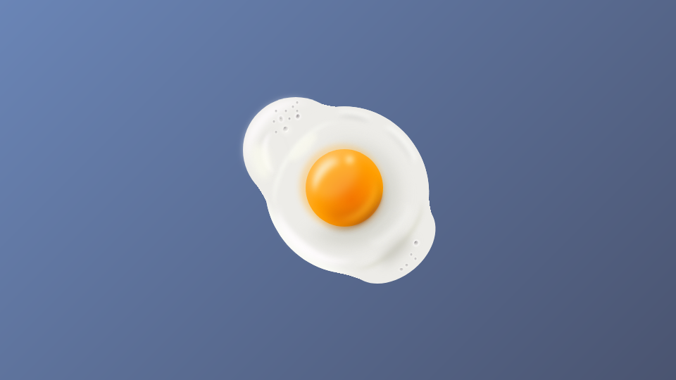
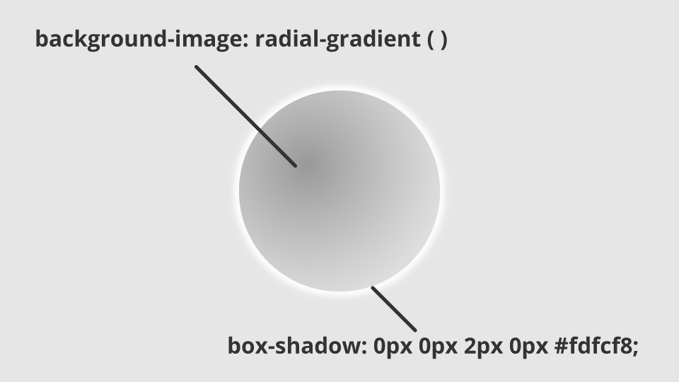
小さい穴はradial-gradientでくぼみを表現しbox-shadowで周囲を少しハイライトのように明るい色を乗せています。こうすることで周囲は盛り上がり、真ん中がくぼんだクレーターのようになります。
▼概念図
仕上げに焦げとドロップシャドウを加える
ここまできたら仕上げに入ります。端っこは焦げるので、それも追加します。
<div class="koge koge1"></div>
<div class="koge koge2"></div>
<div class="koge koge3"></div>
<div class="koge koge4"></div>
.koge {
  position: absolute;
  z-index: 15;
  &1 {
    width: 116px;
    height: 76px;
    border-radius: 50%;
    top: 7.7%;
    left: 4.8%;
    border-top: 2px solid #593107;
    transform: rotate(-30deg);
    filter: blur(0.9px);
  }
  &2 {
    width: 116px;
    height: 76px;
    border-radius: 50%;
    top: 8%;
    left: 5%;
    border-top: 4px solid rgba(208, 146, 81, 0.5);
    transform: rotate(-28deg);
    filter: blur(1px);
  }
  &3 {
    width: 126px;
    height: 76px;
    border-radius: 50%;
    top: 65.6%;
    left: 56.7%;
    border-top: 3px solid #6a4318;
    transform: rotate(142deg);
    filter: blur(1.5px);
  }
  &4 {
    width: 126px;
    height: 76px;
    border-radius: 50%;
    top: 65.5%;
    left: 53%;
    border-top: 3px solid #fcfcf6;
    transform: rotate(149deg);
    filter: blur(1.5px);
  }
}

焦げについてもこれまでと同様です。最後に目玉焼き自体の影を落とします。
<div class="dropshadow dropshadow1"></div>
<div class="dropshadow dropshadow2"></div>
<div class="dropshadow dropshadow3"></div>
.dropshadow {
  position: absolute;
  z-index: 0;
  &1 {
    width: 150px;
    height: 150px;
    border-radius: 50%;
    position: absolute;
    top: 6%;
    left: 5%;
    box-shadow: 1px 2px 4px 1px $dropshadow;
    filter: blur(1px);
  }
  &2 {
    width: 230px;
    height: 240px;
    border-radius: 50%;
    transform: rotate(-30deg);
    top: 10%;
    left: 16%;
    box-shadow: 1px 4px 4px 1px $dropshadow;
    filter: blur(1px);
  }
  &3 {
    width: 140px;
    height: 100px;
    border-radius: 50%;
    transform: rotate(-40deg);
    top: 58%;
    left: 52%;
    box-shadow: 1px 3px 4px 1px $dropshadow;
    filter: blur(1px);
  }
}
ドロップシャドウは最初の白身本体と同じ大きさの要素を作り、そこにbox-shadowをかけています。
これでリアルな目玉焼きの完成です!
最後に
前回のタピオカよりも要素は多くて少し複雑ではありますが、使っている技法は前回とそこまで変わりません。