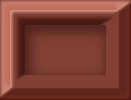
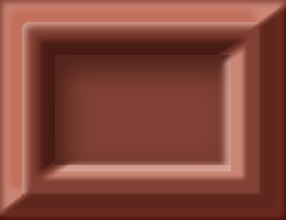
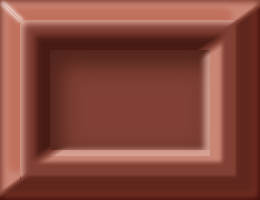
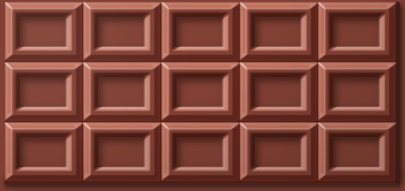
本日はバレンタインということで、チョコレートを作りました(CSS的な意味で)。今回はbox-shadowを多用して作っています。最近話題のNeomorphismもbox-shadowを使って陰影を実装できますが、その参考になるかもしれません。
See the Pen MWwaxqp by Nishihara (@Nishihara) on CodePen.
概要
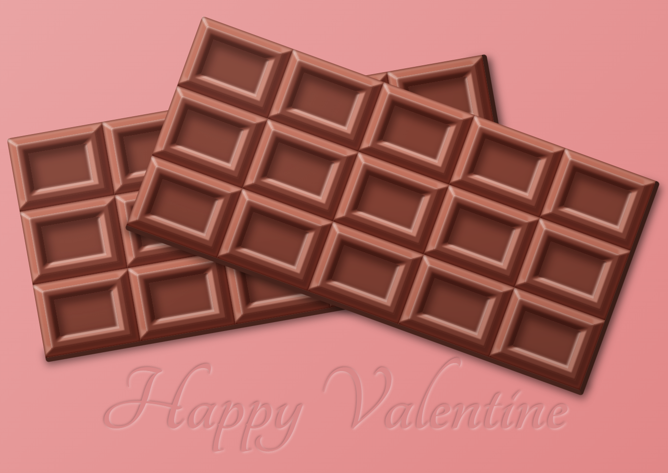
矩形のブロックが基本構成なので、box-shadowを使って陰影を作りました。明るいbox-shadowと暗いbox-shadowを重ねることでハイライトと影を表現します。div要素に加え、擬似要素にもbox-shadowを使っているので、けっこう重ね掛けしています。
今回は装飾にtext-shadowも使って内エンボス加工風の文字も添えました。
45度の突き合わせ
こだわったのは、角の部分です。斜め45度で突き合わせるのですが、普通にbox-shadowを組み合わせてもパキッといきません。
そこで、mask-imageとlinear-gradient()を使って、斜めのマスクを作成します。マスクを使って左斜め上と右斜め下のパーツに分けてくっつけて45度の突き合わせを実現したしています。マスクの端部を少しグラデーションさせてパキッとはしつつも、鋭角になりすぎないようにしています。
今思えば、borderとblur()を使えばもっと手軽に実装できたかもしれません。
mix-blend-modeとmix関数の活用
描画負荷は少し高くなりますがmix-blend-modeも活用しています。光が当たっている部分はscreenを、影の部分にはmultiplyを使っています。
また照りや影は、真っ白や真っ暗ではなく、実際には物体が持つ色を含んでいます。SCSSのmix()関数を使うことでチョコレートの色を含んだ反射光や影をつけました。
作り方
では、作り方を解説していきます。1つのブロックに注目して進ます。なお、チョコレートの色は全体ラッパー要素である、<div class="chocolate">で指定しています。
<div class="block block1">
  <div class="outerBottomRight"></div>
  <div class="outerTopLeft"></div>
  <div class="innerBottomRight"></div>
  <div class="innerTopLeft"></div>
  <div class="edge"></div>
</div>
.block {
  width: 130px;
  height: 100px;
  position: relative;
  overflow: hidden;
  &:before {
    content: "";
    display: block;
    width: 80px;
    height: 50px;
    position: absolute;
    top: 25px;
    left: 25px;
    box-shadow: inset 3px 5px 10px 3px rgba(mix($base, #000, 55%), 0.5);
    mix-blend-mode: multiply;
  }
}
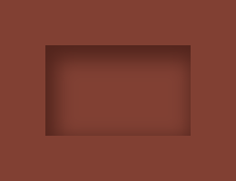
1つの大きさは130px×100pxです。疑似要素で中に二周りほど小さい四角を作り、内側にシャドウをかけています。これだけだとただの箱です。ぽっこりと膨らんだ表現は外側と内側の2つの要素に分けて作っています。
外側の膨らみを作っていく
左上と右下に分けて作っています。
<div class="outerBottomRight"></div>
<div class="outerTopLeft"></div>
.outerTopLeft,
.outerBottomRight {
  position: absolute;
  top: 0;
  left: 0;
  width: 130px;
  height: 100px;
  &:before {
    content: "";
    display: block;
    position: absolute;
    top: 10px;
    left: 10px;
    width: 110px;
    height: 80px;
  }
  &:after {
    content: "";
    display: block;
    position: absolute;
  }
}
ここでは共通部分を定義しています。大きさはブロックと同じですが、疑似要素はさきほどの内側の四角よりは大きい、一回り小さいサイズです。
.outerTopLeft {
  mix-blend-mode: screen;
  -webkit-mask-image: linear-gradient(
    -0.63rad,
    transparent 0 50%,
    black 51% 100%
  );
  &:before {
    box-shadow: 0 0 3px 9px rgba(mix($base, #fff, 85%), 1);
  }
  &:after {
    top: 10px;
    left: 10px;
    width: 110px;
    height: 80px;
    border-radius: 3px;
    box-shadow: -5px -5px 3px 1px rgba(mix($base, #fff, 100%), 1),
      inset 1px 1px 3px 1px rgba(mix($base, #fff, 70%), 1);
  }
}
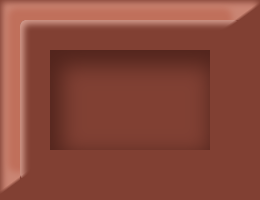
ここで、さきほどの書いた45度の突き合わせを使っています。-webkit-mask-image: linear-gradient(-0.63rad, transparent 0 50%, black 51% 100%);で擬似要素にかけたbox-shadowの左上半分だけが表示されます。縁の部分にもinsetでわずかに白いハイライトいれることで、角が少し丸みをおびたように見えます。
.outerBottomRight {
  mix-blend-mode: multiply;
  -webkit-mask-image: linear-gradient(
    -0.63rad,
    black 0 49%,
    transparent 50% 100%
  );
  &:after {
    top: 0;
    left: 0;
    width: 130px;
    height: 100px;
    mix-blend-mode: screen;
    box-shadow: inset -2px -2px 3px 2px rgba(mix($base, #fff, 100%), 1);
  }
  &:before {
    box-shadow: 0 0 3px 9px rgba(mix($base, #fff, 55%), 1),
      inset 0 0 1px 2px rgba(mix($base, #fff, 50%), 1);
  }
}
同じようにして、右下も作ります。
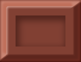
内側を作っていく
外側ができたので、内側も作っていきます。基本的には同じ手法になります。
.innerTopLeft,
.innerBottomRight {
  position: absolute;
  top: 0;
  left: 0;
  width: 130px;
  height: 100px;
  -webkit-mask-size: 100%;
  &:after,
  &:before {
    content: "";
    display: block;
    position: absolute;
    top: 25px;
    left: 25px;
    width: 80px;
    height: 50px;
  }
}
共通部分を作り、
.innerTopLeft {
  mix-blend-mode: multiply;
  -webkit-mask-image: linear-gradient(
    -0.58rad,
    transparent 0 50%,
    black 52% 100%
  );
  &:before {
    width: 90px;
    height: 60px;
    top: 20px;
    left: 20px;
    box-shadow: 0 0 3px 3px rgba(mix($base, #fff, 55%), 1);
  }
  &:after {
    box-shadow: 0 0 1.5px 6px rgba(mix($base, #999, 50%), 1);
  }
}
左上の影を入れ…
.innerBottomRight {
  mix-blend-mode: screen;
  -webkit-mask-image: linear-gradient(
    -0.58rad,
    black 0 48%,
    transparent 50% 100%
  );
  &:before {
    box-shadow: 0 0 1.5px 6px rgba(mix($base, #fff, 85%), 1);
  }
  &:after {
    height: 53px;
    box-shadow: inset -2px -2px 3px 1px rgba(mix($base, #fff, 65%), 1);
  }
}
右下にはハイライトを入れます。これで、だいたいできました。
斜めのエッジにハイライトを加える。
左上の斜めの辺が一番光を強く受けるのでハイライトを加えます。
.edge {
  width: 12px;
  box-shadow: 0 0 2px 1px rgba(mix($base, #fff, 15%), 1);
  transform: rotate(0.75rad);
  mix-blend-mode: screen;
  position: absolute;
  top: 6px;
  left: 0;
}
これでブロックの完成です!
最終調整
あとは、これをで15個並べていきます。
<div class="chocolate">
  <div class="block block1">
    <div class="outerBottomRight"></div>
    <div class="outerTopLeft"></div>
    <div class="innerBottomRight"></div>
    <div class="innerTopLeft"></div>
    <div class="edge"></div>
  </div>
  <div class="block block2">
    <div class="outerBottomRight"></div>
    <div class="outerTopLeft"></div>
    <div class="innerBottomRight"></div>
    <div class="innerTopLeft"></div>
    <div class="edge"></div>
  </div>
  <div class="block block3">
    <div class="outerBottomRight"></div>
    <div class="outerTopLeft"></div>
    <div class="innerBottomRight"></div>
    <div class="innerTopLeft"></div>
    <div class="edge"></div>
  </div>
  <div class="block block4">
    <div class="outerBottomRight"></div>
    <div class="outerTopLeft"></div>
    <div class="innerBottomRight"></div>
    <div class="innerTopLeft"></div>
    <div class="edge"></div>
  </div>
  <div class="block block5">
    <div class="outerBottomRight"></div>
    <div class="outerTopLeft"></div>
    <div class="innerBottomRight"></div>
    <div class="innerTopLeft"></div>
    <div class="edge"></div>
  </div>
  <div class="block block6">
    <div class="outerBottomRight"></div>
    <div class="outerTopLeft"></div>
    <div class="innerBottomRight"></div>
    <div class="innerTopLeft"></div>
    <div class="edge"></div>
  </div>
  <div class="block block7">
    <div class="outerBottomRight"></div>
    <div class="outerTopLeft"></div>
    <div class="innerBottomRight"></div>
    <div class="innerTopLeft"></div>
    <div class="edge"></div>
  </div>
  <div class="block block8">
    <div class="outerBottomRight"></div>
    <div class="outerTopLeft"></div>
    <div class="innerBottomRight"></div>
    <div class="innerTopLeft"></div>
    <div class="edge"></div>
  </div>
  <div class="block block9">
    <div class="outerBottomRight"></div>
    <div class="outerTopLeft"></div>
    <div class="innerBottomRight"></div>
    <div class="innerTopLeft"></div>
    <div class="edge"></div>
  </div>
  <div class="block block10">
    <div class="outerBottomRight"></div>
    <div class="outerTopLeft"></div>
    <div class="innerBottomRight"></div>
    <div class="innerTopLeft"></div>
    <div class="edge"></div>
  </div>
  <div class="block block11">
    <div class="outerBottomRight"></div>
    <div class="outerTopLeft"></div>
    <div class="innerBottomRight"></div>
    <div class="innerTopLeft"></div>
    <div class="edge"></div>
  </div>
  <div class="block block12">
    <div class="outerBottomRight"></div>
    <div class="outerTopLeft"></div>
    <div class="innerBottomRight"></div>
    <div class="innerTopLeft"></div>
    <div class="edge"></div>
  </div>
  <div class="block block13">
    <div class="outerBottomRight"></div>
    <div class="outerTopLeft"></div>
    <div class="innerBottomRight"></div>
    <div class="innerTopLeft"></div>
    <div class="edge"></div>
  </div>
  <div class="block block14">
    <div class="outerBottomRight"></div>
    <div class="outerTopLeft"></div>
    <div class="innerBottomRight"></div>
    <div class="innerTopLeft"></div>
    <div class="edge"></div>
  </div>
  <div class="block block15">
    <div class="outerBottomRight"></div>
    <div class="outerTopLeft"></div>
    <div class="innerBottomRight"></div>
    <div class="innerTopLeft"></div>
    <div class="edge"></div>
  </div>
  <div class="overlay"></div>
</div>
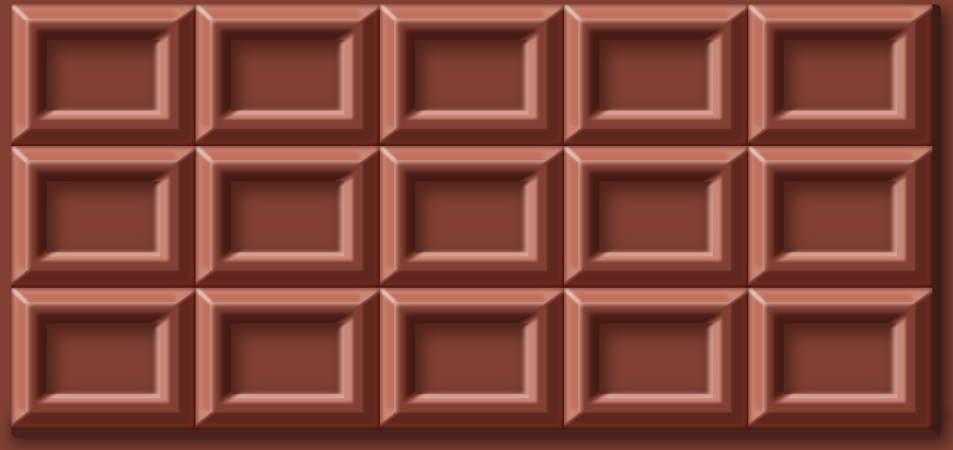
display: flexで配置しています。下側と右側にborderで厚みを加えています。
.chocolate {
  width: 656px;
  height: 306px;
  background-color: $base;
  border-bottom: 6px solid mix($base, #000, 55%);
  border-right: 6px solid mix($base, #000, 45%);
  border-radius: 4px;
  display: flex;
  justify-content: flex-start;
  align-items: flex-start;
  flex-wrap: wrap;
  position: relative;
  &:before {
    content: "";
    display: block;
    position: absolute;
    z-index: -1;
    top: 15px;
    left: 640px;
    width: 10px;
    height: 270px;
    box-shadow: 0 0 10px 10px rgba(0, 0, 0, 0.6);
  }
  &:after {
    content: "";
    display: block;
    position: absolute;
    z-index: -1;
    top: 300px;
    left: 10px;
    width: 640px;
    height: 0;
    box-shadow: 0 0 10px 10px rgba(0, 0, 0, 0.5);
  }
}
最後にオーバーレイ要素で全体的な濃淡の差を少し加えます。リアル感が少しでます。
.overlay {
  position: absolute;
  width: 650px;
  height: 300px;
  background-image: radial-gradient(
    ellipse at 5px 0px,
    rgba(0, 0, 0, 0) 50%,
    rgba(0, 0, 0, 0.15)
  );
  &:after {
    content: "";
    position: absolute;
    width: 650px;
    height: 300px;
    mix-blend-mode: lighten;
    background-image: radial-gradient(
      circle at 70px 40px,
      rgba(255, 255, 255, 0.05) 5%,
      rgba(255, 255, 255, 0) 40%
    );
  }
}
あとはよしなに配置すれば完成です。
おわりに
四角い矩形で比較的つるっとした表面なので、簡単に作れるかなって思っていましたが、やはりそれなりに時間はかかりました。box-shadowの良い練習になりました。