CGなどのパーティクルで炎を作るやり方を応用して、HTMLとCSSだけでリアルな炎のアニメーションを作成しました。
完成品はこちら
See the Pen Only HTML + CSS Fire by Nishihara (@Nishihara) on CodePen.
概要
パーティクルのかわりに大量のdiv要素を用意しています。1個1個はただの円形ですが、それらを上昇させつつ重ね合わせることで、炎のような演出を作っています。div要素大量に作るのが面倒だったのでPugを使っています。
HTML
▼Pug
# wrapper
  - for (var i=1; i < 201; i++)
    .particle(class=`particle${i}`)
▼コンパイル後のHTML
<div id="wrapper">
  <div class="particle particle1"></div>
  <div class="particle particle2"></div>
  ...
  <div class="particle particle200"></div>
</div>
#wrapperの中にparticleと連番のクラスを振ったdivが格納されているだけです。この要素1つ1つがパーティクルになります。今回は200個作りました。
CSS
# wrapper {
  width: 400px;
  height: 400px;
  position: relative;
  filter: contrast(120%);
}
ラッパーの要素に関しては大きさとpositionに関する設定をしています。filter: contrast(120%)そしてコントラストを強めて炎中心部の白さと周辺部の赤を際立たせています。
▼パーティクルの共通CSS
@mixin clothoid-gradient($color: #000000, $alpha-from: 1, $alpha-to: 0) {
  $diff: $alpha-from - $alpha-to;
  background-image: radial-gradient(
    closest-side,
    rgba($color, $alpha-from) 0%,
    rgba($color, $alpha-from - $diff * 0.7) 50%,
    rgba($color, $alpha-from - $diff * 0.85) 65%,
    rgba($color, $alpha-from - $diff * 0.925) 75.5%,
    rgba($color, $alpha-from - $diff * 0.963) 82.85%,
    rgba($color, $alpha-from - $diff * 0.981) 88%,
    rgba($color, $alpha-to) 100%
  );
}

.particle {
  width: 68px;
  height: 68px;
  border-radius: 50%;
  @include clothoid-gradient($color: #ff895b, $alpha-from: 0.8, $alpha-to: 0);
  position: absolute;
  bottom: 0;
  left: 45%;
  mix-blend-mode: screen;
  animation-duration: 1500ms;
  animation-iteration-count: infinite;
  animation-timing-function: linear;
  animation-fill-mode: backwards;
  transform-origin: 50% 0;
}
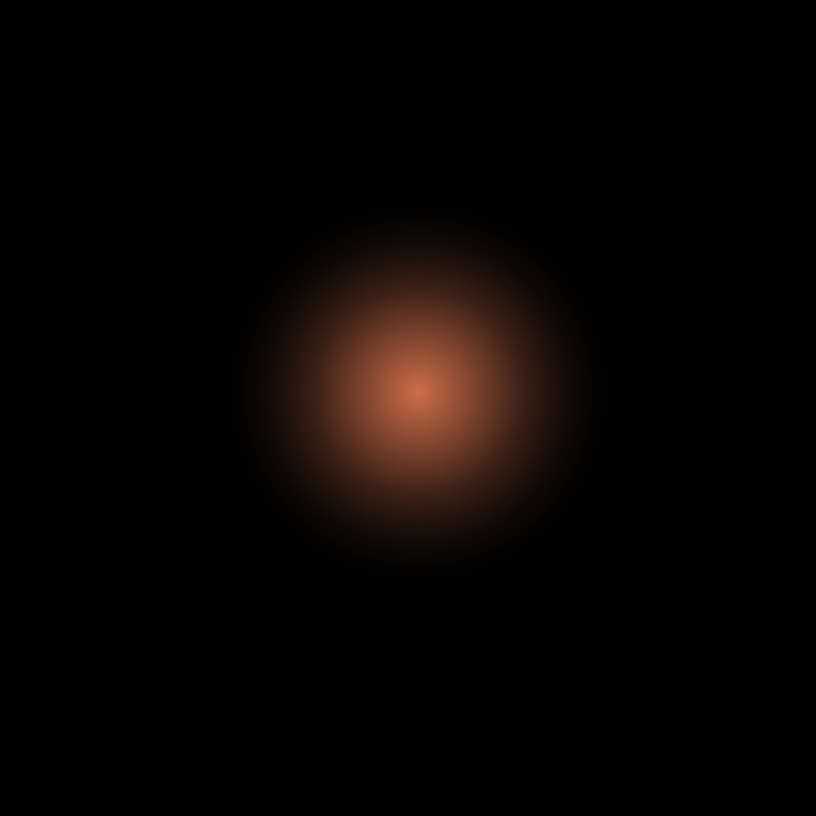
mixinが特徴的ですが、これはクロソイド曲線のグラデーションを作るmixinです。通常のグラデーションだと変化具合が線形でいい感じのぼけた丸が作れません。クロソイド曲線を利用すると下記のようなぼやっとしたグラデーションを表現できます。
これらを200個重ねるのですが、重ね方をmix-blend-modeのscreenで指定しています。
screenは光を重ね合わせたように、重なった部分が明るくなります。炎の中心部ほどパーティクルが重なるので明るくできます。
個々のアニメーションの設定は1.5秒間隔で無限に繰り返しています。
アニメーション
@keyframes fireParticle1 {
  0% {
    transform: scale(1) translate(0, 0);
    opacity: 0;
  }
  8% {
    transform: scale(1) translate(10px, -15px);
    opacity: 1;
  }
  100% {
    transform: scale(0.4) translate(-5px, -460px);
    opacity: 0;
  }
}
個々のアニメーションの設定はいたってシンプルで透明で出現し、ちょっと右に移動しつつ上昇し、小さくなりながら左に戻って上昇して消える、という具合です。これらの値を少し変えたものを10パターン作成しました。
200個に適用していく
@for $i from 1 to 201 {
  .particle#{$i} {
    margin-left: random(10) * -1.5px + 5px; //出現位置の横方向をランダム
    bottom: random(10) * 3px; //出現位置の縦方向をランダム
    animation-name: fireParticle#{$i % 10 +1};
    animation-delay: $duration / $particles * $i;
  }
}
アニメーションのプロパティを200個の要素に適用していきます。連番の要素にアニメーションを1〜10割り当て、開始時間をanimation-durationをパーティクルの数で割った値ずつずらしていきます。
パーティクルの出現位置をscssのrandom()関数でmargin-leftとbottomでずらします。random()関数はあくまでリアルタイムにランダムになるわけではなく、コンパイル時にランダムに決定されます。for文の中なので、個々にランダムな値が算出されます。
完成!

最後に
重ねて動かしているだけですが、200個のアニメーションとブレンドモードの重ね合わせはそれなりの描画負荷があります。自分のiPhone7では一部が描画されず、ボフッ、ボフッと途切れ途切れの炎になりました。(石油プラントフォームの煙突の炎みたいな感じ)
プロダクトで使う場合には注意しましょう。
参考