概要
Excel標準アドオン「分析ツール」の「ヒストグラム」機能を使ってみる。
公式ページ(インストール方法と概要説明)
分析ツールを使用して統計学的および工学的分析を行う - Excel
入力データ
■のぞえり小説投稿数(Pixiv・月別)
dataset.tsv
年月	投稿数	階級
2012/05	0	0
2012/06	0	5
2012/10	0	10
2012/11	0	15
2013/02	0	20
2013/03	1	25
2013/04	4	30
2013/05	12	35
2013/06	9
2013/07	7
2013/08	16
2013/09	26
2013/10	12
2013/11	14
2013/12	15
2014/01	20
2014/02	32
2014/03	22
出力データ
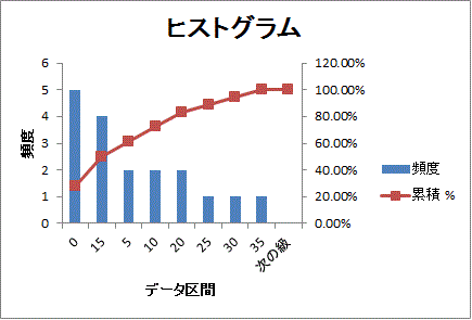
| データ区間 | 頻度 | 累積 % | データ区間 | 頻度 | 累積 % |
|---|---|---|---|---|---|
| 0 | 5 | 27.78% | 0 | 5 | 27.78% |
| 5 | 2 | 38.89% | 15 | 4 | 50.00% |
| 10 | 2 | 50.00% | 5 | 2 | 61.11% |
| 15 | 4 | 72.22% | 10 | 2 | 72.22% |
| 20 | 2 | 83.33% | 20 | 2 | 83.33% |
| 25 | 1 | 88.89% | 25 | 1 | 88.89% |
| 30 | 1 | 94.44% | 30 | 1 | 94.44% |
| 35 | 1 | 100.00% | 35 | 1 | 100.00% |
| 次の級 | 0 | 100.00% | 次の級 | 0 | 100.00% |
出力オプション
出力オプションのON/OFF次第で出力される列が変わる。
又、グラフが出力されるか変わる。
・パレート図 …… 右「データ区間|頻度|累積 %」3列の表示
・累積度数分布の表示 …… 左右「累積 %」列の表示
・グラフ作成 …… グラフの表示