概要
上下にゆっくり動く半透明なアナログ時計を実装します。

本記事は、以下の動画をReactで実装したものです。
スタイリングには、emotion/css(CSS in JS)を使用しています。
実装
.tsx
import React, { useEffect, useRef, VFC } from 'react';
import { css, keyframes } from '@emotion/css';

export const GlassmorphismAnalogClock: VFC = () => {
	const hRef = useRef<HTMLDivElement>(null)
	const minRef = useRef<HTMLDivElement>(null)
	const secRef = useRef<HTMLDivElement>(null)

	useEffect(() => {
		const intervalID = setInterval(() => {
			const deg = 6
			let day = new Date()
			let hh = day.getHours() * 30
			let mm = day.getMinutes() * deg
			let ss = day.getSeconds() * deg

			hRef.current!.style.transform = `rotateZ(${hh + mm / 12}deg)`
			minRef.current!.style.transform = `rotateZ(${mm}deg)`
			secRef.current!.style.transform = `rotateZ(${ss}deg)`
		})

		return () => clearInterval(intervalID)
	}, [])

	return (
		<div className={styles.screen}>
			<div className={styles.container}>
				<div className={styles.box}>
					<div className={styles.clock}>
						{/* hour hand */}
						<div className={styles.handContainer}>
							<div ref={hRef} className={styles.hour}></div>
						</div>
						{/* minutes hand */}
						<div className={styles.handContainer}>
							<div ref={minRef} className={styles.minutes}></div>
						</div>
						{/* seconds hand */}
						<div className={styles.handContainer}>
							<div ref={secRef} className={styles.seconds}></div>
						</div>
					</div>
				</div>
			</div>
		</div>
	)
}

const animations = {
	animate: keyframes`
    0%, 100% {
      transform: translateY(10px);
    }
    50% {
      transform: translateY(-10px);
    }
  `
}

const templates = {
	flex: css`
		display: flex;
		justify-content: center;
		align-items: center;
	`,
	hand: css`
		display: flex;
		justify-content: center;
		position: absolute;
		border-radius: 50%;
	`
}

const styles = {
	screen: css`
		position: relative;
		width: 100%;
		height: 100%;
		${templates.flex}

		&::before {
			content: '';
			position: absolute;
			top: 0;
			left: 0;
			width: 100%;
			height: 100%;
			background: linear-gradient(45deg, #e91e63 50%, #ffc107 50%);
		}
		&::after {
			content: '';
			position: absolute;
			top: -20px;
			left: 0;
			width: 100%;
			height: 100%;
			background: linear-gradient(160deg, #03a9f4 50%, transparent 50%);
			animation: ${animations.animate} 5s ease-in-out infinite;
		}
	`,
	container: css`
		position: relative;

		&::before {
			content: '';
			position: absolute;
			bottom: -150px;
			width: 100%;
			height: 60px;
			background: radial-gradient(rgba(0, 0, 0, 0.2), transparent, transparent);
			border-radius: 50%;
		}
	`,
	box: css`
		position: relative;
		z-index: 1;
		width: 400px;
		height: 400px;
		backdrop-filter: blur(25px);
		border-radius: 50%;
		border: 1px solid rgba(255, 255, 255, 0.5);
		animation: ${animations.animate} 5s ease-in-out infinite;
		animation-delay: -2.5s;
	`,
	clock: css`
		position: absolute;
		top: 10px;
		bottom: 10px;
		left: 10px;
		right: 10px;
		${templates.flex}
		background: radial-gradient(transparent, rgba(255, 255, 255, 0.2)), url('/assets/clock.png');
		background-size: cover;
		border-radius: 50%;
		backdrop-filter: blur(25px);
		border: 1px solid rgba(255, 255, 255, 0.5);
		border-bottom: none;
		border-right: none;
		box-shadow: -10px -10px 20px rgba(255, 255, 255, 0.1), 10px 10px 20px rgba(0, 0, 0, 0.1),
			0px 40px 50px rgba(0, 0, 0, 0.2);

		&::before {
			content: '';
			position: absolute;
			width: 15px;
			height: 15px;
			background-color: #fff;
			border-radius: 50%;
			z-index: 1000;
		}
	`,
	handContainer: css`
		position: absolute;
		${templates.flex}
	`,
	hour: css`
		width: 160px;
		height: 160px;
		${templates.hand}

		&::before {
			content: '';
			position: absolute;
			width: 8px;
			height: 80px;
			background-color: #ff105e;
			z-index: 11;
			border-radius: 6px;
		}
	`,
	minutes: css`
		width: 190px;
		height: 190px;
		${templates.hand}

		&::before {
			content: '';
			position: absolute;
			width: 4px;
			height: 90px;
			background-color: #fff;
			z-index: 12;
			border-radius: 6px;
		}
	`,
	seconds: css`
		width: 230px;
		height: 230px;
		${templates.hand}

		&::before {
			content: '';
			position: absolute;
			width: 2px;
			height: 150px;
			background-color: #fff;
			z-index: 12;
			border-radius: 6px;
		}
	`
}
-
backgroundにlinear-gradientを使用して、斜めの領域(#03a9f4・#e91e63・#ffc107)を作成しています。(個人的にここが一番参考になりました)
.tsx
screen: css`
	・・・

	&::before {
		・・・
		background: linear-gradient(45deg, #e91e63 50%, #ffc107 50%);
	}
	&::after {
		・・・
		background: linear-gradient(160deg, #03a9f4 50%, transparent 50%);
	}
`
-
setIntervalの第2引数には、
delayを取ることができ、指定した間隔でcallback関数が実行されます。
delayを省略した場合、setIntervalを呼び出せるタイミングで、callback関数が実行されるようです。
- 時針(分針、秒針)は、以下のようなイメージでパーツを作成して、灰色の領域(実際は透明)を回転させています。
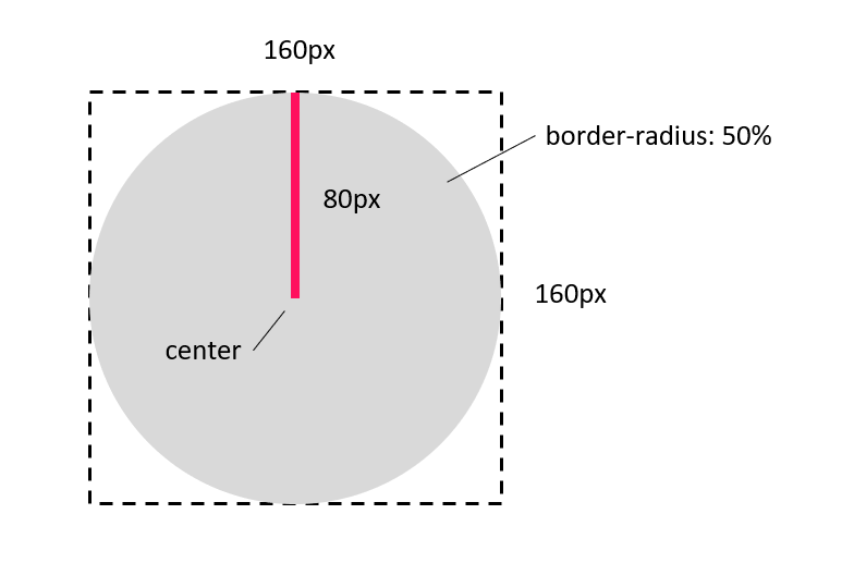
.tsx
hour: css`
	position: absolute;
	width: 160px;
	height: 160px;
	display: flex;
	justify-content: center;
	border-radius: 50%;

	&::before {
		content: '';
		position: absolute;
		width: 8px;
		height: 80px;
		background-color: #ff105e;
		z-index: 11;
		border-radius: 6px;
	}
`