概要
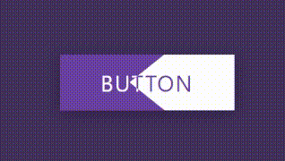
2つの領域をもち、ホバーするとその領域が広がるボタンを実装します。
本記事は、以下の動画をReactに変換したものです。(ほぼ写経です)
スタイリングには、emotion/css(CSS in JS)を使用しています。
実装
.tsx
import React, { VFC } from 'react';
import { css } from '@emotion/css';

export const ClipPathButton: VFC = () => {
	return (
		<div className={styles.container}>
			<a className={styles.link} href="/">
				<span className={styles.text}>Button</span>
				<span className={styles.text}>Button</span>
			</a>
		</div>
	)
}

const styles = {
	container: css`
		position: relative;
		width: 100vw;
		height: 100vh;
		display: flex;
		justify-content: center;
		align-items: center;
		background-color: #43345d;
	`,
	link: css`
		position: relative;
		display: inline-flex;
		width: 250px;
		height: 80px;
		box-shadow: 0 5px 25px rgba(0, 0, 0, 0.25);
	`,
	text: css`
		position: absolute;
		top: 0;
		left: 0;
		width: 100%;
		height: 100%;
		color: #fff;
		background-color: #6c4ba5;
		display: flex;
		justify-content: center;
		align-items: center;
		text-transform: uppercase;
		letter-spacing: 2px;
		font-size: 2rem;

		&:nth-child(2) {
			color: #6c4ba5;
			background-color: #fff;
			overflow: hidden;
			z-index: 2;
			transition: 0.5s;
			clip-path: polygon(60% 0, 100% 0%, 100% 100%, 60% 100%, 40% 50%);
		}
		&:nth-child(2):hover {
			clip-path: polygon(0 0, 100% 0%, 100% 100%, 0 100%, 0 50%);
		}
		&:nth-child(1):hover ~ :nth-child(2) {
			clip-path: polygon(100% 0, 100% 0%, 100% 100%, 100% 100%, 100% 50%);
		}
	`
}
- 背面と前面にColorだけ違う同じテキストを用意します。clip-pathを使用して、その表示領域を調整しています。
- 一般兄弟結合子(~)を使用して、背面のテキスト領域がhoverされたときに、前面のテキスト領域のclip-pathが右端に寄るようにしています。