概要
アニメーションで徐々に組み上がっていく背景イメージを実装します。
JS Animationとありますが、使用するのはCSS Animationです。
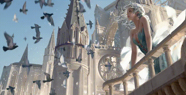
本記事は、以下の動画をReactで実装したものです。
スタイリングには、emotion/css(CSS in JS)を使用しています。
実装
.tsx
import React, { VFC } from 'react';
import { css, keyframes } from '@emotion/css';

export const AnimatedBackgroundImage: VFC = () => {
	const bloks = 400

	return (
		<div className={styles.container}>
			<h2 className={styles.title}>JS Animation</h2>
			<div className={styles.banner}>
				{[...Array(bloks)].map((_, i) => (
					<div key={i} className={styles.block(i * 0.05)}></div>
				))}
			</div>
		</div>
	)
}

const animations = {
	animate: keyframes`
    0% {
      opacity: 0;
      transform: scale(0) translateY(1000px);
    }
    50% {
      opacity: 1;
      background: url('/assets/bg.jpg');
      background-position: center;
      background-attachment: fixed;
    }
    100% {
      opacity: 1;
      transform: scale(1) translateY(0);
      background: url('/assets/bg.jpg');
      background-position: center;
      background-attachment: fixed;
    }
  `
}

const styles = {
	container: css`
		position: relative;
		width: 100vw;
		height: 100vh;
		background-color: #333;
		display: flex;
		justify-content: center;
		align-items: center;
	`,
	title: css`
		position: absolute;
		font-size: 10vw;
		color: #fff;
		font-weight: 700;
	`,
	banner: css`
		position: absolute;
		top: 0;
		left: 0;
		width: 100%;
		height: 100%;
		overflow: hidden;
		display: flex;
		flex-wrap: wrap;
	`,
	block: (delay: number) => css`
		position: relative;
		display: block;
		width: 5vw;
		height: 5vh;
		animation: ${animations.animate} 0.75s ease-in-out ${delay}s forwards;

		&:nth-child(even) {
			animation-duration: 1s;
		}
		&:nth-child(7n + 3) {
			animation-duration: 2.5s;
		}
		&:nth-child(7n + 7) {
			animation-duration: 1.5s;
		}
	`
}
- アニメーション実行時に、イメージを固定しておくのがポイントです。
.tsx
background-position: center;
background-attachment: fixed;