概要
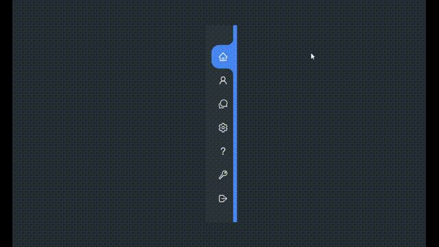
アクティブなタブのコーナーが丸い、サイドナビゲーターを実装します。
本記事は、以下の動画をReactで実装したものです。
スタイリングには、emotion/css(CSS in JS)を使用しています。
アイコンは、react-iconsを使用しています。
実装
.tsx
import React, { useState, VFC } from 'react';
import { AiOutlineHome, AiOutlineUser } from 'react-icons/ai';
import {
	IoChatbubblesOutline, IoHelpOutline, IoKeyOutline, IoLogOutOutline, IoSettingsOutline
} from 'react-icons/io5';
import { IconType } from 'react-icons/lib';
import { css, cx } from '@emotion/css';

export const CurvedOutsideInActiveTab: VFC = () => {
	const [activeItem, setActiveItem] = useState('Home')

	const items: { text: string; icon: IconType }[] = [
		{ text: 'Home', icon: AiOutlineHome },
		{ text: 'Profile', icon: AiOutlineUser },
		{ text: 'Messages', icon: IoChatbubblesOutline },
		{ text: 'Setting', icon: IoSettingsOutline },
		{ text: 'Help', icon: IoHelpOutline },
		{ text: 'Password', icon: IoKeyOutline },
		{ text: 'Sign Out', icon: IoLogOutOutline }
	]

	return (
		<div className={styles.container}>
			<div className={styles.navigation}>
				<ul className={styles.list}>
					{items.map((item, i) => {
						const active = item.text === activeItem
						return (
							<li key={i} className={cx(styles.item, { [styles.activeItem]: active })}>
								<a
									className={cx(styles.link, { [styles.activeLink]: active })}
									href={`#${item.text}`}
									onClick={() => setActiveItem(item.text)}>
									<span className={styles.iconContainer}>
										<item.icon className={styles.icon} />
									</span>
									<span className={styles.text}>{item.text}</span>
								</a>
							</li>
						)
					})}
				</ul>
			</div>
		</div>
	)
}

const styles = {
	container: css`
		position: relative;
		width: 100vw;
		height: 100vh;
		display: flex;
		justify-content: center;
		align-items: center;
		background-color: #232c33;
	`,
	navigation: css`
		position: relative;
		height: 500px;
		width: 70px;
		background-color: #2b343b;
		box-shadow: 10px 0 0 #4187f6;
		border-left: 10px solid #2b343b;
		overflow-x: hidden;
		transition: width 0.5s;

		&:hover {
			width: 300px;
		}
	`,
	list: css`
		position: absolute;
		top: 0;
		left: 0;
		width: 100%;
		padding-left: 5px;
		padding-top: 40px;
	`,
	item: css`
		position: relative;
		list-style: none;
		width: 100%;
		border-top-left-radius: 20px;
		border-bottom-left-radius: 20px;
	`,
	activeItem: css`
		background-color: #4187f6;
	`,
	link: css`
		position: relative;
		width: 100%;
		display: flex;
		text-decoration: none;
		color: #fff;
	`,
	activeLink: css`
		&::after,
		&::before {
			content: '';
			position: absolute;
			right: 0;
			width: 30px;
			height: 30px;
			background-color: #2b343b;
			border-radius: 50%;
		}
		&::after {
			bottom: -30px;
			box-shadow: 15px -15px 0 #4187f6;
		}
		&::before {
			top: -30px;
			box-shadow: 15px 15px 0 #4187f6;
		}
	`,
	iconContainer: css`
		position: relative;
		display: block;
		min-width: 60px;
		height: 60px;
		line-height: 60px;
		text-align: center;
	`,
	icon: css`
		position: relative;
		font-size: 1.6rem;
		z-index: 1;
	`,
	text: css`
		position: relative;
		display: block;
		padding-left: 10px;
		height: 60px;
		line-height: 60px;
		white-space: nowrap;
		font-size: 1rem;
		z-index: 1;
	`
}
-
ReactのuseStateを使用して、アクティブなタブの管理をしています。
実用的な使い方をするなら、アクティブなタブは、Recoilなどでグローバルな状態管理をする設計になると思います。タブを押したタイミングでページが切り替わりナビゲーター自体も再描画されるので、useStateも初期値に戻るからです。 -
emotion/cssのクラスの統合(cx)を使用して、アクティブなタブに専用のスタイルを当てています。
.tsx
<li key={i} className={cx(styles.item, { [styles.activeItem]: active })}>
	<a
		className={cx(styles.link, { [styles.activeLink]: active })}
		href={`#${item.text}`}
		onClick={() => setActiveItem(item.text)}>
		<span className={styles.iconContainer}>
			<item.icon className={styles.icon} />
		</span>
		<span className={styles.text}>{item.text}</span>
	</a>
</li>
- コーナーの丸みの表現は、border-radius・box-shadowを上手く使って表現しています。