概要
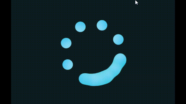
ねばねば結合するLoadingコンポーネントを実装します。
本記事は、以下の動画をReactで実装したものです。
スタイリングには、emotion/css(CSS in JS)を使用しています。
実装
.tsx
import React, { VFC } from 'react';
import { css, cx, keyframes } from '@emotion/css';

export const LiquidLoaderAnimation: VFC = () => {
	const dots = 8
	const rotateDots = 5

	return (
		<div className={styles.container}>
			<svg className={styles.svg}>
				<filter id="gooey">
					<feGaussianBlur in="SourceGraphic" stdDeviation="10" />
					<feColorMatrix
						values="
							1 0 0 0 0
							0 1 0 0 0
							0 0 1 0 0
							0 0 0 20 -10
						"
					/>
				</filter>
			</svg>
			<div className={styles.loader}>
				{[...Array(dots)].map((_, i) => (
					<span key={i} className={styles.dot(45 * i)}></span>
				))}
				{[...Array(rotateDots)].map((_, i) => (
					<span key={i} className={cx(styles.dot(0), styles.rotate(-0.2 * i))}></span>
				))}
			</div>
		</div>
	)
}

const animations = {
	animate: keyframes`
    0% {
      transform: rotate(0deg);
    }
    100% {
      transform: rotate(360deg);
    }
  `
}

const styles = {
	container: css`
		position: relative;
		width: 100vw;
		height: 100vh;
		display: flex;
		justify-content: center;
		align-items: center;
		background-color: #0c1c21;
	`,
	loader: css`
		position: relative;
		width: 250px;
		height: 250px;
		filter: url(#gooey);
		animation: ${animations.animate} 16s linear infinite;
	`,
	dot: (rotate: number) => css`
		position: absolute;
		top: 0;
		left: 0;
		width: 100%;
		height: 100%;
		display: block;
		transform: rotate(${rotate}deg);

		&::before {
			content: '';
			position: absolute;
			top: 0;
			left: calc(50% - 20px);
			width: 40px;
			height: 40px;
			background: linear-gradient(45deg, #c7eeff, #03a9f4);
			border-radius: 50%;
			box-shadow: 0 0 30px #00bcd4;
		}
	`,
	rotate: (delay: number) => css`
		animation: ${animations.animate} 4s ease-in-out infinite;
		animation-delay: calc(${delay}s);
	`,
	svg: css`
		width: 0;
		height: 0;
	`
}
ねばねばしたエフェクト(gooey effect)は、svgの原子フィルター feGaussianBlur・feColorMatrix を使うことで表現しています。
feGaussianBlurでblurをかけて、feColorMatrixで透過部分(blurでぼやけた部分)のコントラストをあげることで、引っ付くような表現をしているようです。
もう少し詳しく知りたい方は、以下の記事が参考になると思います。