はじめに
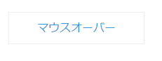
何て表現すれば良いかアレですが、こんなエフェクトを見かけたので再現してみました。マウスオーバーで四方のボーダーがシュッと伸びてきます。Coolデスネ :)
[動作イメージ]

なお実際の動作・ソースは以下で確認ができます
http://codepen.io/nekoneko-wanwan/pen/EVjdvX
http://nekoneko-wanwan.github.io/demo/mouse-action/hover/border/
仕組み
実はアニメーションしているのはborderではなく、幅or高さ1pxの擬似要素です。リンク要素とその内側要素に::before, ::afterを設定して、それぞれ四隅に配置し、:hoverでサイズを100%にする動作をtransitionしているだけです。
コード
.html
<a href="#" class="button change-border01">
  <span class="change-border01__inner">mouse over</span>
</a>
.css
a {
  display: inline-block;
  color: #3498db;
  text-decoration: none;
}
.button {
  border: 1px solid #eee;
  padding: 10px 40px;
  position: relative;
}
/* Effect1
 *************************************** */
/* 擬似要素の共通スタイル */
.change-border01::after,
.change-border01::before,
.change-border01__inner::after,
.change-border01__inner::before {
  background-color: #3498db;
  content: '';
  display: block;
  position: absolute;
  z-index: 10;
  transition: all .3s ease;
  -webkit-transition: all .3s ease;
}
/* 左上へ配置 */
.change-border01::after {
    width: 0px;
    height: 1px;
    top: -1px;
    left: -1px;
}
/* 右下へ配置 */
.change-border01::before {
    width: 0px;
    height: 1px;
    right: -1px;
    bottom: -1px;
}
/* 左下へ配置 */
.change-border01__inner::after {
    width: 1px;
    height: 0px;
    left: -1px;
    bottom: -1px;
}
/* 右上へ配置 */
.change-border01__inner::before {
    width: 1px;
    height: 0px;
    top: -1px;
    right: -1px;
}

/* hover */
.change-border01:hover::after,
.change-border01:hover::before {
  width: 100%;
  width: calc(100% + 1px);
}
.change-border01:hover .change-border01__inner::after,
.change-border01:hover .change-border01__inner::before {
  height: 100%;
  height: calc(100% + 1px);
}
ポイント
- 色を変える場合は、擬似要素の
background-colorを変更します - borderの太さを変える場合は、擬似要素の
heightorwidthを変更します -
calc(100% + 1px)は、隙間を埋めるために指定しています - 四隅だけでなく配置する位置を変えるとまた面白い動きができるかもしれません
- 角丸には対応できないのが残念
[逆バージョン]
応用
応用として少しアニメーションの仕方を変えてみます。
[動作イメージ]

- 各擬似要素の発動タイミングを
duration-delayでズラす - hover時は
transition:none;をすることで、マウスアウトのみにアニメーションさせる
.css
.change-border01::after {
// 省略
  transition-delay: .9s;
}
.change-border01::before {
// 省略
  transition-delay: .3s;
}
.change-border01__inner::after {
// 省略
  transition-delay: 0s;
}
.change-border01__inner::before {
// 省略
  transition-delay: .6s;
}
/* hover */
.change-border01:hover::after,
.change-border01:hover::before,
.change-border01:hover .change-border01__inner::after,
.change-border01:hover .change-border01__inner::before {
  transition: none;
}