matplotlib
Python におけるグラフ作成ライブラリーとして、デファクトスタンダードの地位を獲得している matplotlib ですが、MATLAB の使い勝手をコピーした Pyplot API と Object-Oriented API とで構成されていて、コードでの呼出しスタイルが多様に混在していてます。一からコードを書かずに、ネット上のデモコードを流用して、手早く何かをつくろう、というアプローチを取ると、コーディングスタイルの統一が失われがちです。fig.plot() と ax.plot() とが入り混じりがち。
そこで、このメモでは、matplotlib の多様なコーディングスタイルの中で首尾一貫したスタイルでコーディングするための一例として、自分用のガイドラインを記載します。
この記事では Windows 10 Home にanacona でインストールした python 3.6 と matplotlib 2.1.2, Spyder 3.2.6, ipython 6.2.1, jupyter 1.0.0 で動作を確認した内容を書いていきます。
モジュールの使い方
インポートのスタイル
モジュールをインポートするときには、
import matplotlib.pyplot as plt
import numpy as np
というスタイルでインポートして1、利用コードの中では plt というプレフィックスを使うスタイルを原則とします。名前空間のコンタミネーションを回避し、どこから導入した関数やオブジェクトかを意識して使うためのスタイルです。
plt.subplots で figure と ax を作ろう
fig, ax = plt.subplots(1, 1, figsize=(8, 6)) として、figure と Axes のタプルを作ります。figure のサイズのデフォルト値は plt.rcParams['figure.figsize'] で、インストール状態では [6.0, 4.0] (単位はインチ)です。figure は、ここで描画する絵全体を指し、figure の内部に、一つ以上の Axes (座標軸)を配置することができます。
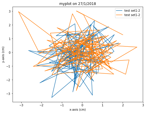
グラフ1枚のプロット
figure の中に一つだけプロットがある場合は、次のようなコードになります。
import matplotlib.pyplot as plt
import numpy as np

import datetime # example of generating dynamic title text

data1, data2, data3, data4 = np.random.randn(4, 100)
fig, ax = plt.subplots(1, 1, figsize=(8, 6))
# fig, ax = plt.subplots(1, 1, figsize=(8, 6), subplot_kw={'aspect': 1})
ax.plot(data1, data2, label="test set1-2")
ax.plot(data3, data4, label="test set1-2")
ax.set_xlabel('x-axis (cm)')
ax.set_ylabel('y-axis (cm)')
dt = datetime.date.today()
title = 'myplot on {0}/{1}/{2}'.format(dt.day, dt.month, dt.year)
ax.set_title(title)
ax.legend(loc='upper right')
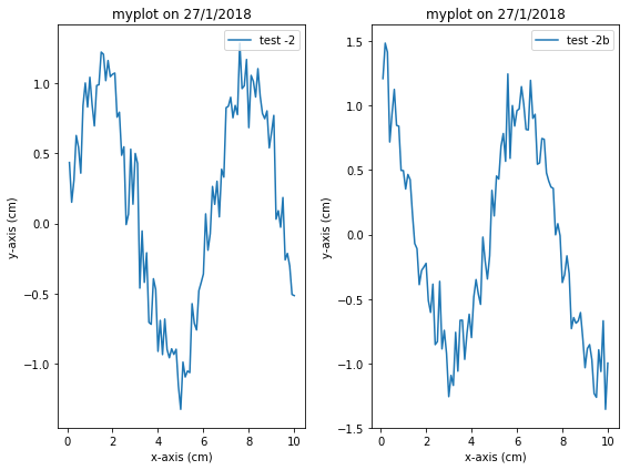
グラフ複数枚のプロット
subplots の引数で、axes の array を作ります。
fig, axlst = plt.subplots(2, 3, figsize=(8, 6))
ax_lst.shape   # (2, 3) 2 行 3 列の Axes の array を生成する例
例えばこんなコードです。
import matplotlib.pyplot as plt
import numpy as np

fig, ax_lst = plt.subplots(1, 2, figsize=(8, 6))
ax_lst[0].plot(np.arange(0.1, 10.01, 0.1), np.sin(np.arange(0.1, 10.01, 0.1))+data3/6.,
        label="test -2")
dt = datetime.date.today()
title = 'myplot on {0}/{1}/{2}'.format(dt.day, dt.month, dt.year)
ax_lst[0].set_xlabel('x-axis (cm)')
ax_lst[0].set_ylabel('y-axis (cm)')
ax_lst[0].set_title(title)
ax_lst[0].legend(loc='upper right')
ax_lst[1].plot(np.arange(0.1, 10.01, 0.1), np.cos(np.arange(0.1, 10.01, 0.1))+data4/6.,
        label="test -2b")
ax_lst[1].set_xlabel('x-axis (cm)')
ax_lst[1].set_ylabel('y-axis (cm)')
ax_lst[1].set_title(title)
ax_lst[1].legend(loc='upper right')
fig.tight_layout()     #adjust the space between axis
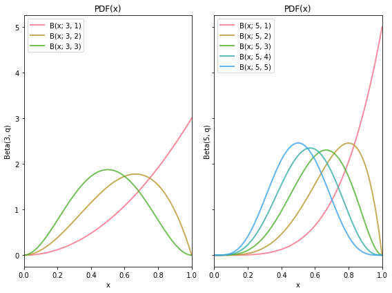
配色 ー seaborn の利用
配色は後からリリースされた seaborn の方が、よく考えられているので、seaborn のパレットを使う。
import matplotlib.pyplot as plt
import numpy as np
import scipy.stats
import seaborn as sns

sns.set_palette("husl")
plt.rcParams["font.size"] = 16 # pt で指定
fig, ax_lst = plt.subplots(1, 2, figsize=(8, 6), sharey=True)

xary = np.linspace(0., 1., 51)
abset3 = [3, 1], [3, 2], [3, 3]
for a, b in abset3:
    rv = scipy.stats.beta(a, b)
    ax_lst[0].plot(xary, rv.pdf(xary), lw=2, label="B(x; {}, {})".format(a, b), alpha=0.8)

ax_lst[0].set_xlabel('x')
ax_lst[0].set_ylabel('Beta(3, q)')
ax_lst[0].set_title("PDF(x)")
ax_lst[0].set_xlim((0, 1))
ax_lst[0].legend(loc='upper left')
# ax_lst[0].tick_params(labelsize='large', width=3) #(tick のフォント指定のキーワード)

abset5 = [5, 1], [5, 2], [5, 3], [5, 4], [5, 5]
for a, b in abset5:
    rv = scipy.stats.beta(a, b)
    ax_lst[1].plot(xary, rv.pdf(xary), lw=2, label="B(x; {}, {})".format(a, b), alpha=0.8)

ax_lst[1].set_xlabel('x')
ax_lst[1].set_ylabel('Beta(5, q)')
ax_lst[1].set_title("PDF(x)")
ax_lst[1].set_xlim((0, 1))
ax_lst[1].legend(loc='upper left')

fig.tight_layout()     #adjust the space between axis
fig.show()
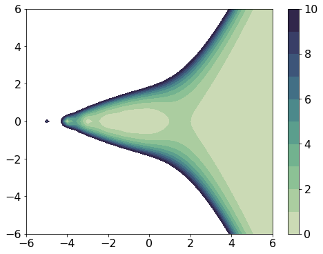
等高線図の塗分け
白黒画像にしても、違いが見えるという cubehelix_palette を使用する
import matplotlib.pyplot as plt
import numpy as np
import scipy.special as spec
import seaborn as sns

fig, ax_lst = plt.subplots(1, 1, figsize=(8, 6),)

x = y = np.linspace(-6.0, 6.0, 61)
X, Y = np.meshgrid(x, y)
Z = spec.gamma(X + 1j*Y + 1.e-4) # 1/Z の発散回避
zinv = 1 / Z
origin = "lower"
levels = [0, 1, 2, 3, 4, 5, 6, 7, 8, 9, 10]

cm = sns.cubehelix_palette(11, start=.5, rot=-.75, as_cmap=True)

CS = ax_lst.contourf(X, Y, np.abs(zinv), levels, cmap=cm, origin=origin)
cbar = fig.colorbar(CS)

fig.show()
数値が大きい方が色が濃いのに、10 以上のところが、白飛びしてしまうので、カラーバーが最大値をカバーできるように使うのが良い。(この場合、全部を入れると原点付近の構造が見えなくなる)
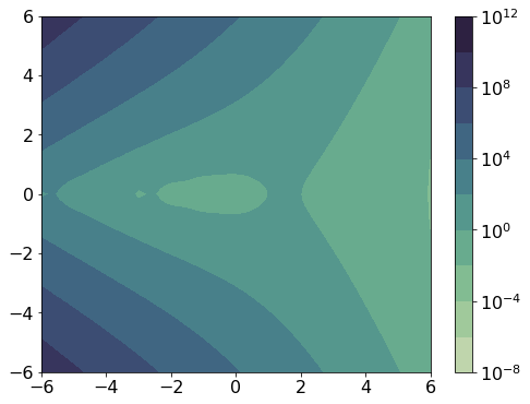
等高線の間隔を等比級数にすれば、全体像が見える。
import matplotlib.pyplot as plt
import numpy as np
import scipy.special as spec
import seaborn as sns
import matplotlib.ticker as ticker

fig, ax_lst = plt.subplots(1, 1, figsize=(8, 6))

x = y = np.linspace(-6.0, 6.0, 61)
X, Y = np.meshgrid(x, y)
Z = spec.gamma(X + 1j*Y + 1.e-5)
zinv = np.abs(1 / Z)
origin = "lower"
levels = [0, 1, 2, 3, 4, 5, 6, 7, 8, 9, 10]
cm = sns.cubehelix_palette(11, start=.5, rot=-.75, as_cmap=True)
CS = ax_lst.contourf(X, Y, zinv, locator=ticker.LogLocator(), cmap=cm, origin=origin)
cbar = fig.colorbar(CS)

fig.show()
-
from matplotlib import pyplot as pltでも、同じ結果になります。ただ、他のモジュールのインポートをしたときに、from の行とimport の行が並ぶのを好まなければ、import で通すのも手です。 ↩