よく使うFlexboxですが、時々、あれ?思う通りにいかないってことがあったりするので、いまいちどチートシートを参考に勉強。
参照
クリエイターボックスさんのチートシート
https://www.webcreatorbox.com/tech/css-flexbox-cheat-sheet
基本の書き方
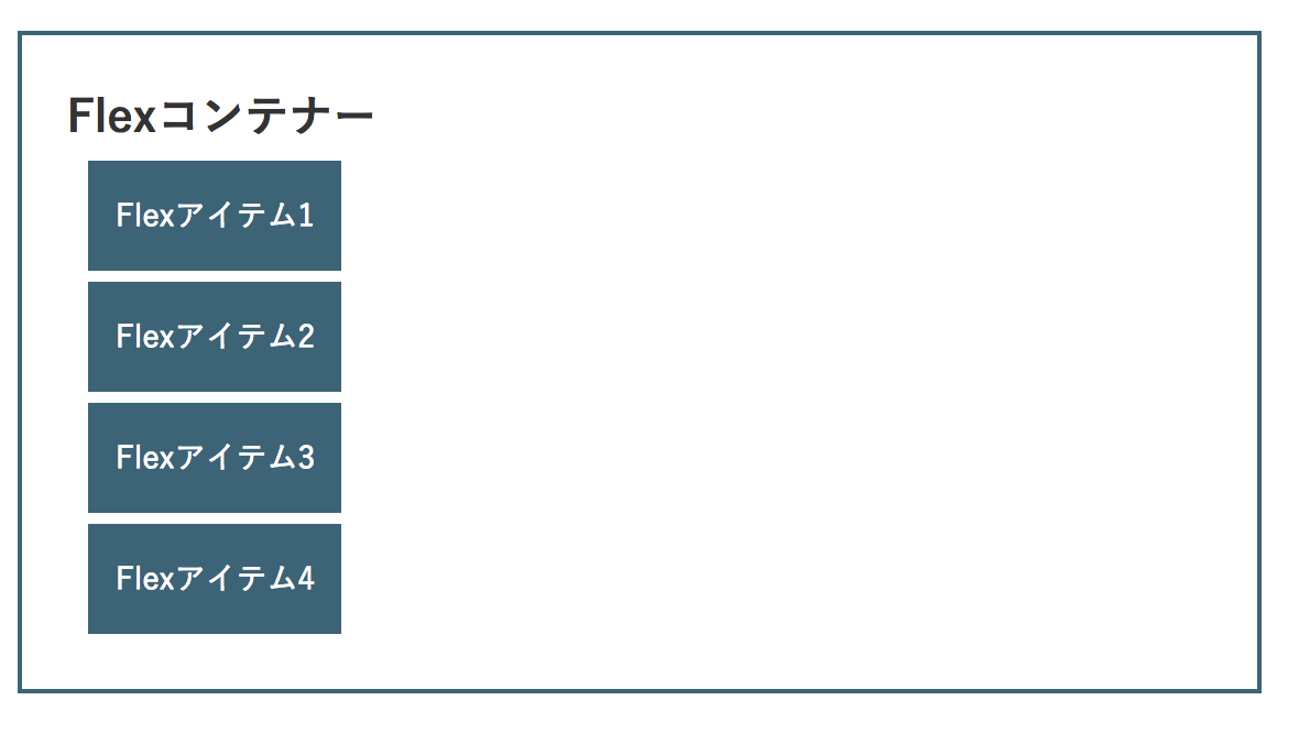
・ Flexコンテナー(親要素)
・Flexアイテム(子要素)
.container Flexコンテナー
  .item Flexアイテム1
  .item Flexアイテム2
  .item Flexアイテム3
  .item Flexアイテム4
Flexコンテナー(親要素)に指定するプロパティ
・ display:flex;
要素を横並びにする
インライン要素に使うときはdisplay:inline-flex;

・ flex-direction
子要素の並ぶ向きを指定する
flex-direction:row(初期値)

flex-direction:row-reverse

flex-direction:column

flex-direction:column-reverse

・ flex-wrap
こ要素を一行もしくは折り返して複数行に配置するかどうかを指定する
子要素が親要素の幅に収まらなくなった場合、折り返して複数行に配置される
flex-wrap:nowrap(初期値)
flex-wrap:wrap

flex-wrap:wrap-reverse

・ justify-content
水平方向の揃えを指定する
justify-content:flex-start(初期値)
左揃え
justify-content:flex-end
右揃え

justify-content:center
中央揃え

justify-content:space-between
最初と最後の子要素を両端に配置し、残りの要素は均等に間隔をあけて配置

justify-content:space-around
両端の子要素も含め、均等に間隔をあけて配置

・ align-items
垂直方向の揃え
align-items:stretch
親要素の高さ、またはコンテンツの一番多い子要素の高さに合わせて広げて配置

align-items:flex-start
親要素の開始位置から配置。上揃え。

align-items:flex-end
親要素の終点から配置。下揃え。

align-items:center
中央揃え

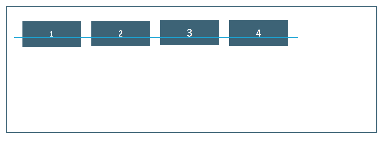
align-items:baseline
ベースラインで揃える
・ align-content
複数行にした時の揃えを指定する
※flex-wrap: nowrap; が適応されていると子要素が一行になるので、align-content は無効になる。
align-content:stretch

align-content:flex-start

align-content:flex-end

align-content:center

align-content:space-between

align-content:space-around
