はじめに
tailwind cssで自分が忘れがちなユーティリティを随時書く。
justify-between
justify-betweenをもつ親要素、の中にある子要素を均等に配置する。flexで横並びにする必要あり。

<div className="flex justify-between p-5">
    <div>A</div>
    <div>B</div>
    <div>C</div>
</div>
下記のように子要素を二つにして、二つ目の子要素に要素を複数持たせるとヘッダーが作れる。

  <div className="flex justify-between bg-gray-200 p-5">
    <div className="bg-green-400 text-white p-2 rounded-md font-bold">
      Qiita
    </div>
    <div className="flex gap-3">
      <div className="bg-white text-black p-2 rounded-md font-bold">
        下書き保存
      </div>
      <div className="bg-green-400 text-white p-2 rounded-md font-bold">
        公開設定
      </div>
    </div>
  </div>
flex-wrap
入りきらない要素がある場合に折り返してくれる。

  <div className="flex flex-wrap p-5 gap-5">
    <div className="p-10 bg-yellow-200">A</div>
    <div className="p-10 bg-yellow-200">B</div>
    <div className="p-10 bg-yellow-200">C</div>
    <div className="p-10 bg-yellow-200">D</div>
    <div className="p-10 bg-yellow-200">E</div>
    <div className="p-10 bg-yellow-200">F</div>
    <div className="p-10 bg-yellow-200">G</div>
    <div className="p-10 bg-yellow-200">H</div>
    <div className="p-10 bg-yellow-200">I</div>
  </div>
flex-wrapを書いていない場合は、折り返すことなく横スクロールバーが出現する。
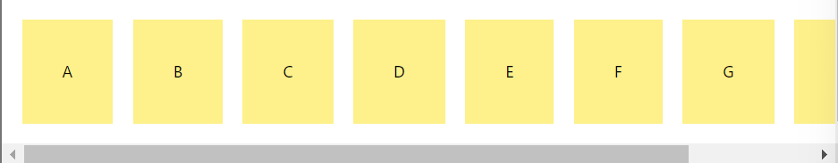
  <div className="flex p-5 gap-5">
    <div className="p-10 bg-yellow-200">A</div>
    <div className="p-10 bg-yellow-200">B</div>
    <div className="p-10 bg-yellow-200">C</div>
    <div className="p-10 bg-yellow-200">D</div>
    <div className="p-10 bg-yellow-200">E</div>
    <div className="p-10 bg-yellow-200">F</div>
    <div className="p-10 bg-yellow-200">G</div>
    <div className="p-10 bg-yellow-200">H</div>
    <div className="p-10 bg-yellow-200">I</div>
  </div>
上下左右中央に配置

<div className="h-screen w-screen flex justify-center items-center">
  <div className="bg-gray-300 p-10">A</div>
</div>
フォントサイズ
- text-xs
- text-sm
- text-base
- text-lg
- text-xl
- text-2xl
- ~
- text-9xl