直接的に役に立つことはあまり無さそうですが、CSSのデザインのアイデアの一つとして記述します。
結果から
将棋盤のイメージを作りました。
ソースはCodePenで公開しています。
https://codepen.io/nakyos/pen/RKJKEL
※以下は、Windows10、Chromeで表示した際のスクリーンショットです。
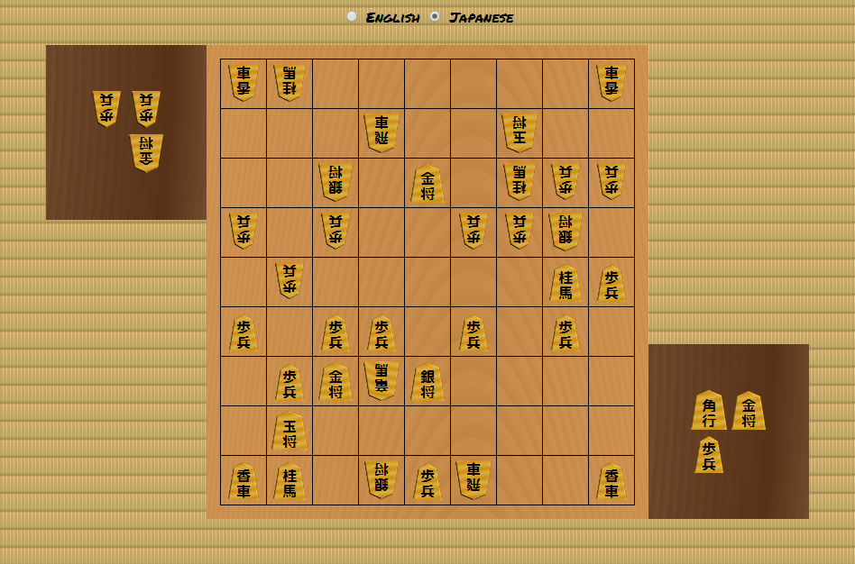
盤
素材:榧
木目:板目
※柾目のほうが高級ですが、デザインとして面白い板目を選択しました。
css
# board {
  background:
    linear-gradient(
      90deg,
      rgba(208, 147, 82, 0.6),
      rgba(192, 134, 70, 0.6) 60%,
      rgba(208, 147, 82, 0.6)
    ),
    repeating-radial-gradient(
      ellipse at 60% 500%,
      #c08646,
      #c08646 0.2%,
      #d09352 0.6%,
      #d09352 1%
    );
}
repeating-radial-gradientで、板目の楕円形を表現しています。
ただ、それだけだとクッキリし過ぎていたので、linear-gradientを重ねて程良くボヤけさせてみました。
駒台
素材:桂
木目:柾目
css
.stand {
  background:
    repeating-radial-gradient(
      circle at -1000% 0%,
      rgba(116, 77, 48, 0.7),
      #573216 7.5%,
      rgba(116, 77, 48, 0.9) 10%
    ),
    repeating-radial-gradient(
      circle at -1000% 0%,
      #573216,
      #573216 0.1%,
      #744d30 0.4%,
      #744d30 0.5%
    );
}
2つ目のrepeating-radial-gradientで、板目の直線に近い円形を表現しています。
ただ、それだけだとあまりにも規則的で人工的な印象になったので、1つ目のrepeating-radial-gradientを重ねて全体に濃淡の差を付けてみました。
畳
素材:い草
css
body {
  background:
    linear-gradient(
      0deg,
      rgba(139, 126, 74, 0.8),
      rgba(168, 157, 95, 0.6) 10%,
      rgba(168, 157, 95, 0.2) 90%,
      rgba(139, 126, 74, 0.8)
    ),
    linear-gradient(
      90deg,
      #f9daa4,
      #f9daa4 25%,
      #cea660 25%,
      #cea660 50%,
      #ddba78 50%,
      #ddba78 75%,
      #c69f5a 75%,
      #c69f5a
    );
  background-size: 4px 20px;
}
細かい縦と横のlinear-gradientを重ねて表現しています。
グラデーションの上下で少しだけ濃さを変え、上から光が差している状況をイメージしました。