本稿は、SwiftUIに限らず Storyboardを使用した場合でも当てはまり、
iOS / macOS とも共通の内容である。
等幅フォントの見た目
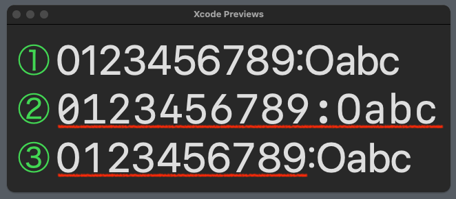
例を示すまでもないが、上図の②と③の数字部分が等幅フォントである。
(赤線部分)
コード
①
Text("0123456789:Oabc")
    .font(.system(size: 60))
②
Text("0123456789:Oabc")
    .font(.system(size: 60, weight: .regular, design: .monospaced))
// OR
//  .font(Font(UIFont.monospacedSystemFont(ofSize: 60, weight: .regular)))
③
Text("0123456789:Oabc")
    .font(Font(UIFont.monospacedDigitSystemFont(ofSize: 60, weight: .regular)))
macOSの場合は、UIFontをNSFontに書き換える。
ソースコードを共有する場合は、次の#ifで切り替えるとよい。
#if os(macOS)
typealias UIFont = NSFont
#endif
考察
-
②は数字も含めて記号やアルファベットもすべて等幅表示だが、①のプロポーショナルフォントと比べると、数字もアルファベットも書体が異なる
-
③は数字だけが等幅表示で、記号やアルファベットはプロポーショナルである。書体は①と同じに見える
結論
数字の等幅表示に関しては、③を使うことにする。(個人的な見解)
以上