宣言的UIであるFlutterとSwiftUiの実装を比較してみました。典型的なUIの実装比較では実戦で使えないと思ったので、実際に存在しているアプリのUIをオマージュすることで、より実践的な、実務に近いソースコードを掲載できるようにしました。
まずは、完成画像を見てください。当然のことですが、FlutterとSwiftUi共に某ポータルサイトのUIをほぼ完璧に再現できました。
ただ、できそうでできなかったこともあるので、それは記事のなかでふれます。
完成版
Flutter
 ## SwiftUi

それでは順番に実装を比較していきましょう。
UIの土台
各UI componentを構成するために必要な土台について比較します。共に決まった書き方があります。
まず、Flutterです。
Flutterには MaterialApp class が用意されています。全てのappは、このclassのconstructorにthemeやhome等を渡すことから始まります。theme property はapp共通のcolorやfontを適用するためのものです。home property には最初に表示する画面classを適用します。
theme property には LightTheme.pattern(context) を適用し、darkTheme propertyには DarkTheme.pattern(context) を適用しています。 これはFlutterはiOSのlight modeとdark modeに容易に対応できることを意味します。
home property には、 TopScreen object を適用し、これが全てのUIの始まりとなります。
class MyApp extends StatelessWidget {
  @override
  Widget build(BuildContext context) {
    return MaterialApp(
      title: 'App Name',
      theme: LightTheme.pattern(context),
      darkTheme: DarkTheme.pattern(context),
      home: TopScreen(),
    );
  }
}
次は、SwiftUiです。
SwiftUiでは SceneDelegate class で最初の画面である TopView object を生成します。
TopView object は UIWindow class の rootViewController property に適用します。
class SceneDelegate: UIResponder, UIWindowSceneDelegate {
    var window: UIWindow?
    func scene(_ scene: UIScene, willConnectTo session: UISceneSession, options connectionOptions: UIScene.ConnectionOptions) {
        let topView = TopView()

        if let windowScene = scene as? UIWindowScene {
            let window = UIWindow(windowScene: windowScene)
            window.rootViewController = UIHostingController(rootView: topView)
            self.window = window
            window.makeKeyAndVisible()
        }
    }
}
FlutterとSwiftUi共に決まった記述方法です。Flutterと異なり、SwiftUiは、App共通のcolorやfontを指定することはできません。
次に、画面下部の「ホーム」、「ツール」、「お知らせ」、「その他」の4画面への遷移を行うtabの実装です。
まず、Flutterです。
Flutterには、material design の足場となる、Scaffold class が用意されています。Scaffold class には appBar property、body property、bottomNavigationBar property があり、これらにWidgetを適用すると画面UIの出来上がります。appBar property はアプリの上部になり、画面のtitleやback buttonが配置されます。body property はこの画面のmain contentが配置されます。bottomNavigationBar property は「ホーム」、「ツール」、「お知らせ」、「その他」の4画面への遷移を行うtabが配置されます。appBar property や bottomNavigationBar property は画面上部と下部に固定されてしまうので、配置するWidgetには注意が必要です。うっかり input fieldのある画面で bottomNavigationBar property にsend buttonを配置してしまうと、keyboardがbuttonと重なってしまい、send buttonが押せないという事態になりかねません。
tab表現は BottomNavigationBar class を使用します。BottomNavigationBar class には、tab用のWidgetをListにして適用します。tab tapでの画面遷移は onTap property で tap eventと何番目のtabがtapされたかの情報を受け取って、この情報で、遷移先の画面をハンドリングします。 BottomNavigationBar class を bottomNavigationBar property に適用すると画面下部のtab表現を実現できます。
class TopScreen extends StatelessWidget {
  @override
  Widget build(BuildContext context) {
    return _LayoutWidget();
  }
}

class _LayoutWidget extends StatelessWidget {
  @override
  Widget build(BuildContext context) {
    return Scaffold(
        appBar: _appBar(),
        body: HomeScreen(),
        bottomNavigationBar: _bottomNavigationBar(context));
  }

  void _tap(BuildContext context, StatelessWidget screen) {
    Navigator.of(context).push(MaterialPageRoute(builder: (context) {
      return screen;
    }));
  }

  AppBar _appBar() {
    return AppBar(
        titleSpacing: 5.0,
        elevation: 0.0,
        title: SearchBar(),
        actions: [
          IconButton(
              icon: Icon(Icons.filter_none, color: Colors.grey),
              onPressed: () => null),
        ],
        backgroundColor: Colors.white,
        bottom: PreferredSize(
            child: Container(
              color: Color(0xffC0C0C0),
              height: 0.4,
            ),
            preferredSize: Size.fromHeight(0.4)));
  }

  Widget _bottomNavigationBar(BuildContext context) {
    return Container(
        decoration: BoxDecoration(color: Colors.transparent, boxShadow: [
          BoxShadow(
              color: Colors.transparent, spreadRadius: 0, blurRadius: 0)
        ]),
        child: SizedBox(
            height: 100,
            child: BottomNavigationBar(
                type: BottomNavigationBarType.fixed,
                iconSize: 30,
                selectedItemColor: Colors.red,
                unselectedItemColor: Colors.grey,
                onTap: (int index) {
                  switch (index) {
                    case 0:
                      _tap(context, HomeScreen());
                      break;
                    case 1:
                      _tap(context, ToolScreen());
                      break;
                    case 2:
                      _tap(context, InformationScreen());
                      break;
                    case 3:
                      _tap(context, OtherScreen());
                      break;
                  }
                },
                items: <BottomNavigationBarItem>[
                  _bottomNavigationBarItem(Icons.home, 'ホーム'),
                  _bottomNavigationBarItem(Icons.view_module, 'ツール'),
                  _bottomNavigationBarItem(Icons.notifications, 'お知らせ'),
                  _bottomNavigationBarItem(Icons.more_horiz, 'その他'),
                ])));
  }

  BottomNavigationBarItem _bottomNavigationBarItem(
      IconData icon, String label) {
    return BottomNavigationBarItem(
      icon: Stack(children: [
        Padding(
          padding: EdgeInsets.only(left: 4, right: 4),
          child: Icon(icon),
        ),
        Positioned(
            right: 0,
            child: Container(
                decoration: BoxDecoration(
                    color: Colors.red, borderRadius: BorderRadius.circular(4)),
                constraints: BoxConstraints(minHeight: 8, minWidth: 8),
                child: Container()))
      ]),
      title: Text(label, style: TextStyle(fontSize: 10)),
    );
  }
}
Scaffold class の appBar property には、_appBar function を適用し、 body property には、 HomeScreen instance を適用します。また、bottomNavigationBar property には _bottomNavigationBarItem functionを適用しています。宣言的UIは階層が深くなりがちなので、可能な限り小分けにして、ソースの見通しを良くしています。_appBar function には後述する SearchBar instance を配置しています。シンプルに画面上部にWidgetを配置したい時は、appBar propertyを使いましょう。面倒なpaddingやmarginでの微調整が不要になります。
次に、SwiftUiです。
SwiftUiには、Flutterの Scaffold class のようなものはありません。 TabView class を使って、tab表現を実現します。TabView class はtab tapで遷移したい画面classを適用するだけで、画面遷移を実現してくれます。FlutterのBottomNavigationBar classのように、tap eventで画面遷移をハンドリングする必要ありません。
struct TopView: View {
    var body: some View {
        TabView{
             HomeScreen()
                 .tabItem {
                     VStack {
                         Image(systemName: "house.fill")
                         Text("ホーム")
                     }
             }.tag(1)
             ToolScreen()
                 .tabItem {
                     VStack {
                         Image(systemName: "square.grid.2x2.fill")
                         Text("ツール")
                     }
             }.tag(2)
             InformationScreen()
                 .tabItem {
                     VStack {
                         Image(systemName: "bell.fill")
                         Text("お知らせ")
                     }
             }.tag(3)
             OtherScreen()
                 .tabItem {
                     VStack {
                         Image(systemName: "ellipsis")
                         Text("その他")
                     }
             }.tag(4)
         }
    }
}

struct TopView_Previews: PreviewProvider {
    static var previews: some View {
        TopView()
    }
}
SwiftUiでは TabView class がある程度UIを整えてくれるので、ソースはシンプルです。Flutterでは、paddingやtextStyleを適用しているためソースが複雑に見えます。あと、SwiftUiの TabView class はbackgroundがdefualtで若干透過になっています。オマージュしたポータルアプリもtab部分のbackgroundが若干透過になっていました。なので、SwiftUiの場合は何も考えることなく実現できました。
一方、Flutterの BottomNavigationBar class では実現できませんでした。
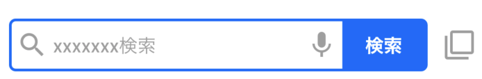
SearchBar
flutter
SwiftUi
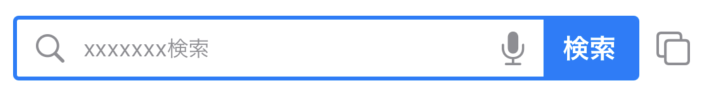
画面上部の検索枠の実装を比較します。
Flutter、SwiftUi共に、検索枠ようのclass(or struct)として SearchBar object を作成しました。Flutterの場合は、これを前述の Scaffold class の appBar property に適用します。これでだけで画面上部に良い感じに表示してくれます。
SwiftUiでは、Scaffold class のように画面UIを構築するためのclassは用意されていないので、普通に、画面の一要素として、適用します。VStack struct の先頭に配置することで、画面上部に表示します。
それでは、SearchBar object の中身を見ていきましょう。
まず、Flutterです。FlutterではUIをWidgetと表現します。
ソースでは build function のreturn値としてWidgetを作成します。 Widgetはたくさん用意されていますが、他のWidgetのベースとなるWidgetが Container widget です。私は 頻繁に、Container widget を使って、Widget全体のサイズや、背景色を決定します。今回は、Container widget の decoration property で検索枠の青枠を作成します。また、width property には、最大サイズとなる double.infinity を適用しました。これにより画面サイズが大きくなっても、そのサイズに合わせて検索枠のサイズを調整できるようになります。
class SearchBar extends StatelessWidget {
  @override
  Widget build(BuildContext context) {
    return Container(
      height: 40,
      width: double.infinity,
      decoration: BoxDecoration(
          border: Border.all(color: Color(0xff0066FF), width: 2),
          borderRadius: BorderRadius.circular(5)),
      child: Row(
        children: [
          Expanded(flex: 1, child: Icon(Icons.search, color: Colors.grey)),
          Expanded(
              flex: 6,
              child: Text("xxxxxxx検索",
                  style: TextStyle(color: Colors.grey, fontSize: 14))),
          Expanded(flex: 1, child: Icon(Icons.mic, color: Colors.grey)),
          Expanded(
              flex: 2,
              child: FlatButton(
                  shape: RoundedRectangleBorder(
                      borderRadius: BorderRadius.all(Radius.circular(0.0))),
                  color: Color(0xff0066FF),
                  child: Text("検索",
                      style: TextStyle(
                          color: Colors.white,
                          fontSize: 16,
                          fontWeight: FontWeight.bold)),
                  onPressed: () => {}))
        ],
      ),
    );
  }
}
次に、SwiftUiです。
HStack struct をベースにUIを構成していきます。HStack struct はFlutterでいうところの Row widget です。
HStack struct はデフォルトでcomponent間に隙間ができてしまうので、パラメータspacingに0を適用して隙間ができないようにしています。個人的にはspacingはdefault 0でいい気がしています。
struct SearchBar: View {
    fileprivate func searchBar() -> some View {
        return HStack(spacing: 0) {
            HStack(spacing: 0) {
                Spacer().frame(width:10)
                Image(systemName:"magnifyingglass")
                    .resizable()
                    .frame(width: 15, height: 15)
                    .foregroundColor(.gray)
                Spacer().frame(width:10)
                Text("xxxxxxx検索")
                    .foregroundColor(Color.gray)
                    .font(.system(size: 12))
                Spacer()
                Image(systemName:"mic.fill" ).foregroundColor(.gray)
                Spacer().frame(width:10)
                Button(action: {}) {
                    Text("検索")
                        .foregroundColor(Color.white)
                        .font(.system(size: 15))
                        .fontWeight(.bold)
                }
                .padding(EdgeInsets(top: 6, leading: 10, bottom: 6, trailing: 10))
                .background(Color.blue)
            }
            .frame(maxWidth: .infinity)
            .padding(EdgeInsets(top: 1, leading: 1, bottom: 1, trailing: 1))
            .overlay(
                RoundedRectangle(cornerRadius: 2)
                    .stroke(Color.blue, lineWidth: 2)
            )
            Spacer().frame(width: 10)
            Image(systemName:"square.on.square" ).foregroundColor(.gray)
        }
        .padding(EdgeInsets(top: 0, leading: 10, bottom: 5, trailing: 10))
    }

    var body: some View {
        VStack(spacing: 0.0) {
            searchBar()
        }
    }
}
ログイン・ID取得
flutter
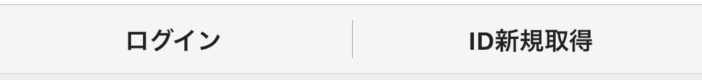
SwiftUi

まずは、Flutterです。
Container widget の中に、Row widget でログインボタンとID新規登録ボタンを横に並べています。ボタンには FlatButton widget を使いました。ログインボタンとID新規登録ボタンの間にあるグレーのセパレータの実現方法を少し迷いました。横線であれば Divider class で簡単に実現できますが、縦線となるとそうはいきませんでした。結論としては、Container widget に height: 20.0, width: 0.4, color: Colors.grey を適用して縦向きのセパレータを実現しました。
class Login extends StatelessWidget {
  @override
  Widget build(BuildContext context) {
    return Container(
        decoration: BoxDecoration(
          border:
              Border(bottom: BorderSide(width: 0.4, color: Color(0xffC0C0C0))),
        ),
        child: Row(children: [
          Expanded(
              flex: 1,
              child: FlatButton(
                  materialTapTargetSize: MaterialTapTargetSize.shrinkWrap,
                  shape: RoundedRectangleBorder(),
                  color: Color(0xffF5F5F5),
                  child: Text("ログイン",
                      style: TextStyle(
                          color: Colors.black87,
                          fontSize: 13,
                          fontWeight: FontWeight.bold)),
                  onPressed: () => {})),
          Container(height: 20.0, width: 0.4, color: Colors.grey),
          Expanded(
              flex: 1,
              child: FlatButton(
                  materialTapTargetSize: MaterialTapTargetSize.shrinkWrap,
                  shape: RoundedRectangleBorder(),
                  color: Color(0xffF5F5F5),
                  child: Text("ID新規取得",
                      style: TextStyle(
                          color: Colors.black87,
                          fontSize: 13,
                          fontWeight: FontWeight.bold)),
                  onPressed: () => {}))
        ]));
  }
}
次に、SwiftUiです。
HStack struct の中に Button struct を配置しています。Flutterで少し苦戦した縦線については、SwiftUiでは、Divider() と書くだけで実現できました。HStack struct で、配下のcomponentの配置位置の指定と自分自身の装飾が指定できるのは便利だと思いました。Flutterでは、Container widget を使って装飾する必要がありますので、SwiftUiの方がFlutterよりソースの階層を浅くできそうです。
struct Login: View {
    fileprivate func login() -> some View {
        return HStack {
            Button(action: {}){
                Text("ログイン")
                .foregroundColor(Color.black)
                .font(.system(size: 12))
            }
            .frame(maxWidth: .infinity, maxHeight: .infinity)
            Divider()
            Button(action: {}){
                Text("ID新規取得")
                .foregroundColor(Color.black)
                .font(.system(size: 12))
            }
            .frame(maxWidth: .infinity, maxHeight: .infinity)
        }
        .padding(EdgeInsets(top: 7, leading: 0, bottom: 7, trailing: 0))
        .frame(height: 30.0, alignment: .center)
        .frame(maxWidth: .infinity)
        .background(Color.init(hex: "eee"))
        .border(Color.init(hex: "bbb"), width: 0.5)
    }

    var body: some View {
        VStack(spacing: 0.0) {
            login()
        }
    }
}
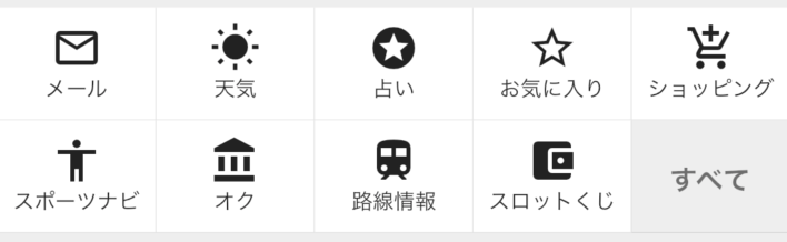
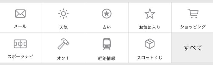
タイルメニュー : メール、天気、占い等
flutter
SwiftUi
まずは、Flutterです。
Column widget 配下に Row widget を二つ配置することで、2列のメニューを表現します。Row widget の children には、各メニューのwidgetを設定しますが、 widgetは共通のfunctionで生成可能です。 この共通functionを使用するために、widget tree 内でループ処理を行いたいので、 List class のconstractorである generate を使用しました。
class Menu1 extends StatelessWidget {
  final List<Map<String, dynamic>> menuData1 = [
    {"icon": Icons.mail_outline, "text": "メール"},
    {"icon": Icons.wb_sunny, "text": "天気"},
    {"icon": Icons.stars, "text": "占い"},
    {"icon": Icons.star_border, "text": "お気に入り"},
    {"icon": Icons.add_shopping_cart, "text": "ショッピング"}
  ];

  final List<Map<String, dynamic>> menuData2 = [
    {"icon": Icons.accessibility, "text": "スポーツナビ"},
    {"icon": Icons.account_balance, "text": "オク"},
    {"icon": Icons.train, "text": "路線情報"},
    {"icon": Icons.account_balance_wallet, "text": "スロットくじ"},
    {"icon": Icons.all_inclusive, "text": "すべて"}
  ];

  @override
  Widget build(BuildContext context) {
    return Column(
      children: [
        Row(
            children: List.generate(
                menuData1.length,
                (index) => Expanded(
                    child: _menu(
                        icon: menuData1[index]["icon"],
                        text: menuData1[index]["text"])))),
        Container(
            color: Color(0xffEEEEEE),
            padding: EdgeInsets.only(bottom: 6.0),
            child: Row(
                children: List.generate(
                    menuData2.length,
                    (index) => Expanded(
                        child: _menu(
                            icon: menuData2[index]["icon"],
                            text: menuData2[index]["text"])))))
      ],
    );
  }

  Widget _menu({IconData icon, String text}) {
    return text != "すべて"
        ? GestureDetector(
            onTap: () => {},
            child: Container(
                decoration: BoxDecoration(
                    color: Colors.white,
                    border: Border(
                        right: BorderSide(width: 0.4, color: Colors.black12),
                        bottom: BorderSide(width: 0.4, color: Colors.black12))),
                padding: EdgeInsets.only(top: 7, bottom: 7),
                child: Column(children: [
                  Icon(icon),
                  Text(text, style: TextStyle(fontSize: 10))
                ])))
        : Container(
            decoration: BoxDecoration(
                color: Color(0xffEEEEEE),
                border: Border(
                    right: BorderSide(width: 0.4, color: Colors.black12),
                    bottom: BorderSide(width: 0.4, color: Colors.black12))),
            child: SizedBox(
                height: 53.0,
                child: Padding(
                    padding: EdgeInsets.only(top: 18.0),
                    child: Text("すべて",
                        style: TextStyle(
                            fontSize: 13,
                            fontWeight: FontWeight.bold,
                            color: Colors.black54),
                        textAlign: TextAlign.center))));
  }
}
次に、SwiftUiです。
VStack struct 配下に HStack struct を二つ配置することで、2列のメニューを表現します。
Flutterと同様に、各メニューは共通のfunctionで生成しました。Flutterの時のように、HStack struct 内でForEachを使って、ループ処理内で共通functionを起動させようとしましたが、作成した共通functionはgenericなViewをreturnするため、ForEach内に記載するとコンパイルエラーとなってしました。なので、ForEachは使いませんでした。 冗長になってしまいますが、HStack struct 内でメニューの数だけ、共通functionを起動するようにしました。
struct Menu1: View {
    @State private var isMailScreenPresented = false
    @State private var isWeatherScreenPresented = false

    fileprivate func menu1() -> some View {

        return VStack(spacing: 0) {
            Divider()
            HStack(spacing: 0) {
                tile(imageName: "envelope",
                     label: "メール",
                     isPresented: $isMailScreenPresented,
                     tapGesture: {self.isMailScreenPresented.toggle()},
                     screen: MailScreen(isMailScreenPresented: self.$isMailScreenPresented))
                Divider()
                tile(imageName: "sun.max",
                     label: "天気",
                     isPresented: $isWeatherScreenPresented,
                     tapGesture: {self.isWeatherScreenPresented.toggle()},
                     screen: WeatherScreen(isWeatherScreenPresented: self.$isWeatherScreenPresented))
                Divider()
                tile(imageName: "star.circle",
                    label: "占い",
                    isPresented: $isWeatherScreenPresented,
                    tapGesture: {self.isWeatherScreenPresented.toggle()},
                    screen: WeatherScreen(isWeatherScreenPresented: self.$isWeatherScreenPresented))
                Divider()
                tile(imageName: "star",
                    label: "お気に入り",
                    isPresented: $isWeatherScreenPresented,
                    tapGesture: {self.isWeatherScreenPresented.toggle()},
                    screen: WeatherScreen(isWeatherScreenPresented: self.$isWeatherScreenPresented))
                Divider()
                tile(imageName: "cart",
                    label: "ショッピング",
                    isPresented: $isWeatherScreenPresented,
                    tapGesture: {self.isWeatherScreenPresented.toggle()},
                    screen: WeatherScreen(isWeatherScreenPresented: self.$isWeatherScreenPresented))
            }
            Divider()
            HStack(spacing: 0) {
                tile(imageName: "sportscourt",
                     label: "スポーツナビ",
                     isPresented: $isWeatherScreenPresented,
                     tapGesture: {self.isWeatherScreenPresented.toggle()},
                     screen: WeatherScreen(isWeatherScreenPresented: self.$isWeatherScreenPresented))
                Divider()
                tile(imageName: "hammer",
                     label: "オク!",
                     isPresented: $isWeatherScreenPresented,
                     tapGesture: {self.isWeatherScreenPresented.toggle()},
                     screen: WeatherScreen(isWeatherScreenPresented: self.$isWeatherScreenPresented))
                Divider()
                tile(imageName: "tram.fill",
                     label: "経路情報",
                     isPresented: $isWeatherScreenPresented,
                     tapGesture: {self.isWeatherScreenPresented.toggle()},
                     screen: WeatherScreen(isWeatherScreenPresented: self.$isWeatherScreenPresented))
                Divider()
                tile(imageName: "cube.box",
                     label: "スロットくじ",
                     isPresented: $isWeatherScreenPresented,
                     tapGesture: {self.isWeatherScreenPresented.toggle()},
                     screen: WeatherScreen(isWeatherScreenPresented: self.$isWeatherScreenPresented))
                Divider()
                Text("すべて").font(.system(size: 12))
                .frame(height: 52, alignment: .center)
                .frame(maxWidth: .infinity)
                .background(Color.init(hex: "eee"))
                .onTapGesture {}
            }
            Divider()
                .padding(EdgeInsets(top: 0, leading: 0, bottom: 7, trailing: 0))
                .background(Color(red: 230/255, green: 230/255, blue: 230/255))
        }
    }

    fileprivate func tile<T:View>(imageName: String,
                          label: String,
                          isPresented: Binding<Bool>,
                          tapGesture: @escaping () -> Void,
                          screen: T) -> some View {
        return VStack(spacing: 0) {
            Image(systemName:imageName ).foregroundColor(.gray)
            .padding(EdgeInsets(top: 10, leading: 0, bottom: 10, trailing: 0))
            Text(label).font(.system(size: 8))
        }
        .frame(height: 48, alignment: .center)
        .frame(maxWidth: .infinity)
        .padding(EdgeInsets(top: 0, leading: 0, bottom: 4, trailing: 0))
        .onTapGesture {tapGesture()}
        .sheet(isPresented: isPresented) {
            screen
        }
    }

    var body: some View {
        VStack(spacing: 0.0) {
            menu1()
        }
    }
}
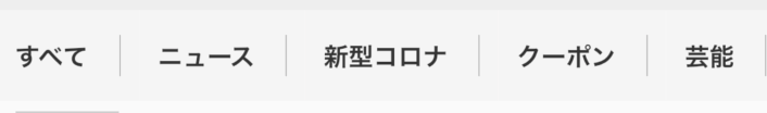
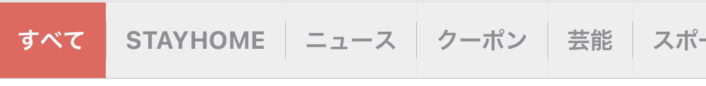
スクロールメニュー:StayHome、ニュース、クーポン、芸能等
flutter
SwiftUi
まずは、Flutterです。
横にスクロールさせる必要がありますので、SingleChildScrollView widget を使い、scrollDirection property に Axis.horizontalを適用しました。 defaultだと縦スクロールになってしまいます。前出と同様に、共通functionで各メニューを作成するために、widget tree 内でループ処理を行いたいので、 List class のconstractorである generate を使用しました。
また、tap eventを取得するために GestureDetector widgetを使用しています。GestureDetector widgetでラップされたwidgetをtapすると、onTap property に適用した処理が呼び出されます。今回は処理を適用していませんが、メニューの切り替えやページ遷移をここで行います。
class Menu2 extends StatelessWidget {
  final List<String> menuData = [
    "すべて",
    "ニュース",
    "新型コロナ",
    "クーポン",
    "芸能",
    "スポーツ",
    "話題",
    "フォロー",
    "東京五輪"
  ];
  @override
  Widget build(BuildContext context) {
    return SingleChildScrollView(
        scrollDirection: Axis.horizontal,
        child: Row(
            children: List.generate(
                menuData.length, (index) => _tabMenu(menuData[index]))));
  }

  Widget _tabMenu(String label) {
    return GestureDetector(
        onTap: () => {},
        child: Container(
            color: Color(0xffF5F5F5),
            padding: EdgeInsets.symmetric(vertical: 12.0, horizontal: 9.0),
            child: Row(children: [
              Text(label,
                  style: TextStyle(
                      color: Color(0xff333333),
                      fontSize: 12,
                      fontWeight: FontWeight.bold),
                  textAlign: TextAlign.center),
              label != "東京五輪"
                  ? Padding(
                      padding: EdgeInsets.only(left: 15.0),
                      child: Container(
                          height: 20.0, width: 0.4, color: Colors.grey))
                  : Container()
            ])));
  }
}
次に、SwiftUiです。
HStack struct を使い、メニューを表現しました。横スクロールさせるために、ScrollView struct を使用しました。defaultだと縦スクルールになってしまうので、 .horizontal を与えることで、横スクロールにします。HStack struct 内で ForEachを使用して、9個のメニューを Button structで表現しました。
struct Menu2: View {
    @Binding var selectedPage: Int

    let menu2s = ["すべて","StayHome","ニュース","クーポン","芸能","スポーツ","話題","フォロー","東京五輪"]

    var body: some View {
        VStack(spacing: 0) {
            ScrollView(.horizontal, showsIndicators: false) {
                HStack(spacing: 0) {
                    ForEach(0..<9) { index in
                        Button(
                            action: {
                                self.selectedPage = index
                            })
                            {
                                Text(self.menu2s[index])
                                    .foregroundColor(self.selectedPage == index ? .white : .gray)
                                .font(.system(size: 13))
                                .fontWeight(.bold)

                            }
                        .padding(EdgeInsets(top: 12, leading: 10, bottom: 12, trailing: 10))
                        .background(self.selectedPage == index ? Color.init(hex: "ed615b") : Color.init(hex: "eee"))
                        Divider().padding(EdgeInsets(top: 10, leading: 0, bottom: 10, trailing: 0))
                    }
                }
            }
            Divider()
        }
    }
}
ニュースリスト1:最新ニュース
flutter
SwiftUi
ニュースコンテンツのUIパターンが4つあります。まず1つ目です。
左に写真、右にタイトル、更新日時等を1つのニュースコンテンツとして、これを6つ配置するもので、ニュースコンテンツの中では一番小さいものになります。
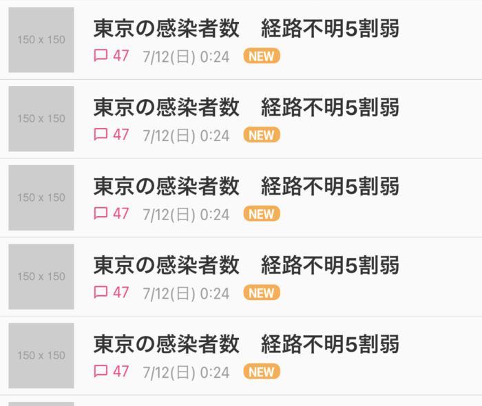
まずは、Flutterです。左に写真、右にタイトル、更新日時等を配置し、1つのニュースコンテンツであるNewsList class を実装しました。左に配置する写真と右に配置するタイトル、更新日時等のwidgetを常に同じ比率で表示するために、Expanded widget を使用しました。
NewsList class を Column widget 内に6つ配置してニュースリスト1の完成です。
class NewsList extends StatelessWidget {
  @override
  Widget build(BuildContext context) {
    return Container(
        padding: EdgeInsets.all(5.0),
        decoration: BoxDecoration(
            border: Border(
                bottom: BorderSide(color: Color(0xffc5c5c5), width: 0.3))),
        child: Row(children: [
          Expanded(
              flex: 1,
              child: SizedBox(
                width: 50.0,
                height: 50.0,
                child: Image.asset("assets/images/150x150.png"),
              )),
          SizedBox(width: 10),
          Expanded(
              flex: 5,
              child: Column(
                  crossAxisAlignment: CrossAxisAlignment.start,
                  children: [
                    Text("東京の感染者数 経路不明5割弱",
                        style: TextStyle(
                            fontSize: 16.0,
                            fontWeight: FontWeight.bold,
                            color: Color(0xff333333))),
                    SizedBox(width: 10),
                    Row(children: [
                      Icon(Icons.chat_bubble_outline,
                          size: 12, color: Colors.pinkAccent),
                      SizedBox(width: 3),
                      Text("47",
                          style: TextStyle(
                              fontSize: 12.0, color: Colors.pinkAccent)),
                      SizedBox(width: 10),
                      Text("7/12(日) 0:24",
                          style: TextStyle(
                              fontSize: 12.0,
                              color: Colors.grey,
                              textBaseline: TextBaseline.ideographic)),
                      SizedBox(width: 10),
                      Container(
                        padding: EdgeInsets.symmetric(horizontal: 4.0),
                        decoration: BoxDecoration(
                            borderRadius:
                                BorderRadius.all(Radius.circular(5.0)),
                            color: Colors.orangeAccent),
                        child: Text("NEW",
                            style: TextStyle(
                                fontWeight: FontWeight.w600,
                                fontSize: 10.0,
                                color: Colors.white,
                                letterSpacing: -0.5)),
                      )
                    ])
                  ]))
        ]));
  }
}
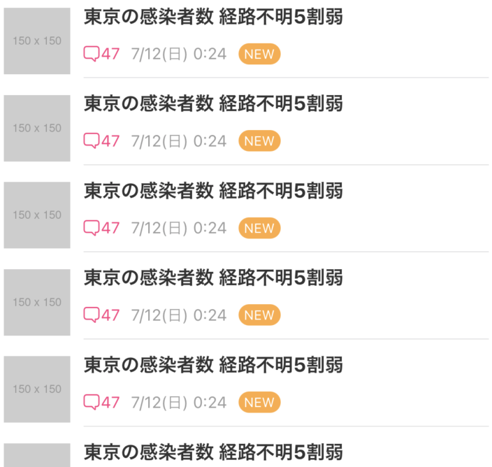
次に、SwiftUiです。
左に写真、右にタイトル、更新日時等を配置し、1つのニュースコンテンツである NewsList struct を実装しました。VStack struct と HStack struct を使って、UIを表現します。
NewsList struct を VStack struct 内に6つ配置してニュースリスト1の完成です。
struct NewsList: View {
    fileprivate func newsDetail() -> some View {
        return HStack(spacing: 0.0){
            Image("150x150").resizable().frame(width: 50.0, height: 50.0)
            Spacer().frame(width:10)
            VStack(alignment: .leading){
                Text("東京の感染者数 経路不明5割弱")
                    .font(.system(size: 15))
                    .fontWeight(.bold)
                    .foregroundColor(Color.init(hex: "333333"))
                HStack{
                    Image(systemName: "bubble.right")
                        .resizable()
                        .frame(width: 12.0, height: 12.0, alignment: .center)
                        .foregroundColor(Color.init(hex: "FF4081"))
                    Spacer().frame(width:1)
                    Text("47")
                        .font(.system(size: 12))
                        .foregroundColor(Color.init(hex: "FF4081"))
                    Text("7/12(日) 0:24")
                        .font(.system(size: 12))
                        .foregroundColor(Color.init(hex: "9E9E9E"))
                    Text("NEW")
                        .padding(EdgeInsets.init(top: 2.0, leading: 4.0, bottom: 2.0, trailing: 4.0))
                        .font(.system(size: 10))
                        .foregroundColor(.white)
                        .background(Color.init(hex: "FFAB40"))
                        .cornerRadius(30)
                }
                Divider()
            }
        }
        .frame(maxWidth: .infinity, alignment: .leading)
        .padding(EdgeInsets.init(top: 5.0, leading: 5.0, bottom: 5.0, trailing: 5.0))

    }

    var body: some View {
            VStack(spacing: 0.0){
                newsDetail()
            }
    }
}
ニュースリスト2:一番大きなニュース
flutter
SwiftUi
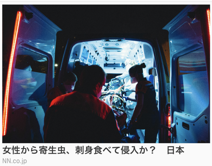
画面横幅一杯の写真を配置し、その写真の下にニュースのタイトルと、このニュースの提供元を表示します。
まずは、Flutterです。
写真、ニュースタイトル、提供元を上から順番に配置すればいいので、Column widget を使用します。Column widget内のwidgetを全て左寄せにしたいので、Column widget の crossAxisAlignment property にCrossAxisAlignment.startを適用します。
class BigNews extends StatelessWidget {
@override
Widget build(BuildContext context) {
return Container(
decoration: BoxDecoration(
border:
Border(bottom: BorderSide(color: Color(0xffc5c5c5), width: 0.3))),
padding: EdgeInsets.all(5.0),
child: Column(crossAxisAlignment: CrossAxisAlignment.start, children: [
Image.asset("assets/images/collecting.jpeg"),
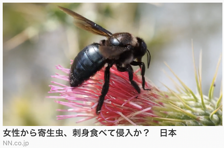
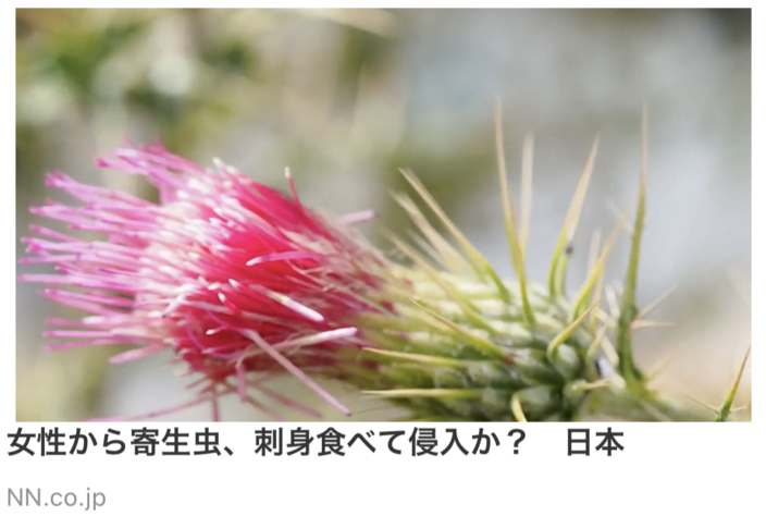
Text("女性から寄生虫、刺身食べて侵入か? 日本",
style: TextStyle(
fontSize: 16.0,
fontWeight: FontWeight.bold,
color: Color(0xff333333))),
SizedBox(width: 10),
Text("NN.co.jp",
style: TextStyle(
fontSize: 12.0,
color: Colors.grey,
textBaseline: TextBaseline.ideographic)),
]),
);
}
}
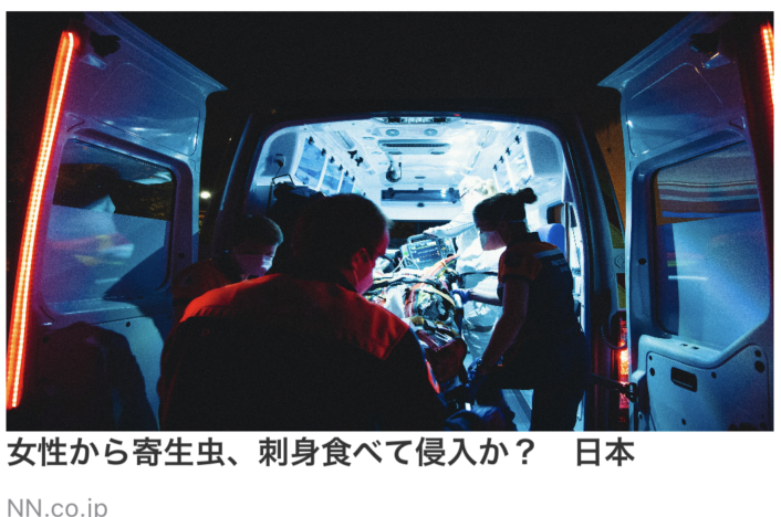
次に、SwiftUiです。
Flutterと同様で、写真、ニュースタイトル、提供元を上から順番に配置すればいいので、VStack struct を使用します。VStack struct内のUIを全て左寄せにしたいので、VStack struct の alignment property に.leadingを適用します。
struct BigNews: View {
    fileprivate func newsDetail() -> some View {
        return VStack(alignment: .leading, spacing: 0.0) {
            Image("collecting").resizable()
                .frame(height: 200)
            Text("女性から寄生虫、刺身食べて侵入か? 日本")
            .font(.system(size: 16))
            .fontWeight(.bold)
            .foregroundColor(Color.init(hex: "333333"))
            Spacer().frame(height:10)
            Text("News.co.jp")
            .font(.system(size: 12))
            .foregroundColor(Color.gray)
        }
        .padding(EdgeInsets.init(top: 5.0, leading: 5.0, bottom: 5.0, trailing: 5.0))
    }

    var body: some View {
        VStack(spacing: 0.0) {
            newsDetail()
        }
    }
}
ニュースリスト3:二番目に大きなニュース
flutter
SwiftUi
まずは、Flutterです。
それぞれのニュースコンテンツの中身は、ニュースリスト2:一番大きなニュース と同じですが、横幅が異なります。
Row widget を使って、画面の横幅を半分ずつ使用して、2つのニュースコンテンツを配置します。
class MiddleNews extends StatelessWidget {
@override
Widget build(BuildContext context) {
return Container(
decoration: BoxDecoration(
border: Border(
bottom: BorderSide(color: Color(0xffc5c5c5), width: 0.3))),
padding: EdgeInsets.all(5.0),
child: Row(children: [
Container(
decoration: BoxDecoration(
border: Border(
right: BorderSide(color: Color(0xffc5c5c5), width: 0.3))),
padding: EdgeInsets.only(right: 5.0),
width: (MediaQuery.of(context).size.width / 2) - 10.0,
child: Column(
crossAxisAlignment: CrossAxisAlignment.start,
children: [
Image.asset("assets/images/collecting.jpeg"),
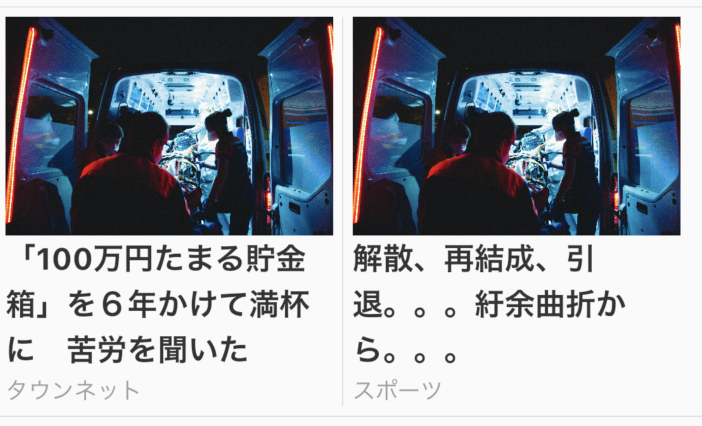
Text("「100万円たまる貯金箱」を6年かけて満杯に 2000日の苦労を本人い聞いた",
style: TextStyle(
fontSize: 16.0,
fontWeight: FontWeight.bold,
color: Color(0xff333333))),
SizedBox(width: 10),
Text("タウンネット",
style: TextStyle(
fontSize: 12.0,
color: Colors.grey,
textBaseline: TextBaseline.ideographic)),
])),
Container(
padding: EdgeInsets.only(left: 5.0),
width: (MediaQuery.of(context).size.width / 2) - 10.0,
child: Column(
crossAxisAlignment: CrossAxisAlignment.start,
children: [
Image.asset("assets/images/collecting.jpeg"),
Text("「当時は睡眠2時間」、再結成、引退。。。紆余曲折から。。。",
style: TextStyle(
fontSize: 16.0,
fontWeight: FontWeight.bold,
color: Color(0xff333333))),
SizedBox(width: 10),
Text("スポーツニュース",
style: TextStyle(
fontSize: 12.0,
color: Colors.grey,
textBaseline: TextBaseline.ideographic)),
])),
]));
}
}
次に、SwiftUiです。
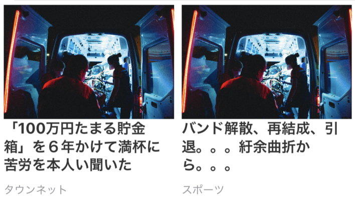
Flutterと同様で、それぞれのニュースの中身は、ニュースリスト2:一番大きなニュース と同じですが、横幅が異なります。HStack struct を使って、画面の横幅を半分ずつ使用して、2つのニュースコンテンツを配置します。
struct MiddleNews: View {
    fileprivate func newsDetail() -> some View {
        return HStack {
            VStack(alignment: .leading, spacing: 0.0) {
                Image("collecting").resizable()
                    .frame(height: 150)
                Text("「100万円たまる貯金箱」を6年かけて満杯に 2000日の苦労を本人い聞いた")
                .font(.system(size: 16))
                .fontWeight(.bold)
                .foregroundColor(Color.init(hex: "333333"))
                Spacer().frame(height:10)
                Text("タウンネット")
                .font(.system(size: 12))
                .foregroundColor(Color.gray)
            }
            VStack(alignment: .leading, spacing: 0.0) {
                Image("collecting").resizable()
                    .frame(height: 150)
                Text("「当時は睡眠2時間」解散、再結成、引退。。。紆余曲折から。。。")
                .font(.system(size: 16))
                .fontWeight(.bold)
                .foregroundColor(Color.init(hex: "333333"))
                Spacer().frame(height:10)
                Text("スポーツニュース")
                .font(.system(size: 12))
                .foregroundColor(Color.gray)
            }
        }
        .padding(EdgeInsets.init(top: 5.0, leading: 5.0, bottom: 5.0, trailing: 5.0))
    }

    var body: some View {
        VStack(spacing: 0.0) {
            newsDetail()
        }
    }
}
ニュースリスト4:一番シンプルなUIのニュース
flutter
SwiftUi
まずは、Flutterです。
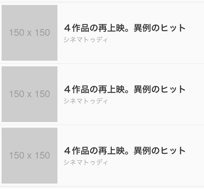
それぞれのニュースの中身は、ニュースリスト2:一番大きなニュース と同じですが、配置が少し異なります。左に写真、右にニュースタイトル、提供元を配置します。
左右の分割は Row widget を実現し、ニュースタイトルと提供元の縦並びは Column widget で実現しました。
class SmallNews extends StatelessWidget {
  @override
  Widget build(BuildContext context) {
    return Container(
        padding: EdgeInsets.all(5.0),
        decoration: BoxDecoration(
            border: Border(
                bottom: BorderSide(color: Color(0xffc5c5c5), width: 0.3))),
        child: Row(children: [
          Expanded(
            flex: 2,
            child: Image.asset("assets/images/150x150.png"),
          ),
          SizedBox(width: 10),
          Expanded(
              flex: 5,
              child: Column(
                  crossAxisAlignment: CrossAxisAlignment.start,
                  children: [
                    Text("映画4作品の再上映。異例のヒット",
                        style: TextStyle(
                            fontSize: 16.0,
                            fontWeight: FontWeight.bold,
                            color: Color(0xff333333))),
                    SizedBox(width: 10),
                    Text("シネマシネマ",
                        style: TextStyle(
                            fontSize: 12.0,
                            color: Colors.grey,
                            textBaseline: TextBaseline.ideographic)),
                  ]))
        ]));
  }
}
次に、SwiftUiです。
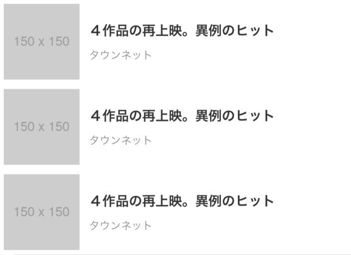
Flutterと同様で、それぞれのニュースの中身は、ニュースリスト2:一番大きなニュース と同じですが、配置が少し異なります。左に写真、右にニュースタイトル、提供元を配置します。
左右の分割は HStack struct を実現し、ニュースタイトルと提供元の縦並びは VStack struct で実現しました。
struct SmallNews: View {
    fileprivate func newsDetail() -> some View {
        return HStack(spacing: 0.0){
            Image("150x150").resizable().frame(width: 120.0, height: 120.0)
            Spacer().frame(width:10)
            VStack(alignment: .leading){
                Text("映画4作品の再上映。異例のヒット")
                    .font(.system(size: 15))
                    .fontWeight(.bold)
                    .foregroundColor(Color.init(hex: "333333"))
                Spacer().frame(height:10)
                Text("タウンネット")
                    .font(.system(size: 12))
                    .foregroundColor(Color.gray)
            }
        }
        .frame(maxWidth: .infinity, alignment: .leading)
        .padding(EdgeInsets.init(top: 5.0, leading: 5.0, bottom: 5.0, trailing: 5.0))

    }

    var body: some View {
            VStack(spacing: 0.0){
                newsDetail()
            }
    }
}
動画ニュース
flutter
SwiftUi
まずは、Flutterです。
動画再生用にvideo_player package を使用しました。
Column widget 内に、video_playerを使って動画用widget、ニュースタイトル、提供元を配置します。
class BigMovie extends StatefulWidget {
  @override
  _BigMovie createState() => _BigMovie();
}

class _BigMovie extends State<BigMovie> {
  VideoPlayerController _controller;

  @override
  void initState() {
    super.initState();
    _controller = VideoPlayerController.network(
        'https://flutter.github.io/assets-for-api-docs/assets/videos/bee.mp4')
      ..initialize().then((_) {
        _controller.setLooping(true);
        _controller.play();
        setState(() {});
      });
  }

  @override
  Widget build(BuildContext context) {
    return Container(
      decoration: BoxDecoration(
          border:
              Border(bottom: BorderSide(color: Color(0xffc5c5c5), width: 0.3))),
      padding: EdgeInsets.all(5.0),
      child: Column(crossAxisAlignment: CrossAxisAlignment.start, children: [
        _controller.value.initialized
            ? AspectRatio(
                aspectRatio: _controller.value.aspectRatio,
                child: VideoPlayer(_controller))
            : Container(),
        Text("女性から寄生虫、刺身食べて侵入か? 日本",
            style: TextStyle(
                fontSize: 16.0,
                fontWeight: FontWeight.bold,
                color: Color(0xff333333))),
        SizedBox(width: 10),
        Text("NN.co.jp",
            style: TextStyle(
                fontSize: 12.0,
                color: Colors.grey,
                textBaseline: TextBaseline.ideographic)),
      ]),
    );
  }
}
次に、SwiftUiです。
動画再生用の PlayerView struct を作り、動画のDLから再生まで行いました。
このサイトで紹介されているコードを流用しました。
VStack struct 内に、PlayerView struct、ニュースタイトル、提供元を配置します。
struct BigMovie: View {
    fileprivate func movieDetail() -> some View {
        return VStack(alignment: .leading, spacing: 0.0) {
            PlayerView().frame(height: 200, alignment: .center)
            Text("女性から寄生虫、刺身食べて侵入か? 日本")
            .font(.system(size: 16))
            .fontWeight(.bold)
            .foregroundColor(Color.init(hex: "333333"))
            Spacer().frame(height:10)
            Text("NN.co.jp")
            .font(.system(size: 12))
            .foregroundColor(Color.gray)
        }
        .frame(maxWidth: .infinity, alignment: .leading)
        .padding(EdgeInsets.init(top: 5.0, leading: 5.0, bottom: 5.0, trailing: 5.0))
    }

    var body: some View {
        VStack(spacing: 0.0) {
            movieDetail()
        }
    }
}
スクロール
上にスクロールすることで、search barとスクロールメニューをトップに固定して、その他のコンテンツは画面上部へと消えていきます。
下にスクロールすることで、上部に消えたコンテンツが再表示されます。
まずは、Flutterです。
CustomScrollView widget、SliverAppBar widget、SliverToBoxAdapter widget を使いました。SliverAppBar widget の flexibleSpace property に Login widget、menu1 widget を適用します。ここはスクロールが一番上の時に表示し、スクロールすると上部に消えるコンテンツを適用する場所になります。bottom property には上部にスクロールした際も消えないコンテンツを適用します。今回はスクロールメニューであるmenu2 widgetを適用します。
class HomeScreen extends StatelessWidget {
  @override
  Widget build(BuildContext context) {
    return CustomScrollView(
      slivers: [
        SliverAppBar(
            pinned: true,
            backgroundColor: Color(0xffFFFAFA),
            expandedHeight: 242,
            flexibleSpace: FlexibleSpaceBar(
                background: Container(
                    child: Column(children: [Login(), PickUpNews(), Menu1()]))),
            bottom: PreferredSize(
                preferredSize: Size.fromHeight(-6), child: Menu2())),
        SliverToBoxAdapter(
            child:
                Column(crossAxisAlignment: CrossAxisAlignment.start, children: [
          _newsList(),
          _bigNewsList(),
          _middleNewsList(),
          _smallNewsList(),
          _bigMovieList(),
        ]))
      ],
    );
  }
}
次に、SwiftUiです。
List struct を使って実現します。まず、スクロールしていない状態では表示され、スクロールされると消えるコンテンツを VStack struct 内に適用します。今回はLogin class や Menu1 class になります。スクロールしても消さない部分は、Section struct の header property に適用します。ここはMenu2 classを適用します。content property には、Menu2 classの下部に表示する各メニューリストのclassを適用します。
var body: some View {
    VStack(spacing: 0) {
        SearchBar()
        List {
            VStack(spacing: 0) {
                Login()
                PickupNews()
                Menu1()
            }
            .background(Color.white)
            .listRowInsets(EdgeInsets())
            Section(header: Menu2(selectedPage: $selectedPage)) {
                self.minNewsList()
                self.minNewsList()
                self.bigNewsList()
                self.middleNewsList()
                self.smallNewsList()
                self.bigMovieList()
            }
            .listRowInsets(EdgeInsets())
        }
    }
}
まとめ
今回、某ポータルアプリのUIをFlutterとSwiftUiで構築しました。FlutterとSwiftUiともにですが、font family、font size、padding、margin等を全く同じにするのはかなり工数がかかることがわかりました。宣言的UIの実装については、書きやすさ、ソースの見通しの良さに関して大きな差異は感じませんでした。(慣れの問題でFlutterの方が若干書きやすかったですが)
iOS開発で、storyboardを使ってきた人間からすると、SwiftUiに抵抗があるかもしれませんが、慣れてしまえばこっちの方が、速いし、軽いし、プログラミングぽくていいです。
画面遷移や画面内のwidgetの挙動に関してもっと実装したいという思いはありますが、今回は静的な部分を実装することにしました。あと、uiのrebuildについても比較してみたいです。Flutterは、rebuildをいかに美しく行うかを目指して、いろんなpackageが出ています。SwiftUiはどうなのでしょうか。気になるところです。