はじめに
過去に投稿した「[DatePicker]DatePickerの使用方法を紹介!」では、
DatePickerを使用して、日付と時刻を入力するためのコンポーネント作成、使用方法を紹介しました。
今回は、さらに進んでDatePickerのカスタマイズ方法を紹介します!
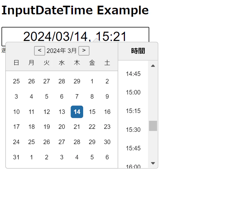
1.スタイルのカスタマイズ
まず、DatePickerのスタイルをカスタマイズします。
このcssをコンポーネントへ挿入すると、ポップアップするカレンダーの大きさや位置、テキストの大きさ等をカスタマイズできるようになります。
/* styles/InputDateTime.module.css */

.datePicker {
  width: 100%;
  max-width: 90%;
  margin: 0 auto;
  padding: 5px;
  box-sizing: border-box;
  font-size: 36px;
  text-align: center;
}

.customCalendar {
  /* カレンダーに対するスタイルを指定 */
  transform: scale(1.3);
  margin: 18px 0 0 60px;
}
2.InputDateTimeコンポーネントのカスタマイズ
次に、InputDateTimeコンポーネントに、以下の3点のカスタマイズを施します!
・先ほどのスタイルを適用
・ヘッダーをカスタム
・テキストの日本語化
// components/InputDateTime.js

import React from "react";
import DatePicker, { registerLocale } from "react-datepicker";
import "react-datepicker/dist/react-datepicker.css";
import styles from "/src/styles/InputDateTime.module.css";
import ja from "date-fns/locale/ja";

/**
 * @param selectedDate - 選択された日付と時刻
 * @param onChange - 日付と時刻が変更されたときのコールバック関数
 */
const InputDateTime = ({ selectedDate, onChange }) => {
  registerLocale("ja", ja);

  const renderCustomHeader = ({ date, decreaseMonth, increaseMonth }) => {
    const year = new Intl.DateTimeFormat("ja", { year: "numeric" }).format(
      date
    );
    const month = new Intl.DateTimeFormat("ja", { month: "long" }).format(date);

    return (
      <div className={styles.customHeader}>
        <button onClick={decreaseMonth}>{`<`}</button>
        <span>{` ${year} ${month} `}</span>
        <button onClick={increaseMonth}>{`>`}</button>
      </div>
    );
  };

  return (
    <DatePicker
      selected={selectedDate}
      onChange={(date) => onChange(date)}
      showTimeSelect
      timeFormat="HH:mm"
      timeIntervals={15}
      dateFormat="yyyy/MM/dd, HH:mm"
      timeCaption="時間"
      customInput={<CustomInput />}
      calendarClassName={styles.customCalendar}
      locale="ja"
      renderCustomHeader={renderCustomHeader}
    />
  );
};

// カスタム入力フィールドのコンポーネント
const CustomInput = React.forwardRef(({ value, onClick }, ref) => (
  <input
    value={value}
    onClick={onClick}
    readOnly
    ref={ref}
    className={styles.datePicker}
  />
));

// displayNameを追加
CustomInput.displayName = "CustomInput";

export default InputDateTime;

まとめ
今回は、DatePickerのカスタム例を紹介しました!
今回の記事を参考に、DatePickerを色々とカスタムしてみてください!