はじめに
過去に投稿した記事、[Next.js] Next.jsで番号入力フォームを作成する方法では、シンプルな番号入力フォームの作り方を紹介しました!
今回は、入力フォームを押すことで、キーボードがポップアップする改造を行ってみます!
1.NumberInputコンポーネントの作成
まず、ポップアップするNumberInputコンポーネントを作成します!
引数には、keyboardVisibleChangeというコールバック関数を設定しております!
これはindex.jsにて、オーバーレイの表示、非表示を管理する為に使用します。
// components/NumberInput.jsx
import React, { useState, useEffect } from "react";
import styles from "../styles/NumberInput.module.css";
const NumberInput = ({ keyboardVisibleChange }) => {
// キーボード用
const [number, setNumber] = useState("");
// キーボードが表示されているかどうか
const [isKeyboardVisible, setIsKeyboardVisible] = useState(false);
// キーボードが表示されているかどうかが変更された時
useEffect(() => {
keyboardVisibleChange(isKeyboardVisible);
}, [isKeyboardVisible, keyboardVisibleChange]);
// キーボードのボタンクリック
const handleKeyClick = (key) => {
setNumber((prevNumber) => prevNumber + key);
};
// バックスペースボタンクリック
const handleBackspace = () => {
setNumber((prevNumber) => prevNumber.slice(0, prevNumber.length - 1));
};
// インプットフィールドクリック
const handleInputClick = () => {
setIsKeyboardVisible(true);
};
// 閉じるボタン
const handleClose = () => {
setIsKeyboardVisible(false);
};
return (
<>
{/* キーボード */}
<div className={styles.NumberInput}>
{/* インプットフィールド */}
<input
type="tel"
value={number}
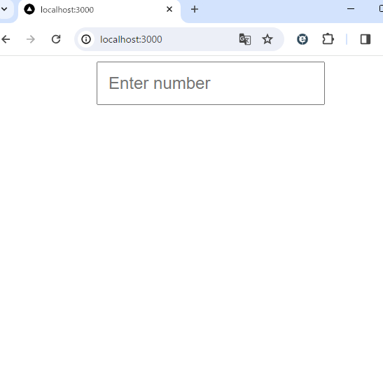
placeholder="Enter number"
readOnly
className={styles.inputField}
onClick={handleInputClick}
/>
{/* isKeyboardVisibleがtrueの時、PopUpを表示 */}
{isKeyboardVisible && (
<div className={styles.PopUp}>
{/* 閉じるボタン */}
<button onClick={handleClose} className={styles.closeButton}>
Close
</button>
{/* インプットフィールド */}
<input
type="tel"
value={number}
placeholder="Enter number"
readOnly
className={styles.inputFieldPoP}
/>
{/* キーボード */}
<div className={styles.keyboard}>
{[1, 2, 3, 4, 5, 6, 7, 8, 9].map((num) => (
<button
key={num}
onClick={() => handleKeyClick(String(num))}
className={styles.button}
>
{num}
</button>
))}
<button className={styles.button}></button>
<button
key={0}
onClick={() => handleKeyClick(String(0))}
className={styles.button}
>
0
</button>
{/* バックスペースボタン */}
<button onClick={handleBackspace} className={styles.button}>
Backspace
</button>
</div>
</div>
)}
</div>
</>
);
};
export default NumberInput;
/* styles/NumberInput.module.css */
.NumberInput {
  display: flex;
  flex-direction: column;
  align-items: center;
}

.inputField {
  padding: 15px;
  font-size: 24px;
}

.keyboard {
  display: grid;
  grid-template-columns: repeat(3, 1fr);
  gap: 5px;
}

.emptyButton {
  visibility: hidden;
}

.button {
  padding: 10px;
  font-size: 24px;
  cursor: pointer;
  border: 1px solid #ccc;
  background-color: #fff;
}

.PopUp {
  position: fixed;
  top: 50%;
  left: 50%;
  transform: translate(-50%, -50%);
  background-color: #fff;
  padding: 20px;
  box-shadow: 0 0 10px rgba(0, 0, 0, 0.2);
  /* オーバーレイよりも前面に */
  z-index: 1500;
  text-align: center;
}

.inputFieldPoP {
  padding: 15px;
  font-size: 24px;
  margin: 10px auto 15px;
}

.rentCardType {
  display: block;
  font-size: 24px;
}
.rentCardNumber {
  font-size: 24px;
}

.closeButton {
  position: absolute;
  top: 10px;
  right: 10px;
  font-size: 24px;
  cursor: pointer;
}
ここで、ポップアップのZ-indexはoverlayよりも大きくしておきます。
2.フォームをページに組み込む
次に、作成したNumberInputコンポーネントをページに組み込みます!
// pages/index.jsx
import { useState } from "react";
import NumberInput from "../components/NumberInput";
import styles from "../styles/index.module.css";

export default function HomePage() {
  // キーボードが表示されているかどうか
  const [keyboardVisible, setKeyboardVisible] = useState(false);

  return (
    <div>
      {/* キーボードが表示されている時、背景を黒塗り */}
      {keyboardVisible && <div className={styles.overlay}></div>}

      <NumberInput
        // コールバック関数
        keyboardVisibleChange={(visible) => setKeyboardVisible(visible)}
      />
    </div>
  );
}
/* src/styles/index.module.css */

.overlay {
  position: fixed;
  top: 0;
  left: 0;
  width: 100%;
  height: 100%;
  background: rgba(0, 0, 0, 0.5);
  z-index: 1000;
}
ここで、overlayはポップアップされたキーボードのZ-indexより小さくしてください。

まとめ
今回は、Next.jsを利用してポップアップする番号入力フォームを作成しました!
この記事を参考に作成してみてください!