以前からFlexboxにはお世話になっていたのですがまとめられていなかったので備忘録として。
CSSで要素を横並びにしたいときは習った教材などの通りにfloat: leftして擬似要素を作って...みたいな事をしてましたがFlexboxに出会ってからは色々とカスタマイズできるのでずっと使っています笑
flexコンテナー(親要素)とflexアイテム(子要素)
flexboxは親要素であるコンテナーと子要素のアイテムにプロパティを指定してCSS見た目を変えていきます。
  <div class="container">  <!-- flex-container(親要素) -->
    <div class="box box-1">1</div>  <!-- flex-item(子要素) -->
    <div class="box box-2">2</div>
    <div class="box box-3">3</div>
    <div class="box box-4">4</div>
    <div class="box box-5">5</div>
 </div>
.container {
  width: 300px;
  height: 300px;
  color: #fff;
  background: #eee;
  display: flex;
}
.box {
  height: 80px;
  width: 80px;
}
.box-1 { background: tomato; }
.box-2 { background: slategray; }
.box-3 { background: pink; }
.box-4 { background: skyblue; }
.box-5 { background: limegreen; }
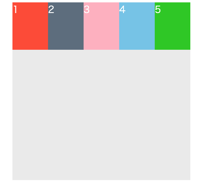
上の例でいう**flexコンテナー(親要素)**は背景色がグレーの要素になります。
**flexアイテム(子要素)**はそれぞれ色(赤、青、緑とか)のついている要素になります。
flex-containerの作り方はdisplay: flexと指定するだけです。
これだけで要素は横並びになります。
flex-containerを作成すると**flex-direction(rowかcolumn)**が指定できるようになります。
flex-directionは選択していなくてもデフォルトrow(行)になっているので横並びになっているわけです。
.container {
  width: 300px;
  height: 300px;
  color: #fff;
  background: #eee;
  display: flex;   /* flex-direction: row  記述しなくてもデフォルトになっている。 */
}
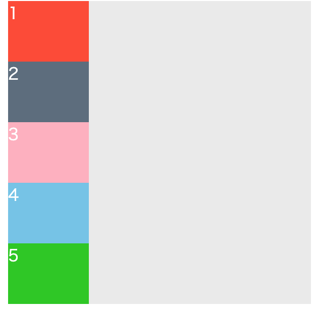
ではflex-directionをcolumn(列)にしてみます。
.container {
  width: 300px;
  height: 300px;
  color: #fff;
  background: #eee;
  display: flex;
  flex-direction: column;
すごく便利です。
他にも並べる順番を逆にするrow-reverse/column-reverseも指定できます。
-
###flex-containerにつけるプロパティ
- flex-direction(初期値はrow) -子要素の並ぶ向き
- flex-wrap(初期値はnowrap) -子要素の折り返し
- justify-content(初期値はflex-start) -水平方向の揃え
- align-items(初期値はstrech) -垂直方向の揃え
- align-content(初期値はstrech) -複数行にしたときの揃え
-
###flex-itemにつけるプロパティ
- order - 順序の指定
- flex-grow -子要素の伸びる率
- flex-shrink -子要素の縮む率
- flex-basis - 子要素のベースとなる幅の指定
- align-self -子要素の垂直方向の揃え
https://flexboxfroggy.com/#ja
こちらのサイトはflexboxxの練習に適してるのではないかと思います!