React Native の習得:コンポーネント[button]
React Native 標準のコンポーネントについて使い方を見ていきます。
まずは button コンポーネントを使って見ます。
実行環境
Mac: MacBook Air
macOS 10.13.1 (High Sierra)
Xcode 9.2
node.js: v6.11.5
react-native-cli: 2.0.1
react: 16.0.0
react-native: 0.51.0
ボタンコードの貼り付け
react-native init myapp にて作成されたコードに公式ドキュメントにあるコードを貼って実行。
import React, { Component } from 'react';
import {
  Platform,
  StyleSheet,
  Alert,
  Text,
  Button,
  View
} from 'react-native';

export default class App extends Component<{}> {
  onPressLearnMore() {
    Alert.alert('ボタンを押しました!')
  }
  render() {
    return (
      <View style={styles.container}>
        <Button
          onPress={this.onPressLearnMore}
          title="Learn More"
          color="#841584"
          accessibilityLabel="Learn more about this purple button"
        />
      </View>
    );
  }
}

const styles = StyleSheet.create({
  container: {
    flex: 1,
    justifyContent: 'center',
    alignItems: 'center',
  },
});
シミュレータ実行結果
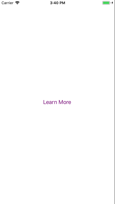
"Learn More" をクリック
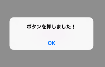
いちおう動作しました。
ただ、ボタンっぽくないですね。ios の場合 color を指定すると、テキストのカラーを設定し android だと背景色だけが設定されるようです。
そこで <view> で囲って背景色を設定し少しだけボタンらしくして見ます。
import React, { Component } from 'react';
import {
  Platform,
  StyleSheet,
  Alert,
  Text,
  Button,
  View
} from 'react-native';

export default class App extends Component<{}> {
  _onPressButton() {
    Alert.alert('ボタンを押しました!')
  }

  render() {
    return (
      <View style={styles.container}>
        <View style={styles.buttonContainer}>
          <Button
            onPress={this._onPressButton}
            title="start"
          />
        </View>
        <View style={styles.buttonContainer}>
          <Button
            onPress={this._onPressButton}
            title="stop"
          />
        </View>
      </View>
    );
  }
}

const styles = StyleSheet.create({
  container: {
    flex: 1,
    justifyContent: 'center',
    alignItems: 'center',
    backgroundColor: '#333333',
  },
  buttonContainer: {
    height: 100,
    width: 200,
    padding: 10,
    backgroundColor: '#FFFFFF',
    margin: 3
  },
});
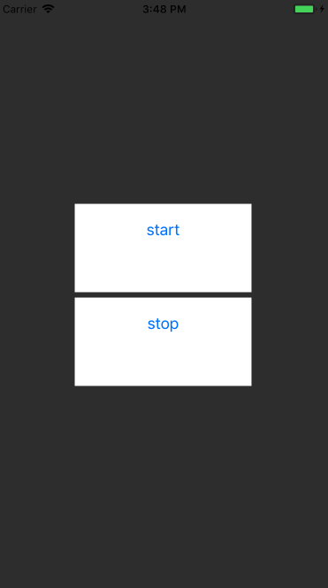
少しボタンらしくなりました。
TouchableOpacity でのボタンの実装
TouchableOpacity でも同様のことができるとのことで試して見ました。
合わせて border-radius を設定して、角を丸くして見ます。
import React, { Component } from 'react';
import {
  Platform,
  StyleSheet,
  Alert,
  Text,
  TouchableOpacity,
  Button,
  View
} from 'react-native';

export default class App extends Component<{}> {
  _onPressButton() {
    Alert.alert('You tapped the button!')
  }

  render() {
    return (
      <View style={styles.container}>
        <TouchableOpacity onPress={this._onPressButton} style={styles.button}>
           <Text>start</Text>
        </TouchableOpacity>
        <TouchableOpacity onPress={this._onPressButton} style={styles.button}>
           <Text>end</Text>
        </TouchableOpacity>
      </View>
    );
  }
}

const styles = StyleSheet.create({
  container: {
    flex: 1,
    justifyContent: 'center',
    alignItems: 'center',
    backgroundColor: '#333333',
  },
  button: {
    width: 250,
    height: 100,
    padding: 10,
    borderRadius: 10,
    backgroundColor: 'lightgray',
    alignItems: 'center',
    justifyContent: 'center',
    margin: 3
  },
});
実行結果
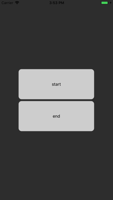
出来ました。
標準コンポーネントでは少し足りなさそうですね。
いつか react-native-elements に挑戦してみようと思います。
参考ページ