「ggplot2でグラフに4本の折れ線を引いて,うち2本は点線にして,2本は実線にしたい」というような要望を実現する方法がわからず,探すのに結構な時間がかかったのでメモします。
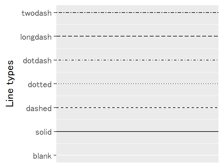
線のスタイル:linetype
「点線にするか,実線にするか」といった線のスタイルに関するオプションは,linetypeという引数に指定します。
# read libraries and setting ----------------------------------------
library(ggplot2)
library(tidyverse)

# なんとなくフォントを変更
windowsFonts(Fo = windowsFont("Noto Sans CJK JP"))
ggplot()+theme_set(theme_gray(base_size = 14, base_family = "Fo"))
# -------------------------------------------------------------------
# Line type 一覧
ggplot()+
  geom_hline(yintercept = 0, linetype = "blank")+
  geom_hline(yintercept = 1, linetype = "solid")+
  geom_hline(yintercept = 2, linetype = "dashed")+
  geom_hline(yintercept = 3, linetype = "dotted")+
  geom_hline(yintercept = 4, linetype = "dotdash")+
  geom_hline(yintercept = 5, linetype = "longdash")+
  geom_hline(yintercept = 6, linetype = "twodash")+
  scale_y_continuous(breaks = c(0:6),
    labels = c("blank","solid","dashed","dotted","dotdash","longdash","twodash"))+
  labs(y = "Line types")
linetypeは0~6の数字か上記の名前で指定します。
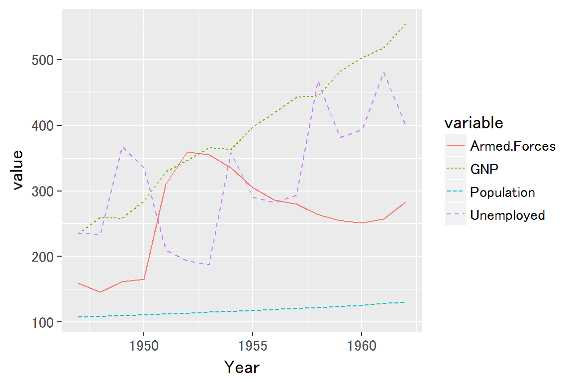
linetypeを自動で設定する場合⇒colorなどと同様にグループ変数名を指定
もし,「この変数には点線を使いたい」などの要望がなく,「なんでもいいから線のタイプを変えたい」という状況なら,colourやfillなどと同様にグループラベルが入った変数の名前を指定すれば十分です。
longleyのデータを用いて例示します。
そのまえに一応,今回の例に使うデータをhead()で表示しておきます。
# 例に使うデータ
head(longley)
##      GNP.deflator     GNP Unemployed Armed.Forces Population Year Employed
## 1947         83.0 234.289      235.6        159.0    107.608 1947   60.323
## 1948         88.5 259.426      232.5        145.6    108.632 1948   61.122
## 1949         88.2 258.054      368.2        161.6    109.773 1949   60.171
## 1950         89.5 284.599      335.1        165.0    110.929 1950   61.187
## 1951         96.2 328.975      209.9        309.9    112.075 1951   63.221
## 1952         98.1 346.999      193.2        359.4    113.270 1952   63.639
ggplotで読めるようにtidyr::gather()で変形します。
# GNP, Population, Unemployed, Armed.Forcesを選んで図示
temp <- longley %>%
  select(Year, GNP, Population, Unemployed, Armed.Forces) %>%
  gather(key = Year, value = c('Unemployed', 'Armed.Forces'))
colnames(temp) <- c("Year", "variable", "value")
temp %>% head()
##   Year variable   value
## 1 1947      GNP 234.289
## 2 1948      GNP 259.426
## 3 1949      GNP 258.054
## 4 1950      GNP 284.599
## 5 1951      GNP 328.975
## 6 1952      GNP 346.999
variable列に変数のグループ名を入れているので,それをlinetypeに指定すれば,自動で変数ごとにlinetypeを変えてくれます。
# linetypeを自動で設定してもらう場合
ggplot(temp, aes(x = Year, y = value, color = variable, linetype = variable))+
  geom_line()

# ちなみに,こういう表記にしても同じ図が描かれる
# ggplot(temp)+
  # geom_line(aes(x = Year, y = value, color = variable, linetype = variable))
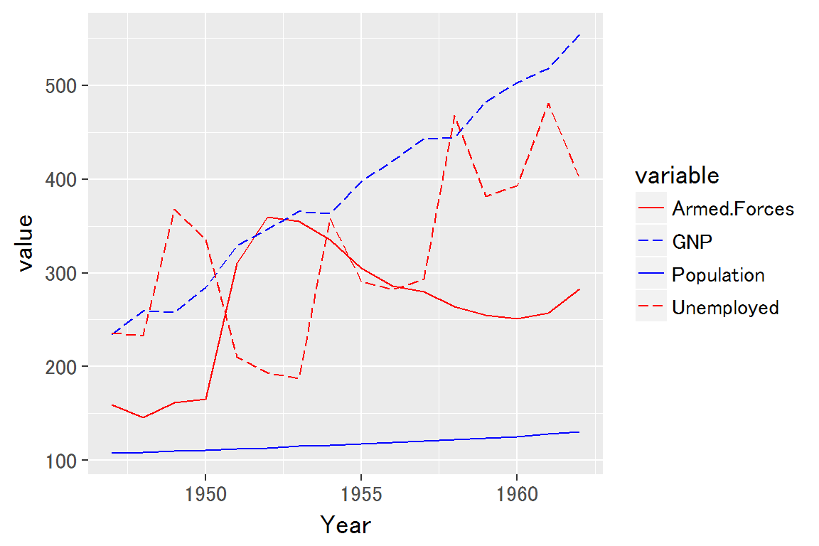
linetypeを手動で設定する場合⇒scale_linetype_manual
本題です。「この変数には点線を使いたい」などを実現するにはscale_linetype_manual()関数を使えば良いようです。
(このとき,一度color = variable, linetype = variableと自動設定したあとにmanualの関数を置かないとうまく動かないので注意)
scale_color_manual()など,他の装飾オプションもmanual指定できるものがあります。
# linetypeを手動で設定する場合
ggplot(temp, aes(x = Year, y = value, color = variable, linetype = variable))+
  geom_line()+
  scale_linetype_manual(values = c("solid", "longdash", "solid", "longdash"))+
  scale_color_manual(values = c('red', 'blue', 'blue','red'))
RStudioのggplot2チートシートを使えば一発で解決
この悩みが解決した後で [PDF] RStudioが作っているggplot2のチートシートを見つけました。
そして,manualの話もこのチートシートに載っていました。
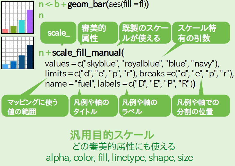
manualのみならず,様々な機能について簡潔にまとめられています。
今後ggplotの悩みのほとんどはこのチートシートを読めば解決できそうです!
RStudio万歳!
参考
- ggplot2 line types : How to change line types of a graph in R software? - Easy Guides - Wiki - STHDA
- Rグラフィックスクックブック カテゴリーの記事一覧 - Mukku John Blog
-
Cheatsheets – RStudio
- RStudioのチートシート一覧(ggplot以外のチートシートもあります。下の方に日本語版チートシート一覧があります)