justify-contentとは
flexアイテムの配置を指定するプロパティで、左寄せ・右寄せ・中央寄せなど、アイテムの間の余白などを指定することができます。
また、justify-contentは、display:flex;で横並びにした要素の配置を指定するプロパティです。
web制作をしている時、横に並べた要素の間隔を均等に配置したりとか、要素を中央に寄せたりすることができます。
justify-contentには使い方が何種類かあるのですが今回はよく使うものでいうと
・flex-start(左寄せ)
・flex-end (右寄せ)
・center(中央寄せ)
・space-between(両端揃え)
・space-around(アイテムの両側に均等な余白をつける)
などになります。
具体的にどんな変化があるのか見ていきます。
まずboxを作っていきます。
HTMLは親要素である「content」というクラスのついたdivの中に子要素である「box」というクラスのついたdivが入っています。
<div class="content">
 <div class="box">1</div>
 <div class="box">2</div>
 <div class="box">3</div>
</div>
.content {
display:flex;
/* ここにjustify-contentを指定する */
}
.box {
background:lightskyblue;
width:300px;
height:300px;

}
display:flex;の下にjustify-contentを指定します。
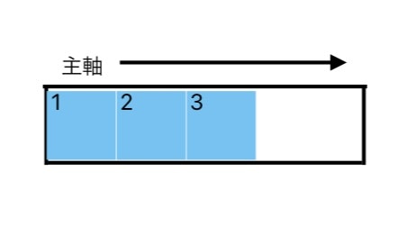
justify-content の余白は、主軸方向につけられます。
主軸とは、flexアイテムが並ぶ向き(縦・横)のことを指します。
justify-content:flex-start;(左寄せ)を指定した場合
justify-content:flex-end;(右寄せ)を指定した場合

justify-content:center;(中央寄せ)を指定した場合

justify-content:space-between;(両端揃え)を指定した場合

justify-content:space-around;(アイテムの両側に均等な余白をつける)を
指定した場合

最後に
justify-contentはdisplay:flex;とセットで使われるので
justify-contentのコードを指定しているのに効いていないなと思ったら
display:flex;を指定しているか確認してみましょう。