スタジオみずたまでWebサイト制作のお仕事をいただいた際に、レスポンシブなハンバーガーメニューをシンプルに実装できたので、知見を共有します。
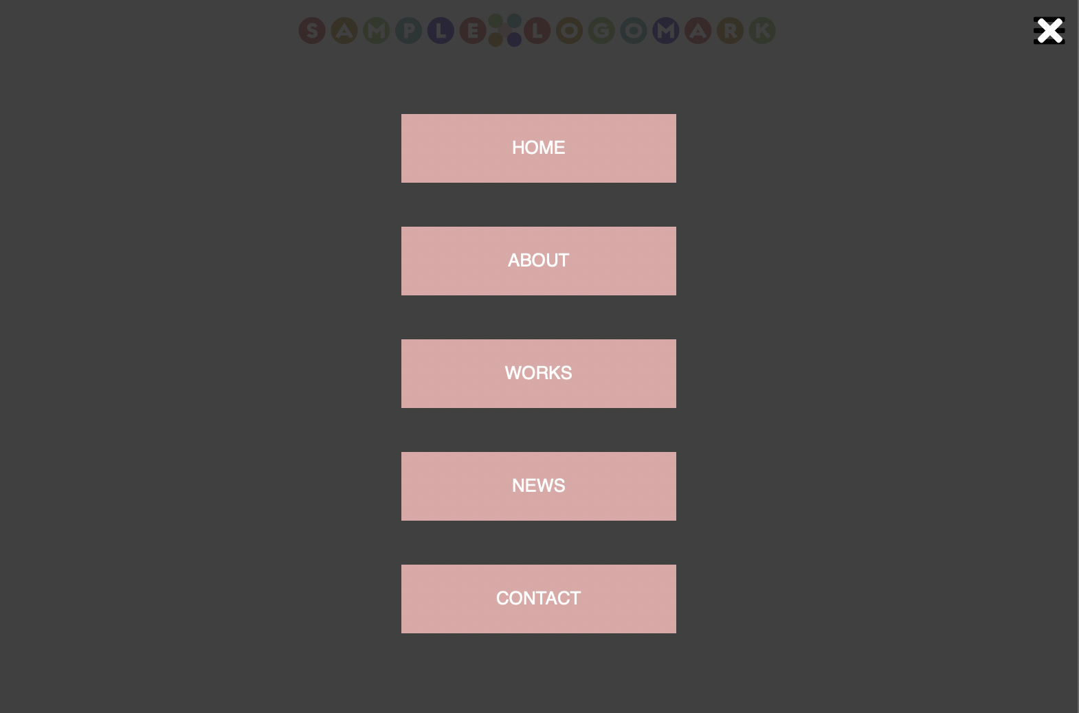
目標物
PC表示では小型ロゴ+ナビゲーションメニュー

スマホ・タブレットでは大型ロゴ+ハンバーガーメニュー

HTML
<link>でfontawesomeを読み込んでいます。その他特筆すべき部分はありません。
<!DOCTYPE html>
<html>
  <head>
    <meta charset="utf-8">
    <title>ハンバーガーメニューのサンプル</title>
    <link rel="stylesheet" href="style.css">
    <link rel="stylesheet" href="https://cdnjs.cloudflare.com/ajax/libs/font-awesome/5.15.3/css/all.min.css" integrity="sha512-iBBXm8fW90+nuLcSKlbmrPcLa0OT92xO1BIsZ+ywDWZCvqsWgccV3gFoRBv0z+8dLJgyAHIhR35VZc2oM/gI1w==" crossorigin="anonymous" referrerpolicy="no-referrer" />
    <meta name="viewport" content="width=device-width, initial-scale=1.0">
  </head>
  <body>
    <header>
      <nav>
        <a href="#"><img id="top-logo" src="images/toplogo.png" alt="TOP LOGO"><img id="top-logo2" src="images/toplogo2.svg" alt="TOP LOGO"></a>
        <i class="fas fa-bars" id="menu"></i>
        <ul id="nav-ul">
          <i class="fas fa-times" id="close-button"></i>
          <li><a href="#">HOME</a></li>
          <li><a href="#">ABOUT</a></li>
          <li><a href="#">WORKS</a></li>
          <li><a href="#">NEWS</a></li>
          <li><a href="#">CONTACT</a></li>
        </ul>
      </nav>
    </header>
    <script src="./src/main.js"></script>
  </body>
</html>
CSS
PC向け
みんな大好きなdisplay: flex;でレイアウトしています。
PC向けでは非表示な要素はdisplay: none;です。
body {
  font-family: sans-serif;
  margin: 0;
}
a {
  text-decoration: none;
}
/* ヘッダー */
header {
  display: flex;
  justify-content: center;
  position: fixed;
  width: 100%;
  height: 50px;
  top: 0px;
  z-index:10;
  background: #F6DFDE;
}
header nav {
  display: flex;
  width: 100%;
  max-width: 1058px;
}
header a img#top-logo {
  height: 30px;
  padding: 10px;
  background: #FFF;
}

header a img#top-logo2 {
  display: none;
}

header i.fa-bars {
  display: none;
}

# close-button {
  display: none;
}

header ul {
  display: flex;
  width: 100%;
  max-width: 1000px;
  margin: 0;
  padding: 0;
}

header ul li {
  list-style: none;
  text-align: center;
  border-right: 1px solid #FFF;
  background: #E0A7A6;
  width: calc(100% / 5);
  max-width: 200px;
  padding: 0;
  margin: 0;
  border-bottom: none;
}

header ul li:hover {
  background: #F6DFDE;
}

header ul li a {
  display: block;
  color: #FFF;
  font-size: 13px;
  line-height: 50px;
  width: 100%;
  height: 100%;
}

# menu {
  cursor: pointer;
}
スマホ・タブレット向け
max-width: 800pxでメディアクエリを切っています。
.showクラスによりモーダルの表示・非表示を切り替えます。
flex-flow: column;とalign-items: center;で中央揃え縦並びにします。
::before擬似要素によりロゴを中央揃えにしています。
/* タブレット向けサイズ */
@media screen and (max-width: 800px) {
  header {
    background: #FFF;
  }
  header nav {
    justify-content: center;
  }
  header nav::before {
    content: "";
    width: 22.75px;
    display: block;
    margin: 0 auto 0 10px;
  }
  header a img#top-logo {
    display: none;
  }
  header a img#top-logo2 {
    display: inline;
    height: 30px;
    padding: 10px;
  }
  header i.fa-bars {
    display: inline;
    font-size: 26px;
    line-height: 50px;
    margin: 0 10px 0 auto;
  }
  #nav-ul {
    display: none;
  }
  #nav-ul.show {
    display: flex;
    position: absolute;
    flex-flow: column;
    align-items: center;
    top: 0;
    left: 0;
    width: 100%;
    height: 100vh;
    background: rgba(0,0,0,0.75);
  }
  #nav-ul.show li {
    width: 80%;
    margin: 16px auto;
    border: none;
  }
  #close-button {
    display: inline;
    margin: 0 12px 20px auto;
    color: #FFF;
    font-size: 26px;
    line-height: 50px;
    cursor: pointer;
  }
}
JavaScript
clickイベントを拾ってshowクラスをadd/removeするだけです。
remove時は<ul>要素全体でイベントを拾います。
リンクに触れたとき、クローズボタンに触れたとき、その他の部分に触れたときのいずれの場合もモーダルウィンドウを閉じることができます。
/**
 * @param {HTMLElement}
 */
let menu = document.getElementById("menu");

/**
 * @param {HTMLElement}
 */

let navUl = document.getElementById("nav-ul");

/**
 * @param {HTMLElement}
 */
let closeButton = document.getElementById("close-button");


menu.addEventListener("click",function(){
  navUl.classList.add("show");
});

navUl.addEventListener("click",function(){
  navUl.classList.remove("show");
});