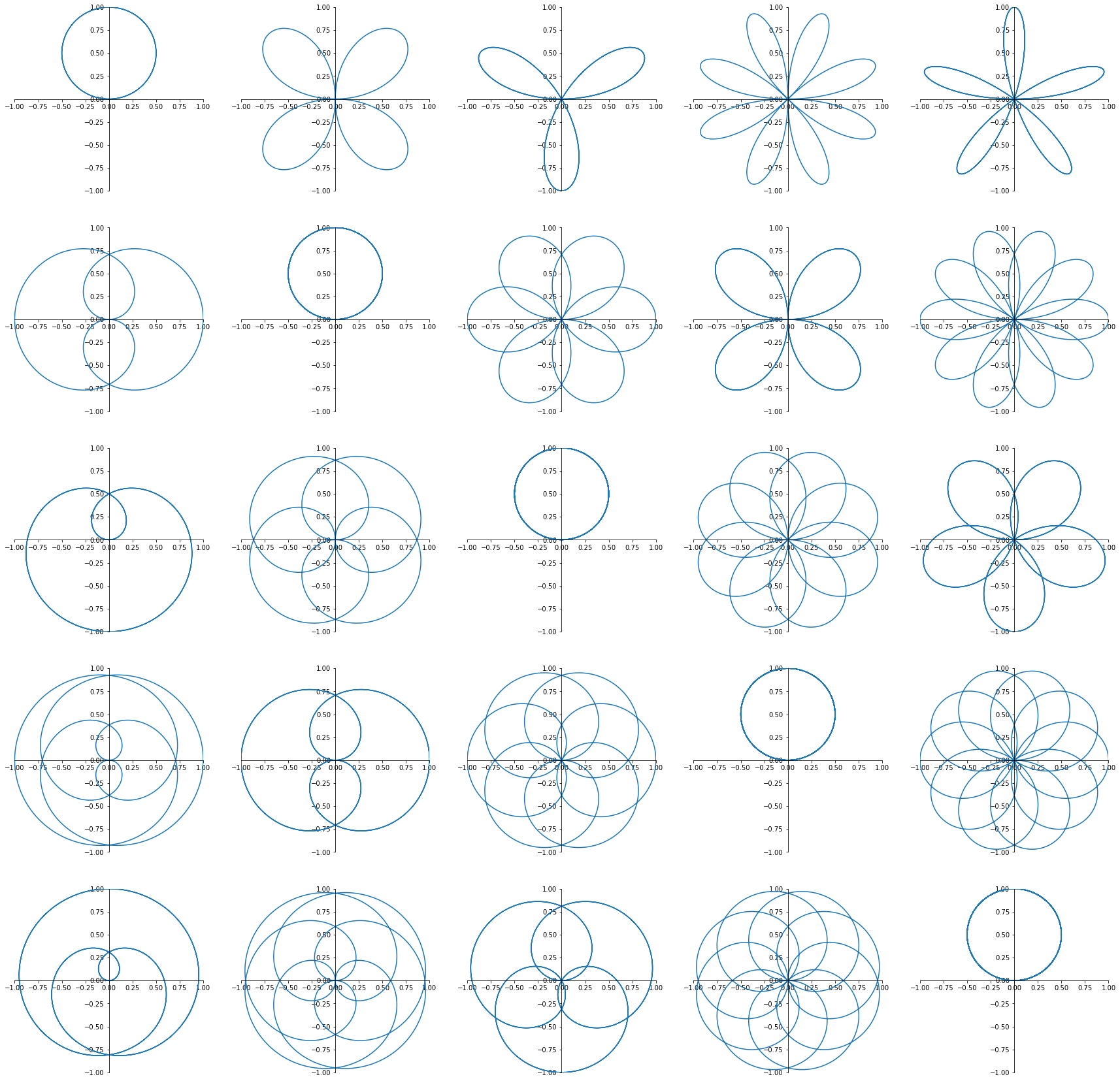
import matplotlib.pyplot as plt
import numpy as np

fig = plt.figure(figsize=(30,30))
c=1
for k in range(1,6):
  for n in range(1,6):

    ax = fig.add_subplot(5,5,c)
    ax.spines['right'].set_visible(False)
    ax.spines['top'].set_visible(False)
    ax.spines['bottom'].set_position('zero')
    ax.spines['left'].set_position('zero')
    ax.axis([-1,1,-1,1])

    th = np.arange(0, (2*np.pi)*k, 0.01)

    r = np.sin((n/k)*th)
    x = r * np.cos(th) # 極座標からの変換
    y = r * np.sin(th) # 極座標からの変換

    ax.plot(x, y) # 描画

    c+=1
実行結果