React NativeではAnimatedという標準機能を使ってアニメーションを付けることができます。
公式ドキュメント
https://facebook.github.io/react-native/docs/animations#docsNav
https://facebook.github.io/react-native/docs/animated
平たく言うと、基本的にこのような流れになります。
- 動的に変化させる値を
new Animated.Value([初期値])で作成 - 1を
AnimatedComponentのpropsに渡してrenderする(開発者が意識するコンポーネントのrenderはこの時だけ) - 必要に応じて1の値を変化させる
- 内部的にパフォーマンス最適化された形で2でrenderしたコンポーネントが1の値の変化に応じてアニメーションされる
React Nativeの基本的な要素は最初からAnimatedComponentとして用意されていて(Animated.ViewやAnimated.Textなど)、そのほかの要素の場合はAnimated.createdAnimatedComponent([Reactコンポーネント])でAnimatedComponent化することができます。
AnimatedComponent化することで、通常は数値や色の文字列としてpropsに渡すようなコンポーネントや、styleに対しても、Animated.Valueをセットすることができるようになります。
もちろん単にstateを段階的に変化させ、毎フレームコンポーネントをrenderすることでもアニメーションは実装できるのですが、これはネイティブの要素を直接変化させたりをやってくれているようなので、パフォーマンス的に有利なようです。
この記事では、Animatedの機能をある程度使ってこのようなカルーセルを作ってみます。
まず、コンポーネントの全体のソースはこちら、
import React, { Component, Fragment } from "react";
import {
View,
StyleSheet,
StatusBar,
TouchableWithoutFeedback,
Easing,
Animated,
Dimensions
} from "react-native";
import { LinearGradient } from "expo-linear-gradient";
import { PanGestureHandler, State } from "react-native-gesture-handler";
const colors = {
white: "#fff",
black: "#000"
};
const styles = StyleSheet.create({
container: {
flex: 1,
height: "100%",
width: "100%",
justifyContent: "center",
alignItems: "center",
backgroundColor: colors.black
},
slide: {
position: "absolute",
width: "100%",
height: "100%",
justifyContent: "center",
alignItems: "center"
},
slideImage: {
width: "100%",
height: "100%",
},
slideDescription: {
position: "absolute",
width: "100%",
fontSize: 18,
bottom: 64,
lineHeight: 26,
textAlign: "center",
fontWeight: "bold",
color: colors.white,
zIndex: 1
},
descriptionBg: {
position: "absolute",
width: "100%",
height: 200,
left: 0,
bottom: 0
},
paginationWrapper: {
position: "absolute",
bottom: 24,
flexDirection: "row"
},
pagination: {
width: 8,
height: 8,
marginHorizontal: 4,
borderRadius: 4,
borderWidth: 1,
borderColor: colors.white
},
paginationInner: {
width: "100%",
height: "100%",
backgroundColor: colors.white
}
});
const data = [
{
color: "rgb(146, 101, 34)",
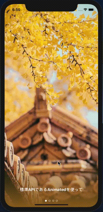
description: "標準APIであるAnimatedを使って",
image: require(`./assets/images/1.jpeg`),
},
{
color: "rgb(21, 55, 67)",
description: "意外と簡単に",
image: require(`./assets/images/2.jpeg`)
},
{
color: "rgb(206, 34, 32)",
description: "このようなカルーセルを",
image: require(`./assets/images/3.jpeg`)
},
{
color: "rgb(48, 66, 46)",
description: "作ることができます",
image: require(`./assets/images/4.jpeg`)
}
];
class LinearGradientHelper extends Component {
render() {
const { color1, color2, start, end, style } = this.props;
return (
<LinearGradient style={style} colors={[color1, color2]} start={start} end={end} />
);
}
}
const AnimatedGradient = Animated.createAnimatedComponent(LinearGradientHelper);
export default class Carousel extends Component {
position = new Animated.Value(0);
panStartPosition = 0;
onPan = event => {
const position =
this.panStartPosition -
event.nativeEvent.translationX / Dimensions.get("window").width;
if (position >= 0 && position <= data.length - 1) {
this.position.setValue(position);
this.direction = event.nativeEvent.x < this.prevPanX;
this.prevPanX = event.nativeEvent.x;
}
};
onPanStateChange = event => {
if (event.nativeEvent.state === State.BEGAN) {
this.panStartPosition = this.position._value;
} else if (event.nativeEvent.state === State.END) {
delete this.panStartPosition;
this.slideTo(
this.direction
? Math.ceil(this.position._value)
: Math.floor(this.position._value)
);
}
};
slideTo = index => {
Animated.timing(this.position, {
toValue: index,
duration: 500,
easing: Easing.in(Easing.out(Easing.ease))
}).start();
};
render() {
return (
<PanGestureHandler
onGestureEvent={this.onPan}
onHandlerStateChange={this.onPanStateChange}
>
<View style={styles.container}>
<StatusBar barStyle="dark-content" />
{data.map((item, index) => (
<Fragment key={index}>
<View style={styles.slide}>
<Animated.Image
source={item.image}
style={[
styles.slideImage,
{
opacity: this.position.interpolate({
inputRange: [index - 1, index, index + 1],
outputRange: [0, 1, 0]
}),
transform: [
{
scale: this.position.interpolate({
inputRange: [index - 1, index, index + 1],
outputRange: [1, 1.1, 1.2]
})
}
]
}
]}
/>
</View>
</Fragment>
))}
{data.map((item, index) => (
<Animated.Text
key={index}
style={[
styles.slideDescription,
{
opacity: this.position.interpolate({
inputRange: [index - 1, index - 0.4, index, index + 0.4, index + 1],
outputRange: [0, 0, 1, 0, 0]
}),
transform: [
{
translateX: this.position.interpolate({
inputRange: [index - 1, index, index + 1],
outputRange: [15, 0, -15]
})
}
]
}
]}
>
{item.description}
</Animated.Text>
))}
<AnimatedGradient
style={styles.descriptionBg}
color1={this.position.interpolate({
inputRange: data.map((item, index) => (index)),
outputRange: data.map(item => item.color.replace("rgb", "rgba").replace(")", ", 1)"))
})}
color2={this.position.interpolate({
inputRange: data.map((item, index) => (index)),
outputRange: data.map(item => item.color.replace("rgb", "rgba").replace(")", ", 0)"))
})}
start={[0, 1]}
end={[0, 0]}
/>
<View style={styles.paginationWrapper}>
{data.map((item, index) => (
<TouchableWithoutFeedback
key={index}
onPress={() => this.slideTo(index)}
>
<Animated.View
style={[
styles.pagination,
{
borderWidth: this.position.interpolate({
inputRange: [index - 1, index - 0.2, index, index + 0.2, index + 1],
outputRange: [1, 1, 4, 1, 1]
})
}
]}
/>
</TouchableWithoutFeedback>
))}
</View>
</View>
</PanGestureHandler>
);
}
}
Animatedの他に、パン操作をハンドリングするためにreact-native-gesture-handlerを使用します。これはreact-navigationが依存しているモジュールなので採用しました。
スタイリングは割愛して、Animatedを使っている部分を順に見ていきます。
インスタンス変数の定義部分
  position = new Animated.Value(0);
  panStartPosition = 0;
  prevPanX = 0;
カルーセルの各スライドに関するデータが入った配列(data)があるとして、0からdataの最大インデックスまでの段階的な値をとって位置を表現するためのpositionという値を用意します。
パン操作を適切に処理するために、パン操作を開始した時点でのpositionの値も保持するため、これをpanStartPositionとして定義しておきます。また、パン操作の向きを判定するための値も用意します。
react-native-gesture-handlerでパン操作をハンドリング
パン操作時で毎回呼ばれるリスナー関数をonGestureEvent、パン操作の開始・終了に対するリスナー関数をonHandlerStateChangeに指定します。
import { PanGestureHandler, State } from "react-native-gesture-handler";

<PanGestureHandler
  onGestureEvent={this.onPan}
  onHandlerStateChange={this.onPanStateChange}
>
{/* 省略... */}
</PanGestureHandler>
  onPan = event => {
    const position =
      this.panStartPosition -
      event.nativeEvent.translationX / Dimensions.get("window").width;
    if (position >= 0 && position <= data.length - 1) {
      this.position.setValue(position);
      this.direction = event.nativeEvent.x < this.prevPanX;
      this.prevPanX = event.nativeEvent.x;
    }
  };

  onPanStateChange = event => {
    if (event.nativeEvent.state === State.BEGAN) {
      this.panStartPosition = this.position._value;
    } else if (event.nativeEvent.state === State.END) {
      delete this.panStartPosition;
      this.slideTo(
        this.direction
          ? Math.ceil(this.position._value)
          : Math.floor(this.position._value)
      );
    }
  };
パン操作を開始した時(event.nativeEvent.state === State.BEGAN)、panStartPositionに現在のpositionの値を保持しておきます。
Animated.Valueの現在の値は_valueで取得できます。アンダースコアがついているということは推奨されていないみたいですね。これ以外に簡単に値を取得する方法はわからず、もし不安であれば別に変数を用意しておいて同時に変更するのでもいいと思います。
パン操作の毎回のイベント時には、実際にpositionを変化させ、パン操作の向きを判定して保持しておくなどしておきます。まあ、この辺りのパターンは何でも同じな気がします。
Animated.Valueの値を直接指定の値に変化させるためには、setValueメソッドを使います。
パン操作が終了したら、向きに応じてpositionをキリのいい前後どちらかのスライド位置までアニメーションさせます。
  slideTo = index => {
    Animated.timing(this.position, {
      toValue: index,
      duration: 500,
      easing: Easing.in(Easing.out(Easing.ease))
    }).start();
  };
この部分で、duration、easingなどを指定してAnimated.timingメソッドを使用し指定のインデックスまでpositionを変化させます。
これで、カルーセルの基本的な動作のための準備ができました。
あとはこのpositionの値に応じて変化する、純粋関数的なViewコンポーネントを作っていくようなイメージになります。
画像の表示部分
各スライドのデータごとに画像を生成している部分です。
          {data.map((item, index) => (
            <Fragment key={index}>
              <View style={styles.slide}>
                <Animated.Image
                  source={item.image}
                  style={[
                    styles.slideImage,
                    {
                      opacity: this.position.interpolate({
                        inputRange: [index - 1, index, index + 1],
                        outputRange: [0, 1, 0]
                      }),
                      transform: [
                        {
                          scale: this.position.interpolate({
                            inputRange: [index - 1, index, index + 1],
                            outputRange: [1, 1.1, 1.2]
                          })
                        }
                      ]
                    }
                  ]}
                />
              </View>
            </Fragment>
          ))}
ここではそれぞれのスライドが、
前のスライドが表示されている 〜 当のスライドが表示されている 〜 次のスライドが表示されている
というpositionの段階的な変化に応じて、
opacityが0 〜 1 〜 0
scaleが1 〜 1.1 〜 1.2
という風に段階的な変化をするようにしています。
interpolateメソッドを使って、このようにAnimated.Valueの値の変化を別の形の変化に変換するような処理をすることができます。
テキストの表示部分
テキストの方は、opacityとtranslateXを変化させます。
opacityの方では値の区切りを工夫することで、それぞれのテキストが重なって表示されるタイミングが無いようにしています。
          {data.map((item, index) => (
            <Animated.Text
              key={index}
              style={[
                styles.slideDescription,
                {
                  opacity: this.position.interpolate({
                    inputRange: [index - 1, index - 0.4, index, index + 0.4, index + 1],
                    outputRange: [0, 0, 1, 0, 0]
                  }),
                  transform: [
                    {
                      translateX: this.position.interpolate({
                        inputRange: [index - 1, index, index + 1],
                        outputRange: [15, 0, -15]
                      })
                    }
                  ]
                }
              ]}
            >
              {item.description}
            </Animated.Text>
          ))}
ナビゲーションの表示部分
このような
○ ○ ● ○
ナビゲーションの表示部分は、borderWidthの変化に。
            {data.map((item, index) => (
              <TouchableWithoutFeedback
                key={index}
                onPress={() => this.slideTo(index)}
              >
                <Animated.View
                  style={[
                    styles.pagination,
                    {
                      borderWidth: this.position.interpolate({
                        inputRange: [index - 1, index - 0.2, index, index + 0.2, index + 1],
                        outputRange: [1, 1, 4, 1, 1]
                      })
                    }
                  ]}
                />
              </TouchableWithoutFeedback>
            ))}
グラデーションの表示部分
デザイン的には余計な気もしますが、グラデーションもアニメーションできるかどうか試してみました。
expo-linear-gradientを使用します。このコンポーネントでは、グラデーションのそれぞれの位置の色を配列でpropsに渡すのですが、Animated.createAnimatedComponentで作成したAnimatedComponentに渡すAnimated.Valueは、配列で渡すことができません。
なので、一つラッパーを作成して、配列ではなくcolor1、color2という風に渡すような形に直します。
このtipsはこちらの記事を参考にしました。
class LinearGradientHelper extends Component {
  render() {
    const { color1, color2, start, end, style } = this.props;
    return (
      <LinearGradient style={style} colors={[color1, color2]} start={start} end={end} />
    );
  }
}

const AnimatedGradient = Animated.createAnimatedComponent(LinearGradientHelper);
interpolateのinputRangeに[0, 1, 2, 3, n...]、outputRangeに色の配列を渡すことで、各スライドに応じた色から色へ変化するようにします。
          <AnimatedGradient
            style={styles.descriptionBg}
            color1={this.position.interpolate({
              inputRange: data.map((item, index) => (index)),
              outputRange: data.map(item => item.color.replace("rgb", "rgba").replace(")", ", 1)"))
            })}
            color2={this.position.interpolate({
              inputRange: data.map((item, index) => (index)),
              outputRange: data.map(item => item.color.replace("rgb", "rgba").replace(")", ", 0)"))
            })}
            start={[0, 1]}
            end={[0, 0]}
          />
終わり
これで完成しました。
このように、Animatedを使えば、段階的に変化する値が一つあるだけでもそれなりに多様なアニメーションが作れることがわかりました。