React Nativeで基本的なフォーム画面を作成する手法を模索したのでまとめてみます。ラジオボタンやドロップダウン選択など、アプリにあまり無いようなものも使ってフォームを作成する際、悩ましいのがこういう点だと思います。
- UIコンポーネント類はいくつかあるが、色々な種類のフォームフィールドを扱うためのスタンダードなライブラリが無い
- それらをつぎはぎするとデザインが統一しにくくなる
- デザインのカスタマイズをある程度できるようにしたい
- そもそもチェックボックスやラジオボタンなどにライブラリを使う必要を感じない(でもなるべく煩雑にならないようにしたい)
- Formik等にstate管理を任せてYupでバリデーションしたい、でもFormikとReact Nativeの相性があまりよくない
これらをなるべく解決したいと思います。
デザインのカスタマイズ性と既成のUIコンポーネント類を使う手軽さとどちらを取るかは人によって考え方が異なると思いますが、使いたい全ての機能をサポートするような既成のものがなかったため、この記事では自作している部分が多くなりました。
対応するフォーム用コンポーネント
- テキスト入力
- ラジオボタン
- チェックボックス
- トグルスイッチ
- ドロップダウン
- ファイル入力
- 日付選択
Formik / Yup を導入
最終的なソースを最後に載せますが、順を追って要素を追加していきます。
import React, { Component } from "react";
import {
StyleSheet,
Text,
View,
ScrollView,
TextInput
} from "react-native";
import { Formik } from "formik";
import * as Yup from "yup";
const schema = Yup.object().shape({
name: Yup.string()
.min(3, "3文字以上で入力してください")
.max(20, "20文字以内で入力してください")
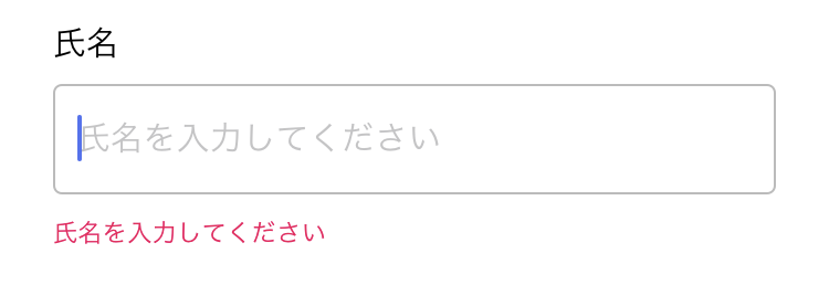
.required("氏名を入力してください")
});
const styles = StyleSheet.create({
container: {
width: "100%",
padding: 24,
backgroundColor: "#fff",
alignItems: "center",
justifyContent: "center"
},
form: {
width: "100%"
}
});
export default class App extends Component {
onSubmit = async (values, actions) => {
// データ送信
};
render() {
return (
<ScrollView contentContainerStyle={styles.container}>
<View style={styles.form}>
<Formik
initialValues={{
name: ""
}}
validateOnMount
validationSchema={schema}
onSubmit={this.onSubmit}
>
{({ handleSubmit, handleChange, handleBlur, isValid, isSubmitting, values, errors, touched }) => (
<>
<View>
{errors.name && touched.name ? <Text>{errors.name}</Text> : null}
<TextInput
value={values.name}
onChangeText={handleChange('name')}
onBlur={handleBlur('name')}
placeholder="氏名を入力してください"
/>
</View>
<Button
title="Submit"
onPress={handleSubmit}
disabled={!isValid || isSubmitting}
/>
</>
)}
</Formik>
</View>
</ScrollView>
);
}
}
大まかな流れとしてはHTMLと一緒ですが、HTMLでFormikを使用する場合は<Form />や<Field />などのコンポーネントをそのまま使って簡潔に書けるのに対して、React NativeでFormikを使う際は一手間必要です。
エラーの表示や入力イベントのハンドリングなどを<Formik />の子要素として渡すfunctionの引数(errors, handleChange等)から自分で処理します。
また、Formikはテキスト入力以外のフィールドからは通常HTMLのイベントを利用して値などを取得しているため、React Nativeで文字列以外の値を持つ入力フィールドを普通に作ろうとすると以下のようなエラーが出ると思います。
TypeError: undefined is not an object (evaluating 'target.type')
そこで、これらを解決するためというのと、複数種類の入力フィールドのデザインを統一するために、各フィールドをラップするコンポーネントを作ってみます。
FormFieldコンポーネントを作成
まずはHTMLに依存している部分を避けてFormikをReact Nativeで使うために、react-native-formikというヘルパーをインストールし、withFormikControl関数を使ってみます。
これは引数に与えられたコンポーネントのpropsにFormikの状態やセッター関数を渡してくれる高階functional componentだと認識しておけば大丈夫です。ちなみに実装自体はシンプルなのですが、npmでUnpacked Sizeが2.4 MBとあったので何事かと思ったら、サンプル画像の容量が大きいだけでした。
さて、このwithFormikControlを使ってコンポーネントをラップしますが、せっかくなので下記のように、フィールドのタイトルやエラーの処理、デザインなどを統一するためのさらに高階のコンポーネント(FormField)を作っておきます。
import React from "react";
import * as PropTypes from "prop-types";
import { View, Text, StyleSheet } from "react-native";
import { withFormikControl } from "react-native-formik";
import colors from "../constants/colors";

const styles = StyleSheet.create({
  container: {
    width: "100%",
    marginVertical: 12,
    paddingBottom: 24
  },
  label: {
    fontSize: 16,
    marginBottom: 10
  },
  error: {
    position: "absolute",
    color: colors.red,
    fontSize: 12,
    bottom: 0
  }
});

function FormField(WrappedComponent) {
  return withFormikControl(function(props) {
    const { label, error, touched } = props;
    return (
      <View style={styles.container}>
        <Text style={styles.label}>{label}</Text>
        <WrappedComponent {...props} />
        {error && touched ? <Text style={styles.error}>{error}</Text> : null}
      </View>
    );
  });
}

FormField.propTypes = {
  label: PropTypes.string.isRequired,
  name: PropTypes.string.isRequired
};

export default FormField;
FormField > withFormikControl > 子要素(WrappedComponent)という構造になっているのがわかるでしょうか。
バリデーションエラーはフィールドを触っていなければ表示しないようにするために、touchedも見て表示を切り替えています。
また、スタイリングの話ですが、エラー表示によって下の要素がガタッとずれないようにposition: "absolute"やpaddingによって調整しています。
ちょっと分かりにくいかもしれないので、一番シンプルなテキスト入力フィールドの例を先に載せます。
テキスト入力コンポーネントを作成
import React from "react";
import * as PropTypes from "prop-types";
import { TextInput } from "react-native";
import colors from "../constants/colors";
import FormField from "./FormField";

const style = {
  width: "100%",
  height: 50,
  paddingHorizontal: 10,
  borderWidth: 1,
  borderColor: colors.border,
  borderRadius: 4,
  fontSize: 16
};

function Input(props) {
  const { placeholder, value, setFieldValue, setFieldTouched } = props;
  return (
    <TextInput
      style={style}
      placeholder={placeholder}
      autoCapitalize="none"
      onChangeText={setFieldValue}
      onBlur={() => setFieldTouched(true)}
      value={value}
    />
  );
}

Input.defaultProps = {
  placeholder: "",
  value: ""
};

Input.propTypes = {
  placeholder: PropTypes.string,
  value: PropTypes.string,
  setFieldValue: PropTypes.func.isRequired,
  setFieldTouched: PropTypes.func.isRequired
};

export default FormField(Input);
フォーム内に追加するときはこのような感じになります。
...
{({ handleSubmit, isValid, isSubmitting }) => (
  <>
    <Input
      label="氏名"
      name="name"
      placeholder="氏名を入力してください"
    />
...
Input.js自体は普通っぽいですが、最後の行でFormField関数によってコンポーネントをラップしています。
App.jsの例を見て分かる通り、このInputコンポーネント自体に明示的に渡すpropsはlabelとname、placeholderのみ(もちろん、styleやdisabledなど適宜追加してOKですし、propsをそのまま全てdeconstructionして渡すのでもOK)です。
labelはFormField関数内でタイトルとして表示されるために利用され、nameはwithFormikControlを通してFormikにおいてどのフィールドの要素なのかを特定するために使われます。そして、placeholderは最終的にInput.jsで定義した子要素に伝わります。
Input.jsでJSXを返している部分を見てみると、propsにvalue, setFieldValue, setFieldTouchedといった値が入っていて、それを使ってvalueやtouchedの変更していることが分かるかと思います。これらの値はwithFormikControlを通したことで追加されたものです。
さて、これでFormikをReact Nativeで扱うときの問題はスッキリ解決しそうです。
タイトルやエラー表示を共通化しつつ、スタイリング自由なテキスト入力フィールドができました。
ここで一旦ちょっと脇道にそれる気がしますが、入力中にキーボードが表示されている時に、ビューの他の部分をタップしたらキーボードを閉じる処理を追加します。これはHTMLと違って自分で処理しなければいけません。
ページ全体をTouchableWithoutFeedbackで囲み、onPress(あるいはonPressInでも)でKeyboard.dismissメソッドを呼ぶようにしておきます。
import {
...
  TouchableWithoutFeedback,
  Keyboard,
...
} from "react-native";

...
      <ScrollView contentContainerStyle={styles.container}>
        <TouchableWithoutFeedback onPress={Keyboard.dismiss}> // ここ
          <View style={styles.form}> // 以下Formik
...
ラジオボタンを作成
さて、ここからは単純にそれぞれのコンポーネントを作っていきます。
あとあとデザインの変更やアニメーションの調整など容易にするために、(使えるライブラリは使いつつも)あまり大したことをしていないUIコンポーネント類はなるべく使わないという方向でいきます。
import React from "react";
import * as PropTypes from "prop-types";
import { View, Text, TouchableOpacity, StyleSheet } from "react-native";
import colors from "../constants/colors";
import FormField from "./FormField";

const styles = StyleSheet.create({
  container: {
    flexDirection: "row"
  },
  option: {
    padding: 10,
    marginLeft: -10,
    marginRight: 30,
    flexDirection: "row",
    alignItems: "center"
  },
  label: {
    fontSize: 16
  },
  labelActive: {
    color: colors.accent
  },
  icon: {
    width: 20,
    height: 20,
    marginLeft: 10,
    borderWidth: 1,
    borderRadius: 10,
    borderColor: colors.border,
    justifyContent: "center",
    alignItems: "center"
  },
  iconActive: {
    borderColor: colors.accent
  },
  iconInner: {
    width: 10,
    height: 10,
    backgroundColor: colors.accent,
    borderRadius: 5
  }
});

function RadioButton(props) {
  const { options, value, setFieldValue } = props;
  return (
    <View style={styles.container}>
      {options.map(option => {
        const active = option.value === value;
        return (
          <TouchableOpacity
            disabled={active}
            key={option.value}
            onPress={() => {
              setFieldTouched(true);
              setFieldValue(option.value);
            }}
          >
            <View style={[styles.option, active && styles.active]}>
              <Text style={[styles.label, active && styles.labelActive]}>
                {option.label}
              </Text>
              <View style={[styles.icon, active && styles.iconActive]}>
                {active && <View style={styles.iconInner} />}
              </View>
            </View>
          </TouchableOpacity>
        );
      })}
    </View>
  );
}

RadioButton.defaultProps = {
  value: null
};

RadioButton.propTypes = {
  value: PropTypes.oneOfType([PropTypes.string, PropTypes.number]),
  options: PropTypes.arrayOf(
    PropTypes.shape({
      label: PropTypes.string.isRequired,
      value: PropTypes.oneOfType([PropTypes.string, PropTypes.number])
        .isRequired
    })
  ).isRequired,
  setFieldValue: PropTypes.func.isRequired,
  setFieldTouched: PropTypes.func.isRequired
};

export default FormField(RadioButton);
ラジオボタンは、表示名と値を持つ選択肢の配列を受け取り現在の値によって表示を切り替える単純な要素です。
Formikと連携するため、何かしら選択したときにsetFieldTouchedにtrueを渡してFormikのtouchedを変更します。これらの処理は既成のUIコンポーネントを使用しても構造的に同じになります。
// 選択肢の定義
const genderOptions = [
  { label: "男性", value: 0 },
  { label: "女性", value: 1 }
];

// Yupのスキーマを定義(値は数値にしてみます。他の値を取らないよう制限も追加。)
const schema = Yup.object().shape({
  ...
  gender: Yup.number()
    .oneOf(
      genderOptions.map(option => option.value),
      "性別を選択して下さい"
    )
    .required("性別を選択して下さい"),
  ...
});

// フォーム内に追加
<RadioButton
  label="性別"
  name="gender"
  options={genderOptions}
/>
これでシンプルなラジオボタンができました。

チェックボタンを作成
import React from "react";
import * as PropTypes from "prop-types";
import { View, Text, StyleSheet, TouchableOpacity } from "react-native";
import Icon from "@expo/vector-icons/Ionicons";
import colors from "../constants/colors";
import FormField from "./FormField";

const styles = StyleSheet.create({
  container: {
    padding: 10,
    marginLeft: -10,
    marginTop: -10,
    marginBottom: -10,
    marginRight: -10,
    flexDirection: "row",
    alignItems: "center"
  },
  box: {
    width: 30,
    height: 30,
    marginRight: 10,
    borderWidth: 1,
    borderRadius: 4,
    borderColor: colors.border,
    justifyContent: "center",
    alignItems: "center"
  },
  checked: {
    backgroundColor: colors.accent,
    borderColor: colors.accent
  },
  checkedInner: {
    width: 30,
    height: 30,
    textAlign: "center"
  }
});

function CheckBox(props) {
  const { title, value, setFieldValue, setFieldTouched } = props;
  return (
    <TouchableOpacity
      onPress={() => {
        setFieldTouched(true);
        setFieldValue(!value);
      }}
    >
      <View style={styles.container}>
        <View style={[styles.box, value && styles.checked]}>
          {value && (
            <Icon
              name="ios-checkmark"
              size={30}
              color={colors.white}
              style={styles.checkedInner}
            />
          )}
        </View>
        <Text style={styles.title}>{title}</Text>
      </View>
    </TouchableOpacity>
  );
}

CheckBox.propTypes = {
  title: PropTypes.string.isRequired
};

export default FormField(CheckBox);
こちらも非常にシンプルに、真偽値に応じて見た目を変えればOKです。
上記のラジオボタンの場合は一回タップしたら何かしら選択せざるをえないためrequiredエラーが発生することはありませんが、こちらのチェックボックスの場合はYupでチェックを必要とするようにしてみます。
const schema = Yup.object().shape({
  ...
  terms: Yup.bool()
    .oneOf([true], "同意が必要です"),
  ...
});

<CheckBox label="同意事項" title="同意する" name="terms" />
チェックした状態から

チェックを外すと、touchedがtrueになっているのでエラー文言が表示されます。(FormField.jsで実装した部分)

トグルスイッチ(Switch)を作成
トグルスイッチは各OS標準のものをそのまま使ってみます。
import React from "react";
import { Switch as RNSwitch, View, StyleSheet } from "react-native";
import FormField from "./FormField";
import colors from "../constants/colors";

const styles = StyleSheet.create({
  container: {
    alignItems: "flex-start"
  }
});

function Switch(props) {
  const { value, setFieldValue, setFieldTouched } = props;
  return (
    <View style={styles.container}>
      <RNSwitch
        value={value}
        ios_backgroundColor={colors.lightGray}
        thumbColor={colors.white}
        trackColor={{ true: colors.accent, false: colors.lightGray }}
        onValueChange={newValue => {
          setFieldTouched(true);
          setFieldValue(newValue);
        }}
      />
    </View>
  );
}

export default FormField(Switch);
処理の構造はチェックボックスと同様になります。
カスタマイズできるのは色のみですが、OS標準とあっておかしなところが無いので使いやすそうです。
各OS見た目が違い、このような感じになります。
iOS

Android

色を指定しない場合の標準デザインはこちら
iOS

Android

選択UIを作成
通常iOSではドラムロールで表示されるPickerを使用しますが、ここではドロップダウン型のものを作ってみます。
少しだけ複雑なコンポーネントになるため、必要とあれば既成のUIコンポーネント類を使用したいのですが、ことドロップダウンに関してはあまり需要がないのか、良いものが見つかりませんでした。(参考:https://qiita.com/zaburo/items/7e2d2f0f6b9317a7789e)
車輪の再発明かもしれませんが、それほど難しいものではないので自作してみます。
まず全体のソースはこちら
import React, { PureComponent } from "react";
import * as PropTypes from "prop-types";
import {
  Dimensions,
  FlatList,
  Modal,
  Text,
  View,
  StyleSheet,
  TouchableWithoutFeedback,
  TouchableOpacity
} from "react-native";
import Icon from "@expo/vector-icons/Ionicons";
import colors from "../constants/colors";
import FormField from "./FormField";

const styles = StyleSheet.create({
  container: {
    position: "relative",
    width: "100%"
  },
  current: {
    width: "100%",
    height: 50,
    lineHeight: 50,
    justifyContent: "center",
    paddingHorizontal: 10,
    borderWidth: 1,
    borderColor: colors.border,
    backgroundColor: colors.white,
    borderRadius: 4,
    fontSize: 16
  },
  arrow: {
    position: "absolute",
    top: 13,
    right: 16
  },
  option: {
    width: "100%",
    height: 49,
    lineHeight: 49,
    justifyContent: "center",
    paddingHorizontal: 10,
    backgroundColor: colors.white,
    fontSize: 16
  },
  separator: {
    width: "100%",
    height: 1,
    backgroundColor: colors.border
  },
  modal: {
    width: "100%",
    height: "100%"
  },
  modalBg: {
    position: "absolute",
    width: "100%",
    height: "100%",
    top: 0,
    left: 0
  },
  modalInner: {
    position: "absolute",
    height: "100%",
    zIndex: 1,
    borderRadius: 4,
    borderWidth: 1,
    borderColor: colors.border,
    shadowColor: colors.black,
    shadowOpacity: 0.3,
    shadowRadius: 3,
    shadowOffset: {
      width: 2,
      height: 2
    },
    elevation: 4
  },
  list: {
    backgroundColor: colors.white,
    borderRadius: 4
  }
});

class Select extends PureComponent {
  state = {
    active: false
  };

  /**
   * ドロップダウンを表示
   */
  open = () => {
    // 絶対座標で表示するために要素の位置・サイズを取得
    this.currentComponent.measureInWindow((x, y, width, height) => {
      const { maxHeight, minHeight, options } = this.props;
      const windowHeight = Dimensions.get("window").height;
      let modalY = y;
      const modalMinHeight = minHeight
        ? Math.min(options.length * height, minHeight)
        : null;
      let modalMaxHeight = Math.min(windowHeight - y, maxHeight);
      if (modalMinHeight > modalMaxHeight) {
        // 選択肢が下に見切れる場合は上向きに表示する
        modalMaxHeight = Math.min(y + height, maxHeight);
        modalY = y + height - modalMaxHeight;
      }
      this.setState({
        active: true,
        x,
        y: modalY,
        width,
        height,
        minHeight: modalMinHeight,
        maxHeight: modalMaxHeight
      });
    });
  };

  /**
   * ドロップダウンを非表示
   */
  dismiss = () => {
    const { setFieldTouched } = this.props;
    setFieldTouched(true);
    this.setState({ active: false });
  };

  render() {
    const { active, x, y, width, height, minHeight, maxHeight } = this.state;
    const { value, options, placeholder, setFieldValue } = this.props;
    const selectedOption = options[value];
    return (
      <View style={styles.container}>
        <TouchableOpacity onPress={this.open}>
          <View>
            <Text
              ref={component => {
                this.currentComponent = component;
              }}
              style={styles.current}
              suppressHighlighting
            >
              {selectedOption ? selectedOption.label : placeholder}
            </Text>
            <Icon
              name="ios-arrow-down"
              color={colors.border}
              size={24}
              style={styles.arrow}
            />
          </View>
        </TouchableOpacity>
        <Modal visible={active} transparent={true}>
          <View style={styles.modal}>
            <TouchableWithoutFeedback onPressIn={this.dismiss}>
              <View style={styles.modalBg} />
            </TouchableWithoutFeedback>
            <View
              style={[
                styles.modalInner,
                {
                  left: x,
                  top: y,
                  width: width,
                  minHeight,
                  maxHeight
                }
              ]}
            >
              <FlatList
                data={options}
                ItemSeparatorComponent={() => <View style={styles.separator} />}
                keyExtractor={item => item.label}
                initialScrollIndex={value}
                getItemLayout={(data, index) => ({
                  length: height,
                  offset: height * index,
                  index
                })}
                style={styles.list}
                renderItem={({ item, index }) => (
                  <TouchableOpacity
                    onPress={() => {
                      this.dismiss();
                      setFieldValue(index);
                    }}
                  >
                    <Text style={styles.option} suppressHighlighting>
                      {item.label}
                    </Text>
                  </TouchableOpacity>
                )}
              />
            </View>
          </View>
        </Modal>
      </View>
    );
  }
}

Select.defaultProps = {
  selectedIndex: -1,
  maxHeight: 225,
  minHeight: 125,
  placeholder: "選択してください"
};

Select.propTypes = {
  value: PropTypes.number,
  options: PropTypes.arrayOf(
    PropTypes.shape({
      label: PropTypes.string.isRequired,
      value: PropTypes.oneOfType([PropTypes.string, PropTypes.number])
        .isRequired
    })
  ).isRequired,
  placeholder: PropTypes.string,
  maxHeight: PropTypes.number
};

export default FormField(Select);
現在の値、あるいはプレースホルダーを表示しておき、タップしたら選択肢を表示すればよいわけです。
ここで考慮するのは、
- React NativeのModalを使用する(FlatListをそのまま使うと、ページ自体のスクロールと二重になってしまうため)
- 選択フィールドの位置・サイズを取得して同じ絶対位置に選択肢を表示する
- 選択肢が画面の下に見切れてしまわないように高さを調整する
- propsでセットした最小の高さより小さくなりそうな場合は上向きに表示させる
といったところです。
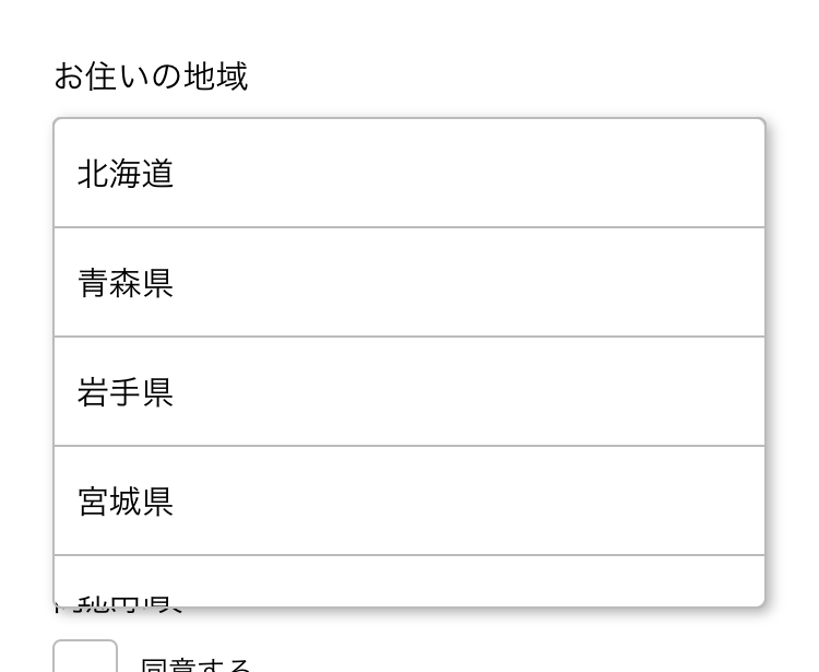
propsの形式などはラジオボタンの時と合わせて、都道府県の選択フィールドを作ってみます。
export default [
  { value: 1, label: "北海道" },
  ...
];
選択肢のデータを用意しておき、
const schema = Yup.object().shape({
  ...
  prefecture: Yup.number()
    .oneOf(
      prefectures.map(option => option.value),
      "地域を選択してください"
    )
    .nullable()
    .required("地域を選択してください"),
  ...
});
ラジオボタンと同じく念の為選択肢の値以外のものが入らないようにしておきます。
また、ラジオボタンと違い一度選択肢を表示してから何も選ばず閉じる場合もあるため、選択していない場合の値nullが入っても型が違うというエラーが出ないようスキーマを定義(nullable)しておきます。
<Select
  label="お住いの地域"
  name="prefecture"
  options={prefectures}
/>
コンポーネントを使うところはラジオボタンと同じです。


ファイル入力(画像)を作成
画像をカメラロールから選択するフィールドを作成します。
コンポーネント側ではボタンと、expo-image-pickerの処理、サムネイル表示を用意し、expo-image-pickerで取得した一時ファイルのURLを値としてFormikに渡すようにします。
サムネイルはローディング時の表示などよしなにやってくれるreact-native-elementsのAvatarを流用してみます。
import React from "react";
import * as PropTypes from "prop-types";
import { View, StyleSheet } from "react-native";
import * as ImagePicker from "expo-image-picker";
import { Avatar } from "react-native-elements";
import Button from "./Button";
import FormField from "./FormField";

const styles = StyleSheet.create({
  container: {
    width: "100%"
  },
  thumbnail: {
    marginBottom: 8
  }
});

function ImageSelect(props) {
  const { title, value, setFieldValue, setFieldTouched } = props;

  async function select() {
    const { status } = await ImagePicker.requestCameraRollPermissionsAsync();
    if (status === "granted") {
      const { cancelled, uri } = await ImagePicker.launchImageLibraryAsync();
      setFieldTouched(true);
      if (!cancelled && uri) {
        setFieldValue(uri);
      }
    }
  }

  return (
    <View style={styles.container}>
      <Avatar
        containerStyle={styles.thumbnail}
        source={value ? { uri: value } : null}
        size="large"
      />
      <Button title={title} onPress={select} />
    </View>
  );
}

ImageSelect.defaultProps = {
  title: "画像を選択"
};

ImageSelect.propTypes = {
  title: PropTypes.string
};

export default FormField(ImageSelect);
const schema = Yup.object().shape({
  ...
  image: Yup.string()
    .nullable()
    .required("画像が必要です"),
  ...
});

...
<ImageSelect label="アカウント画像" name="image" />
...
と、ここまでは簡単なのですが、expo-image-pickerで取得した画像URLはアプリの起動中に一時的にキャッシュされている画像ファイルのURLなので、後ほど送信する際はこれをダウンロードしてから保存する必要があります。
その部分は後述するとして、最後に日付選択フィールドを作成します。
日付選択を作成
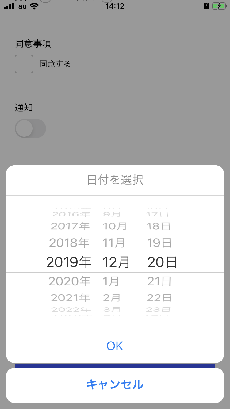
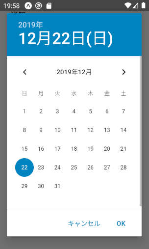
React Nativeではまず標準のものが (https://github.com/react-native-community/react-native-datetimepicker) 用意されていますが、iOSではページ内にそのまま表示されてしまい使い勝手が悪いため、これをモーダル内に表示するreact-native-modal-datetime-pickerを使用します。
Githubの説明にしたがって最新のパッケージをインストールしてください。
また、Date型を扱いやすくするためmomentもインストールします。
$ npm i react-native-modal-datetime-picker@8.x.x @react-native-community/datetimepicker moment
コンポーネントではプレースホルダー、あるいは現在選択されている日付をタイトルとしたボタンを表示し、適宜isVisibleの切り替えを行います。
今回は時間はなく日付のみ選択させる想定なので、Formikで管理する値は日付の最初の時刻(0時00分0秒0)を取るようにします。(momentのstartOfDayを利用)
import React, { useState } from "react";
import * as PropTypes from "prop-types";
import moment from "moment";
import Button from "./Button";
import DateTimePickerModal from "react-native-modal-datetime-picker";
import FormField from "./FormField";

function DatePicker(props) {
  const { value, title, placeholder, setFieldValue, setFieldTouched } = props;
  const [active, setActive] = useState(false);

  const open = () => {
    setActive(true);
  };

  const dismiss = () => {
    setActive(false);
    setFieldTouched(true);
  };

  return (
    <>
      <DateTimePickerModal
        isVisible={active}
        date={
          value ||
          moment()
            .startOf("day")
            .toDate()
        }
        onConfirm={date => {
          dismiss();
          setFieldValue(moment(date).startOf('day').toDate());
        }}
        headerTextIOS={title}
        cancelTextIOS="キャンセル"
        confirmTextIOS="OK"
        onCancel={dismiss}
        locale="ja"
      />
      <Button
        title={value ? moment(value).format("YYYY年MM月DD日") : placeholder}
        onPress={open}
      />
    </>
  );
}

DatePicker.defaultProps = {
  title: "日付を選択してください",
  placeholder: "日付を選択してください"
};

DatePicker.propTypes = {
  title: PropTypes.string,
  placeholder: PropTypes.string
};

export default FormField(DatePicker);
const schema = Yup.object().shape({
  ...
  date: Yup.date()
    .nullable()
    .required("日付を選択してください")
  ...
});

<DatePicker
  label="日付"
  title="日付を選択"
  placeholder="日付を選択"
  name="date"
/>
YupではDate型も使用できます。
iOS


Androidはカレンダー式の表示です。タイトルは表示されません。
Firestore / Firebase Storageに保存
最後に、入力した値をFirebaseに送信して保存する例を実装してみたいと思います。
最初に載せたソースの時点で送信ボタンをタップしたらonSubmitメソッドが呼ばれるようにしてあるので、そちらに書いていきます。
import firebase from 'firebase';
import 'firebase/firestore';
const db = firebase.firestore();

  ...
  onSubmit = async (values, actions) => {
    try {
      await db.collection("/members").add(values);
      actions.resetForm();
      Alert.alert("送信できました");
    } catch (error) {
      Alert.alert("送信に失敗しました", error.message);
    }
  };
  ...
単純な例ですが、これでFormikから渡されたvaluesをシンプルにmembersコレクションのドキュメントとして登録することができます。
Formikから第二引数にFormikBagオブジェクトが入り、setSubmittingで送信状態を操作したり、値をリセットしたりすることができます。
isSubmittingを見て送信中はボタンがdisabledになるようにしていますが、FormikのonSubmitに渡した関数がPromiseを返す(この例ではasync function)場合には自動的にisSubmittingがセットされるので、明示的にsetSubmittingする必要はありません。この例では、送信が完了したらフォームをリセットするようにのみ処理しています。
先ほど作成したようなファイル入力フィールドを使用している場合は、もう一手間必要です。
Firebaseの設定の方でStorageを有効にしてから、画像をfetch→Blob化してStorageに保存→Storage上のURLを取得という流れで画像を保存しFirestoreのドキュメントに紐付けます。
  onSubmit = async (values, actions) => {
    try {
      const localImageUrl = values.image; // 画像URL(キャッシュ)を保持
      delete values.image; // Firestoreに最初に保存する際は画像URL(キャッシュ)を削除
      const docRef = await db.collection("/members").add(values);
      const { imageUrl } = await this.submitImage(localImageUrl, docRef.id);
      await docRef.update({ imageUrl }); // 画像URLを登録
      actions.resetForm();
      Alert.alert("送信できました");
    } catch (error) {
      Alert.alert("送信に失敗しました", error.message);
    }
  };

  // 画像を保存する
  submitImage = async (localImageUrl, memberId) => {
    const imagePath = `members/${memberId}.jpg`; // 画像の位置を決める(とりあえずmemberのidを使う)
    const imageRef = storage.ref().child(imagePath); // refを作成
    const imageResponse = await fetch(localImageUrl); // キャッシュから画像ファイルをダウンロード
    const blob = await imageResponse.blob(); // Blob化
    const snapshot = await imageRef.put(blob); // Storageに保存
    const imageUrl = await imageRef.getDownloadURL(); // URLを取得
    return { imageUrl, snapshot };
  };
作成されたmembersのドキュメントのimageUrlフィールドにStorage上のURLが保存されていれば成功です。
Github
Firebaseへの送信処理を抜いたものですが、サンプルのソースはGithubに公開しています。
https://github.com/mildsummer/react-native-form-example
未掲載のソース
最終的にApp.jsはこんな感じになりました。
import React, { Component } from "react";
import {
  StyleSheet,
  TouchableWithoutFeedback,
  Keyboard,
  View,
  ScrollView,
  Alert
} from "react-native";
import { Formik } from "formik";
import * as Yup from "yup";
import { db, storage } from "./app/utils/firebase";

import Select from "./app/components/Select";
import Input from "./app/components/Input";
import ImageSelect from "./app/components/ImageSelect";
import RadioButton from "./app/components/RadioButton";
import Button from "./app/components/Button";
import CheckBox from "./app/components/CheckBox";
import Switch from "./app/components/Switch";
import DatePicker from "./app/components/DatePicker";
import prefectures from "./app/constants/prefectures";

const genderOptions = [
  { label: "男性", value: 0 },
  { label: "女性", value: 1 }
];

const schema = Yup.object().shape({
  name: Yup.string()
    .min(3, "3文字以上で入力してください")
    .max(20, "20文字以内で入力してください")
    .required("氏名を入力してください"),
  gender: Yup.number()
    .oneOf(
      genderOptions.map(option => option.value),
      "性別を選択して下さい"
    )
    .required("性別を選択して下さい"),
  prefecture: Yup.number()
    .oneOf(
      prefectures.map(option => option.value),
      "地域を選択してください"
    )
    .nullable()
    .required("地域を選択してください"),
  terms: Yup.bool().oneOf([true], "同意が必要です"),
  notification: Yup.bool(),
  image: Yup.string()
    .nullable()
    .required("画像が必要です"),
  date: Yup.date()
    .nullable()
    .required("日付を選択してください")
});

const styles = StyleSheet.create({
  container: {
    width: "100%",
    padding: 24,
    backgroundColor: "#fff",
    alignItems: "center",
    justifyContent: "center"
  },
  form: {
    width: "100%"
  }
});

export default class App extends Component {
  onSubmit = async (values, actions) => {
    try {
      const localImageUrl = values.image;
      delete values.image;
      const docRef = await db.collection("/members").add(values);
      const { imageUrl } = await this.submitImage(localImageUrl, docRef.id);
      await docRef.update({ imageUrl });
      actions.resetForm();
      Alert.alert("送信できました");
    } catch (error) {
      Alert.alert("送信に失敗しました", error.message);
    }
  };

  submitImage = async (localImageUrl, memberId) => {
    const imagePath = `members/${memberId}.jpg`;
    const imageRef = storage.ref().child(imagePath);
    const imageResponse = await fetch(localImageUrl);
    const blob = await imageResponse.blob();
    const snapshot = await imageRef.put(blob);
    const imageUrl = await imageRef.getDownloadURL();
    return { imageUrl, snapshot };
  };

  render() {
    return (
      <ScrollView contentContainerStyle={styles.container}>
        <TouchableWithoutFeedback onPress={Keyboard.dismiss}>
          <View style={styles.form}>
            <Formik
              initialValues={{
                name: "",
                gender: null,
                prefecture: null,
                terms: false,
                notification: false,
                date: null,
                image: null
              }}
              validateOnMount
              validationSchema={schema}
              onSubmit={this.onSubmit}
            >
              {({ handleSubmit, isValid, isSubmitting }) => (
                <>
                  <Input
                    label="氏名"
                    name="name"
                    placeholder="氏名を入力してください"
                  />
                  <RadioButton
                    label="性別"
                    name="gender"
                    options={genderOptions}
                  />
                  <Select
                    label="お住いの地域"
                    name="prefecture"
                    options={prefectures}
                  />
                  <CheckBox label="同意事項" title="同意する" name="terms" />
                  <Switch label="通知" name="notification" />
                  <ImageSelect label="アカウント画像" name="image" />
                  <DatePicker
                    label="日付"
                    title="日付を選択"
                    placeholder="日付を選択"
                    name="date"
                  />
                  <Button
                    title="Submit"
                    onPress={handleSubmit}
                    disabled={!isValid || isSubmitting}
                  />
                </>
              )}
            </Formik>
          </View>
        </TouchableWithoutFeedback>
      </ScrollView>
    );
  }
}
import firebase from "firebase";
import "firebase/firestore";
import "firebase/storage";

firebase.initializeApp(...); // ここは各自のプロジェクトで

export const db = firebase.firestore();
export const storage = firebase.storage();
export default firebase;
ボタンもデザインを共通化できるようreact-native-elementsのボタンをラップしています。
import React from "react";
import { StyleSheet } from "react-native";
import { Button as RNButton } from "react-native-elements";
import colors from "../constants/colors";

const styles = StyleSheet.create({
  container: {
    width: "100%"
  },
  button: {
    height: 50,
    borderColor: 4,
    backgroundColor: colors.accent
  }
});

function Button(props) {
  const { title, disabled, loading, onPress } = props;
  return (
    <RNButton
      title={title}
      disabled={disabled}
      loading={loading}
      containerStyle={styles.container}
      buttonStyle={styles.button}
      onPress={onPress}
    />
  );
}

export default Button;
export default {
  white: "#FFFFFF",
  black: "#000000",
  text: "#212121",
  border: "#BBBBBB",
  accent: "#3D5AFE",
  lightGray: "#DDDDDD",
  red: "#F50057"
};