CSSの中央寄せはややこしい
CSSの縦横センタリングについて調べると、
-
text-align: center;で中央揃えする- ただし目的の要素をinline要素にする必要がある
-
margin: auto;で中央寄せをする- ただし目的の要素の大きさを指定する必要がある
-
line-heightを親要素のheightと同じにして縦方向の中央寄せをする- ただし親要素の高さを指定する必要がある
-
position: absolute;で50%指定してtransformで中央にずらす- ただし色々する必要がある
など様々な方法が紹介されているものの、それぞれ条件があり使い分けが面倒。
そんなわずらわしさを解消してくれる(気がする)のが、本記事で紹介する CSS Flexible Box Layout による中央寄せである。
中央寄せにはFlexboxを使う
以下のCSSを中央寄せしたい要素の親要素に指定する。
コンテナをFlexboxにし、水平方向と垂直方向に対し子要素を中央に持ってくるように指定している。
.parent {
    display: flex;            /* Flexboxを指定 */
    justify-content: center;  /* 水平方向の中央寄せ */
    align-items: center;      /* 垂直方向の中央寄せ */
}
だいたいこれをすれば条件などを気にすることなく素直に中央に寄ってくれる。
いちいち3行書くのも面倒なので、SCSSを導入して関数にしてあげれば1行で指定できて楽。
@mixin flexCentering($justify: center, $align: center) {
    display: flex;
    justify-content: $justify;
    align-items: $align;
}

.parent {
    @include flexCentering();
}
基本的な中央寄せの例
とりあえず例に使う要素とスタイルは以下のようにする。
<div class="parent">
    <div class="child">袋井宿</div>
</div>
.parent {
    width: 300px;
    height: 200px;
    background: lightblue;
}
.child {
    margin: 10px;
    padding: 10px;
    background: lightgreen;
}
ど真ん中に中央寄せ
先ほどのFlexboxのCSSを親要素に指定する。
.parent {
    display: flex;
    justify-content: center;
    align-items: center;
}
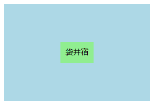
これが中央寄せのベースとなる。
横方向の中央寄せ
垂直方向の配置を指定する align-items に flex-start を指定する。
.parent {
    display: flex;
    justify-content: center;
    align-items: flex-start;  /* 垂直方向は上に寄せる */
}
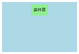
align-items に flex-end を指定すれば下に行く。
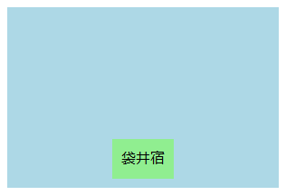
縦方向の中央寄せ
水平方向の配置を指定する justify-content に flex-start を指定する。
.parent {
    display: flex;
    justify-content: flex-start;  /* 水平方向は左に寄せる */
    align-items: center;
}

justify-content に flex-end を指定すれば右に行く。

応用的な中央寄せの例
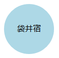
丸の真ん中に文字
大きさのない要素を border と border-radius を使い円弧で囲うことによって丸形を作り、その中に入れる文字を中央寄せする。
white-space: nowrap; を指定すると狭い幅でも文字列が折り返しされない。
<div class="parent">袋井宿</div>
.parent {
    display: flex;
    justify-content: center;
    align-items: center;
    width: 0;
    height: 0;
    border: 50px solid lightblue;
    border-radius: 50px;
    white-space: nowrap;
}
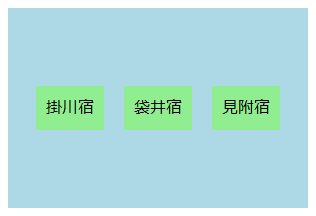
複数要素の中央寄せ
Flexboxなので複数要素でもラッパーをつけたりせず中央寄せできる。
<div class="parent">
    <div class="child">掛川宿</div>
    <div class="child">袋井宿</div>
    <div class="child">見附宿</div>
</div>
.parent {
    display: flex;
    justify-content: center;
    align-items: center;
    width: 300px;
    height: 200px;
    background: lightblue;
}
.child {
    margin: 10px;
    padding: 10px;
    background: lightgreen;
}
縦方向に並べて中央寄せしたい場合は、新たに flex-direction プロパティを追加して colmun (縦方向)を指定してあげればOK。
ただし、このプロパティを指定することによって要素の配列方向が変わるため justify-content と align-items の役割は逆になることに注意。
そもそも、本来 justify-content は主軸方向、align-items は交差軸方向の配置を指定するプロパティなので、言っておいてなんだが「水平」や「垂直」と呼ぶのはあまり良くない。デフォルトでの flex-direction の値は row (横方向)である。
深掘りはもはやFlexboxの説明になってしまうので割愛。
.parent {
    display: flex;
    justify-content: center; /* 主軸方向に中央寄せ */
    align-items: center;     /* 交差軸方向に中央寄せ */
    flex-direction: column;  /* 縦方向に並べる */
}
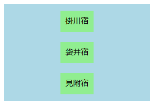
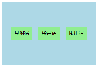
蛇足だが、flex-direction プロパティに row-reverse を指定してあげると逆順になる。
東海道の起点は日本橋なので掛川宿は袋井宿の東にある。
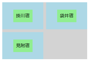
メリットとデメリット
他の中央寄せの方法と違って親要素や子要素の大きさを指定するすることなく中央寄せができるところがメリット。
たとえば、CSS Gridの各要素は基本的にセルごとにストレッチされるため、大きさを直接指定することがない。よってこの中で中央寄せをしたいとなると、子要素の大きさを指定して margin: auto; を指定することになるだろうが、その子要素が文字列で可変なので大きさを指定するのはなんかやだ!みたいなときに使える。
<div class="container">
    <div class="parent">
        <div class="child">掛川宿</div>
    </div>
    <div class="parent">
        <div class="child">袋井宿</div>
    </div>
    <div class="parent">
        <div class="child">見附宿</div>
    </div>
</div>
.container {
    display: grid;
    grid-template-rows: 1fr 1fr;
    grid-template-columns: 1fr 1fr;
    row-gap: 10px;
    column-gap: 10px;
    width: 300px;
    height: 200px;
    background: lightgray;
}
.parent {
    display: flex;
    justify-content: center;
    align-items: center;
    background: lightblue;
}
.child {
    margin: 10px;
    padding: 10px;
    background: lightgreen;
}
また、基本的なFlexboxの機能は現行のブラウザではすべて -ms- や -webkit- などのベンダープレフィクスをつけることなく使用できる。接頭辞をつければ全ユーザの99%、つけなくても98%をサポートする。
ただし、IE9以下などの古いバージョンのブラウザは対応していないことが多いため、そのあたりを考慮に入れるなら他の方法をとるしかない。そもそもIEはIE11でもバグが多く部分的なサポートのみであるようなので要確認。
また「基本的な」Flexboxの機能といったように、複数要素の中央寄せで出てきた flex-direction などは別枠である。
詳細は以下のリンクからどうぞ。
Can I use... Support tables for HTML5, CSS3, etc
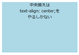
なお、中央寄せといっても以下のような複数行の中央揃えはできないので、素直に text-align: center; するしかない。というかこっちのほうが楽。
<div class="parent">
    中央揃えは<br>
    text-align: center;を<br>
    やるしかない
</div>
.parent {
    width: 300px;
    height: 200px;
    background: lightblue;
    text-align: center;
}
また、値を center から flex-start へ変えるなどの変化にアニメーションは適用されないようなので注意が必要。ここは margin の操作で代用できる。