Chart.js + chartjs-plugin-annotation を素のhtml/jsから呼ぶ
そもそも
業務上で Chart.jsを使っていて、y軸方向に線を表示したいけどうまく行かないと相談されたので、じゃぁ最小限のコードを書いてみようとしました。
条件
業務で使っていた Chart.js はv2.9.2でしたが、このサンプルではあまり気にせずv2.9系最後の v2.9.4 を指定しています。
組み合わせるのは、ネット上の情報を総合して、chartjs-plugin-annotation の v0.5.7 を組み合わせています。
バージョン違いを組み合わせてもうまく機能しないようです。
コード
ベースにしたのは、Getting Started | Chart.jsにあるコードです。
<html>
<head>
    <script src="https://cdn.jsdelivr.net/npm/chart.js@2.9.4/dist/Chart.bundle.min.js" integrity="sha256-eA+ych7t31OjiXs3fYU0iWjn9HvXMiCLmunP2Gpghok=" crossorigin="anonymous"></script>
    <script src="https://cdn.jsdelivr.net/npm/chartjs-plugin-annotation@0.5.7/chartjs-plugin-annotation.min.js" integrity="sha256-Olnajf3o9kfkFGloISwP1TslJiWUDd7IYmfC+GdCKd4=" crossorigin="anonymous"></script>
</head>
<body>
<canvas id="canvas"></canvas>
<script>
	//window.onload = function () {
        var ctx = document.getElementById('canvas').getContext('2d');
        var myChart = new Chart(ctx, {
            // The type of chart we want to create
            type: 'line',

            // The data for our dataset
            data: {
                labels: ['January', 'February', 'March', 'April', 'May', 'June', 'July'],
                datasets: [{
                    label: 'My First dataset',
                    backgroundColor: 'rgb(255, 99, 132)',
                    borderColor: 'rgb(255, 99, 132)',
                    fill: false,
                    data: [0, 10, 5, 2, 20, 30, 45]
                }]
            },

            // Configuration options go here
            options: {
                annotation: {
                    drawTime: 'afterDatasetsDraw',
                    annotations: [
                        {
                            id: 'hline',
                            type: 'line',
                            mode: 'horizontal',
                            scaleID: 'y-axis-0',
                            value: 15,
                            borderColor: 'black',
                            borderWidth: 2,
                            label: {
                                backgroundColor: "red",
                                content: "Test Label",
                                enabled: true
                            },
                        },
                    ]
                }
            }
        });

	//}

</script>
</body>
</html>
optionsのところを書き加えて、chartjs-plugin-annotation にまつわる定義を加えています。
ハマったのは、scaleIDの記述で、ドキュメント上の記述を見つけられていませんが暗黙的に(?)y軸を示すIDが決まっているのか、「scaleID: 'y-axis-0'」を書くまでは全く横棒を表示できませんでした。
実行結果
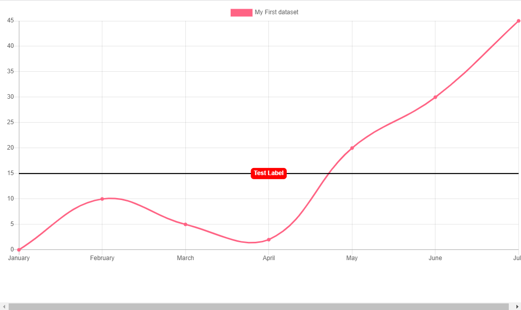
htmlが適当なので、横にはみ出てしまっているから、ちゃんとcanvas要素をdiv要素で括っとけっていうお話。
参考情報
【Nuxt.js】Chart.jsでグラフに境界線を引く(chartjs-plugin-annotation)
こちらの例では、scales > yAxes > id を明示した上で、annotation > annotations > scaleID を明示しています。(今説明を書いている時点でわかるけれど、調べている最中はなかなか気づかなかった。)
Chart.jsで線グラフで縦棒を書く方法 - Qiita
縦棒ですけど、要は同じなんですよね。x←→y、vertical←→horizontalさえ気づけば。