前提条件
SDKバージョン: 30
Androidバージョン: 9.0
ToolBar/ActionBarとは?
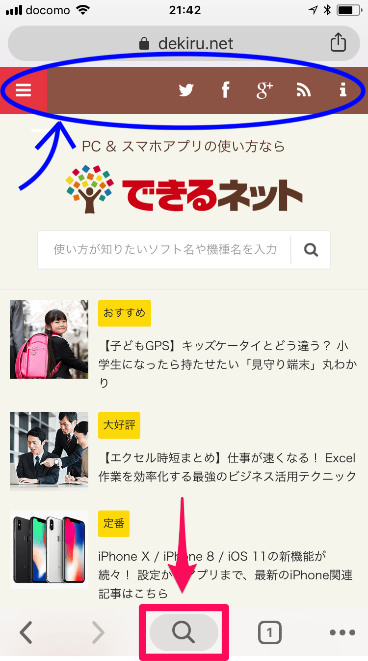
スマホアプリを開くと大体上に表示されている、画像の青の丸で囲っている
部分です。ちなみにこのアプリの画面は適当に「スマホアプリ ツールバー」とかで調べました。また、ToolBarと呼ばれることもありますが、ActionBarとも呼ばれます。違いはよく分かりませんので私は同じであると認識しています。
なぜ自作するのか
実はわざわざ作らなくてもアプリをビルドすればデフォルトのツールバーが画面最上部に自動的に表示されます。もちろんそれで問題ない場合は既存のものを利用すれば良いと思います。ただ、デフォルトのアクションバーはかなり融通が効かず、もっとこういうふうにしたい!と思ってもなかなかうまく行きません。例えば、アクションバーに表示するタイトルを中央に表示したいなど、結構カンタンそうですが難しいです。他にもできそうでなかなかできないことが多いので、それなら自分で自分好みのツールバーを作っちゃおうということです。
それでは早速作っていきましょう
ツールバーを作成
まずツールバーを作ります。私はこんな感じで左右にイメージボタン、中央にテキストビューを配置していかにもツールバーって感じのデザインにしてみました。

コードは以下の通りです
<?xml version="1.0" encoding="utf-8"?>
<LinearLayout xmlns:android="http://schemas.android.com/apk/res/android"
    xmlns:app="http://schemas.android.com/apk/res-auto"
    android:id="@+id/layout_custom_toolbar"
    android:layout_width="match_parent"
    android:layout_height="120dp"
    android:background="#76ead7"
    android:orientation="horizontal">

    <ImageButton
        android:id="@+id/btn_left"
        android:layout_width="wrap_content"
        android:layout_height="match_parent"
        android:layout_weight="0.5"
        android:background="@color/dark_green"
        android:scaleType="center"
        android:scaleX="2"
        android:scaleY="2"
        app:srcCompat="@drawable/ic_baseline_arrow_back_24"
        app:tint="@color/light_green" />

    <TextView
        android:id="@+id/text_title"
        android:layout_width="wrap_content"
        android:layout_height="match_parent"
        android:layout_weight="1"
        android:background="@color/dark_green"
        android:gravity="center"
        android:text="アンチエイジング検診アプリ"
        android:textAppearance="@style/TextAppearance.AppCompat.Large"
        android:textColor="#76ead7"
        android:textSize="36sp" />

    <ImageButton
        android:id="@+id/btn_right"
        android:layout_width="wrap_content"
        android:layout_height="match_parent"
        android:layout_weight="0.5"
        android:background="@color/dark_green"
        android:scaleX="2"
        android:scaleY="2"
        app:srcCompat="@drawable/ic_baseline_menu_24"
        android:contentDescription="TODO"
        app:tint="@color/light_green" />
</LinearLayout>
ではこのツールバーを配置したい画面に、ツールバーをいれる用の入れ物(コンテナ)を作成しましょう。
ツールバーを表示させたい画面に準備をする
こんな感じで画面の上部にツールバーを表示するための空間をつくります。先ほどツールバーを作成した時はwidthはmatch_parentでheightは120dpにしました(もしかしたら120dpはちょっと大きめかもですね。これはタブレットなので少し太めにしてますが、普通のスマホアプリだとしたら100dpで十分かもしれません)。なので、同じサイズのLinearLayoutをツールバーの入れ物として表示させたい部分に作成します。
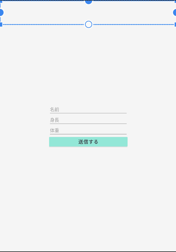
念のためにコードを貼っておきます。ちなみに今回はカスタムツールバーの説明なので画像のeditTextや送信ボタン部分のコードは無視してもらって大丈夫です!
<?xml version="1.0" encoding="utf-8"?>
<androidx.constraintlayout.widget.ConstraintLayout xmlns:android="http://schemas.android.com/apk/res/android"
    xmlns:app="http://schemas.android.com/apk/res-auto"
    xmlns:tools="http://schemas.android.com/tools"
    android:layout_width="match_parent"
    android:layout_height="match_parent"
    android:background="@color/background_color"
    tools:context=".InputDataActivity">

    <LinearLayout
        android:id="@+id/container_for_toolbar"
        android:layout_width="match_parent"
        android:layout_height="120dp"
        android:orientation="vertical"
        app:layout_constraintEnd_toEndOf="parent"
        app:layout_constraintStart_toStartOf="parent"
        app:layout_constraintTop_toTopOf="parent"></LinearLayout>

    <LinearLayout
        android:layout_width="400dp"
        android:layout_height="wrap_content"
        android:orientation="vertical"
        app:layout_constraintBottom_toBottomOf="parent"
        app:layout_constraintEnd_toEndOf="parent"
        app:layout_constraintStart_toStartOf="parent"
        app:layout_constraintTop_toTopOf="parent">

        <EditText
            android:id="@+id/edit_text_name"
            android:layout_width="match_parent"
            android:layout_height="wrap_content"
            android:ems="10"
            android:hint="名前"
            android:inputType="textPersonName"
            android:textSize="24sp" />

        <EditText
            android:id="@+id/edit_text_height"
            android:layout_width="match_parent"
            android:layout_height="wrap_content"
            android:ems="10"
            android:hint="身長"
            android:inputType="textPersonName"
            android:textSize="24sp" />

        <EditText
            android:id="@+id/edit_text_weight"
            android:layout_width="match_parent"
            android:layout_height="wrap_content"
            android:ems="10"
            android:hint="体重"
            android:inputType="textPersonName"
            android:textSize="24sp" />

        <Button
            android:id="@+id/btn_send"
            android:layout_width="match_parent"
            android:layout_height="wrap_content"
            android:paddingTop="8dp"
            android:paddingBottom="8dp"
            android:text="送信する"
            android:textColor="#393e46"
            android:textSize="24sp"
            android:textStyle="bold"
            app:backgroundTint="@color/light_green"
            app:rippleColor="@color/dark_green" />

    </LinearLayout>

</androidx.constraintlayout.widget.ConstraintLayout>
カスタムツールバーが各画面で柔軟にデザインを変更できるように設定する
例えば、今回の場合はツールバーにイメージボタンやテキストビューがありますが、テキストビューに表示する文字を画面によって変えたいと思いませんか?もしくは、イメージボタンの画像も画面によっては非表示にしたり、または別の画像に変えたりしたくはありませんか?そういったことを可能にするための設定を行います。特に今回は、
- イメージボタンをクリックした際の処理を、各画面で決定できるようにする
- イメージボタンを表示するか非表示にするかの切り替えを、各画面で決定できるようにする
- テキストビューに表示する文字を、各画面で決定できるようにする
の、3点を実装します。もしイメージボタンの画像を各画面で決定できるようにしたいんだけど...という人がいたら、テキストビューに表示する文字を、各画面で決定できるようにするの部分を参考にして欲しいです。完全に同じではないですが、原理は同じです。
コードは以下です
interface ToolBarCustomViewDelegate {
    fun onClickedLeftButton()
    fun onClickedRightButton()
}

class ToolBarCustomView : LinearLayout {
    var delegate: ToolBarCustomViewDelegate? = null

    constructor(context: Context) : super(context) {
        init(null, 0)
    }

    constructor(context: Context, attrs: AttributeSet) : super(context, attrs) {
        init(attrs, 0)
    }

    constructor(context: Context, attrs: AttributeSet, defStyle: Int) : super(
            context,
            attrs,
            defStyle
    ) {
        init(attrs, defStyle)
    }

    private fun init(attrs: AttributeSet?, defStyle: Int) {
        LayoutInflater.from(context).inflate(R.layout.custom_tool_bar, this, true)
    }

    // ツールバーに表示する文字や、ボタンの表示/非表示の切り替えを設定する
    fun configure(titleText: String, isHideLeftButton: Boolean, isHideRightButton: Boolean) {
        // カスタムツールバーのImageButtonとTextViewを取得する
        val titleTextView: TextView = findViewById(R.id.text_title)
        val leftButton: ImageButton = findViewById(R.id.btn_left)
        val rightButton: ImageButton = findViewById(R.id.btn_right)

        // TextViewに文字を設定
        // ImageViewの表示/非表示を切り替える
        titleTextView.text = titleText
        leftButton.visibility = if (isHideLeftButton) View.INVISIBLE else View.VISIBLE
        rightButton.visibility = if (isHideRightButton) View.INVISIBLE else View.VISIBLE

        // ボタンがクリックされたときのリスナーを設定
        // 実際の処理は画面ごとのActivityで設定
        leftButton.setOnClickListener {
            delegate?.onClickedLeftButton()
        }
        rightButton.setOnClickListener {
            delegate?.onClickedRightButton()
        }
    }
}
上記のコードの3つのconstructor()の部分はLinearLayoutを継承したら書かないといけないお決まりの呪文なので心を無にしてコピペです。
それでは、お次はツールバーを表示したい画面のActivityをいじっていきます。
ツールバーを表示したい画面のActivity
この画面ではカスタムツールバーにどんな文字を表示させたいか、また、イメージボタンクリック時にどんな処理をさせたいのかを決定(設定)します。
コードはこんな感じです
class InputDataActivity : AppCompatActivity(), ToolBarCustomViewDelegate {

    // viewModelの初期化
    private val viewModel by viewModels<ConfirmViewModel>()
    // bindingクラスをlateinit varで宣言
    private lateinit var binding: ActivityInputDataBinding

    override fun onCreate(savedInstanceState: Bundle?) {
        super.onCreate(savedInstanceState)

        // bindingの初期化とsetContentViewを行う
        binding = ActivityInputDataBinding.inflate(layoutInflater)
            .apply { setContentView(this.root) }

        // デフォルトのアクションバーを非表示にする
        supportActionBar?.hide()

        // カスタムツールバーを設置
        setCustomToolBar()

        ...
    }

    ...

    // ===== setCustomToolBar()を実装 =====
    private fun setCustomToolBar() {
        val toolBarCustomView = ToolBarCustomView(this)
        toolBarCustomView.delegate = this

        val title = getString(R.string.title_tool_bar)
        toolBarCustomView.configure(title, false, false)

        // カスタムツールバーを挿入するコンテナ(入れ物)を指定
        val layout: LinearLayout = binding.containerForToolbar
        // ツールバーの表示をコンテナに合わせる
        toolBarCustomView.layoutParams = ViewGroup.LayoutParams(
                ViewGroup.LayoutParams.MATCH_PARENT,
                ViewGroup.LayoutParams.MATCH_PARENT
        )
        // カスタムツールバーを表示する
        layout.addView(toolBarCustomView)
    }

    override fun onClickedLeftButton() {
        // 前の画面に戻る
        finish()
    }

    override fun onClickedRightButton() {
        // TODO: メニューを表示
        // TODO: メニュークリックでConfirmActivityに画面遷移
    }
}
上記のコードでは、カスタムツールバーと関係のないところは省略しています。ポイントは、ToolBarCustomViewDelegateというインタフェースを継承するのと、setCustomToolBar()でカスタムツールバーの設定(イメージボタンの表示/非表示の決定やタイトルに表示する文字など)を行うことです。また、盲点なのが、デフォルトのツールバーを非表示にすることです。
この部分ですね
// デフォルトのアクションバーを非表示にする
supportActionBar?.hide()
このコードを書くとその画面からデフォルトのツールバー(アクションバー)が非表示にされます。これをしないとデフォルトのツールバーとカスタムツールバーが二つ出てきてしまいます。
ビルドしてみよう!
ここまでできればカスタムツールバーが表示されるはずです!実際にどのように表示されるのか、完成をみてみましょう!こんな感じです!!
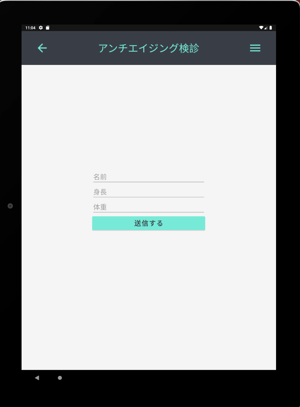
いい感じです!!
ここで皆さんの中にはある「違和感」を覚える人がいるかもしれません。私の画像ではなく、私の記事を読みながらカスタムツールバーを作成したあなたのエミュレータの画面にです。ステータスバーの色、浮いてません?ステータスバーとはwifiとか充電とかが表示されている部分です。そうなんです。ツールバーとステータスバーは別物!だからツールバーだけ色を変えるとステータスバーの色が目立っちゃう!なんか浮いちゃう!なので、ステータスバーの色も好きないろに変更しましょう!themes.xmlのcolorPrimaryVariantっていうところの色を変えるとステータスバーの色が変わります。私の画像ではもう変えてあるので違和感はないかと思います。他にもステータスバーの色の変え方は簡単な方法から難しい方法まで多岐に渡るので調べてみてください。
それでは!!!