やりたいこと
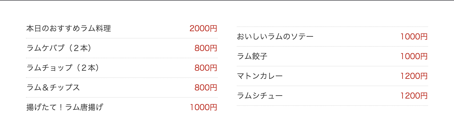
PCでは2〜3カラム、SPでは1カラムの料金表にしたい
イメージ

出来上がったコード
表組みだとやりたいイメージを実現できないので、リストで書きます。
index.html
<ul class="price_list">
  <li><strong>本日のおすすめラム料理</strong>2000円</li>
  <li><strong>ラムケバブ(2本)</strong>800円</li>
  <li><strong>ラムチョップ(2本)</strong>800円</li>
  <li><strong>ラム&チップス</strong>800円</li>
  <li><strong>揚げたて!ラム唐揚げ</strong>1000円</li>
  <li><strong>おいしいラムのソテー</strong>1000円</li>
  <li><strong>ラム餃子</strong>1000円</li>
  <li><strong>マトンカレー</strong>1200円</li>
  <li><strong>ラムシチュー</strong>1200円</li>
</ul>
2カラムにするために column-count を使います。
style.css
ul.price_list{
  list-style:none;
  column-count: 2;
  column-gap: 40px;
  margin:5%;
  padding:0;
}
ul.price_list li{
  display: inline-flex;
  padding-bottom: 8px;
  border-bottom: #d2d2d2 1px dotted;
  margin-bottom: 8px;
  width: 100%;
  color:#cc0000;
}
ul.price_list li strong{
  font-weight:normal;
  color:#333;
  margin-right:auto;
}
@media screen and (max-width: 500px){
  ul.price_list{
    column-count: 1;
  }
}
column-count で分割する要素がブロック要素の場合、↓のようにpaddingやborderなどがズレてしまいます。
column-count 内の要素はインライン要素にしてください。
今回はメニューと料金を分けるために inline-flex を使用しているのがポイントです。
実際のサンプル
See the Pen 2カラムの料金表サンプル by Mei Koutsuki (@mei331)on CodePen.