「疫病が流行ったら私を描きなさい」
と言われているそうなので、CSSでアマビエを描いてみました。
できた画像
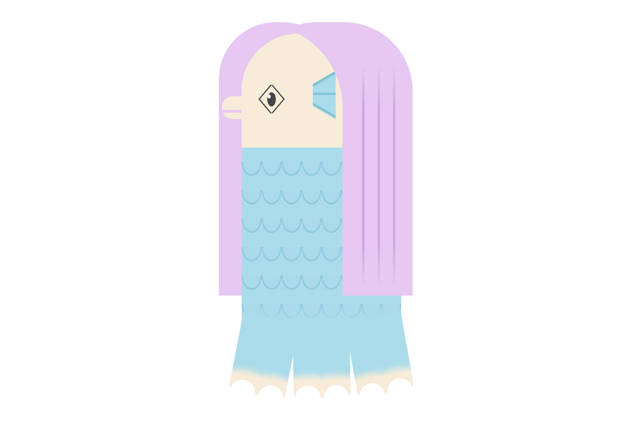
色みは画像検索で出てきた参考画像で可愛かった組み合わせにしてます。
ちょっとファンシー。
できたコード
index.html
<p class="amabie">
<span class="eki">疫</span>
<span class="byo">病</span>
<span class="tai">退</span>
<span class="san">散</span>
</p>
style.css
.amabie{
	margin: 5em auto;
	padding: 0;
	position: relative;
	width: 280px;
	height: 600px;
	text-indent: -9999px;
	border-radius: 100px 100px 0 0;
}
.amabie span{
	display: block;
	text-indent: -9999px;
	position: absolute;
}
.amabie .eki{/* 髪 左側 */
	content: '';
	display: block;
	width: 230px;
	height: 480px;
	position: absolute;
	top: -20px;
	left: -40px;
	border-radius: 100px 120px 0 0;
	background-color: #eec6f5;
	z-index: 30;
}
.amabie .byo{/* 顔 */
	width: 280px;
	height: 200px;
	background-color: #faebd6;
	border-radius: 100px 100px 0 0;
	position: absolute;
	top: 0;
	left: 0;
	z-index: 50;
}
.amabie .byo:before{/* 唇 */
	content: '';
	display: block;
	width: 60px;
	height: 40px;
	position: absolute;
	top: 110px;
	left: -35px;
	z-index: 55;
	background-image:linear-gradient(180deg, #faebd6 0, #faebd6 60%, transparent 60%, transparent 72%, #faebd6 72%);
	border-radius: 30px;
}
.amabie .byo:after{/* 目 */
	content: '';
	display: block;
	width: 45px;
	height: 50px;
	position: absolute;
	top: 90px;
	left: 30px;
	z-index: 55;
	background-image:
		radial-gradient(ellipse , #fff 0, #fff 70%, transparent 70%),
		linear-gradient(50deg, transparent calc(25% - 1px), #444 calc(25% - 1px), #444 calc(25% + 1px), transparent calc(25% + 1px), transparent calc(75% - 1px), #444 calc(75% - 1px), #444 calc(75% + 1px), transparent calc(75% + 1px)),
		linear-gradient(-50deg, transparent calc(25% - 1px), #444 calc(25% - 1px), #444 calc(25% + 1px), transparent calc(25% + 1px), transparent calc(75% - 1px), #444 calc(75% - 1px), #444 calc(75% + 1px), transparent calc(75% + 1px)),
		radial-gradient(ellipse , #444 0, #444 70%, transparent 70%);
	background-size: 5px 7px , 45px 50px , 45px 50px , 15px 25px;
	background-position:40% 40% , center center, center center, center center;
	background-repeat: no-repeat;
}
.amabie .tai{/* 耳 */
	width: 40px;
	height: 90px;
	position: absolute;
	top: 60px;
	left: 125px;
	z-index: 65;
	background-image:
		linear-gradient(-210deg, transparent 49%, #67c5db 50%, #67c5db 55%, #9added 60%),
		linear-gradient(210deg, #9added 49%, #67c5db 50%, #67c5db 55%, transparent 60%),
		linear-gradient(-180deg, #9added 42%, #67c5db 50%, #67c5db 58%, #9added 60%);
	background-size: 50px 40px, 50px 40px, 50px 30px;
	background-position: right top, right bottom, right center;
	background-repeat: no-repeat;
}
.amabie .tai:before{ /* 髪 右側 */
	content: '';
	display: block;
	width: 270px;
	height: 480px;
	position: absolute;
	top: -80px;
	right: -140px;
	border-radius: 100px 120px 0 0;
	background:
		linear-gradient(180deg, #eec6f5 50%, transparent 100%),
		linear-gradient(180deg, transparent 40%, #eec6f5 90%),
		linear-gradient(90deg, transparent 0, transparent 54%, #eec6f5 55%, #eec6f5 67%, #d7a2e0 67.5%, #d7a2e0 68.5%, #eec6f5 69%, #eec6f5 77%, #d7a2e0 77.5%, #d7a2e0 78.5%, #eec6f5 79%, #eec6f5 87%, #d7a2e0 87.5%, #d7a2e0 88.5%, #eec6f5 89%),
		radial-gradient(circle at bottom left, transparent 40%, #eec6f5 40%);
	background-position: 155px 0, 155px 330px, bottom left, 0 -100px ;
	background-size: 130px 150px, 130px 150px, 270px 420px, 270px 250px;
	background-repeat: no-repeat;
	z-index: 100;
}
.amabie .tai:after{/* 身体 */
	content: '';
	display: block;
	width: 280px;
	height: 310px;
	position: absolute;
	top: 140px;
	left: -125px;
	z-index: 55;
	background-color: #9added;
	background-image:
		linear-gradient(180deg, #9added 0, #9added 50%, transparent  50%),
	radial-gradient(ellipse at top center, transparent 0, transparent calc(70% - 3px), #67c5db 70%, transparent 70%);
	background-size: 35px 50px, 35px 25px;
}
.amabie .san{/* 足 中央 */
	width: 100px;
	height: 160px;
	position: absolute;
	bottom: -40px;
	left: 90px;
	z-index: 60;
	background-image:
		linear-gradient(-180deg, transparent 0, #9added 20%, #9added 84%, transparent 100%),
		radial-gradient(circle at bottom center, transparent 40%, #faebd6 40%, #faebd6 70%, #9added 100%),
		radial-gradient(circle at bottom center, transparent 40%, #faebd6 40%, #faebd6 70%, #9added 100%);
	background-size: 100px 130px, 50px 50px, 50px 50px;
	background-position: right top, left bottom, right bottom;
	background-repeat: no-repeat;
	border-radius: 10px;
	transform: rotate(-1deg);
}
.amabie .san:before{/* 足 左 */
	content: '';
	display: block;
	width: 100px;
	height: 160px;
	position: absolute;
	bottom: 5px;
	left: -99px;
	z-index: 58;
	background-image:
		linear-gradient(-180deg, transparent 0, #9added 20%, #9added 84%, transparent 100%),
		radial-gradient(circle at bottom center, transparent 40%, #faebd6 40%, #faebd6 70%, #9added 100%),
		radial-gradient(circle at bottom center, transparent 40%, #faebd6 40%, #faebd6 70%, #9added 100%);
	background-size: 100px 130px, 50px 50px, 50px 50px;
	background-position: right top, left bottom, right bottom;
	background-repeat: no-repeat;
	border-radius: 10px;
	transform: rotate(12deg);
}
.amabie .san:after{/* 足 右 */
	content: '';
	display: block;
	width: 100px;
	height: 160px;
	position: absolute;
	bottom: 5px;
	right: -100px;
	z-index: 58;
	background-image:
		linear-gradient(-180deg, transparent 0, #9added 20%, #9added 84%, transparent 100%),
		radial-gradient(circle at bottom center, transparent 40%, #faebd6 40%, #faebd6 70%, #9added 100%),
		radial-gradient(circle at bottom center, transparent 40%, #faebd6 40%, #faebd6 70%, #9added 100%);
	background-size: 100px 130px, 50px 50px, 50px 50px;
	background-position: right top, left bottom, right bottom;
	background-repeat: no-repeat;
	border-radius: 10px;
	transform: rotate(-9deg);
}

/* アニメーション */

.amabie:after{
	content: '';
	display: block;
	width: 600px;
	height: 600px;
	position: absolute;
	top: -70px;
	right: -150px;
	z-index: 20;
}
.amabie:hover:after{
	background-image:
		radial-gradient(circle closest-side, #fff 40%, #fff5a8 70%, #fff5a8 80%, transparent 100%);
	background-position: left top;
	background-repeat: no-repeat;
	animation: anime1 3s linear .1s infinite;
}
.amabie:hover .san{
	animation: anime2 3s linear .1s infinite;
}
@keyframes anime1 {
	0%{
		transform: scale(1, 1);
	}
	30%{
		transform: scale(.7, .7);
	}
	70%{
		transform: scale(1.2, 1.2);
	}
	100%{
		transform: scale(1, 1);
	}
}
@keyframes anime2 {
	0%{
		transform: rotate(-1deg);
		left: 90px;
		bottom: -40px;
	}
	30%{
		transform: rotate(-4deg);
		left: 93px;
		bottom: -35px;
	}
	70%{
		transform: rotate(4deg);
		left: 85px;
		bottom: -35px;
	}
	100%{
		transform: rotate(-1deg);
		left: 90px;
		bottom: -40px;
	}
}
一番難しかったのは、身体のウロコ模様ですね。
倍サイズの半分ベタで、円形の一部を隠すことで実現してます。
background-imageは最初に描いたオブジェクトが一番上になるのを覚えておくと便利です。
hoverで後光が入り、足が動くアニメーションをつけました。
radial-gradientのいろんな可能性を見出した感じがします。
実際のサンプル
See the Pen amabie - CSSDrawing by Mei Koutsuki (@mei331) on CodePen.