3日間の学習範囲
模写コーディング
【無料練習素材】あなたはできる?模写コーディング腕試し!|東京フリーランス|note
https://note.com/tokyofreelance/n/n4baf7dd10306
(学習時間:5時間)
学習メモ
calc関数
{プロパティ: calc(数式)}
CSSのプロパティ値を指定する際に計算を行う
その他
前回の状態だと、font-sizeやmarginなどがまだ固定のままで、
少しでもサイズを変えると格好悪くなってしまったため、
文字サイズを「px」ではなく「rem」「%」「vw」などを使うように修正した。
レスポンシブに関してなんとなく理解したので、
Bootstrapを学習した後に挑戦する次の模写コーディングでは、
より早くコンパクトにコーディングしていきたい。
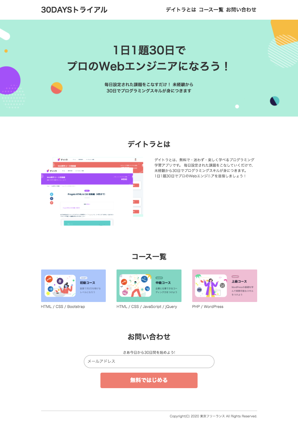
PC画面
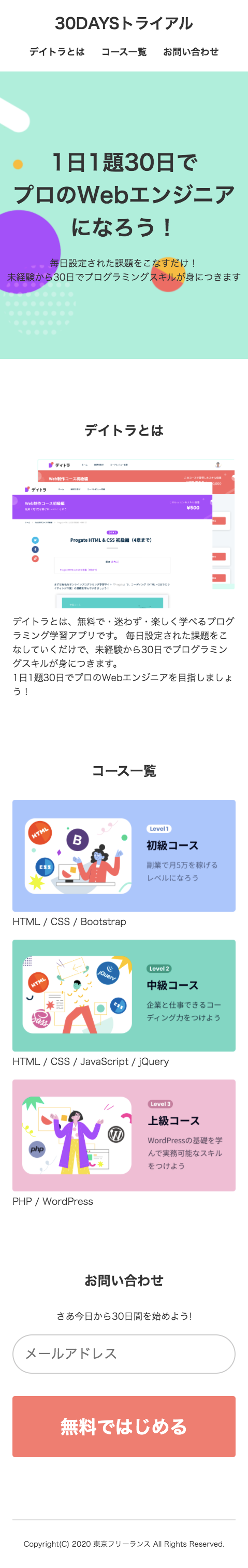
スマホ画面
コード
html{ color: #333333; font-size: 62.5%; } body { font-size: 1.6rem; margin: 0; } a { color: #333333; text-decoration: none; } header { display: flex; margin-bottom: 1.5%; margin-left: auto; margin-right: auto; margin-top: 1.5%; width: 72.5%; } header h1 { font-size: calc(1.6rem + (1vw / 1.25)); margin: 0; } header h2 { font-size: calc(1.6rem + (1vw / 10)); margin: 0; } .header_title { margin-right: 7.5%; width: 42.5%; } .header_menu { align-items: center; display: flex; margin-left: 7.5%; text-align: center; width: 42.5%; } .header_menu_about { margin-right: 0.25%; width: 34.5%; } .header_menu_course { margin-left: 0.25%; margin-right: 0.25%; width: 30%; } .header_menu_inquiry { margin-left: 0.25%; width: 34.5%; } .center_title { background-image: url(../img/main-vsual-nontitle.png); background-size: cover; margin-bottom: 7.5%; margin-top: 1.5%; padding-bottom: 7.5%; padding-top: 7.5%; text-align: center; width: 100%; } .center_title_main { margin-bottom: 2.5%; margin-left: auto; margin-right: auto; width: 60%; } .center_title_main h1 { font-size: calc(1.6rem + (1vw / 0.5)); margin: 0; } .center_title_sub { margin-left: auto; margin-right: auto; margin-top: 2.5%; width: 30%; } .center_title_sub p { font-size: calc(1rem + (1vw / 2.5)); font-weight: bold; margin: 0; } .center_title_sub p br { display: none; } body > h1 { font-size: calc(1.6rem + (1vw / 1.25)); margin-bottom: 2.5%; margin-top: 7.5%; text-align: center; } body p { margin: 0; font-size: calc(1rem + (1vw / 5)); } .about { display: flex; margin-bottom: 7.5%; margin-left: auto; margin-right: auto; margin-top: 2.5%; width: 72.5%; } .about_image { margin-right: 2.5%; width: 47.5%; } .about_text { margin-left: 2.5%; width: 47.5%; } .about_image img { width: 100%; } .course { display: flex; margin-bottom: 7.5%; margin-left: auto; margin-right: auto; margin-top: 2.5%; width: 72.5%; } .course img { width: 100%; } .course_beginner { margin-right: 2.5%; width: 30%; } .course_intermediate { margin-left: 2.5%; margin-right: 2.5%; width: 30%; } .course_advanced { margin-left: 2.5%; width: 30%; } .inquiry { margin-bottom: 7.5%; margin-left: auto; margin-right: auto; margin-top: 2.5%; text-align: center; width: 72.5%; } .inquiry_form { border-color: #cccccc; border-radius: 2.5rem; border-style: solid; margin-bottom: 1%; padding: 0; padding-bottom: 1.75%; padding-top: 1.75%; width: 60%; } .inquiry_form:focus { box-shadow: 0px 0px 0px 1px rgba(0,123,255,.25); outline: 0; } .inquiry_button { background-color: salmon; border-radius: 0.5rem; border-style: none; color: white; font-size: calc(1.6rem + (1vw / 5)); font-weight: bold; margin-top: 1%; padding-bottom: 1.75%; padding-left: 0; padding-right: 0; padding-top: 1.75%; width: 45%; } footer { border-top-color: #dddddd; border-top-style: solid; border-top-width: 0.2rem; margin-bottom: 2.5%; margin-left: auto; margin-right: auto; margin-top: 7.5%; padding-top: 1%; text-align: right; width: 72.5%; } footer p { color: #555555; font-size: calc(1rem + (1vw / 20)); } @media screen and (max-width:479px) { header { display: block; margin-bottom: 5%; margin-top: 5%; width: 90%; } header h1 { font-size: calc(2.4rem + (1vw / 1)); font-weight: 900; } header h2 { font-size: calc(1.6rem + (1vw / 2.5)); } .header_title { margin: 0; margin-bottom: 5%; text-align: center; width: 100%; } .header_menu { margin: 0; margin-top: 5%; width: 100%; } .header_menu_about { margin: 0; margin-left: 5%; width: 30%; } .header_menu_course { margin: 0; width: 30%; } .header_menu_inquiry { margin: 0; margin-right: 5%; width: 30%; } .center_title { background-size: cover; margin-bottom: 25%; margin-top: 5%; padding-bottom: 30%; padding-top: 30%; } .center_title_main { margin-bottom: 5%; width: 95%; } .center_title_main h1 { font-size: calc(3.2rem + (1vw / 0.5)); } .center_title_sub { margin-top: 5%; width: 95%; } .center_title_sub p { font-size: calc(1.6rem + (1vw / 2.5)); font-weight: normal; } .center_title_sub p br { display: inline; } body > h1 { font-size: calc(1.6rem + (1vw / 0.5)); margin-bottom: 7.5%; margin-top: 25%; } body p { font-size: calc(1.6rem + (1vw / 2.5)); } .about { display: block; margin-bottom: 25%; margin-top: 7.5%; width: 90%; } .about_image { margin: 0; width: 100%; } .about_image img { width: 100%; } .about_text { margin: 0; width: 100%; } .course { display: block; margin-top: 7.5%; margin-bottom: 25%; width: 90%; } .course img { width: 100%; } .course_beginner { margin: 0; margin-bottom: 5%; width: 100%; } .course_intermediate { margin: 0; margin-bottom: 5%; margin-top: 5%; width: 100%; } .course_advanced { margin: 0; margin-top: 5%; width: 100%; } .inquiry { margin-bottom: 25%; margin-left: auto; margin-right: auto; margin-top: 7.5%; text-align: center; width: 90%; } .inquiry p { margin-bottom: 2.5%; } .inquiry_form { border-radius: 5rem; font-size: calc(1.6rem + (1vw / 0.5)); margin-bottom: 5%; margin-top: 2.5%; padding-bottom: 5%; padding-top: 5%; width: 99%; } .inquiry_button { font-size: calc(1.6rem + (1vw / 0.25)); margin-top: 5%; padding-bottom: 7.5%; padding-top: 7.5%; width: 100%; } footer { margin-bottom: 7.5%; margin-left: auto; margin-right: auto; margin-top: 25%; padding-top: 7.5%; text-align: center; width: 90%; } footer p { color: #333333; font-size: calc(1.2rem + (1vw / 2.5)); } }