緒言
本記事は下記のMishimaさんのハンズオンを参考にして作成できた画像チェックアプリについてです。
ありがとうございます!
完成イメージは↓のような感じ。
作り方
1. データソース
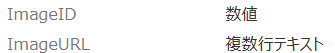
ImageList:チェック対象の画像情報が格納されたリスト
ImageCheck:画像チェック結果を格納するリスト

2. 使用する変数(全てコンテキスト変数)
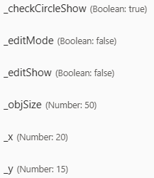
_checkCircleShow: チェックモード切替(Boolean)
_editMode: 登録済データの編集モード切替(Boolean)
_editShow: 登録済データの編集ウィンドウ表示切替(Boolean)
_objSize: チェック箇所を示す円のサイズ数値
_x:x座標関連数値
_y:y座標関連数値
3. 画面設計
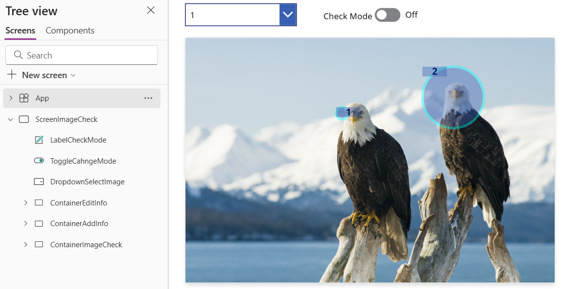
ContainerImageCheck: 画像チェックの心臓部

Ratingでx軸、ThisItem.Valueでy軸のクリック位置の座標数値を取得できるGalleryXYを最表面に配置。
その背面に登録済みデータが格納されたリストImageCheckをソースに持つGalleryShowInfoを配置。
その次にチェック中の場所を示すCircleCheckを配置。
最背面にチェック対象画像のImageCheckingを配置。
主なプロパティ
- ContainerImageCheck:
    Properties:
      Height: =ImageChecking.Height
      Width: =ImageChecking.Width
    Children:
    - ImageChecking:
        Properties:
          Image: =DropdownSelectImage.Selected.ImageURL
    - CircleCheck:
        Properties:
          OnSelect: =
          Height: =_objSize
          Visible: =_checkCircleShow && _x>0
          Width: =_objSize
          X: =_x/(RatingX.Max)*ImageChecking.Width+ImageChecking.X-_objSize/2-ImageChecking.Width/RatingX.Max/2
          Y: =_y/(GalleryXY.AllItemsCount)*ImageChecking.Height+ImageChecking.Y-_objSize/2-ImageChecking.Height/RatingX.Max/2
    - GalleryShowInfo:
        Properties:
          Items: =Filter(ImageCheck,ImageID=DropdownSelectImage.Selected.ImageID)
          Height: =ImageChecking.Height
          TemplateSize: =0
          Width: =ImageChecking.Width
          X: =ImageChecking.X
          Y: =ImageChecking.Y
        Children:
        - LabelCheckNo:
            Properties:
              OnSelect: =Select(CircleChecked)
              Text: =ThisItem.CheckNo
              Tooltip: =CircleChecked.Tooltip
              X: =CircleChecked.X
              Y: =CircleChecked.Y
        - CircleChecked:
            Properties:
              OnSelect: =UpdateContext({_editShow:true})
              Tooltip: |-
                =ThisItem.CheckNo&": "&ThisItem.Description
              Height: =ThisItem.ObjSize
              Width: =ThisItem.ObjSize
              X: =ThisItem.X-Parent.X
              Y: =ThisItem.Y-Parent.Y
    - GalleryXY:
        Properties:
          Items: =Sequence(15)
          Height: =ImageChecking.Height
          TemplateSize: =Self.Height/Self.AllItemsCount
          Visible: =_checkCircleShow||!GalleryShowInfo.Visible
          Width: =ImageChecking.Width
          X: =ImageChecking.X
          Y: =ImageChecking.Y
        Children:
        - RatingX:
            Properties:
              OnSelect: =UpdateContext({_checkCircleShow:true,_x:Self.Value,_y:ThisItem.Value})
              Default: =1
              Max: =20
              RatingFill: =RGBA(0, 0, 0, 0)
ContainerAddInfo: チェック結果の登録ウィンドウ

Sliderでチェック円のサイズ変更し、TextInputの入力をリストImageCheckにPatch関数で記録する。
主なプロパティ
- ContainerAddInfo:
    Properties:
      Visible: =CircleCheck.Visible
      X: =CircleCheck.X+_objSize/2+ContainerImageCheck.X
      Y: =CircleCheck.Y+_objSize/2+ContainerImageCheck.Y
    Children:
    - ButtonSaveAddInfo:
        Properties:
          OnSelect: |-
            =If(
                IsBlank(TextInputDescription.Text)||IsBlank(TextInputCheckNo.Text),
                Notify("メモとCheck#入力必須です",NotificationType.Error),
                Patch(
                    ImageCheck,
                    Defaults(ImageCheck),
                    {
                        CheckNo:TextInputCheckNo.Text,
                        Description:TextInputDescription.Text,
                        ObjSize:_objSize,
                        X:CircleCheck.X,
                        Y:CircleCheck.Y,
                        ImageID:DropdownSelectImage.Selected.ImageID
                    }
                );
                If(IsEmpty(Errors(ImageCheck)),Notify("登録しました",NotificationType.Success))
            );
            UpdateContext({_checkCircleShow:false});
            Reset(TextInputDescription);
            Reset(TextInputCheckNo)
    - IconCloseAddInfo:
        Properties:
          OnSelect: |-
            =Reset(TextInputDescription);Reset(TextInputCheckNo);
            UpdateContext({_checkCircleShow:false})
    - SliderObjSize:
        Properties:
          OnChange: =UpdateContext({ObjSize:Self.Value*25})
          Default: =1
          Max: =10
          Min: =1
ContainerEditInfo: 登録済データの編集ウィンドウ
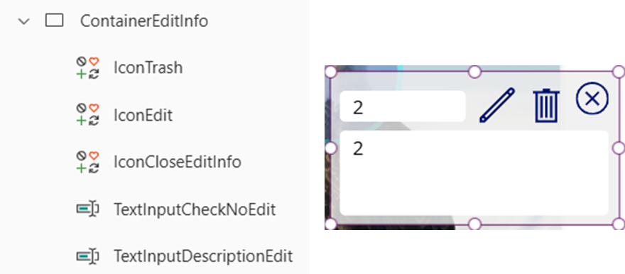
登録済データを編集したり削除したりするウィンドウ。
主なプロパティ
- ContainerEditInfo:
    Properties:
      Visible: =_editShow
      X: =GalleryShowInfo.Selected.CircleChecked.X+GalleryShowInfo.Selected.ObjSize/2+ContainerImageCheck.X
      Y: =GalleryShowInfo.Selected.CircleChecked.Y+GalleryShowInfo.Selected.ObjSize/2+ContainerImageCheck.Y
    Children:
    - TextInputDescriptionEdit:
        Properties:
          Default: =GalleryShowInfo.Selected.Description
          DisplayMode: =If(_editMode,DisplayMode.Edit,DisplayMode.View)
    - TextInputCheckNoEdit:
        Properties:
          Default: =GalleryShowInfo.Selected.CheckNo
          DisplayMode: =If(_editMode,DisplayMode.Edit,DisplayMode.View)
    - IconCloseEditInfo:
        Properties:
          OnSelect: |-
            =Reset(TextInputDescriptionEdit);Reset(TextInputCheckNoEdit);
            UpdateContext({_editShow:false,_editMode:false})
    - IconEdit:
        Properties:
          OnSelect: |-
            =If(
                !_editMode,
                UpdateContext({_editMode:true}),
                If(
                    IsBlank(TextInputDescriptionEdit.Text)||IsBlank(TextInputCheckNoEdit.Text),
                    Notify("メモとCheck#入力必須です",NotificationType.Error),
                    Patch(
                        ImageCheck,
                        GalleryShowInfo.Selected,
                        {CheckNo:TextInputCheckNoEdit.Text,Description:TextInputDescriptionEdit.Text}
                    );
                    If(IsEmpty(Errors(ImageCheck)),Notify("編集しました",NotificationType.Success))
                );
                UpdateContext({_editMode:false});
            )
          Icon: =If(_editMode,Icon.Save,Icon.Edit)
    - IconTrash:
        Properties:
          OnSelect: |-
            =Remove(ImageCheck,GalleryShowInfo.Selected);
            UpdateContext({_editShow:false})
ToggleChangeMode:画像チェックモードか否かを切り替え
主なプロパティ
- ToggleCahngeMode:
    Properties:
      OnCheck: |-
        =UpdateContext({
            _checkCircleShow:true,
            _editShow:false,
            _editMode:false,
            _x:0
        })
      OnUncheck: |-
        =Reset(TextInputDescription);
        Reset(TextInputCheckNo);
        UpdateContext({_checkCircleShow:false})
      Default: =_checkCircleShow
DropdownSelectImage:チェック対象画像の選択
主なプロパティ
- DropdownSelectImage:
    Properties:
      OnChange: =Select(IconCloseAddInfo)
      Items: =SortByColumns(ImageList,"ImageID",SortOrder.Ascending)
4. コピペ用全コード
LabelCheckMode
- LabelCheckMode:
    Control: Label
    Properties:
      Text: ="Check Mode"
      Align: =Align.Right
      X: =415
      Y: =90
ToggleCahngeMode
- ToggleCahngeMode:
    Control: Classic/Toggle
    Properties:
      OnCheck: =UpdateContext({_checkCircleShow:true,_editShow:false,_editMode:false,_x:0})
      OnUncheck: |-
        =Reset(TextInputDescription);Reset(TextInputCheckNo);
        UpdateContext({_checkCircleShow:false})
      Default: =_checkCircleShow
      FocusedBorderThickness: =0
      X: =565
      Y: =94
DropdownSelectImage
- DropdownSelectImage:
    Control: Classic/DropDown
    Properties:
      OnChange: =Select(IconCloseAddInfo)
      Items: =SortByColumns(ImageList,"ImageID",SortOrder.Ascending)
      Height: =44
      Width: =225
      X: =180
      Y: =86
ContainerEditInfo
- ContainerEditInfo:
    Control: GroupContainer
    Variant: manualLayoutContainer
    Properties:
      Fill: =RGBA(237, 237, 237, 0.8)
      Height: =138
      Visible: =_editShow
      Width: =260
      X: =GalleryShowInfo.Selected.CircleChecked.X+GalleryShowInfo.Selected.ObjSize/2+ContainerImageCheck.X
      Y: =GalleryShowInfo.Selected.CircleChecked.Y+GalleryShowInfo.Selected.ObjSize/2+ContainerImageCheck.Y
    Children:
    - TextInputDescriptionEdit:
        Control: Classic/TextInput
        Properties:
          Default: =GalleryShowInfo.Selected.Description
          HintText: ="メモ"
          DisplayMode: =If(_editMode,DisplayMode.Edit,DisplayMode.View)
          Height: =77
          Mode: =TextMode.MultiLine
          Width: =243
          X: =8
          Y: =53
    - TextInputCheckNoEdit:
        Control: Classic/TextInput
        Properties:
          Default: =GalleryShowInfo.Selected.CheckNo
          HintText: ="Check#"
          DisplayMode: =If(_editMode,DisplayMode.Edit,DisplayMode.View)
          Height: =28
          Width: =114
          X: =8
          Y: =17
    - IconCloseEditInfo:
        Control: Classic/Icon
        Variant: CancelBadge
        Properties:
          OnSelect: |-
            =Reset(TextInputDescriptionEdit);Reset(TextInputCheckNoEdit);
            UpdateContext({_editShow:false,_editMode:false})
          Height: =30
          Icon: =Icon.CancelBadge
          Width: =30
          X: =221
          Y: =9
    - IconEdit:
        Control: Classic/Icon
        Variant: Edit
        Properties:
          OnSelect: |-
            =If(
                !_editMode,
                UpdateContext({_editMode:true}),
                If(
                    IsBlank(TextInputDescriptionEdit.Text)||IsBlank(TextInputCheckNoEdit.Text),
                    Notify("メモとCheck#入力必須です",NotificationType.Error),
                    Patch(
                        ImageCheck,
                        GalleryShowInfo.Selected,
                        {CheckNo:TextInputCheckNoEdit.Text,Description:TextInputDescriptionEdit.Text}
                    );
                    If(IsEmpty(Errors(ImageCheck)),Notify("編集しました",NotificationType.Success))
                );
                UpdateContext({_editMode:false});
            )
          Height: =35
          Icon: =If(_editMode,Icon.Save,Icon.Edit)
          Width: =35
          X: =132
          Y: =13
    - IconTrash:
        Control: Classic/Icon
        Variant: Trash
        Properties:
          OnSelect: |-
            =Remove(ImageCheck,GalleryShowInfo.Selected);
            UpdateContext({_editShow:false})
          Height: =35
          Icon: =Icon.Trash
          Width: =35
          X: =177
          Y: =13
ContainerAddInfo
- ContainerAddInfo:
    Control: GroupContainer
    Variant: manualLayoutContainer
    Properties:
      Fill: =RGBA(255, 200, 200, 0.8)
      Height: =155
      Visible: =CircleCheck.Visible
      Width: =260
      X: =CircleCheck.X+_objSize/2+ContainerImageCheck.X
      Y: =CircleCheck.Y+_objSize/2+ContainerImageCheck.Y
    Children:
    - ButtonSaveAddInfo:
        Control: Classic/Button
        Properties:
          OnSelect: |-
            =If(
                IsBlank(TextInputDescription.Text)||IsBlank(TextInputCheckNo.Text),
                Notify("メモとCheck#入力必須です",NotificationType.Error),
                Patch(
                    ImageCheck,
                    Defaults(ImageCheck),
                    {
                        CheckNo:TextInputCheckNo.Text,
                        Description:TextInputDescription.Text,
                        ObjSize:_objSize,
                        X:CircleCheck.X,
                        Y:CircleCheck.Y,
                        ImageID:DropdownSelectImage.Selected.ImageID
                    }
                );
                If(IsEmpty(Errors(ImageCheck)),Notify("登録しました",NotificationType.Success))
            );
            UpdateContext({_checkCircleShow:false});
            Reset(TextInputDescription);
            Reset(TextInputCheckNo)
          Text: ="記録"
          Height: =30
          Width: =80
          X: =127
          Y: =32
    - TextInputDescription:
        Control: Classic/TextInput
        Properties:
          Default: =
          HintText: ="メモ"
          Height: =77
          Mode: =TextMode.MultiLine
          Width: =243
          X: =8
          Y: =69
    - TextInputCheckNo:
        Control: Classic/TextInput
        Properties:
          Default: =
          HintText: ="Check#"
          Height: =28
          Width: =114
          X: =8
          Y: =33
    - IconCloseAddInfo:
        Control: Classic/Icon
        Variant: CancelBadge
        Properties:
          OnSelect: |-
            =Reset(TextInputDescription);Reset(TextInputCheckNo);
            UpdateContext({_checkCircleShow:false})
          Height: =30
          Icon: =Icon.CancelBadge
          Width: =30
          X: =221
          Y: =4
    - SliderObjSize:
        Control: Classic/Slider
        Properties:
          OnChange: =UpdateContext({ObjSize:Self.Value*25})
          Default: =1
          Max: =10
          Min: =1
          BorderStyle: =BorderStyle.None
          HandleSize: =15
          Height: =25
          ShowValue: =false
          Width: =199
          X: =8
          Y: =4
ContainerImageCheck
- ContainerImageCheck:
    Control: GroupContainer
    Variant: manualLayoutContainer
    Properties:
      BorderColor: =If(_checkCircleShow,Color.Red,RGBA(0, 18, 107, 1))
      BorderThickness: =If(_checkCircleShow,5,0)
      DropShadow: =DropShadow.Regular
      Fill: =RGBA(215, 223, 240, 1)
      Height: =ImageChecking.Height
      Width: =ImageChecking.Width
      X: =180
      Y: =154
    Children:
    - ImageChecking:
        Control: Image
        Properties:
          Image: =DropdownSelectImage.Selected.ImageURL
          Fill: =RGBA(237, 237, 237, 1)
          Height: =500
          Width: =750
    - CircleCheck:
        Control: Circle
        Properties:
          OnSelect: =
          BorderColor: =RGBA(255, 0, 0, 0.5)
          BorderThickness: =5
          Fill: =RGBA(255, 255, 0, 0.3)
          Height: =_objSize
          Visible: =_checkCircleShow && _x>0
          Width: =_objSize
          X: =_x/(RatingX.Max)*ImageChecking.Width+ImageChecking.X-_objSize/2-ImageChecking.Width/RatingX.Max/2
          Y: =_y/(GalleryXY.AllItemsCount)*ImageChecking.Height+ImageChecking.Y-_objSize/2-ImageChecking.Height/RatingX.Max/2
    - GalleryShowInfo:
        Control: Gallery
        Variant: BrowseLayout_Vertical_TwoTextOneImageVariant_ver5.0
        Properties:
          OnSelect: =
          Items: =Filter(ImageCheck,ImageID=DropdownSelectImage.Selected.ImageID)
          DelayItemLoading: =true
          Height: =ImageChecking.Height
          Layout: =Layout.Vertical
          LoadingSpinner: =LoadingSpinner.Data
          ShowScrollbar: =false
          TemplatePadding: =0
          TemplateSize: =0
          Width: =ImageChecking.Width
          X: =ImageChecking.X
          Y: =ImageChecking.Y
        Children:
        - LabelCheckNo:
            Control: Label
            Properties:
              OnSelect: =Select(CircleChecked)
              Text: =ThisItem.CheckNo
              Tooltip: =CircleChecked.Tooltip
              Align: =Align.Center
              Color: =RGBA(0, 18, 107, 1)
              Fill: =RGBA(56, 96, 178, 0.4)
              FontWeight: =FontWeight.Bold
              Height: =20
              Size: =14
              Width: =50
              Wrap: =false
              X: =CircleChecked.X
              Y: =CircleChecked.Y
        - CircleChecked:
            Control: Circle
            Properties:
              OnSelect: =UpdateContext({_editShow:true})
              Tooltip: |-
                =ThisItem.CheckNo&": "&ThisItem.Description
              BorderColor: =RGBA(0, 255, 255, 0.4)
              BorderThickness: =5
              Fill: =RGBA(56, 96, 178, 0.4)
              Height: =ThisItem.ObjSize
              Width: =ThisItem.ObjSize
              X: =ThisItem.X-Parent.X
              Y: =ThisItem.Y-Parent.Y
    - GalleryXY:
        Control: Gallery
        Variant: BrowseLayout_Vertical_TwoTextOneImageVariant_ver5.0
        Properties:
          Items: =Sequence(15)
          DelayItemLoading: =true
          Height: =ImageChecking.Height
          Layout: =Layout.Vertical
          LoadingSpinner: =LoadingSpinner.Data
          TemplatePadding: =0
          TemplateSize: =Self.Height/Self.AllItemsCount
          Visible: =_checkCircleShow||!GalleryShowInfo.Visible
          Width: =ImageChecking.Width
          X: =ImageChecking.X
          Y: =ImageChecking.Y
        Children:
        - RatingX:
            Control: Rating
            Properties:
              OnChange: =
              OnSelect: =UpdateContext({_checkCircleShow:true,_x:Self.Value,_y:ThisItem.Value})
              Default: =1
              Max: =20
              BorderStyle: =BorderStyle.None
              Height: =Parent.TemplateHeight
              RatingFill: =RGBA(0, 0, 0, 0)
              ShowValue: =false
              Width: =Parent.Width
        - LabelY:
            Control: Label
            Properties:
              OnSelect: =Select(Parent)
              Text: =ThisItem.Value
              Color: =RGBA(0, 0, 0, 0)
              FontWeight: =FontWeight.Bold
              Height: =33.333333333333336
              X: =60
結言
素晴らしい発想は遊び心からですね!