はじめに
本記事は with Advent Calendar 2021 6日目の記事です。
こんにちは with でAndroid エンジニアをしている石田です。withでは Jetpack Compose を段階的にプロダクトに導入しています。
本記事では、Jetpack Composeで知っていると便利なスロット(Slot)という考え方を紹介します。
スロットとは
スロットは 「投入口」 という意味です。Jetpack ComposeではUI部品を定義して共通化できるのはもちろんのこと、スロットによりUI部品の組み合わせ方を共通化することもできます。
例を見るのが早いと思うので、2つ紹介します。
例1: 注文のチェックアウト
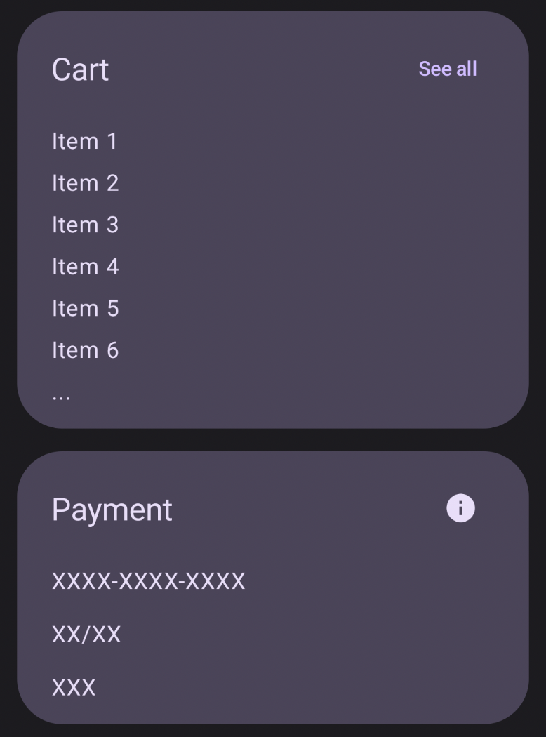
こんな画面を作ってくださいと言われたとします。画面を観察すると、セクションごとに「左上のタイトル」、「右上のアクション」、「コンテンツ」の3つの部品の組み合わせで構成されていることが分かります。
| 画面 | 構造 |
|---|---|
 |
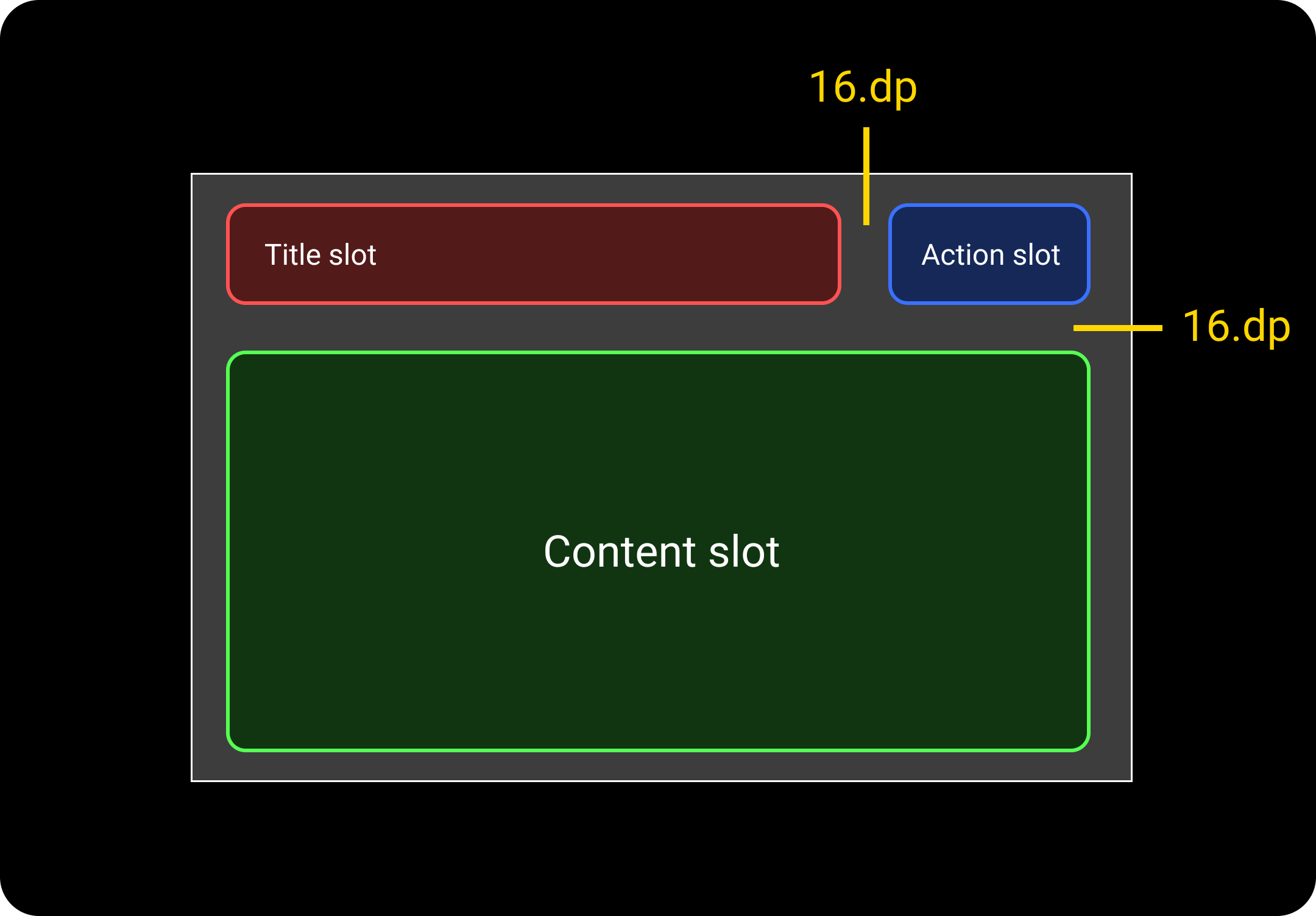 |
そこで、3つのスロットを考えます。
- Title slot
- Action slot
- Content slot
これらのスロットに何をはめ込むかは呼び出し側の自由です。title と action は省略できると便利なので デフォルトで空のコンポーザブル関数を渡しておきます。
@Composable
fun SectionTemplate(
    modifier: Modifier = Modifier,
    title: @Composable () -> Unit = {},
    action: @Composable () -> Unit = {},
    content: @Composable () -> Unit
) {
    Surface(
        color = MaterialTheme.colorScheme.secondaryContainer,
        contentColor = MaterialTheme.colorScheme.onSecondaryContainer,
        shape = RoundedCornerShape(32.dp),
    ) {
        Column(
            modifier = Modifier
                .padding(horizontal = 24.dp, vertical = 16.dp)
                .then(modifier),
            verticalArrangement = Arrangement.spacedBy(16.dp),
        ) {
            Row(
                horizontalArrangement = Arrangement.spacedBy(16.dp),
                verticalAlignment = Alignment.CenterVertically,
            ) {
                Box(
                    modifier = Modifier.weight(1f),
                ) {
                    ProvideTextStyle(
                        MaterialTheme.typography.titleLarge,
                    ) {
                        title()
                    }
                }
                action()
            }
            content()
        }
    }
この SectionTemplate を使用して CartSection と PaymentSection を作成します。
@Composable
fun CartSection() {
    SectionTemplate(
        title = {
            Text(text = "Cart")
        },
        action = {
            TextButton(onClick = {}) {
                Text(text = "See all")
            }
        }
    ) {
        Column(
            verticalArrangement = Arrangement.spacedBy(8.dp),
        ) {
            IntRange(1, 6).forEach {
                Text(text = "Item $it")
            }
            Text(text = "...")
        }
    }
}
@Composable
fun PaymentSection() {
    SectionTemplate(
        title = {
            Text(text = "Payment")
        },
        action = {
            IconButton(onClick = {}) {
                Icon(
                    imageVector = Icons.Filled.Info,
                    contentDescription = null,
                )
            }
        }
    ) {
        Column(
            verticalArrangement = Arrangement.spacedBy(16.dp),
        ) {
            Text(text = "XXXX-XXXX-XXXX")
            Text(text = "XX/XX")
            Text(text = "XXX")
        }
    }
}
例2: Scaffold
実は Scaffold にも以下のようなスロットが用意されていて、自由に中身をはめ込めるようになっています。
- Top Bar slot
- Bottom Bar slot
- Floating Action Button slot
- Drawer Content slot
- Content slot
@Composable
fun Scaffold(
    modifier: Modifier = Modifier,
    topBar: @Composable () -> Unit = {},
    bottomBar: @Composable () -> Unit = {},
    floatingActionButton: @Composable () -> Unit = {},
    drawerContent: @Composable (ColumnScope.() -> Unit)? = null,
    .. 略 ..
    content: @Composable (PaddingValues) -> Unit
) {
  .. 略 ..
}
引用元:
まとめ
- ComposeではUI部品を共通化できるだけでなく、スロットによりUI部品の組み合わせ方を共通化することもできます。
- スロットは抽象度が高めになりますが、強力な考え方になるので覚えておくとよいです。
- 動作可能なサンプルコードをGitHubに公開しているので、併せてご参照ください。