2015/5/28のGoogle I/O 2015にて、Support Library v22.2が発表され、Material Designの実現のためのコンポーネントがいくつか公開されました。
スクリーンショットを交えつつ、ひと通り使い方をや踏んだ罠を紹介します。
パラメータ指定はJavaよりもドキュメント化されていないXML優先です。
最初に注意
Support Libraryをv22.2にあげると、Layout XMLのプレビューのところに

というエラーがでて、プレビューできなくなります。
Android Studio 1.3 previewにUpdateが必要です。
→ プレビューのバージョン(ドロイド君の横に数字の付いてるボタン)を minimum SDK versionに合わせると回避できるそうです。Nunockyさんコメントありがとうございます。
導入
まず導入。gradleです。
compile 'com.android.support:design:22.2.0'
にはcom.android.support:support-design:22.0.0とありますが、パッケージ名が変わった or 間違っています。(罠)
→ 修正されてました。
ビルドエラー
AndroidAnnotationsとかDaggarとかを使ってると、コンパイル通らなかったりします。(罠)
support-v4のDialogFragmentにDialogStyleという@Interfaceがあるのですが、それがソースにはあるけど.classにないそうです。
(最後のリリース前のパッキングツールのバグらしい。)
詳細は以下参照。
Issue Tracker @ Android Open Source Project
Issue @ AndroidAnnotationsのgithub
Issue @ Daggerのgithub
含まれるコンポーネント
- TextInputLayout
- FloatingActionButton
- Snackbar
- TabLayout
- NavigationView
- CoordinatorLayout
- AppBarLayout
- CollapsingToolbarLayout
使ってみた
TextInputLayout
スクショ
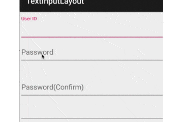
使い方
EditTextをくるむ形で使います
    <android.support.design.widget.TextInputLayout
        android:layout_width="match_parent"
        android:layout_height="wrap_content">
        <EditText
            android:id="@+id/user_id"
            android:layout_width="match_parent"
            android:layout_height="wrap_content"
            android:hint="@string/user_id"/>
    </android.support.design.widget.TextInputLayout>
hintテキストはEditTextのものを引っ張っていってくれます
final TextInputLayout pass = (TextInputLayout)view.findViewById(R.id.password);

//setErrorEnabledをセットしておくと、エラー表示の部分のスペースが予め確保される
// false指定の場合はsetErrorしたときにエラーが追加される
pass.setErrorEnabled(true);

//エラー文言のセット
pass.setError("Error !!");
FloatingActionButton
スクショ

使い方
レイアウトこんな感じ
        <android.support.design.widget.FloatingActionButton
            android:id="@+id/fab1"
            android:layout_width="wrap_content"
            android:layout_height="wrap_content"
            android:src="@drawable/plus"
            app:fabSize="normal"/>
        <android.support.design.widget.FloatingActionButton
            android:id="@+id/fab2"
            android:layout_width="wrap_content"
            android:layout_height="wrap_content"
            android:src="@drawable/rectangle"
            app:fabSize="mini"/>
        <android.support.design.widget.FloatingActionButton
            android:id="@+id/fab3"
            android:layout_width="100dp"
            android:layout_height="100dp"
            android:src="@drawable/rectangle"
            app:fabSize="mini"/>
fabSize指定でサイズがわかります。
width/height指定をすると、そのサイズにもできます。(上記例だとdrawableがはみ出してしまいましたが。ちなみに、指定してるdrawableはただのshape)
fab1.setRippleColor(getResources().getColor(R.color.accentColor));
とやると、Rippleの色が変わるのかとおもいきや、ボタンの自体の色が変わりました。
でも、Android 4.4だとFABの周囲に縁取り的に元の色が残りました…(罠?)
下地の色変更は、XMLなら
app:backgroundTint="#ff0000"
コードなら
fab.setBackgroundTintList(ColorStateList.valueOf(color));
みたいな感じで行いましょう。
また、現状は
borderWidth="0dp"
を指定してあげないと、きちんと丸くならない不具合があるみたいですね。(罠)
さらに、このFAB、Android 4系以前だと、ShadowのためのPaddingが勝手に足されます(罠)。すごく配置しにくい…
とりあえず手元の用途では以下のようなラッパを作ってみて回避してます。
(影のサイズ判別ロジックとか、size指定のint値の割り当てが変わると正常に動作しなくなりますが。あと、MarginLayoutParamsじゃないとこに置く場合もダメですが。あくまで参考までに。)
package com.hoge.piyo;

import android.content.Context;
import android.content.res.TypedArray;
import android.os.Build;
import android.util.AttributeSet;
import android.view.ViewGroup;


public class FloatingActionButton extends android.support.design.widget.FloatingActionButton {
    private int basePadding;

    public FloatingActionButton(Context context) {
        this(context, (AttributeSet)null);
    }

    public FloatingActionButton(Context context, AttributeSet attrs) {
        this(context, attrs, 0);
    }

    public FloatingActionButton(Context context, AttributeSet attrs, int defStyleAttr) {
        super(context, attrs, defStyleAttr);

        TypedArray a = context.obtainStyledAttributes(attrs, android.support.design.R.styleable.FloatingActionButton, defStyleAttr, android.support.design.R.style.Widget_Design_FloatingActionButton);
        int size = a.getInt(android.support.design.R.styleable.FloatingActionButton_fabSize, 0);
        a.recycle();
        int fabSize = size == 0 ? //0:Normal, 1:mini
                this.getResources().getDimensionPixelSize(android.support.design.R.dimen.fab_size_normal) :
                this.getResources().getDimensionPixelSize(android.support.design.R.dimen.fab_size_mini);
        basePadding = (fabSize - this.getResources().getDimensionPixelSize(android.support.design.R.dimen.fab_content_size)) / 2;
    }


    @Override
    public void setLayoutParams(ViewGroup.LayoutParams params) {
        if(Build.VERSION.SDK_INT < Build.VERSION_CODES.LOLLIPOP) {
            //adjust position of FAB
            if (params instanceof ViewGroup.MarginLayoutParams) {
                ViewGroup.MarginLayoutParams layoutParams = (ViewGroup.MarginLayoutParams) params;
                layoutParams.leftMargin -= getPaddingLeft() - basePadding;
                layoutParams.topMargin -= getPaddingTop() - basePadding;
                layoutParams.rightMargin -= getPaddingRight() - basePadding;
                layoutParams.bottomMargin -= getPaddingBottom() - basePadding;
            }
        }
        super.setLayoutParams(params);
    }
}
Snackbar
スクショ


使い方
ACTION無しなら
Snackbar snackbar = Snackbar.make(layout2, "fab2 is clicked", Snackbar.LENGTH_SHORT);
snackbar.show();
これだけです。
ACTION足したいときは、show()の前に
snackbar.setAction("ACTION", new View.OnClickListener() {
    @Override
    public void onClick(View v) {
        Toast.makeText(getActivity().getApplicationContext(), "ACTION executed", Toast.LENGTH_SHORT).show();
    }
});
みたいな感じ。
ちなみに、Material Designのドキュメントでは One Linerと書いてましたが、

もうちょっと長めのところでカットされます。
あと、SnackbarはgetViewでViewを取り出せるので
View snackbarView = snackbar.getView();
snackbarView.setBackgroundColor(Color.MAGENTA);
//Actionの文字色は普通に変えれます。
snackbar.setActionTextColor(Color.WHITE);
とかやるとこんな感じになります。

ちなみに、このViewはSnackbarLayoutというViewでした。
TabLayout
Rippleとかも入ったTabです。
スクショ

使い方
単独の使い方はこんな感じ
TabLayout tabLayout3 = (TabLayout)view.findViewById(R.id.tab_layout3);
tabLayout3.addTab(tabLayout3.newTab().setText("Tab 1"));
tabLayout3.addTab(tabLayout3.newTab().setText("Tab 2"));
tabLayout3.addTab(tabLayout3.newTab().setText("Tab 3"));
ViewPagerと連携させる場合はこんな感じ
TabLayout tabLayout = (TabLayout) view.findViewById(R.id.tab_layout);
ViewPager viewPager = (ViewPager) view.findViewById(R.id.view_pager);

viewPager.setAdapter(new MyFragmentPagerAdapter(getFragmentManager()));
tabLayout.setupWithViewPager(viewPager);
TabのラベルはAdapterのgetPageTitleを使ってます。
以下、カスタマイズ。
デフォルトだと、タブの数を増やしていくと

こうなっちゃうので、MODE_SCROLLABLEにする
tabLayout2.setTabMode(TabLayout.MODE_SCROLLABLE);

あと、タブが画面いっぱいに広がってほしくない時は
tabLayout4.setTabGravity(TabLayout.GRAVITY_CENTER);

タブの色をカスタムしたい場合は
    <android.support.design.widget.TabLayout
        android:id="@+id/tab_layout"
        android:layout_width="match_parent"
        app:tabTextColor="@color/primaryColorDark"
        app:tabSelectedTextColor="@color/accentColor"
        app:tabIndicatorColor="@color/accentColor"
        android:background="@color/primaryColor"
        android:layout_height="60dp"/>

注意
TabLayoutのタブをViewPagerとかPagerAdapterからセットしている場合、PagerAdapterのnotifyDataChangedではタブの中身は変わってくれません。(罠)
PagerSlidingTabStripとか使ってた人は注意。
タブの中身をpagerAdapterから更新したい場合、setTabsFromPagerAdapterでできますが、コレを使った場合は一番左のタブにフォーカスがうつってしまうのも注意。(selectのコールバックも飛んできます)
NavigationView
スクショ

使い方
Android Developersにあるように
<android.support.v4.widget.DrawerLayout xmlns:android="http://schemas.android.com/apk/res/android"
     xmlns:app="http://schemas.android.com/apk/res-auto"
     android:id="@+id/drawer_layout"
     android:layout_width="match_parent"
     android:layout_height="match_parent"
     android:fitsSystemWindows="true">

     <!-- Your contents -->

     <android.support.design.widget.NavigationView
         android:id="@+id/navigation"
         android:layout_width="wrap_content"
         android:layout_height="match_parent"
         android:layout_gravity="start"
         app:headerLayout="@layout/drawer_header"
         app:menu="@menu/my_navigation_items"/>
 </android.support.v4.widget.DrawerLayout>
DrawerLayoutの中に入れます。
GoogleのAPI Documentに記載はありませんが、headerLayoutでドロワーのヘッダ部分のレイアウトXMLも指定できます。
ヘッダ内の要素も普通にfindViewByIdで取り出せます。
ImageView headerImageView = (ImageView)findViewById(R.id.header_image);
//背景色変えてみる
headerImageView.setBackgroundColor(Color.MAGENTA);
Headerのレイアウトはこんな感じ
<?xml version="1.0" encoding="utf-8"?>
<FrameLayout xmlns:android="http://schemas.android.com/apk/res/android"
    android:layout_width="match_parent"
    android:layout_height="200dp"
    android:background="@color/primaryColor">

    <ImageView
        android:id="@+id/header_image"
        android:layout_width="80dp"
        android:layout_height="80dp"
        android:layout_margin="20dp"
        android:src="@drawable/circle"/>
</FrameLayout>
Menuはこんな感じ
<?xml version="1.0" encoding="utf-8"?>
<menu
    xmlns:android="http://schemas.android.com/apk/res/android"
    xmlns:app="http://schemas.android.com/apk/res-auto">

    <item
        android:id="@+id/action_text_input_layout"
        android:icon="@drawable/circle"
        android:title="@string/title_text_input_layout"/>

</menu>
要素選択イベントは
mDrawerLayout = (DrawerLayout)findViewById(R.id.drawer_layout);
mNavigationView = (NavigationView)findViewById(R.id.navigation);
mNavigationView.setNavigationItemSelectedListener(new NavigationView.OnNavigationItemSelectedListener() {
    @Override
    public boolean onNavigationItemSelected(MenuItem menuItem) {
        mToolbar.setTitle(menuItem.getTitle());
        switch (menuItem.getItemId()){
            case R.id.action_text_input_layout:
                replaceFragment(new TextInputLayoutFragment());
                mDrawerLayout.closeDrawers();
                return true;
        }
        return false;
    }
});
こんな感じ
CoordinatorLayout
ザックリ言うと、親子関係のない2つのViewに依存関係を持たせるためのFrameLayout継承のコンポーネントです。
(ただし、それらのViewはどちらも単一のCoordinatorLayoutの子孫である必要がある。)
スクショ

使い方
一番単純なのは
<android.support.design.widget.CoordinatorLayout xmlns:android="http://schemas.android.com/apk/res/android"
    xmlns:app="http://schemas.android.com/apk/res-auto"
    android:layout_width="match_parent"
    android:layout_height="match_parent">
    <ScrollView
        android:layout_width="match_parent"
        android:layout_height="match_parent">
        <LinearLayout
            android:layout_width="match_parent"
            android:layout_height="wrap_content"
            android:orientation="vertical">
            <TextView
                android:layout_width="match_parent"
                android:layout_height="50dp"
                android:text="Hoge1"/>
            <TextView
                android:layout_width="match_parent"
                android:layout_height="50dp"
                android:background="#CCCCCC"
                android:text="Hoge2"/>
            <TextView
                android:layout_width="match_parent"
                android:layout_height="50dp"
                android:text="Hoge3"/>
            <TextView
                android:id="@+id/hoge4"
                android:layout_width="match_parent"
                android:layout_height="50dp"
                android:background="#CCCCCC"
                android:text="Hoge4"/>
            <!--中略-->
            <TextView
                android:layout_width="match_parent"
                android:layout_height="50dp"
                android:background="#CCCCCC"
                android:text="Hoge18"/>
            <TextView
                android:layout_width="match_parent"
                android:layout_height="50dp"
                android:text="Hoge19"/>
            <TextView
                android:layout_width="match_parent"
                android:layout_height="50dp"
                android:background="#CCCCCC"
                android:text="Hoge20"/>
        </LinearLayout>

    </ScrollView>
    <TextView
        android:id="@+id/piyo"
        android:text="Piyo"
        app:layout_anchor="@+id/hoge4"
        app:layout_anchorGravity="center_vertical"
        android:layout_width="match_parent"
        android:layout_height="wrap_content"
        android:gravity="right"/>
</android.support.design.widget.CoordinatorLayout>
(サンプルだからコードでループさせて生成してないのは許してください)
layout_anchor を指定することで、TextView piyo をTextView hoge4 にひもづけることができます。これで、 hoge4 の位置が動けば piyo の位置も変わるようになります。
layout_anchorGravity で center_vertical を指定することで、 hoge4 の縦方向真ん中にanchorしています。
anchorするViewの中心を、anchor先ののどこにanchorするかの指定になっていますので、以下のような感じ。
| layout_anchorGravity | screenshot |
|---|---|
| 指定なし |  |
| center |  |
| center_vertical |  |
| center_horizontal | |
| left |  |
| right |  |
| top |  |
| bottom |  |
| right|bottom |  |
(fill系、clip系は指定しても意味がないようでした)
anchorしているViewがどういう挙動をするかは、Behaviorというので指定できます。Behaviorを継承して、
onDependentViewChanged(CoordinatorLayout parent, V child, View dependency)
とかあたりを好きに実装して使います。
何も指定しない場合にはDefaultBehaviorというものが使われるのですが、上の動画を見る限り画面外には出ない挙動みたいですね。
xmlでの指定の場合は
app:layout_behavior="android.support.design.widget.AppBarLayout$ScrollingViewBehavior"
と、これを調べている時に
http://android-developers.blogspot.jp/2015/05/android-design-support-library.html
の存在に気づく…orz
AppBarLayout
CoordinatorLayoutと組み合わせて使う前提のLinearLayout継承コンポーネントです。
ヘッダ群とスクロールするコンテンツ、という構成の時に、ヘッダ群の全部または一部だけが画面外にスクロールアウトするような画面(GooglePlayとかそうですね)を作るのがすごく楽になります。
動画とかサンプルコードは
http://android-developers.blogspot.jp/2015/05/android-design-support-library.html
とか、
https://github.com/chrisbanes/cheesesquare/blob/master/app/src/main/res/layout/include_list_viewpager.xml
とかを見に行って下さい。
どういう条件で使えるの?
模式的に書くとこうなります。
<CoordinatorLayout>
    <AppBarLayout> <!--(1)-->
        <View app:layout_scrollFlags="scroll|enterAlways"/> <!--(2)-->
        <View>
    </AppBarLayout>
    <ViewGroup app:layout_behavior="@string/appbar_scrolling_view_behavior"><!--(3)-->
        <!--子孫の中にv22.2のRecyclerViewかNestedScrollViewがいる--><!--(4)-->
    </ViewGroup>
</CoordinatorLayout>
- AppBarLayoutは、CoordinatorLayoutの直接の子
- AppBarLayoutの子
- app:layout_scrollFlags="scroll"指定の無いViewよりも後(下)に
app:layout_scrollFlags="scroll"指定をすることはできない。
- app:layout_behaviorを指定するViewGroupはCoordinatorLayoutの直接の子
- (3)の子孫の中にはNestedScrollingChildを実装したViewが必要。スクロールすれば何でも良いわけではない。(罠)
- SupportLibrary v22.2ではRecyclerViewかNestedScrollViewぐらい。他のScrollableなものは、NestedScrollViewの子にしてやれば期待通りの見た目になると思います。(NestedScrollViewは22.1.1時点でNestedScrollingChild継承みたいです。ただ、22.1.1でも期待通り動くかは未確認。)
- 自分のProjectに取り込もうとしたらRecyclerViewがv22.1で「動かねー!」ってハマりました…
なので、
<CoordinatorLayout/>
   <AppBarLayout/>
       <Toolbar
           app:layout_scrollFlags="scroll|enterAlways"/>
   </AppBarLayout>
   <ViewGroup
       app:layout_behavior="@string/appbar_scrolling_view_behavior">
       <TabLayout/>
       <ViewPager>
          <!--SwipeRefreshLayout & RecyclerViewとか-->
       </ViewPager>
   </ViewGroup>
</CoordinatorLayout>
みたいな構造だったり、これのViewGroupの中が別Fragmentだったりしても大丈夫です。
ちなみに、このViewGroupはサイズが変わるわけではなく、位置がAppBarLayoutの下に移動しているだけです。

それが、上へのドラッグでAppBarLayoutと一緒にズリズリと上に動いて、その後NestedScrollingChildのScrollにシームレスにに移行するような動きです。
なので、FloatingActionButtonをViewGroupの子とかにしてしまうと、画面外にはみ出てしまいます。(罠)
layout_scrollFlagsについて
以下の様な感じ
enterAlways
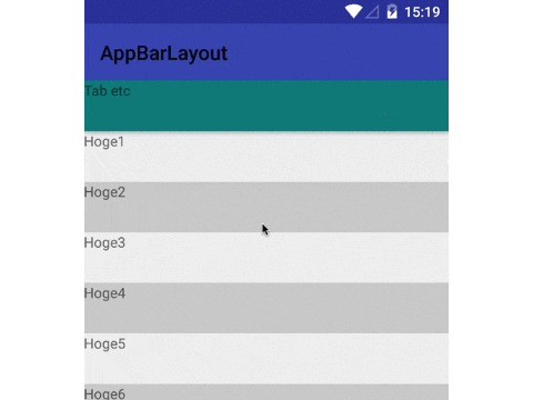
上スクロールするとToolbarがすぐに隠れて、下スクロールするとToolbarがすぐに出てきます。
XMLはこんな感じ。
    <android.support.design.widget.AppBarLayout
        android:layout_width="match_parent"
        android:layout_height="wrap_content">
        <android.support.v7.widget.Toolbar
            android:id="@+id/toolbar2"
            android:layout_height="?attr/actionBarSize"
            android:layout_width="match_parent"
            app:layout_scrollFlags="scroll|enterAlways"/>
        <TextView
            android:layout_width="match_parent"
            android:layout_height="50dp"
            android:text="Tab etc"
            android:background="#007f7f"
            />
    </android.support.design.widget.AppBarLayout>
enterAlwaysCollapsed
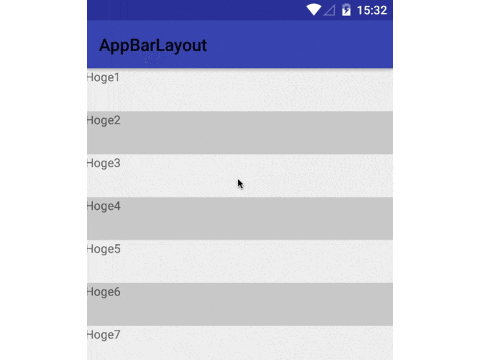
上スクロールするとToolbarがすぐに隠れますが、下スクロールはリスト上端に達するまでToolbarはでてきません。
XMLはこんな感じ。
    <android.support.design.widget.AppBarLayout
        android:layout_width="match_parent"
        android:layout_height="wrap_content">
        <android.support.v7.widget.Toolbar
            android:id="@+id/toolbar2"
            android:layout_height="?attr/actionBarSize"
            android:layout_width="match_parent"
            app:layout_scrollFlags="scroll|enterAlwaysCollapsed"/>
    </android.support.design.widget.AppBarLayout>
AppBarLayoutの中からTab役のViewをけしてますが、あいつがいると下スクロールでToolbarがでてきてくれませんでした…(罠)
画面内に残って欲しいTabとかが必要な場合は、AppBarLayoutの外に置かないとダメかもしれません。
enterAlwaysCollapsed
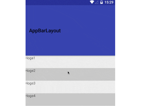
enterAlwaysCollapsedと同じく、上スクロールするとToolbarがすぐに隠れますが、下スクロールはリスト上端に達するまでToolbarはでてきません。ただ、ToolbarのminHeight分は画面内に残ります。
XMLはこんな感じ
    <android.support.design.widget.AppBarLayout
        android:layout_width="match_parent"
        android:layout_height="wrap_content">
        <android.support.v7.widget.Toolbar
            android:id="@+id/toolbar2"
            android:layout_height="200dp"
            android:layout_width="match_parent"
            android:minHeight="?attr/actionBarSize"
            app:layout_scrollFlags="scroll|exitUntilCollapsed"/>
    </android.support.design.widget.AppBarLayout>
SwipeRefreshLayoutと組み合わせる時
List部分には、SwipeRefreshLayoutを組み合わせている人も結構多いと思うのですが、Listが上端を表示している状態から下向きにドラッグすると、結構な割合でタッチイベントがSwipeRefreshLayoutに奪われます。(罠)
    new AppBarLayout.OnOffsetChangedListener() {
        @Override
        public void onOffsetChanged(AppBarLayout appBarLayout, int i) {
            refreshLayout.setEnabled(i == 0);
        }
    };
こんなのをAppBarLayoutのOnOffsetChangedListenerにセットしておくと、AppBarLayoutが領域外にはみ出した状態ではpull refreshが発動しなくなります。
(ただ、この対処だと下へドラッグして上端まで達した後、一度指を離して再度下ドラッグしないとpull refreshできないんですが…)
おまけ
AppBarLayoutはデフォルトで背景(primary color)と影(5.0以上)がつきます。(罠)
背景を消したい場合はandroid:background="@null"、影を消したい場合はapp:elevation="0dp"とかで消しましょう。
(appなのは書き間違いではありません。android:elevationではなくapp:elevationで指定です。コードからはsetTargetElevation)(罠)
CollapsingToolbarLayout
layout_scrollFlags=enterAlwaysCollapsedと組み合わせて、Scrollすると画面内のTitle表示が縮小されながらToolbarに収まるようなUIを実現するコンポーネントです。
http://android-developers.blogspot.jp/2015/05/android-design-support-library.html
とか
https://github.com/chrisbanes/cheesesquare/blob/master/app/src/main/res/layout/include_list_viewpager.xml
参照…