はじめに
html要素を変形するのに「border」「border-radius」「mask-image」を使ってみましたが、「clip-path」について検証してみました。
clip-path
簡単なサンプルを用意します。
.circle{
  width: 200px;
  height: 200px;
  margin: 20px;
  padding: 10px;
  background: #0f0;
  border: 5px solid #f00;
  clip-path: circle(120px at 50% 50%);
  cursor: pointer;
}
すると

のようになります。
描画領域
開発者ツールで確認すると
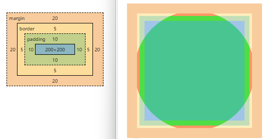
となります。
描画できる領域は「margin」の内側
クリック領域
マウスカーソルを当ててみると


となります。
クリックできる領域は「clip-path」の内側
形の制限
形については「path」が使えるので、どんな形でも書けます。多分…
2つの領域に分ける(分かれたように見える)サンプル
.bos2{
  width: 300px;
  height: 100px;
  margin: 10px;
  padding: 5px;
  background: linear-gradient(to right, #0f0 0, #0f0 150px, #00f 150px, #00f);
  clip-path: polygon(0 0, 0 100px, 100px 100px, 100px 0, 200px 0, 200px 100px, 300px 100px, 300px 0);
}
このようになります。

開発者ツールで見るとこんな感じです。
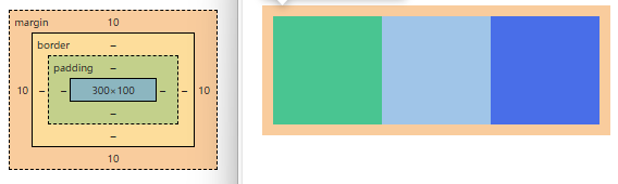
以下のように座標を指定していて、④と⑧のy座標が同じなので④の部分が見えなくなり分かれているように見えています。
色はグラデーションを使ってそれっぽくしています。

おわりに
「clip-path」はアニメーションも使えるようです。
未完成のアニメーション「ホイール」が出来るかもしれません。