説明
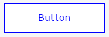
hoverすると下のボタンがぐるっと回転してくれます
コード
html
<a class="button rotation_cube_Y" href="#"><span>Hover</span><span>Button</span></a>
css3
    *{
        font-size: 18px;
        margin: 0;
        padding: 0;
        font-weight: bold;
    }
    .button {
        display: inline-block;
        width: 200px;
        height: 54px;
        text-align: center;
        text-decoration: none;
        line-height: 54px;
        outline: none;
        animation-name:colorChange;
        position: absolute;
        top:300px;
        left: 40%;
    }
    .button::before,
    .button::after {
        position: absolute;
        z-index: -1;
        display: block;
        content: '';
    }
    .button,
    .button::before,
    .button::after {
        -webkit-box-sizing: border-box;
        -moz-box-sizing: border-box;
        box-sizing: border-box;
        -webkit-transition: all .3s;
        transition: all .3s;
    }
    .rotation_cube_Y {
        position: relative;
        -webkit-perspective: 300px;/*奥行き指定*/
        perspective: 300px;/*奥行き指定*/
    }
    .rotation_cube_Y span {
        display: block;
        position: absolute;
        width: 200px;
        height: 60px;
        border: 2px solid #00f;
        text-align: center;
        line-height: 56px;
        -webkit-box-sizing: border-box;
        -moz-box-sizing: border-box;
        box-sizing: border-box;
        -webkit-transition: all .3s;
        transition: all .3s;
        pointer-events: none;
    }
    .rotation_cube_Y span:nth-child(1) {
        background-color: #00f;
        color: #fff;
        -webkit-transform: rotateY(90deg);
        -moz-transform: rotateY(90deg);
        transform: rotateY(90deg);
        -webkit-transform-origin: 50% 50% -100px;
        -moz-transform-origin: 50% 50% -100px;
        transform-origin: 50% 50% -100px;
    }
    .rotation_cube_Y span:nth-child(2) {
        background-color: #fff;
        color: #00f;
        -webkit-transform: rotateY(0deg);
        -moz-transform: rotateY(0deg);
        transform: rotateY(0deg);
        -webkit-transform-origin: 50% 50% -100px;
        -moz-transform-origin: 50% 50% -100px;
        transform-origin: 50% 50% -100px;
    }
    .rotation_cube_Y:hover span:nth-child(1) {
        -webkit-transform: rotateY(0deg);
        -moz-transform: rotateY(0deg);
        transform: rotateY(0deg);
    }
    .rotation_cube_Y:hover span:nth-child(2) {
        background-color: #00f;
        -webkit-transform: rotateY(-90deg);
        -moz-transform: rotateY(-90deg);
        transform: rotateY(-90deg);
    }